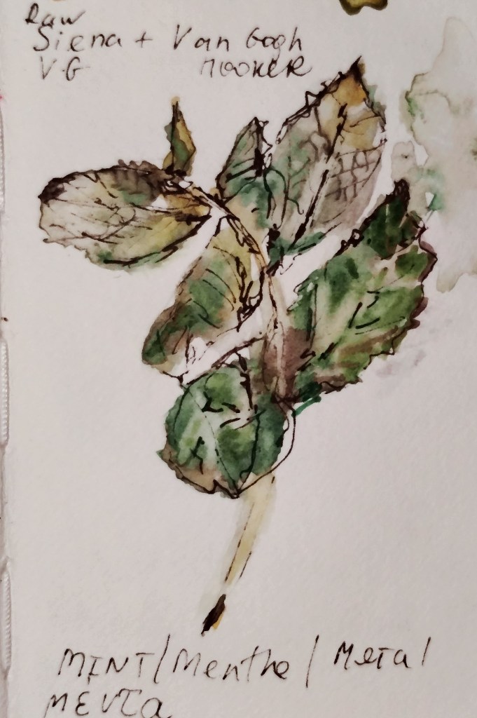
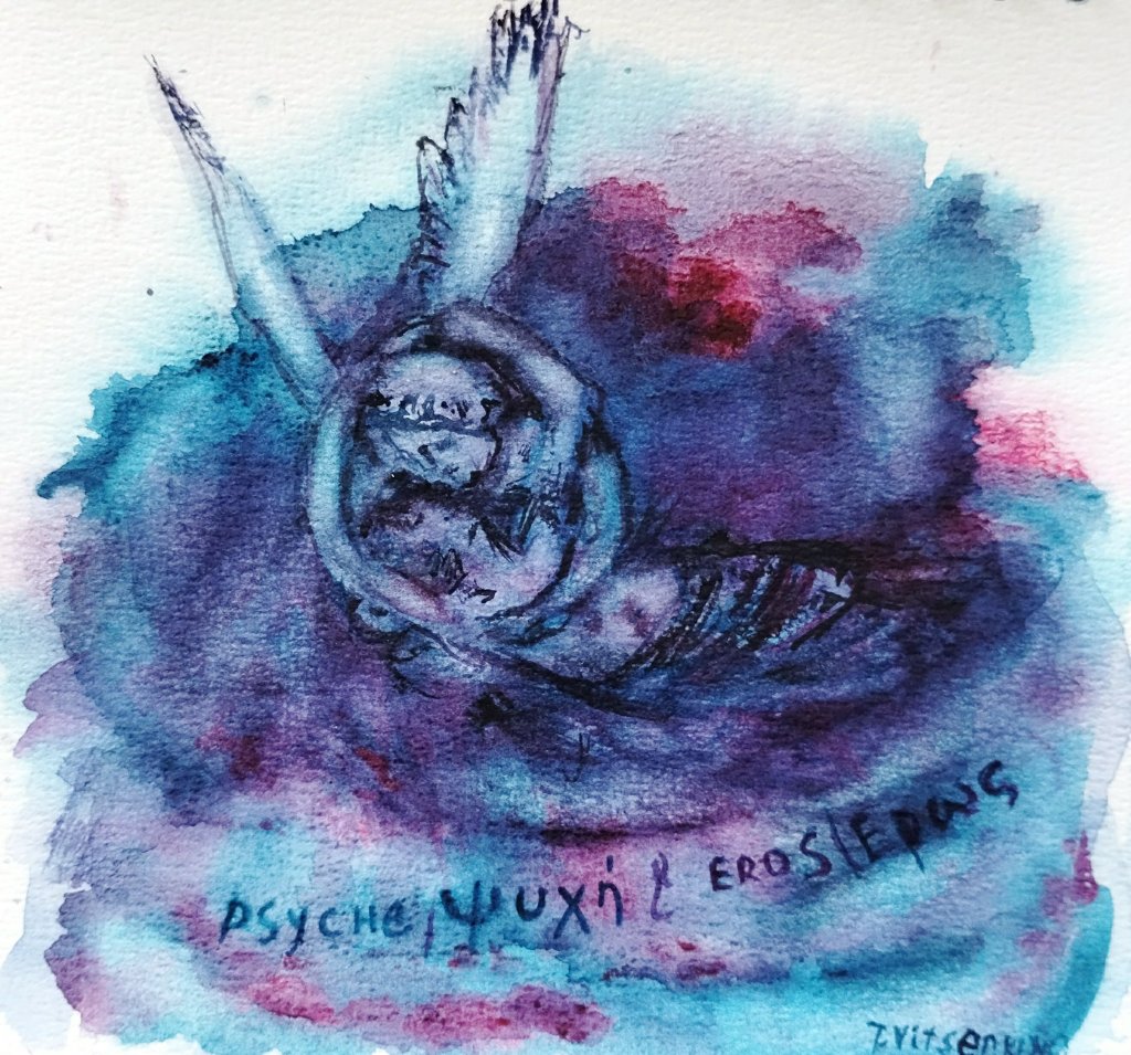
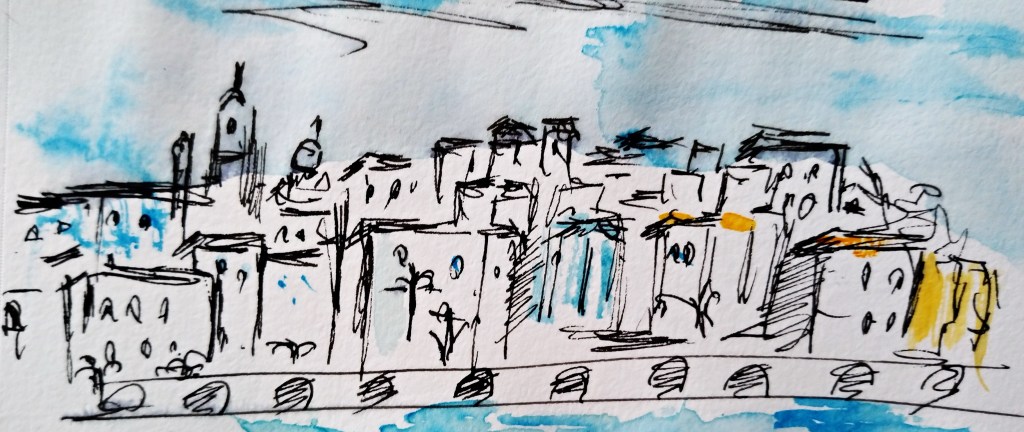
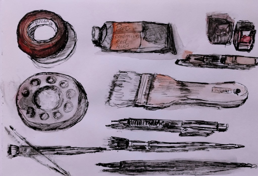
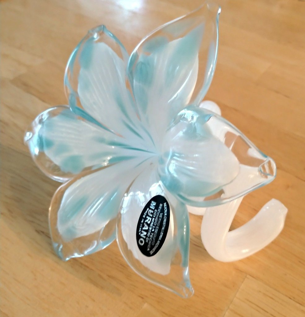
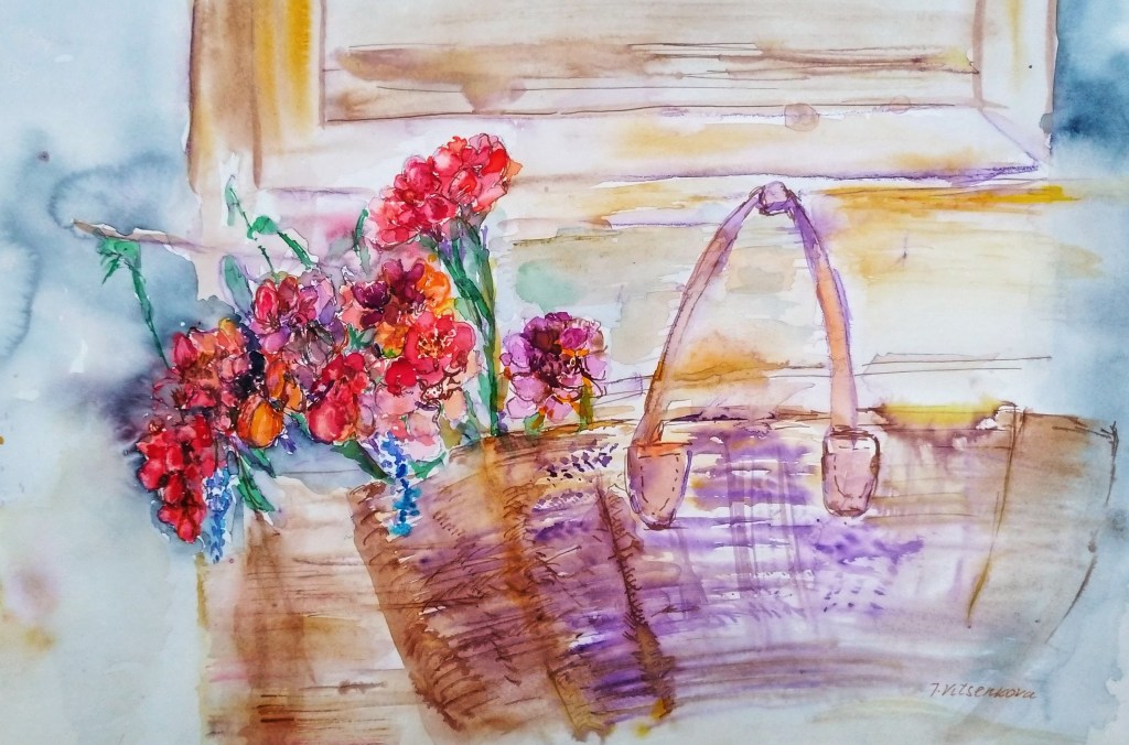
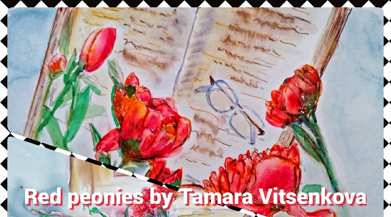
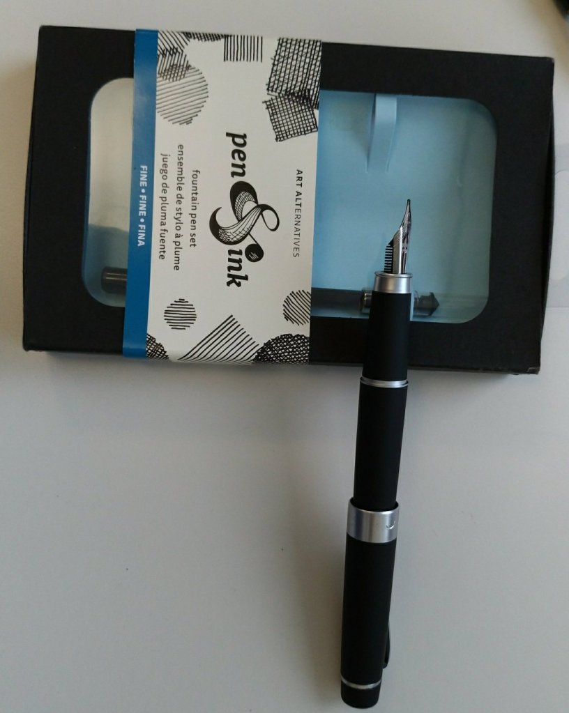
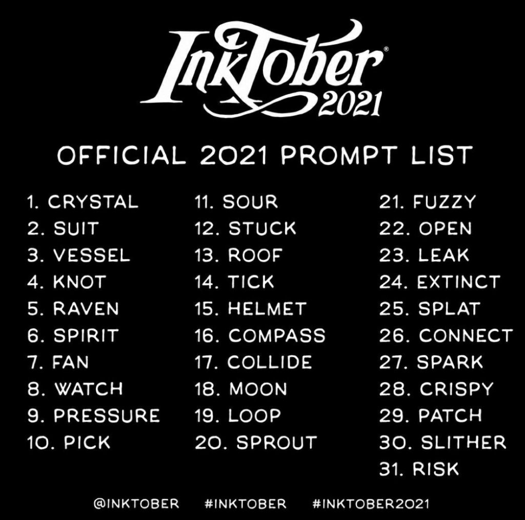
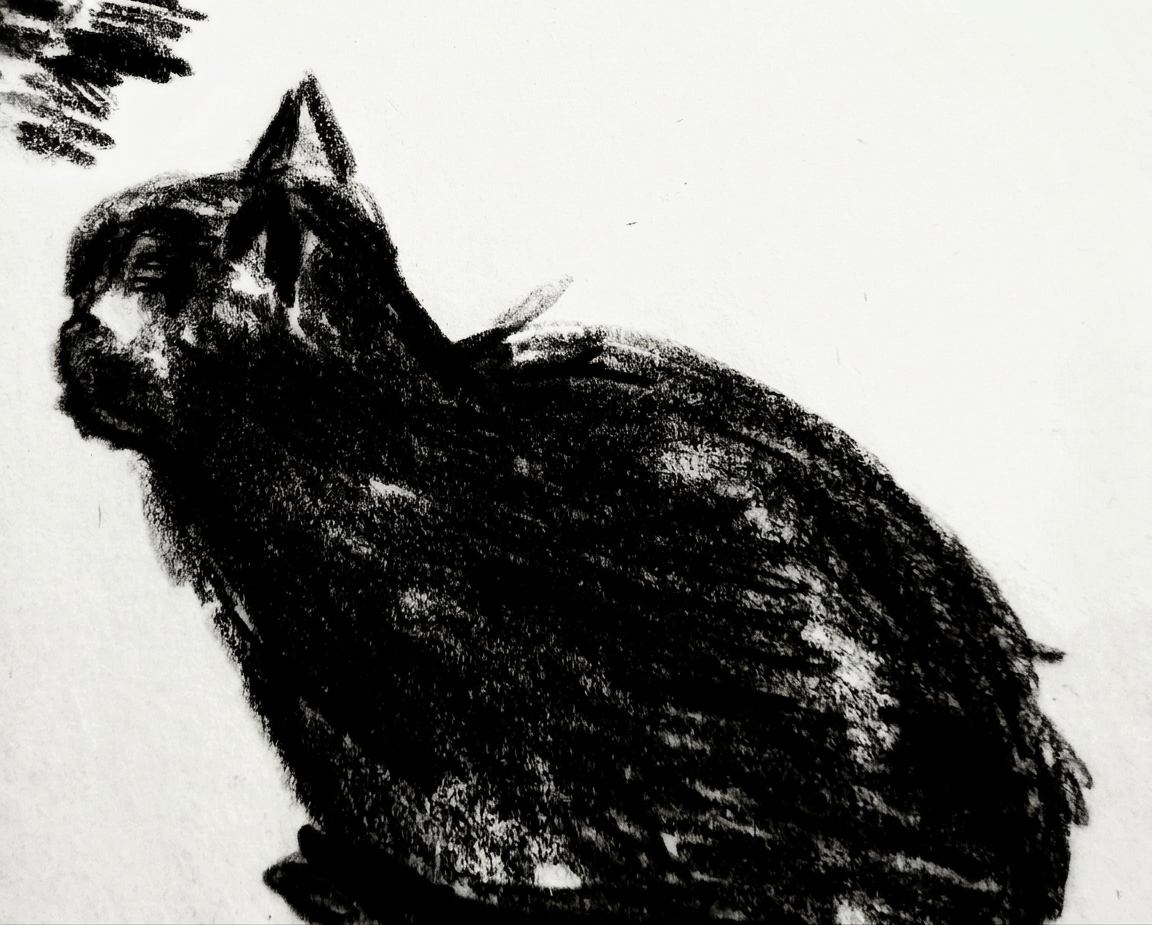
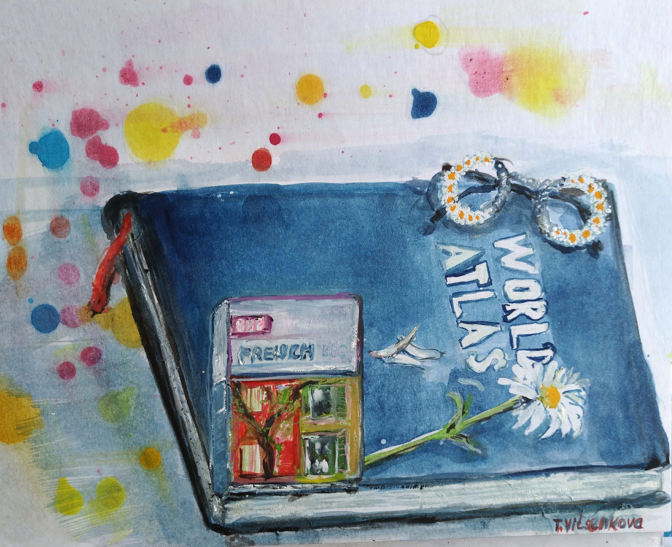
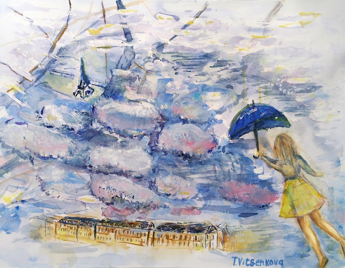
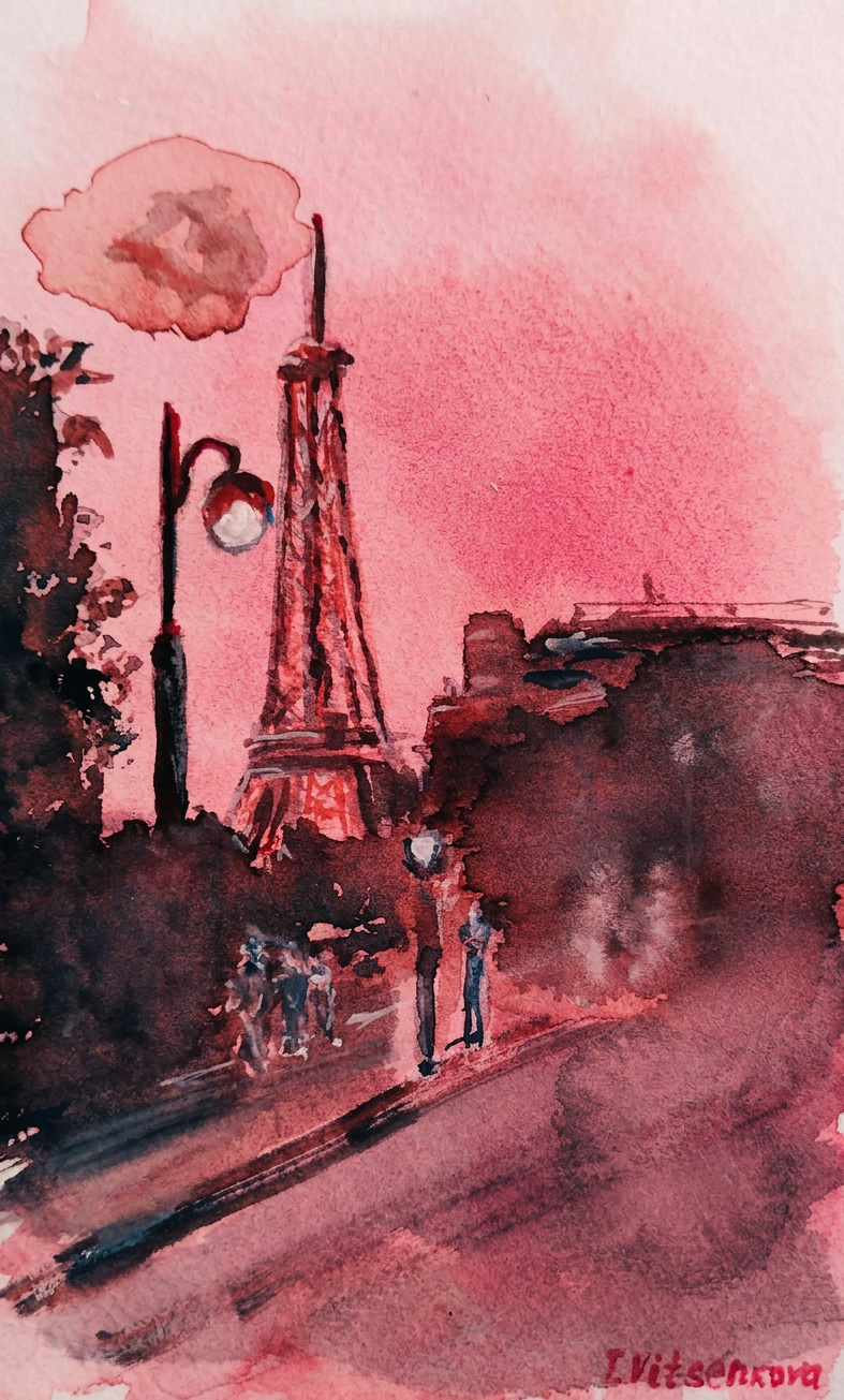
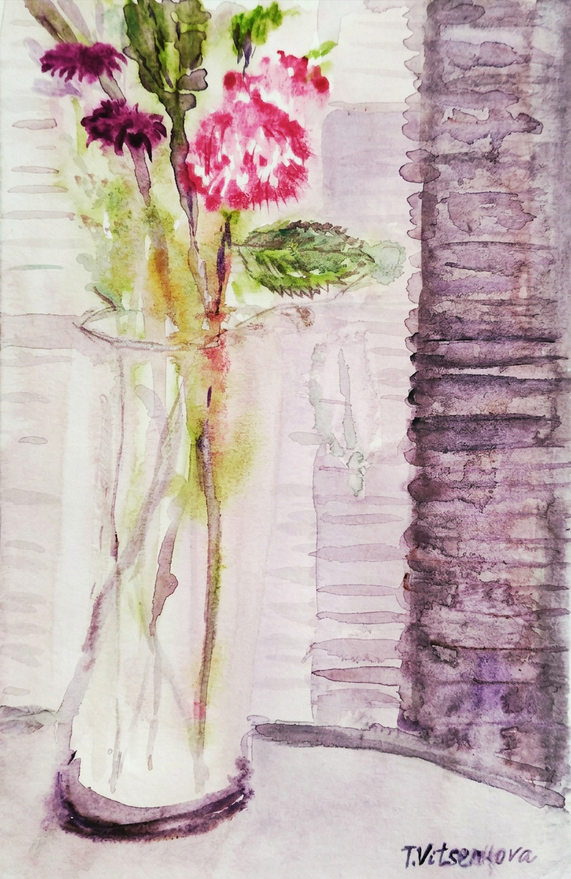
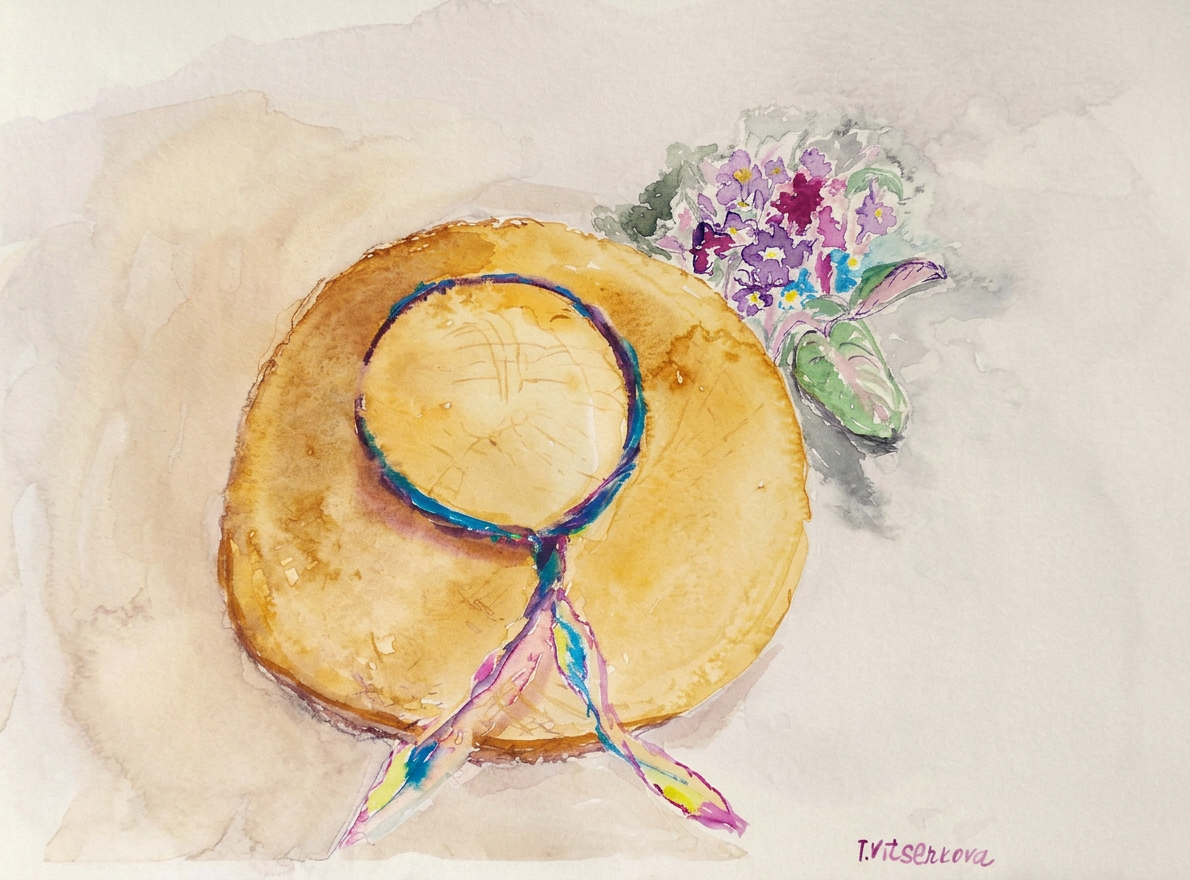
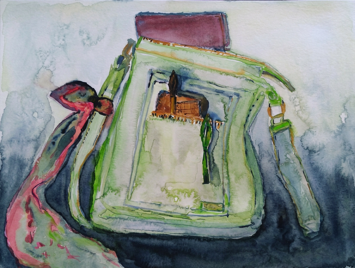
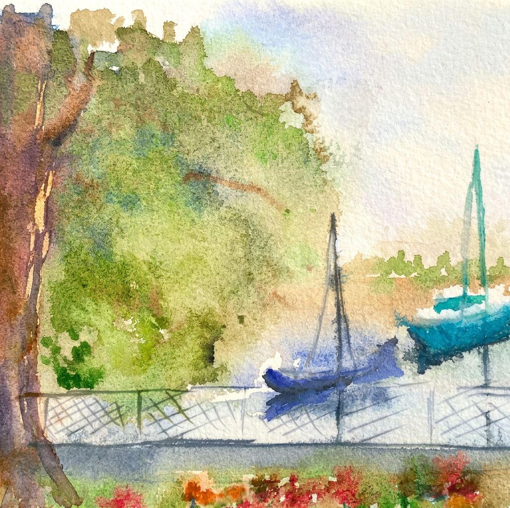
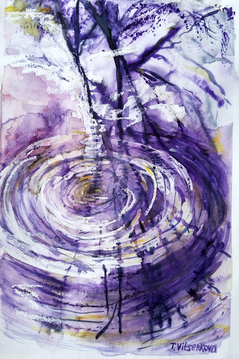
How do you turn a simple two-word phrase into a visual story? As part of my illustration course, I took on a challenge: take short descriptive prompts and bring them to life using craft paper, watercolors, white pencil, and black ink.
Here is how I visually interpreted the written word, one prompt at a time:
1. Shiny Car
Why settle for standard red or black when you can go full classic chic? I picked deep violet and purple tones. The secret trick to making it gleam without spending days on shading was adding crisp white pencil highlights right onto the craft paper.
2. Broken Vase
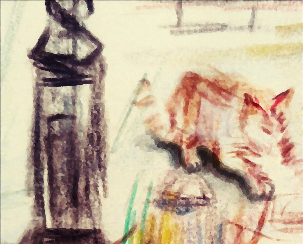
A terracotta vase shattered on the floor, and a completely unbothered fluffy cat sitting right next to the crime scene. The prompt only said “broken vase,” but let’s be honest—any pet owner knows there’s always a furry mastermind behind the chaos!
3. Spooky House
A cozy cabin tucked deep in the woods with a tiny witch flying past on her broomstick. It’s got warm glowing windows mixed with dark ink strokes—the perfect balance between a magical fairytale and a spooky autumn vibe.
4. Little Old Man
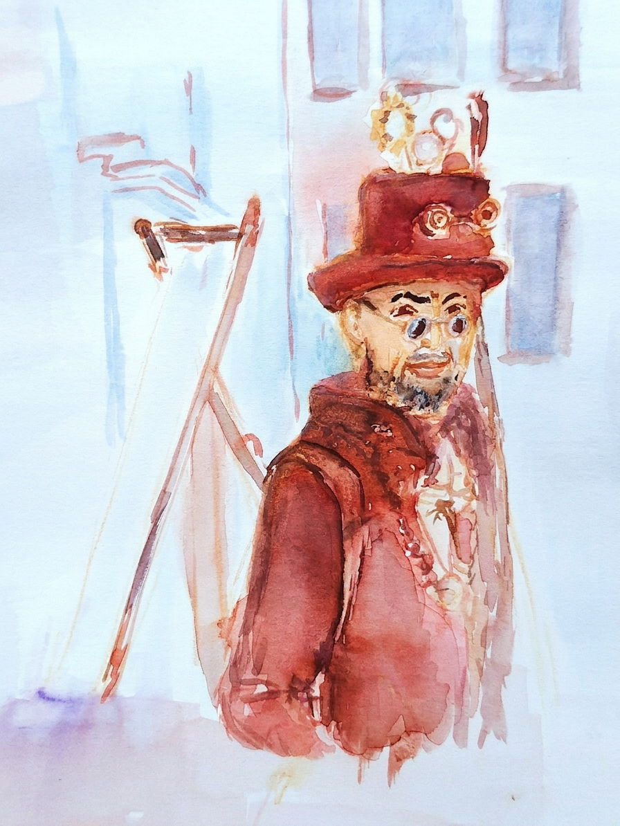
This one is deeply special to me—I drew this character inspired by my amazing 93-year-old dad. I captured him enjoying a peaceful moment outdoors by his bicycle, full of life, warmth, and timeless charm.
5. Contented Cow
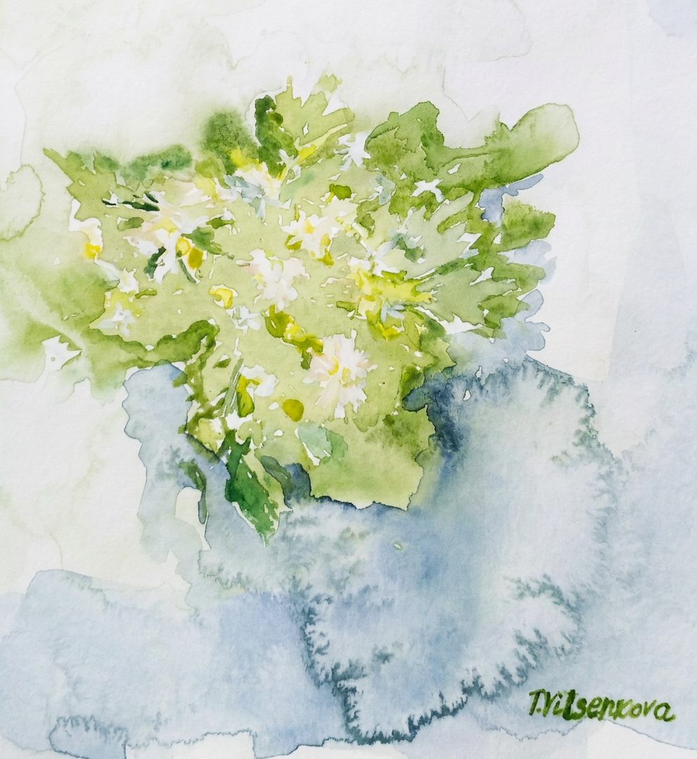
Meet the absolute queen of relaxation! She’s wearing a delicate flower crown, basking in a sunny field, and even has a tiny butterfly perched on her tail. Pure watercolor serenity.
6. Angry Horse
To show real frustration, I went wild with dynamic red and pink strokes! I focused on the sharp lines and fiery energy—this horse looks like it just got stuck in line at the post office.
7. Fat Rabbit
My personal star of the collection: a chubby, bright blue-purple bunny holding a tiny birthday cake with a glowing candle. He’s giving you the sweetest innocent look, but make no mistake—that cake is 100% not for sharing!
8. Tasty Cake
A rich, layered honey cake loaded with plump, juicy blueberries. Working with warm yellows and deep blues on craft paper made it look so delicious that painting it was pure torture for my appetite.
9. Comfortable Chair
A cozy rocking chair nestled right in the middle of a blooming garden surrounded by wildflowers. It’s practically screaming at you to drop everything, grab a cup of tea, and take a long afternoon nap.
Which sketch brought a smile to your face? Let me know in the comments!How to illustrate ,visually interpreting the written world?
17 years of art experience and a pile of degrees, yet here I am at London Art College, sitting like a total freshman. (Honestly, that’s a ready-made punchline.)
It’s a generational engineering trauma: my family is physically incapable of simply buying a ready-made product. Fellow cheapskate artists will appreciate this 10/10.
Welcome to my mini-series, where I’m transforming a heavy oak hanger into a custom studio storyboard panel. Armed with an engineering degree, an illustrator’s eye, and a few everyday items, I’m building a creative workspace from scratch—one detail, texture, and sketch at a time.
Skipping boring, ready-made store options to flex my own designer storyboard…
So, it’s an old coat rack instead of the big online retail giants, turned into a storyboard that works like a puppet theater where you can slide frames up and down.
Creating StoryBoard Panel
I was not sure how to name this old-fashioned hanger, forgotten part of previous owners of my apartment. Maybe the Brief Hanger? Or the Draft Board? Finally the name was chosen as StoryBoard Panel because I am going to create new stories about my friends, characters and maybe animals…
Welcome – StoryBoard Panel
And to wrap it up: who’s with me on this crazy ride? Who else feels that urgent, genetic need to look at a piece of useless junk laying around the house and think: “Yeah, I can definitely build something out of that”? What about you?
Well, I do have a Vintage coat rack / Wooden base. Then what do I need else?
My plan
Spiral sketchbook: This is where the magic (and the chaos) starts before I tear it apart.
Structural engineering, but make it wine.
3-color sketchbook & black paper: For when regular white paper is just too mainstream and boring.
Fluorescent paints: To make my ideas literally glow in the dark and pop off the page.
Wooden pegs: My tiny wooden assistants doing the heavy lifting of holding the story together.
Linen strings: The tightropes my characters walk on while I figure out the plot twist.
Super magnets: For snaps, rapid changes, and maximum satisfying clicks.
Transparent elements:** Now you see it, now you don’t—pure layout wizardry.
The real joke: Designer storyboard
Picture a professional designer with fancy degrees hanging out in a store, aggressively clicking tiny magnets together to test their power. Right after that, I was stress-testing a roll of linen string to see if it would survive being wrapped around an old coat rack, while the staff slowly backed away.
What about you, fellow artists and illustrators? What do you use to keep your storyboards and ideas organized? Share your favorite studio hacks below!
Watercolor journey with the course Roman Architecture by the Yale University.
I continue the art series with the course Roman Architecture + the city of Rome with Yale’s course Roman Architecture https://www.coursera.org/learn/roman-architecture. Rome, Palatine Hill, Romulus Founds Rome, Roman Architecture. 2-1.
Romulus founded the city of Rome and on Palatine Hill and archaeologists still find the remains of that village and houses from which the Roman Empire began to expand. It is difficult to imagine that on this huge passage there was once a small village, which was dug into a wonderful city, my beloved Rome. According to the legend, Romulus founded the City of Rome, on the 21st of April in 753 BC. Romulus village had huts made of wood that had thatched roofs. There are similar huts in a small village in the Maya Riviera near Cancun. Anyone who will visit this place might imagine that they are in a future city of Rome of the 8 century BC.
Rome, Palatine Hill, Romulus Founds Rome, Roman Architecture
The Palatine Hill is the oldest inhabited one in Rome. Actually, the name of the hill comes from the name of the goddess Pales – the patroness of cattle. The hill has long been a place for grazing pets and worshiping this goddess. The first permanent settlements appeared here in about 1000 BC, judging by the archaeological artefacts that appeared on the Palatine. There is the Palatine Hill’s archaeological museum with the Romulus House with the model of huts in the village of the Iron Age.
Several years ago I was in the Capitoline Museums in Rome, near the reproduced images of the Romulus village at the Palatine and Capitoline Hills; I stared in these pictures with fascination to find more information. Who would have known that in a few years I will learn about the Roman architecture and I will have the opportunity to understand why I was so delighted?
Rome, Palatine Hill, Romulus Founds Rome, Roman Architecture
Year of construction- 753 BC
Address: Rome, Palatine Hill, Piazza S. Maria Nova, 53V
Tools used for my painting Watercolour Charvin Ruby red and Emerald, Derwent, Albert Durer and Faber Castell watercolour pencils. Paper Acquarello Fabriano cold pressed watercolour album, 22×30 cm (9 ×12 in.)
Δ
document.getElementById( "ak_js_4" ).setAttribute( "value", ( new Date() ).getTime() );
The magic of the holidays is in the making! Join me on this artistic adventure as I explore the captivating world of #TravelVibes #ArtAdventure
You are welcome to visit my personal website pages. There, you can find out more about the artwork I am offering in oil and watercolor paintings. You can buy canvas prints, framed prints, and more artwork.
All paintings belong to the author. No image is to be copied without permission.
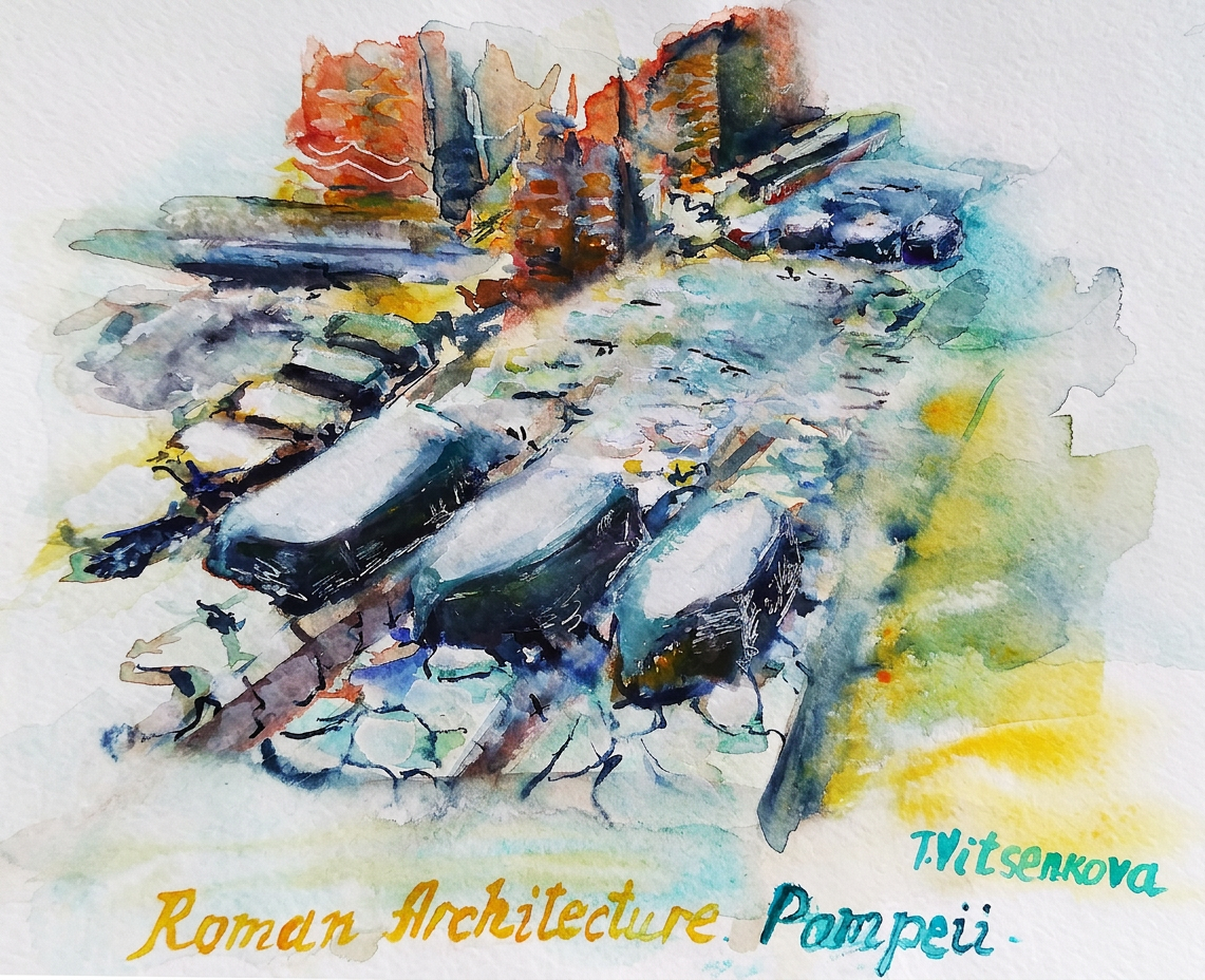
This part of Roman Architecture‘s course was about Pompeii’s daily life in general, with many photo references. Pompeii’s streets look very modern with lots of bakeries, wine shops in the residential part of the city. For example, scientists discovered more than 30 bakeries. Few people in ancient Rome could afford to bake bread at home, so most bought it in the bakeries. Millstones for bake and for bay and ovens, that are part of bakeries look exactly as today’s bakeries in Italy. There were many fountains everywhere, for example a famous fountain with representations of the goddess Ceres.
I chose to paint the residential area with BIG pedestrian polygonal blocks of stones. It is a crossing part of the street. They are “talking” to us, telling their ancient stories about Pompeii’s daily life. If there was torrential rain, and the water piled up, people needed to cross the street without stepping in the water, but how? Romans were ingenious and concerned about their roads and pedestrians.
The stepping stones were placed in the streets so that people could cross the roads during and after the rain. Ancient people could easily walk around and were not afraid to wet their shoes and long dresses. As they continued gathering with friends and families, walking to the city’s centre or theatre, enjoying their daily life.
At the same time, these stepping stones were spaced apart far enough so that carts could still pass through the streets easily. The visible ruts that came from the horses and carts, between the stepping stones, show that they had to coordinate the wheels of the cart in such a way that they would span the stepping stones. Ancient Pompeii citizens could easily make their way across that stream by utilizing these stepping stones, “pondera”.
This was a genius architecture feat with responsible thinking thought about pedestrians. And even when my family walked in the city-museum of Pompeii with its astonishing view and a background of 2 majestic mountains- Vesuvius and Montezuma, we still found ourselves completely astounded by the stepping stones!
Painting – stones on the Streets of Pompeii -Daily Life, Roman Architecture
Year of construction- 79AD
Address: Pompeii
Tools used for my painting Watercolour raw sienna, permanent rose, Charvin vert imperial, Albert Durer and Faber Castell watercolour pencils. Paper Van Gogh National gallery watercolour album, 22×30 cm (9 ×12 in.)
The magic of the holidays is in the making! Join me on this artistic adventure as I explore the captivating world of #TravelVibes #ArtAdventure
All paintings belong to the author. No image is to be copied without permission.
Roman concrete and the revolution in Roman Architecture. 3-1
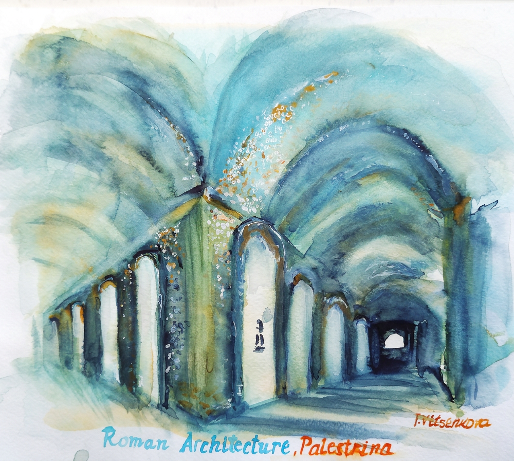
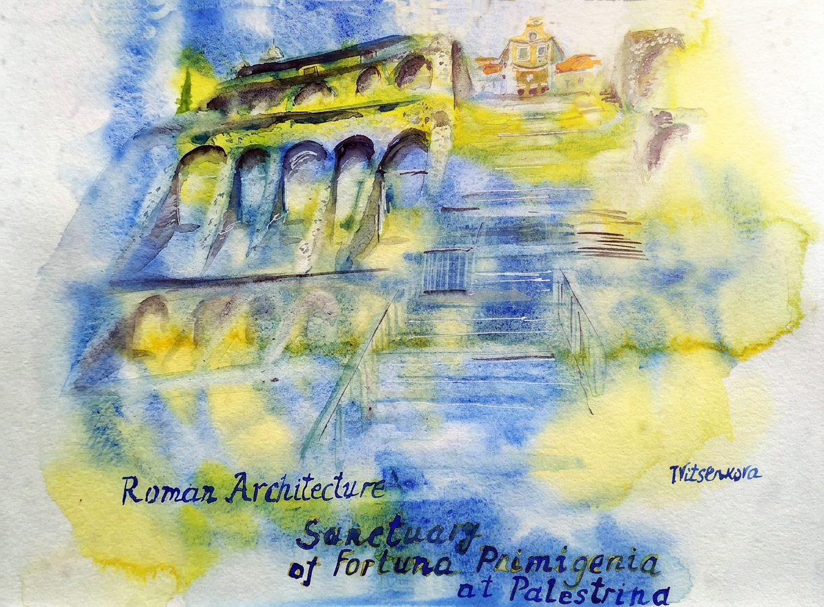
There is a wonderful place near Rome, UNESCO city of Palestrina. The Sanctuary of Fortuna Primigenia at Palestrina (ancient Praeneste) in Italy was built in the 2nd century BCE in honour of the Goddess Isis, the goddess of femininity and motherhood and Fortuna, the ancient Roman goddess of luck. It was built on a natural hill on cement.
My painting is about the interior space of the Sanctuary of Fortuna Primigenia. It was a Sanctuary with built-in shops and a detached theatre in the Middle Ages. For my painting I added subtle bluish and greenish hues, because, of course, the stones fell off and the cement had been exposed over the millennia. Luckily for us, the Temple with its delicate arches has survived until now, and modern architects and archaeologists continue to explore and discover the secrets of ancient Roman architects even after millennia.
The genius Roman architects noticed that the volcanic dust, which is found in the sea in Italy, turns into pumice when in multitude. They realized that it can be used to strengthen any building. This revolutionary discovery created the Roman cement from ash, lime, sand, pebbles of a certain size and volcanic ash and sea water. Added either be large stone blocks or it could be small pieces of stone presses into the concrete when concrete was still wet. When dried, these stones made the building look more attractive and protected the building from moisture.
Like modern constructors, the Romans erected wooden frames for the walls and ceilings and poured the concrete into them. Romans solved two problems this way, protected cement from moisture and hid the non-attractive part of cement at the same time. I would add that they were saving money for the construction and gaining valuable experience. Using the new revolutionary technology, they started to build not only Temples and villas for the rich, they started to develop and build more, and thanks to this experience and development, today we can still admire the architectural monuments of the past.
Another one-day trip from Rome is on my way in Italy:)
All roads lead to Rome – Alain de Lille
Bon voyage! Until the next travel:)
All paintings belong to the author. No image is to be copied without permission.
Address: Via Colle Pastino 20, 00036, Palestrina Italy
Tools used for my painting Watercolour Cotman terra de siena and viridian Corman, Charvin bleu royal, Derwent, Albert Durer and Faber Castell watercolour pencils. Paper Van Gogh, National gallery watercolour album, 22×30 cm (9 ×12 in.)
Watercolor journey with the course Roman Architecture by the Yale Universitypart 3
I continue the Art + Roman Architecture + the city of Rome with Yale’s course Roman Architecture . Roman Architecture. Introduction The urban Grid and Public Architecture.1-2. Link to the course is at the end of this post.
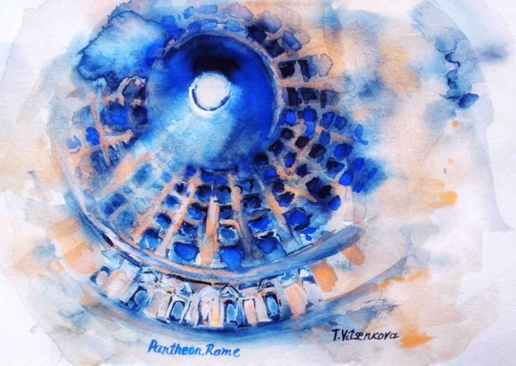
Painting –Rome, Pantheon, Roman Architecture. Year of construction-126 AD. Address:Piazza della Rotonda, 00186 Roma RM, Italy
My painting for this session is about the Pantheon, focusing on its extraordinary, light-filled interior space. The Pantheon’s construction, which utilized Roman cement and stone, was revolutionary. Do you agree that the Pantheon’s grandeur, scale, and elegance represent Rome itself?
A watercolor depiction of the Pantheon in Rome, highlighting its iconic oculus and intricate architectural details.
For centuries, the Pantheon’s majestic Oculus, the massive concrete dome with an central opening has gazed down upon countless imitations.
Ancient architects cast Roman concrete within wooden molds. This innovative technique fundamentally challenged the rigid architectural conventions of the time.
The prevailing Greek and Etruscan designs favored straightforward, rectilinear forms, with simple, flat roofs. The Pantheon, nonetheless, featured a vast dome and innovative use of concrete. It offered a revolutionary departure. This served as a blueprint for architects across the ages.
The Pantheon is a masterpiece of Roman architecture with an innovative structure
The eye of the Pantheon through the centuries has become a model for many buildings. Ancient architects were pouring the roman cement into a wooden model. Essentially they broke the inflexibility of belief from the Greek and Etruscan architects that any architectural buildings should be only straightforward and rectilinear, including roofs
It is so fascinating facts how many building in Europe and North America stand as a testament. These structures demonstrate the Pantheon’s enduring legacy. I am learning from the Professor of History of Art and Classics Diana E.E. Kleiner Dunham that U.S.Capitol Building in Washington, D.C. , British Museum in London, National Gallery of Art and among many others buildings.
The building showcases the power and glory of Rome and its architecture. It is one of the greatest buildings ever conceived, a testament to human ingenuity.
Lost in Time & Whispers of History
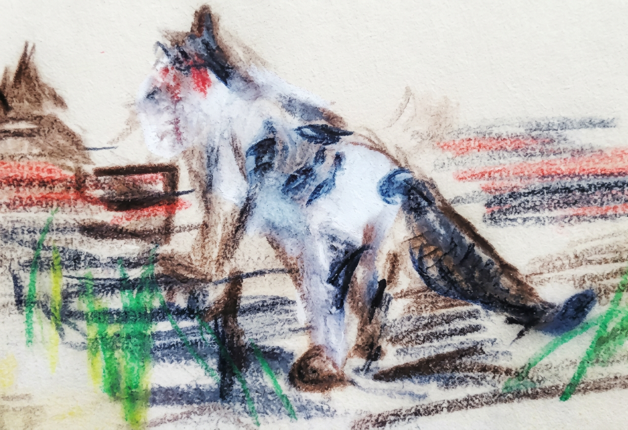
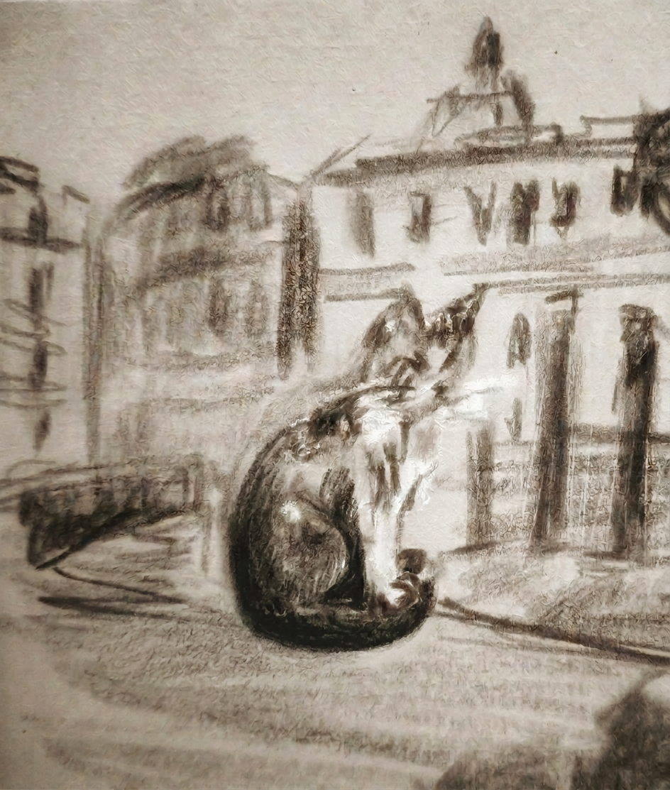
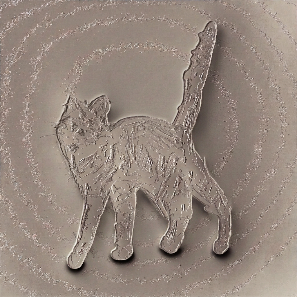
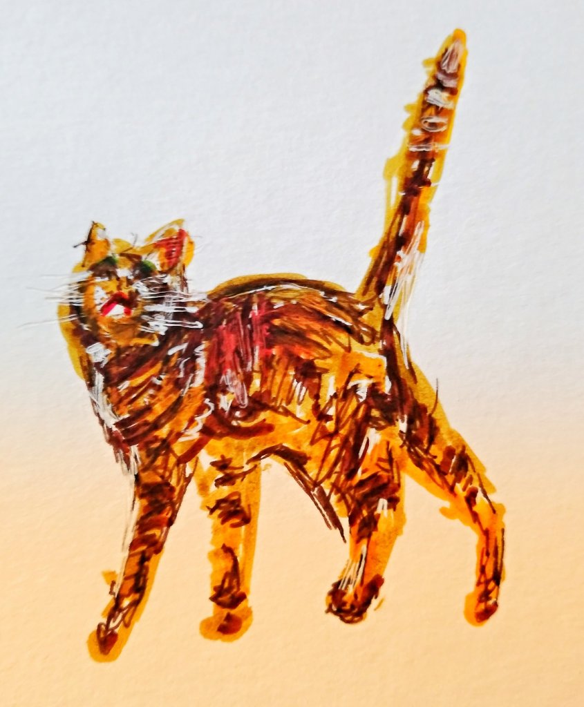
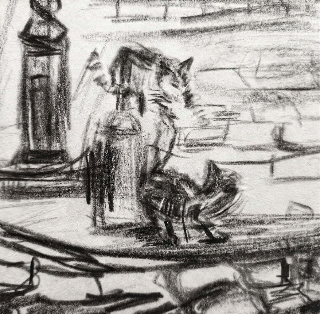
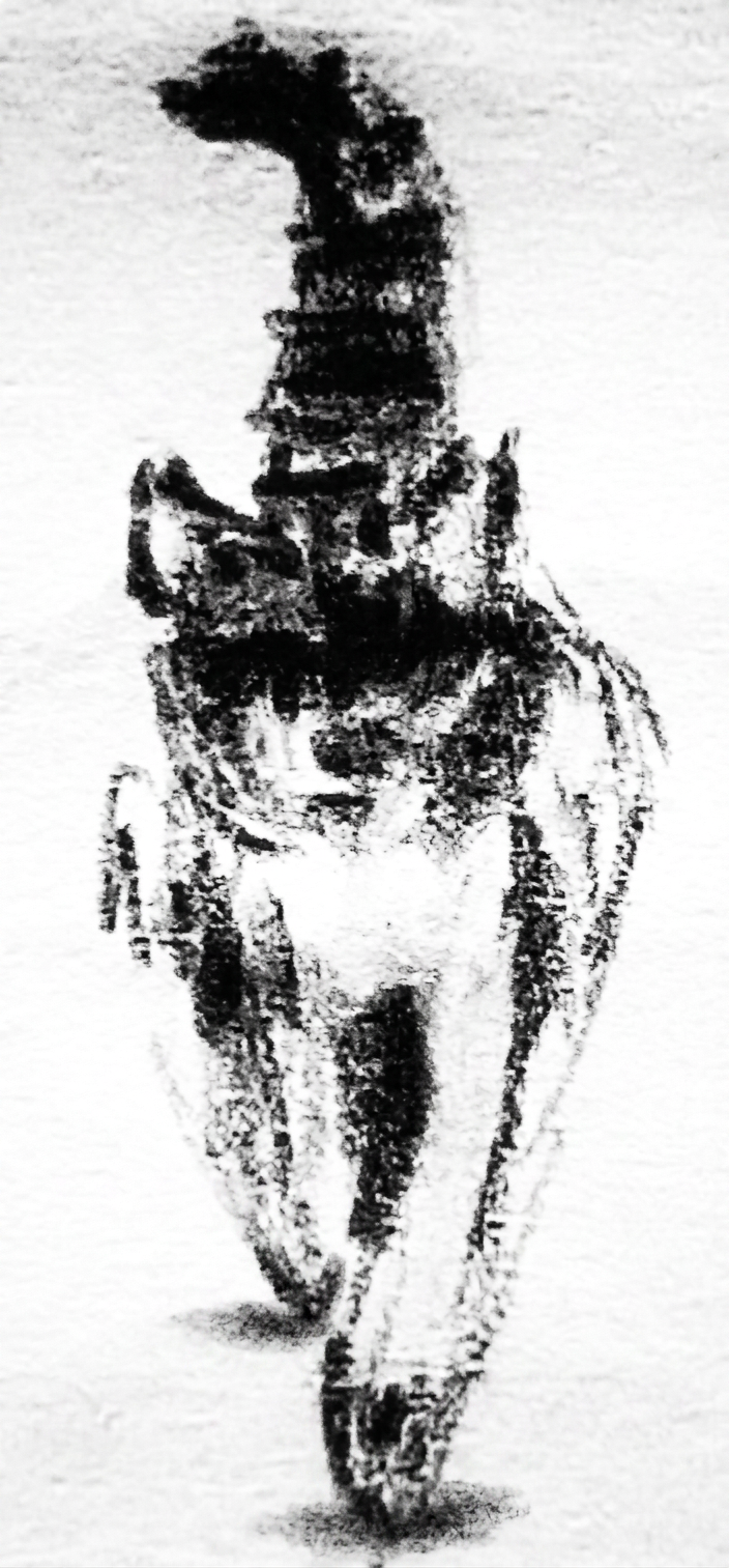
Another story about my vacation. I spent the afternoon sketching this little wanderer, seemingly on a mission! Watch this elegant kitty gracefully navigate these ancient, worn stairs… leading towards the magnificent Pantheon de Roma! ️
The contrast between the modern cat and the timeless architecture is just stunning. Makes you wonder what secrets these walls have observed and what stories the kitty’s journey holds.
All roads lead to Rome- Alain de Lille
A sketch of a cat gracefully navigating ancient stairs, symbolizing the contrast between modern life and Rome’s timeless architecture.
For my artists colleagues . Tools used for my painting Watercolour PWC jaune paint+ (combination PWC indigo paint +Van Gogh ultramarine paint), Derwent, Albert Durer and Faber Castell watercolour pencils. Paper Acquarello watercolour album. Fabriano grana grossa rouch Watercolour album, 22×30 cm (9 ×12 in.)
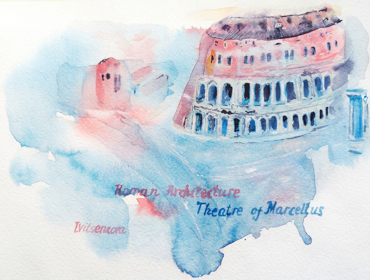
Innovations in Concrete at Rome: The Tabularium and the Theatre of Marcellus. 3-4
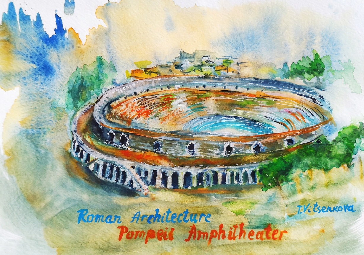
Ancient Rome offered its citizens a number of stunning venues where they could be entertained, wined and dined. The Theatre of Marcellus was one of the most impressive theatre, located in the center of Rome. Apparently Seven famous hills was not enough for Roman architects and if they wanted to build a theatre on a flat terrain, they cemented an artificial hill and built a tribune in the very center of the city where people could sit. For this monument Romans used many architectural innovations, especially their pedestal and yes, the theatre was the precedent for the Colosseum. Theatre of Marcellus was reused as a fortress in middle ages, main prototype for Roman theatres and nowadays it is an expensive condominium. The Romans took what the Greek architects did, and then they took from the Etruscan architectural achievements. They combined the best of both brilliant civilizations of architectural discoveries, then added something of their own, developed further, without fear of experimenting.
For my watercolor reference’s painting of the Theatre of Marcello with a nearby column of the Temple of Apollo , I used the Google Earth app to view the building from a bird’s eye view. Julius Caesar planned the open-air theatre but died before it was completed. Then Emperor Augustus took up the reins and dedicated the theatre to memory of his nephew and son in law Marcellus in 17 BC, when the theatre was used for dramas and arena fights.
Teatro Marcello was decorated with marble statues and large bronze vases, placed around the perimeter to enhance the sound, masks of the heroes of comedies and tragedies. The inner part consisted of three tiers of marble steps, divided into sectors for noble townspeople, places for women, a separate area for common people and slaves. And the box of the emperor was separated from the other seats. Augustus ordered that the interior design of the theatre surpass in its splendor all previous buildings.
I like how Vitruvius, the Roman genius-engineer, artist, architect and writer who wrote 10 books about architecture, described the Greek columns. Theatre of Marcellus’s Doric columns are attached to the 1st level as a “male” column: simple, courageous, no curls or ornaments. Ionic columns are on the second floor, they are the “feminine” type of column with elements of a lady’s hairstyle. Corinthian columns probably decorated the third floor, although nothing survives of the top level, this is only an assumption of scientists since this level has not been preserved.
It was also the preliminary design for the Colosseum and they are so similar… When our family first passed by the Theatre of Marcellus we thought it is the Colosseum, from a view from another side of the street… Theatre of Marcellus was built only a couple of centuries earlier than the Colosseum. I would like to buy tickets for the Roman music concerts here. Every summer there is a series of classical concerts that take place here called “Notti Romane al Teatro di Marcello” and I would imagine the ancient open-air theatre where people used to come and listen to great music or performance in 17 BC.
All roads lead to Rome – Alain de Lille
Bon voyage! Until the next travel:)
Painting – Rome, Theatre of Marcellus, Roman Architecture
Address: Via del Teatro di Marcello, 00186 Roma RM, Italy
Tools used for my painting Watercolour Cotman terra de siena and viridian Corman, Charvin bleu royal, Derwent, Albert Durer and Faber Castell watercolour pencils. Paper Van Gogh, National gallery watercolour album, 22×30 cm (9 ×12 in.)
The magic of the holidays is in the making! Join me on this artistic adventure as I explore the captivating world of #TravelVibes #ArtAdventure
All paintings belong to the author. No image is to be copied without permission.
Exploring Yale’s Course on Roman Architecture. Art Inspired by Ancient Rome
Let’s start my virtual journey Art + Roman Architecture + the city of Rome with Yale’s course Roman Architecture. Professor of History of Art and Classics Diana E.E. Kleiner Dunham
Why did I decide to dive headfirst into the world of Roman architecture
As I start the Yale’s course on Roman Architecture, I’m reminded of my childhood dreams of becoming an architect. Life has taken me on a different path, but it’s never too late to pursue our passions. To share this journey, I’ll be conducting research on each topic we cover and posting my findings here. Plus, as an artist, I’ll be creating a watercolor painting inspired by each lecture—combining my love for art and history.
Well, life is funny thing. You are dreaming about one thing when you are a child, and doing another thing when you are an adult. It is never so late to start to learn our dreamy course.
My visual path to learn Roman Architecture course
As a student, I will share my knowledge. I will conduct research after each topic.And as an artist, I will add one watercolor freely painting for each lecture
How I do my paintings for the course? There is one cheerful technique called from middle tone that I have learned in my art school many years ago. I will give the link to school’s website at the end of this post.
Middle tone watercolor technique
This Italian painting technique is called the middle tone. Basically, you use two or three watercolor paints without worrying too much. The colors blend freely, creating a middle tone. You just add light highlights and dark shadows. And voila, you can paint playfully and fearlessly with this technique!
Have you embraced middle-tone watercolor technique in your artworks? Do you feel that exhilarating spark of joy? Please, I invite you to share your experience in the comments below. I would be thrilled to hear your inspiring story!
So, let’s start!
Introduction. Roman Urbanism. 1-1
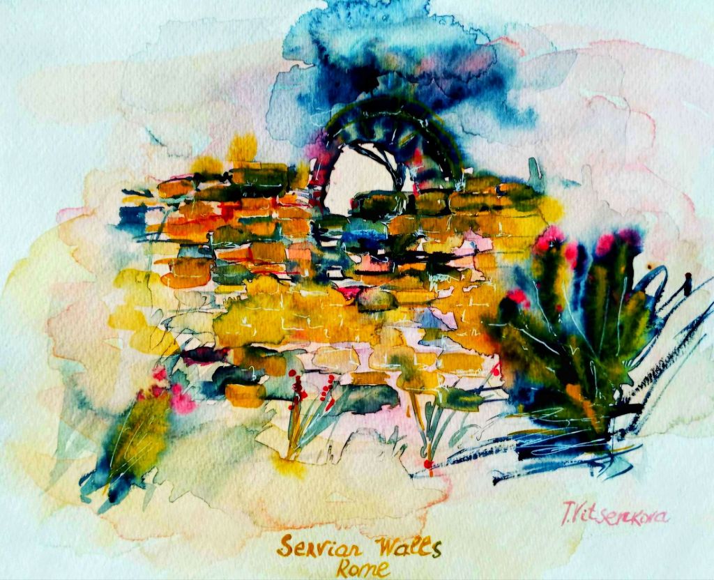
Rome, Servian Walls, Roman Architecture. Year of construction- 3 century B.C.
During the first lecture of Roman Architecture, the professor taught us about the Servian Walls. They are an incredible example of ancient Roman ingenuity.
The Servian Walls stand as a magnificent testament to ancient Roman ingenuity and determination! This formidable barrier rose proudly around the legendary Seven Hills of the republican city. It was constructed in the wake of the catastrophic Sack of Rome in the 4th century B.C., a period when the very soul of the city cried out for protection and resilience. These walls embody the spirit of a civilization striving to safeguard its legacy and embrace its future with unwavering strength!
My first painting celebrates the Servian Wall, the very first ancient Roman wall! This artwork pays tribute to this remarkable monument of ancient Roman architecture, highlighting its significance and enduring beauty.
Watercolor painting of the Servian Walls in Rome, showcasing the vibrant colors and textures inspired by ancient Roman architecture.
The early period of Roman architecture
In the early period of Roman architecture, builders simply stacked stone blocks. These blocks were piled one on top of the other to form the wall.
Rome grew over time. In the first lecture I have learned that in the late third century AD, the emperor Aurelian reigned. During this time, the impressive set of the Aurelian Walls was built. These walls were constructed to protect the city of Rome from external threats.
These fortifications represented a significant architectural achievement of their time. They served as a symbol of the resilience and enduring power of the Roman Empire. They helped secure the city against invasions. They provided a stronghold for its citizens.
The walls spanned approximately 19 kilometers
Romans were constructed using a combination of brick and stone. This showcases the engineering prowess of ancient Rome. It also contributed to the city’s defensive capabilities for centuries to come.
A new technology is concrete revolutionized Roman architecture and concrete faced with brick. We can still see some parts of the two ancient walls in Rome.
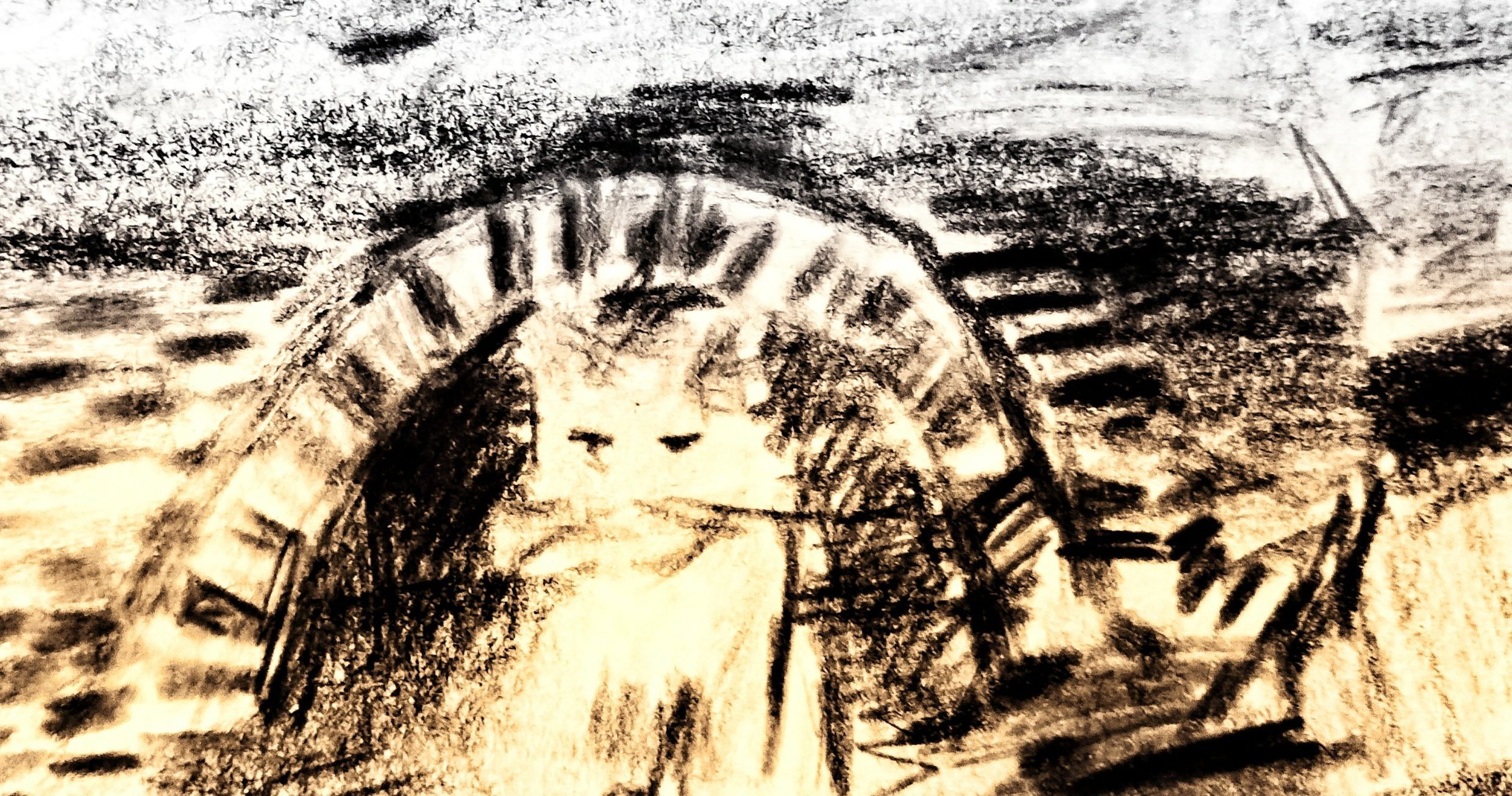
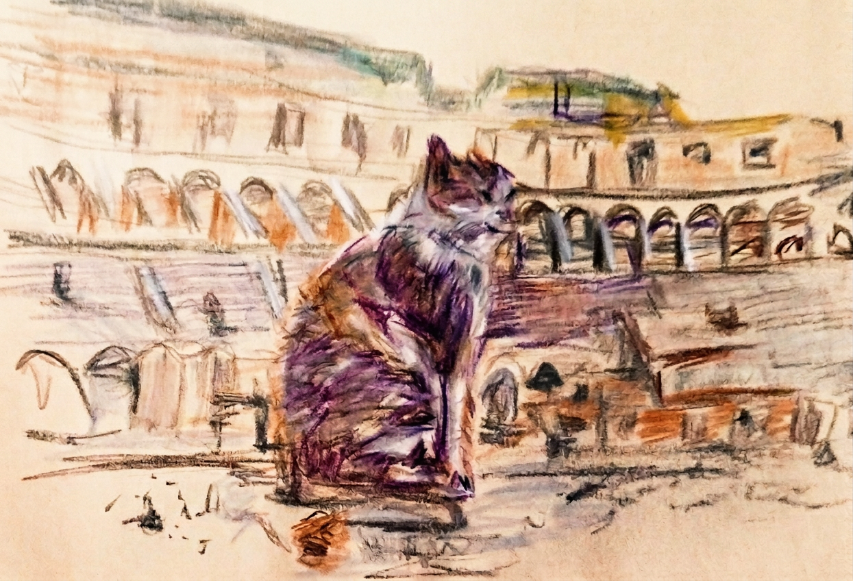
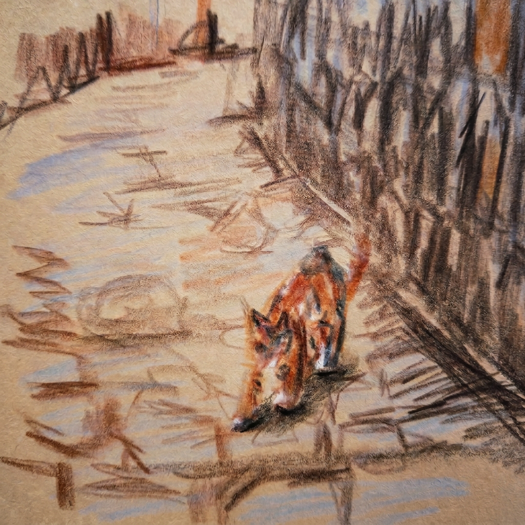
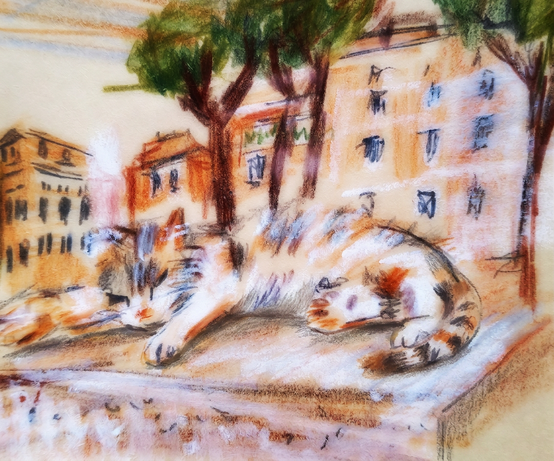
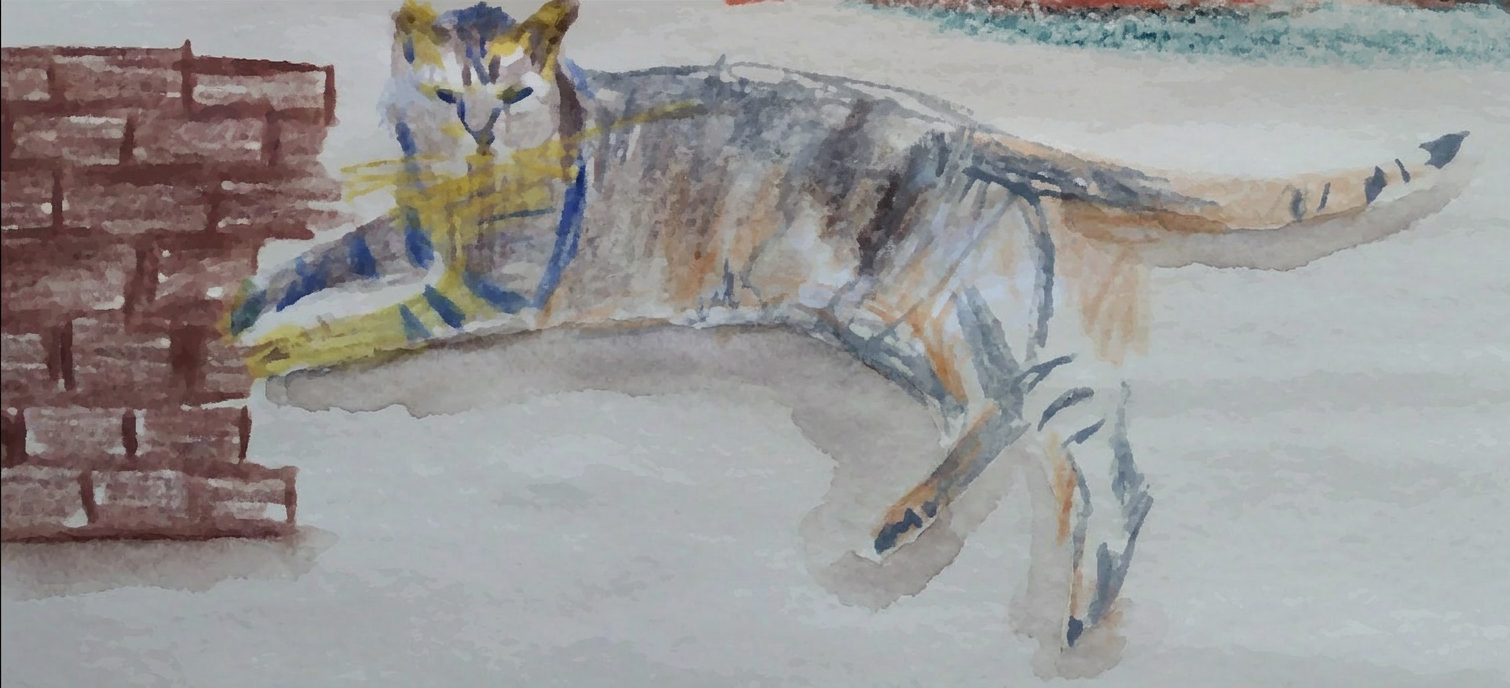
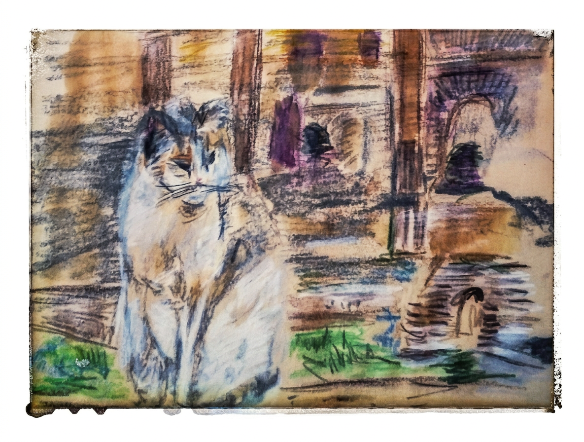
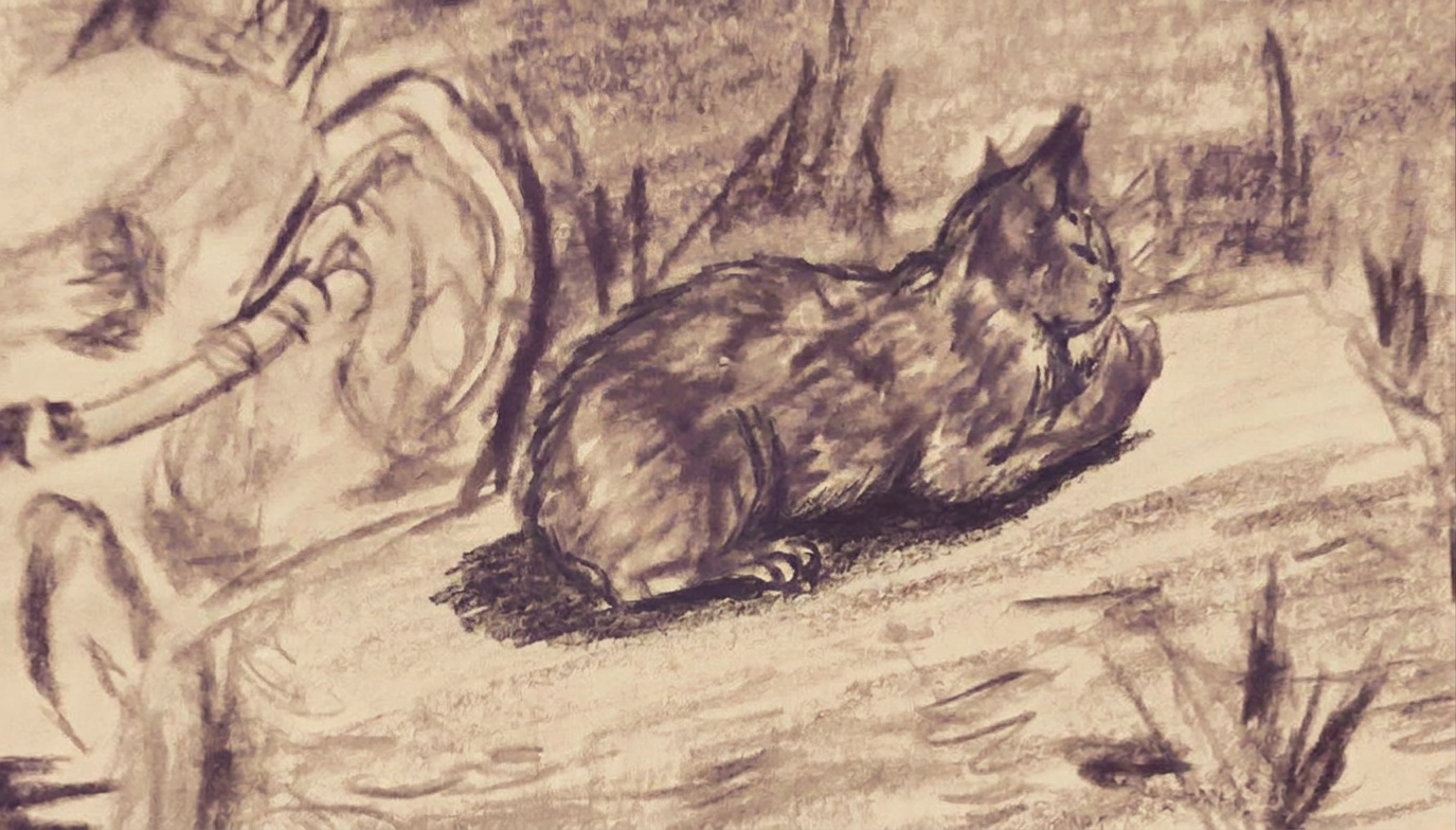
I added to this post a watercolor pencil- sketch with a cat that enjoying a view of Roman architecture, just for fun:)
Watercolor sketch featuring a cat overlooking a view of Roman architecture, inspired by the Servian Walls and the Roman landscape.
Termini station in Rome and nearby hidden gem
We can still see the very wide section of the Servian Walls near Rome’s train station Stazione Termini station.
I must admit, I’ve wandered past a section of the fortress wall near the station in Rome many times. It’s like my own version of a tourist treadmill! Architecture is not just about buildings; it’s about shaping experiences.
And let me tell you, that Esquiline Gate of the Servian Wall? It’s basically the VIP entrance to my accidental monument-hopping tour!
“All roads lead to Rome” Alain de Lille
I completely missed this epic piece of Roman architecture in history. I just admired the architectural monuments during my multiple trips to Rome. I am gaining new knowledge with this course.
On my next trip, I will definitely return to the remains of the fortress wall. I’ll also be making a grand entrance at the gates of the Eternal City. Hopefully, they’ll have a welcome sign and not just a “tourists beware” notice!
This is what I have learned in the first lecture in this course. It is a lot of new information for me. I love Rome and its architecture.
Join me as I uncover the beauty of Roman architecture, and let’s explore this amazing world together!
Bon voyage! Until the next travel:)
Address: Piazzale dei Cinquecento, Rome
The magic of the holidays is in the making! Join me on this artistic adventure as I explore the captivating world of #TravelVibes #ArtAdventure
All paintings belong to the author. No image is to be copied without permission.
Watercolour Windsor Newton Gamboge , Alison, indigo , Derwent, Albert Durer and Faber Castell Watercolour pencils. Paper Fluid 100, cold press Watercolour albums, 22×30 cm (9 ×12 in.)
Art and Travel. Watercolor journey with the course Roman Architecture by the Yale University.
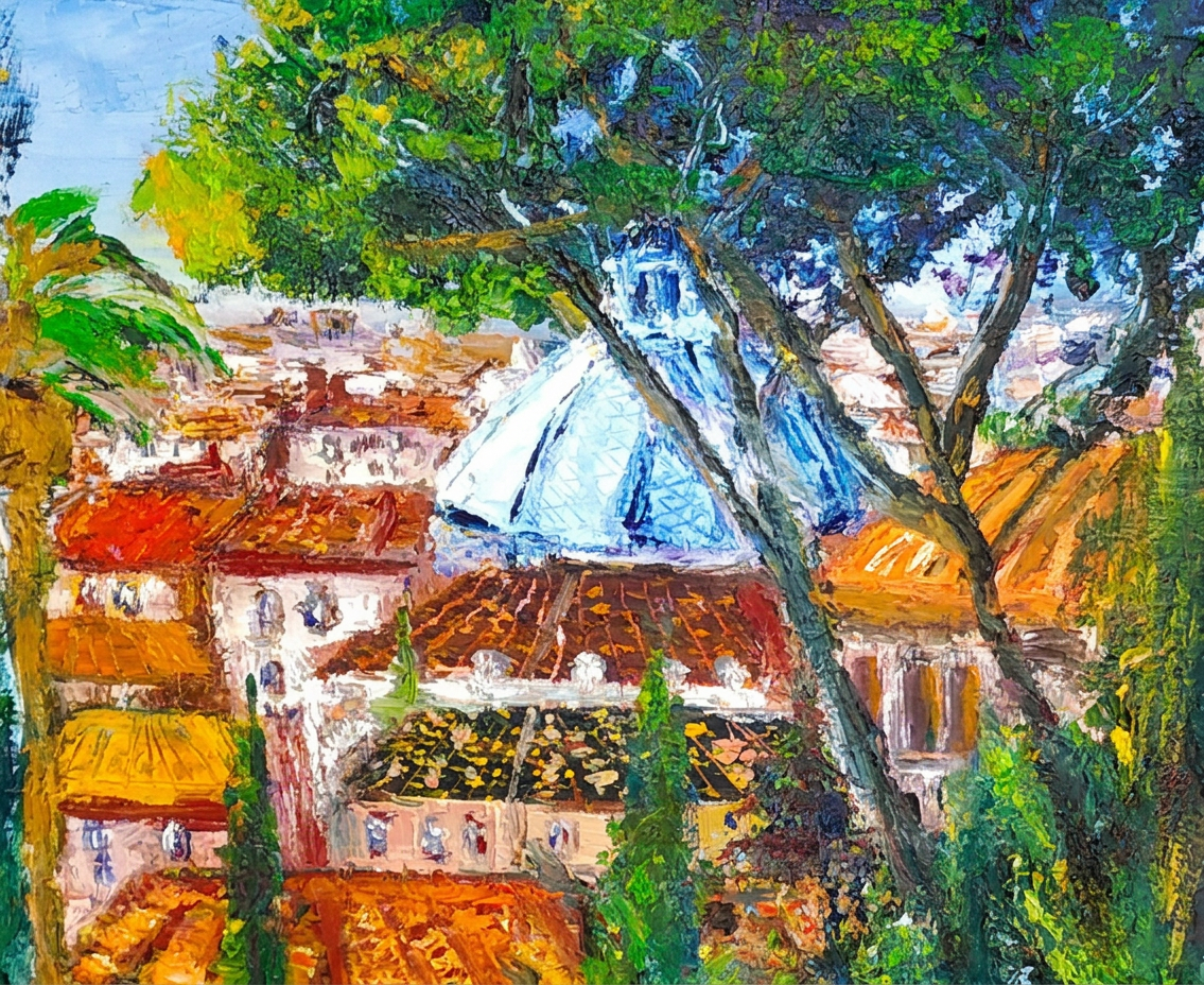
I am pursuing a new artistic path in watercolor illustration through my studies at online Open Yale course. There so many interesting facts I am learning from the Professor of History of Art and Classics Diana E.E. Kleiner Dunham. Link to the course is at the end of this post.
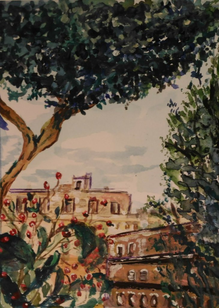
A vibrant watercolor painting showcases the rooftops and architecture of a city. It is framed by lush greenery. The painting reflects the themes of Roman architecture explored in the Yale course.
Painting journey of my three passions
Roman Architecture and Art with references and learning from Yale University Roman Architecture, Professor Kleiner about art, architecture.
The course Roman Architecture is my favorite one. I love to travel. I would like to discover the power of architecture to shape culture and society. I plan to do this with my extra research from the lectures.
The nine-week course explores the great cities and their building
The nine-week course offers an exciting exploration of magnificent cities and their remarkable buildings. It celebrates the engineering wonders of Rome and its empire.It is inspiring visions of their significance in both ancient and contemporary contexts.
Rome, cities of Pompeii, Sicily, France, Germany, Greece, Turkey, Croatia and the rest of Roman Empire.
Experience the full brush of Rome’s beginning as an Iron Age village. Learn how it became a world-class city. Discover its transformation into a gigantic empire surrounding the Mediterranean Sea.
The Romans had a remarkable impact on architecture worldwide, inspiring countless designs even today. Enrolling in the Roman Architecture course excites me as.
It will equip me with the skills to create my very own Roman City Art Project. I’m eager to learn valuable architectural techniques . And that will not only enrich my project but also enhance my life in amazing ways.
Every temple has its story and legend, I love all lectures with interesting facts of the professor Diana E.E. Kleiner. One of the good things about learning is the professor’s enthusiasm and her own photos. Also, I will use my husband’s photos and my own sketches from our multiple vacations in Italy.
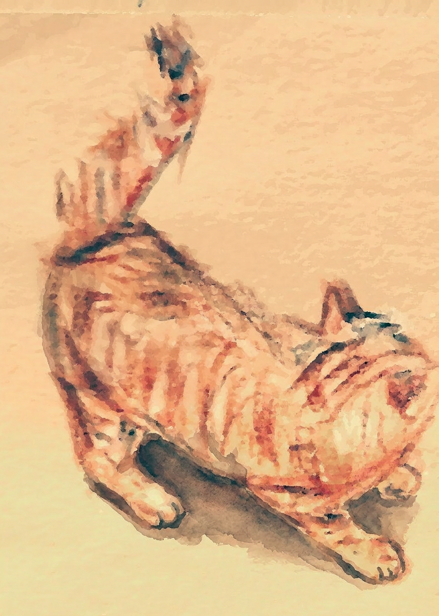
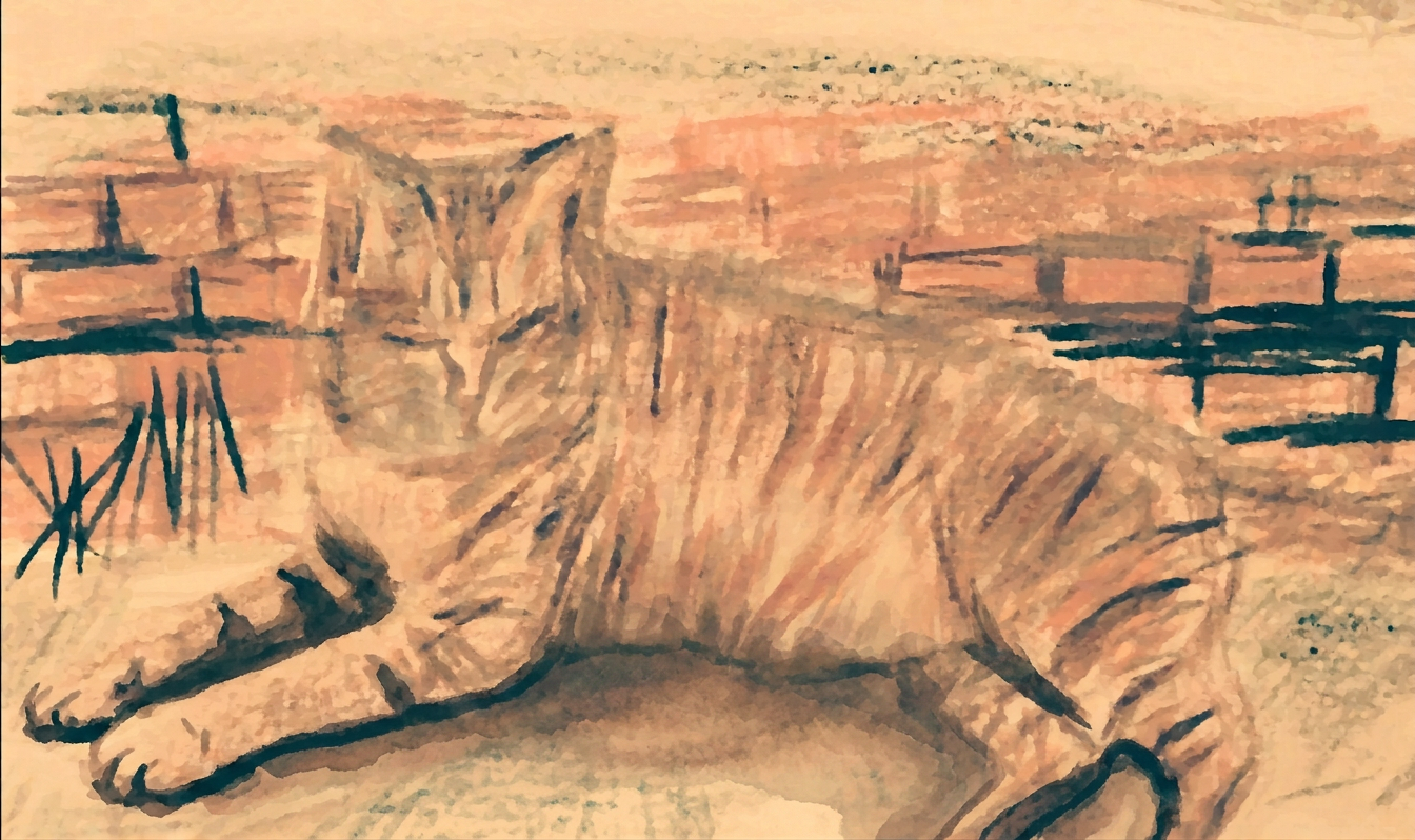
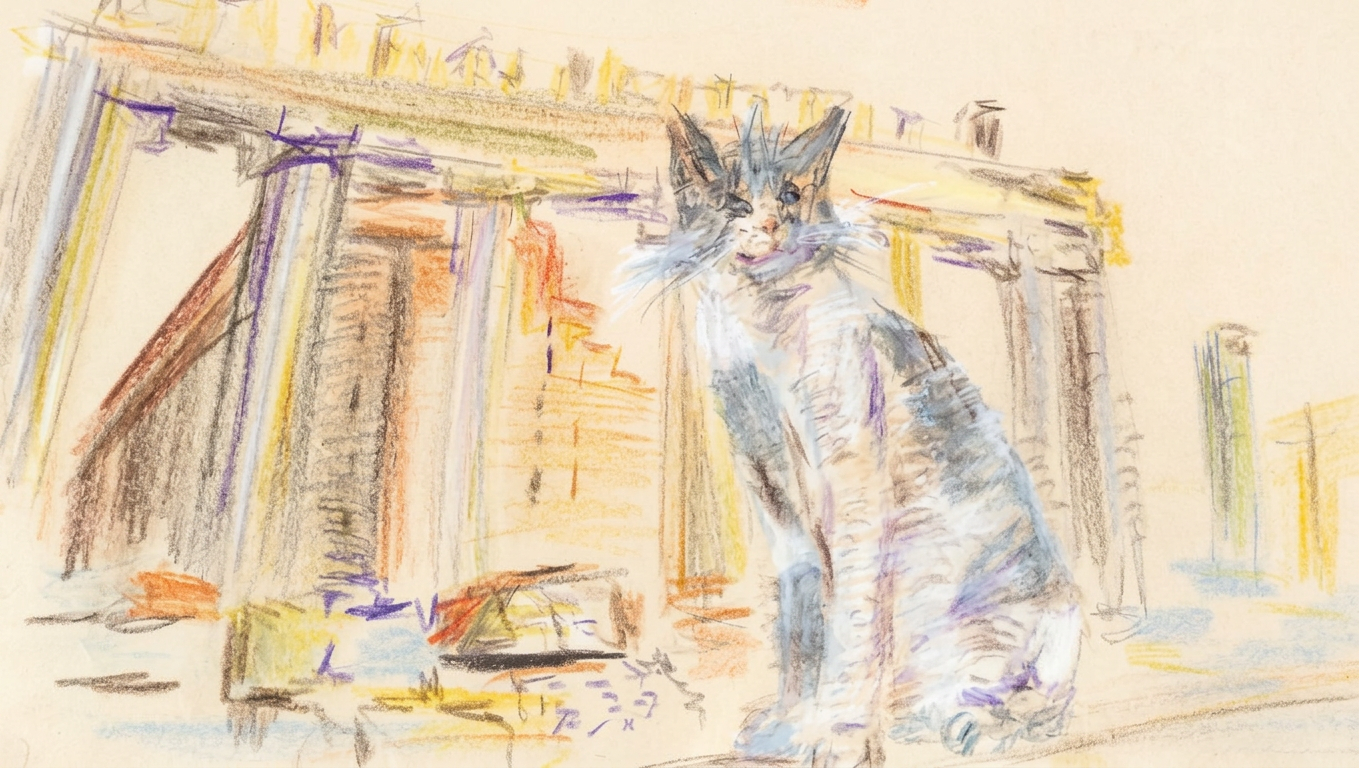
Cats sketching as part of my learning journey
A vibrant pastel sketch depicts Italian architecture. It reflects the beauty of Roman structures. The influence of art was studied in the Yale University course.
I will add some live to my illustrations for architecture. It will be some cats. What do you think about this idea? Are you usually adding some animals or birds for your sketching?
I am reading what I will learn and this is very exciting. The course starts from 8 B.C. architecture and moves from one revolutionary experiment to the next one; and my paintings will follow the consecutive process of the development of Roman architecture that was born out of ancient Greek and Etruscan styles
I hope that soon I will travel to Rome with all my new knowledge from the Roman Architecture course :)
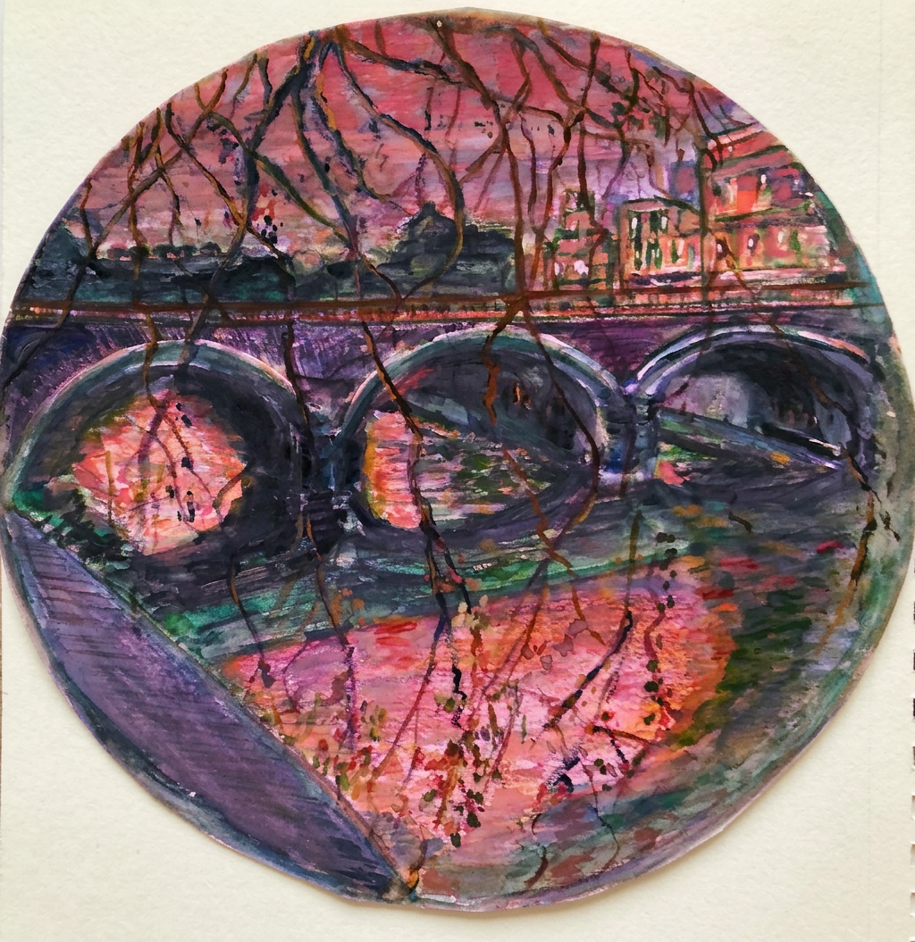
Watercolor painting of a bridge scene, capturing a vibrant sunset reflection on the water.
I am ready for a new educational adventure in watercolor illustration.
I will pick a photo reference from a lecture for each painting. I am going to share my quick comparison for four picks of art watercolor albums and paints.
Acquarello watercolour album. Fabriano cold pressed
Acquarello watercolour album. Fabriano, grana grossa rouch
Fluid 100, cold press
Van Gogh, National gallery
Watercolour paints:
Van Gogh travel box
Van Gogh tubes
PWC
Cotman
Winsor Newton
Charvin
Box Munovo
Gelly roll Sakura white pen
Watercolour pencils Albert Durer
Watercolour pencils Faber Castell Durer
Watercolour pencils Derwent
I am exciting to start the course and share my thoughts and illustrations for the lectures in my posts.
Below is the link to the Roman Architecture course
Watercolour used Charvin and Van Gogh brands, Pastel GrayPas Expressionist, Derwent watercolour pencils and Faber Castell artist pens, Paper Strathmore Watercolour and Mixed Media albums, 15×20 cm (6×8 in.)
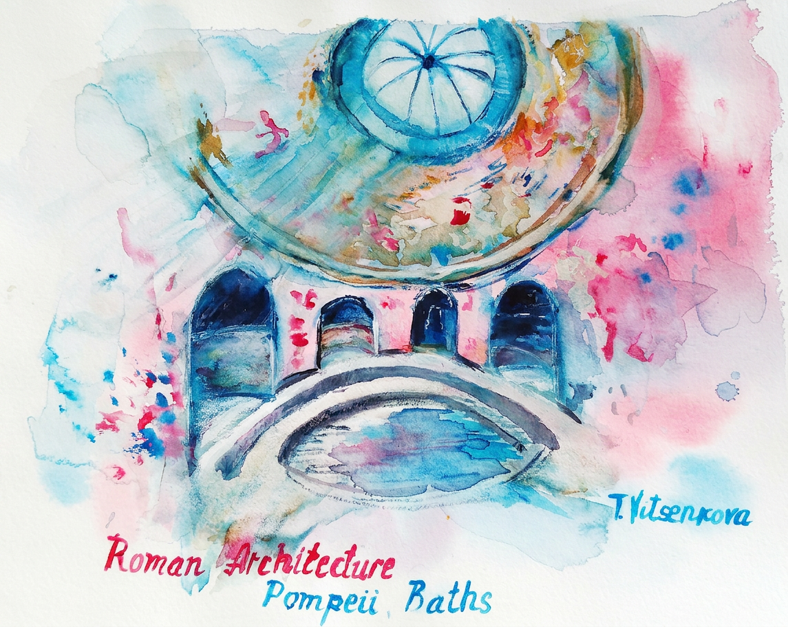
The Bathing culture was a very important aspect of Roman society. Social relations were also developed in those baths with many activities –sport, massage rooms and libraries, but sometimes the Bath complex also had direct access to … taverns:) In ancient Pompeii there were five large thermal baths and each bath could house about 1000 guests at the same time. The thermal baths were not only used to rest the body but the mind as well.
For my watercolor painting I chose one of the best preserved Bath with beautiful and ostentatious decoration, the Stabian thermal bath, painted red, blue and white colors. It was completed in the 4BC with a room that had the “eye” to the sky. It was one of the predecessors to the Pantheon’s roof. Streams of water fell in the pool directly from the niche in the upper part of the wall. The thermal baths were to help ancient people see and appreciate art! There were beautiful decorations, statues of Giants holding spa wall – everything for the people to enjoy seeing the amazing frescoes on the walls and decorate ceiling. It’s like “Louvre” of saunas..
The Stabian Bath was one of several thermal bath complexes in Pompeii, and part of the Roman Architecture development of the early bathing culture. I imagine myself in the beautiful relaxing rooms: In the Frigidarium room, the cold one with dozens of painted Atlantis figures supporting the walls, the Caldarium-hot room, the Tepidarium which was the lukewarm room and the apodyterium which served as the change room. The walls were stuccoed over, with flowering acanthus plants and creatures and animals, humans, Goddesses and Gods flying above:)
It was a wonderful place where people would enjoy their time in the company of friends and family.
Painting – Bath Complexes at Pompeii, Roman Architecture
Year of construction 4BC
Address: Stabian thermal bath, Pompeii
Tools used for my painting Watercolour Van Gogh madler red and Charvin Bleu de France, Albert Durer and Faber Castell watercolour pencils. Paper Acquarello Fabriano cold pressed watercolour album, 22×30 cm (9 ×12 in.)
The magic of the holidays is in the making! Join me on this artistic adventure as I explore the captivating world of #TravelVibes #ArtAdventure
You are welcome to visit my personal website pages. There, you can find out more about the artwork I am offering in oil and watercolor paintings. You can buy canvas prints, framed prints, and more artwork.
All paintings belong to the author. No image is to be copied without permission.
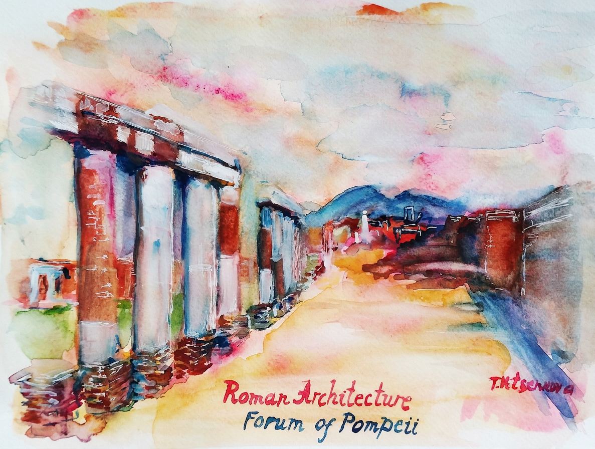
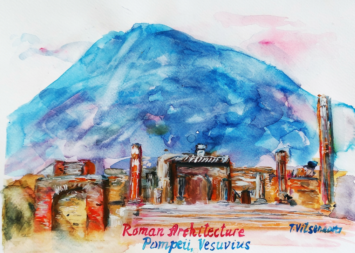
One of the main pieces of Ancient Roman public architecture in Pompeii was the Forum on the main square. Here citizens gathered to run business, gossips, and it was the urban centre of life.
On my painting is the main part of the financial district, the antique downtown of a well-preserved ancient city… The view of the colonnade with Doric columns built around the Forum with bases that supported statues. The Forum was uncovered and opened to the sky. The columns made out of limestone are similar to the Roman’s Theatre of Marcellus with the Greek orders, Doric, Ionic and Corinthian.
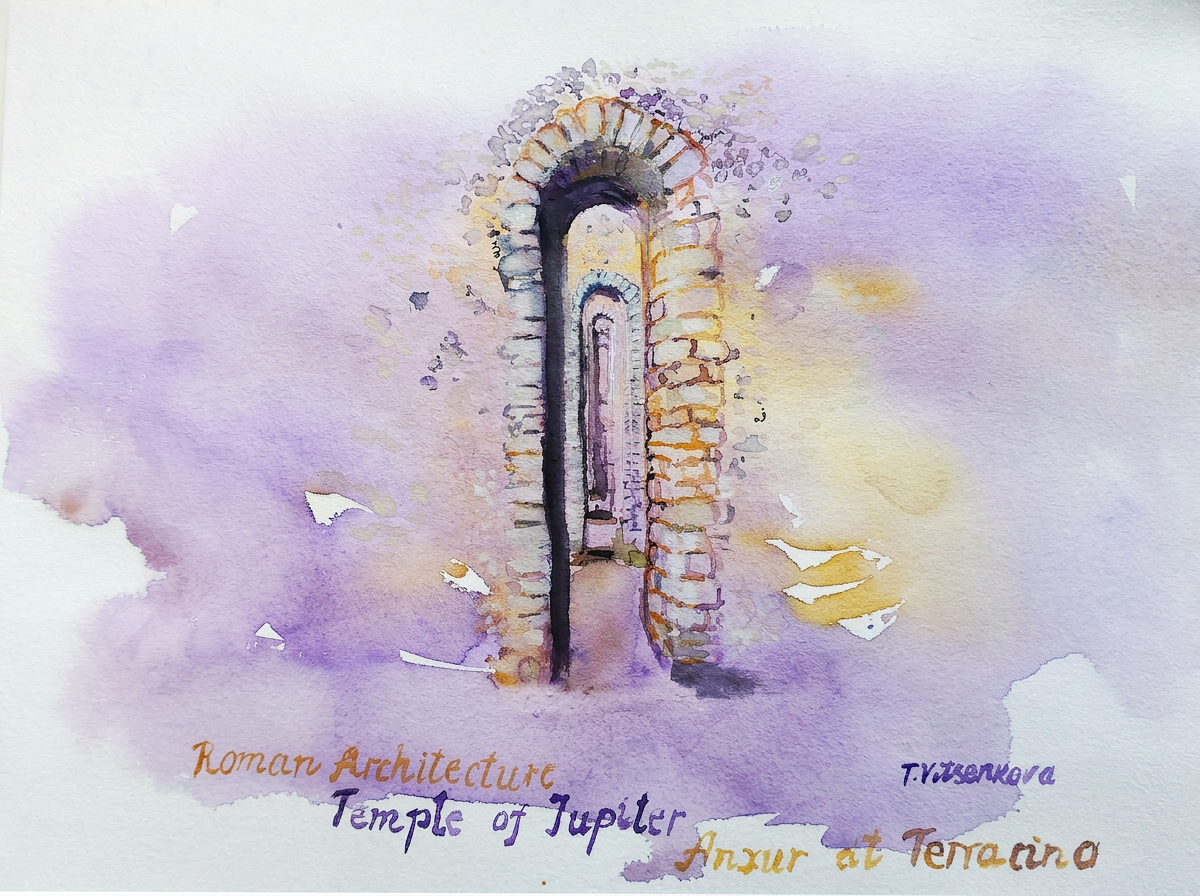
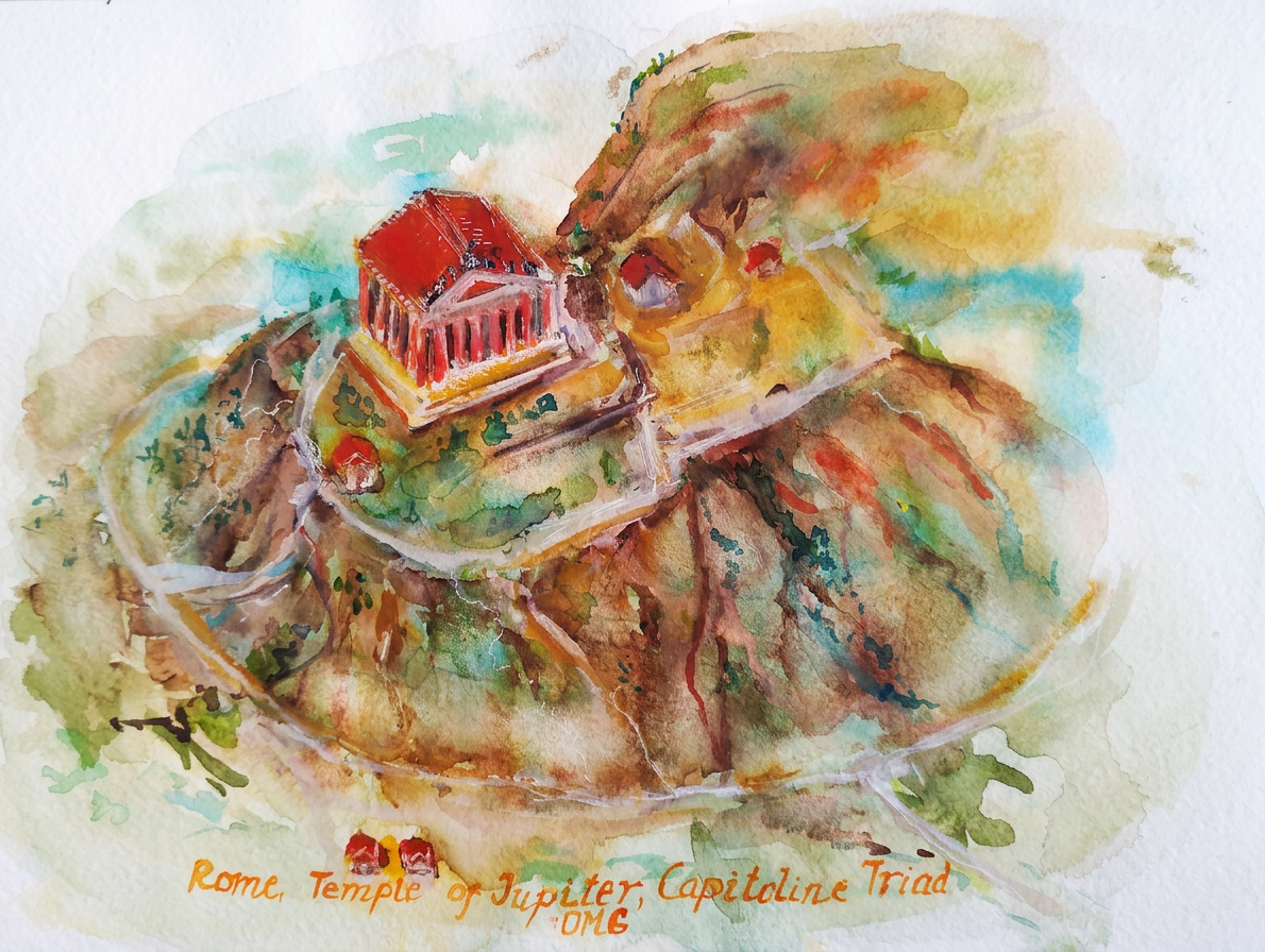
The Temple of Jupiter, Juno and Minerva was the central temple in Pompeii, sometimes called the Temple of the Capitoline Triad with spaces for statues of the Capitoline Triad – Jupiter, Juno and Minerva. The whole temple was surrounded by a colonnade with Ionic columns; this left the strongest impression on me during my travels to Italy.
Why are parts of the columns cut off? After the earthquake of 63BC and the Mount Vesuvius eruption in 79 BC while the ash and lava covered the Forum, columns and buildings came down and the materials washed away or were taken away – now it is an unknown mystery. Who knows the actual reasons? ;)
It is here that you can feel the atmosphere of those years and understand that life is eternal…
Tools used for my painting Watercolour Alizarium and raw siena Cotman, Derwent, Albert Durer and Faber Castell watercolour pencils. Paper watercolour Acquarello watercolour album. Fabriano, grana grossa rouch album, 22×30 cm (9 ×12 in.)
Δ
document.getElementById( "ak_js_11" ).setAttribute( "value", ( new Date() ).getTime() );
The magic of the holidays is in the making! Join me on this artistic adventure as I explore the captivating world of #TravelVibes #ArtAdventure
You are welcome to visit my personal website pages. There, you can find out more about the artwork I am offering in oil and watercolor paintings. You can buy canvas prints, framed prints, and more artwork.
All paintings belong to the author. No image is to be copied without permission.
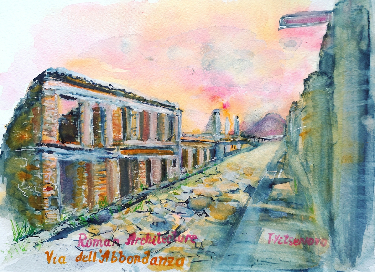
The next lecture was about residential architecture in Rome and the Roman world. It tells us about domestic architecture in between the 1st century BC and 1st century AD. There is no place where the houses are better preserved than at Pompeii, the great live reference for architects and archaeologists.
The watercolour painting is about a two-story house in Pompeii located on via dell’Abandanza, the so-called street of abundance. The house had open panoramic windows. The ancient architect designed the second floor in such a way that you could enjoy a nice view through the columns of the street and watch people outside while sitting in your dining room. I added a gentle glow of dawn on the horizon to imagine what a spring morning in that house would feel like.
There is a difference between our current understanding of how we use our homes and the ancient concept of home space. Although we enjoy having friends, family visits in our places, still, the house is our place to get away from work, transportation and schools, escaping outside life – as opposed to ancient Romans. For them, home was a place not just to live with their families, but also to do business in the house’s atrium.
This house is an example of the early domestic buildings, the part of Roman architecture. It had Domus Italica, an ideal Roman house plan according to the books of Vitruvius, the ancient architecture theoretician. The owners, family, friends and business partners could all benefit from being here. Joie de vivre in French or dolce vita in Italian:)
Painting – Residential two storied house via dell’Abandanza, Roman Architecture
Year of construction 62 AD-79 AD
Address: via dell’Abandanza, Pompeii
Tools used for my painting Watercolour Van Gogh cadmium orange and permanent rose, Albert Durer and Faber Castell watercolour pencils. Paper Acquarello Fabriano, grana grossa rough watercolour album, 22×30 cm (9 ×12 in.)
Still life and urban sketching — basically me trying to make inanimate objects and city blocks look more interesting than they actually are.
Yes, I carried my sketchbook here. No, I don’t regret it.
Barcelona has an indescribably magical atmosphere of a unique and endlessly creative city — you know, the kind of place that makes you wonder how it got so cool without trying. From Antonio Gaudí’s legendary masterpieces (that defy normal architectural rules) to today’s innovative artists still riding that creative wave, Barcelona basically wrote the book on how to be fabulous.
Barcelona said ‘be inspired.’ I said ‘hold my paintbrush.’
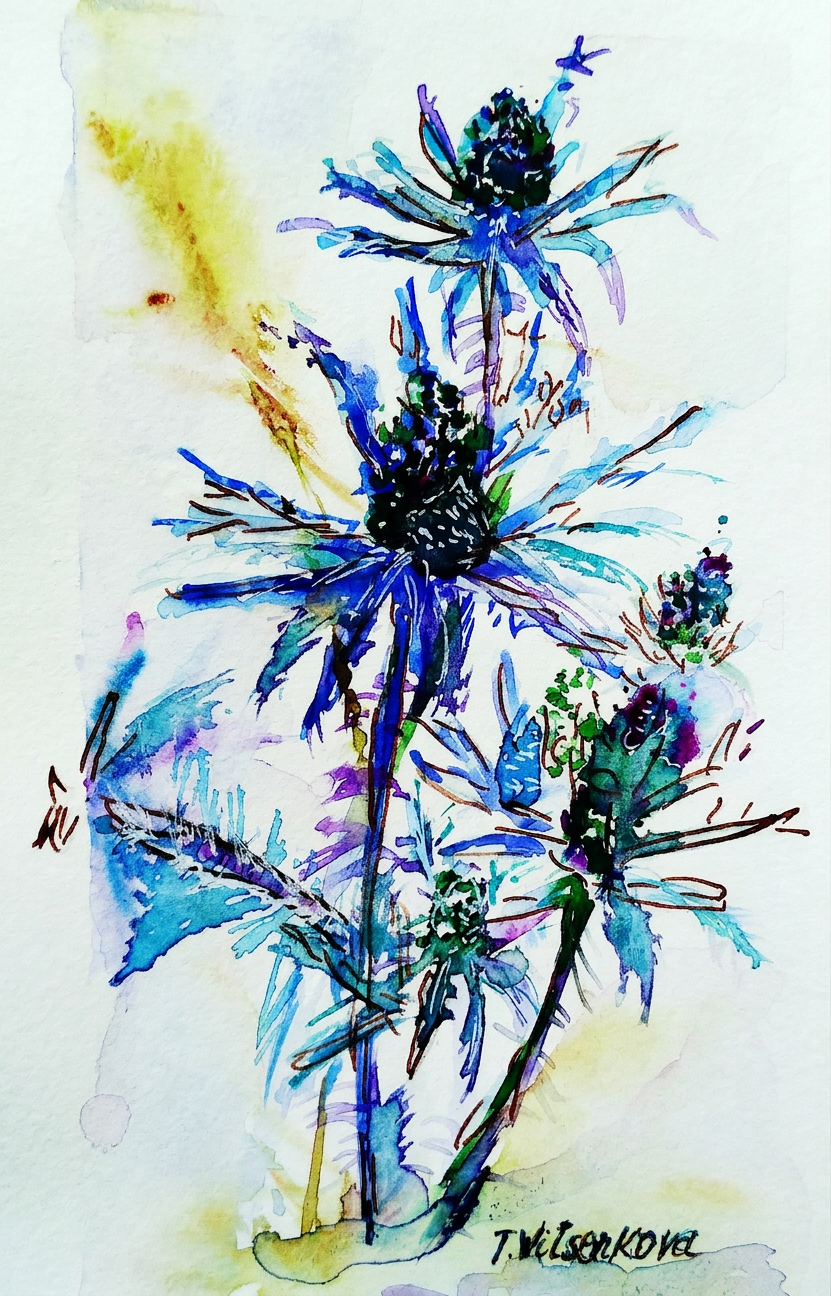
I’m continuing my flowers&cities series, and this time I’m obsessed with the blue thistle. Why Barcelona? Well, according to my imaginary painting logic, it matches perfectly! This post features some gloriously bright blue cultured thistles that will either inspire your next Mediterranean adventure or at least make you wonder why anyone bothers with ordinary purple flowers.
This thistle’s color palette? It’s got depth-of-sea blues, some moody olive tones, sprinkles of raspberry, and pineapple-y yellow hues — basically the Barcelona version of Casa Milà in flower form. You know, Gaudí’s stunning modern architectural masterpiece that looks like it melted in the sun and decided to stick around anyway.
Thistle: 1. My colour mixing skills: nervous.
Behold: another thistle! This one’s sporting petals of lilac and turquoise — colors that somehow perfectly capture Barcelona’s old historical centre, Ciutat Vella, with its Gothic Quarter that screams “Look how old and charming I am!” in the most photogenic way possible.
Gothic Quarter energy in flower form. Très dramatic.
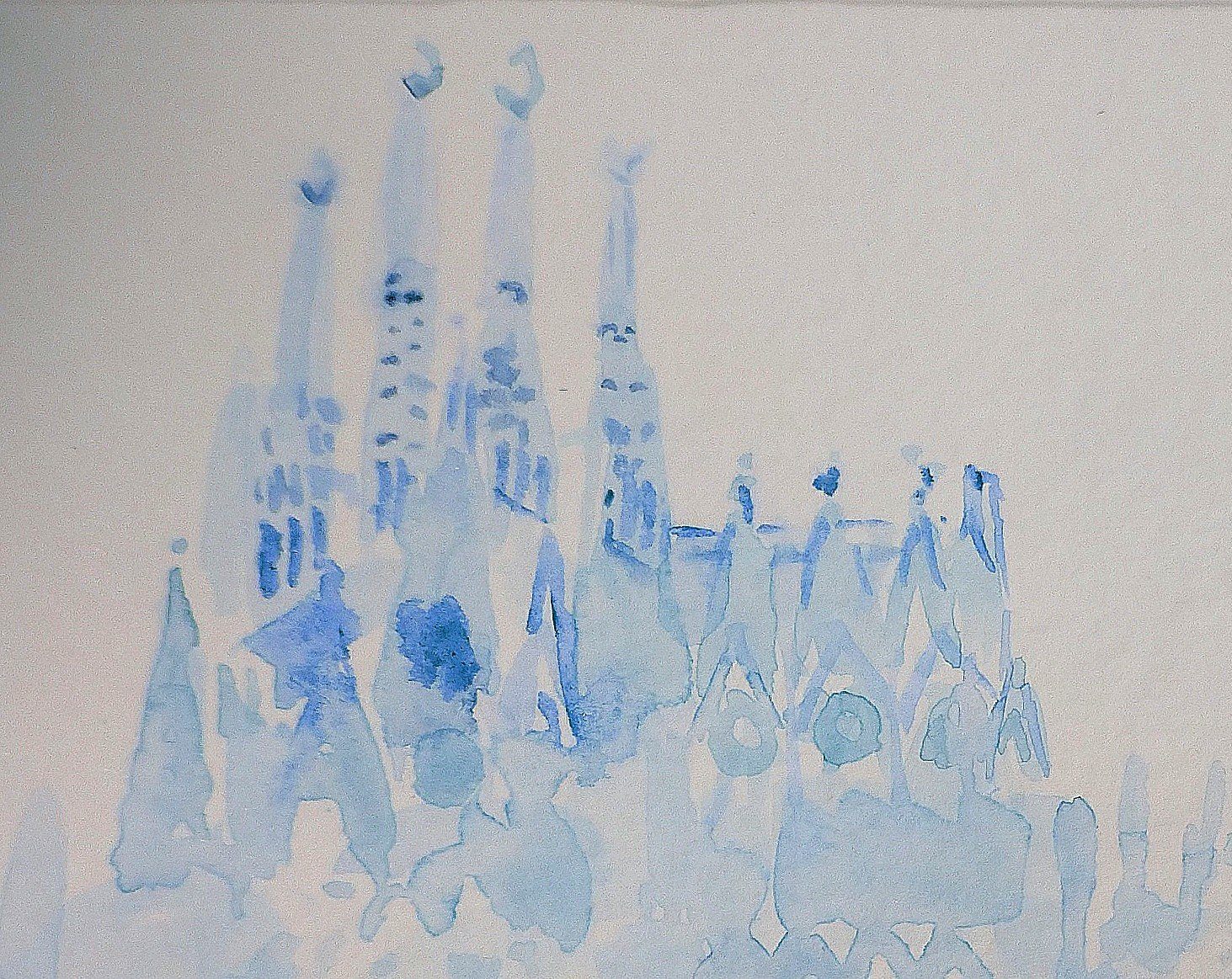
Meet another thistle, this time decked out in azur and silver petals. In my professional artistic opinion (which I made up), this one represents Barcelona’s most Instagram-famous resident: La Sagrada Familia. I’m pretty sure Gaudí would have approved of my choice, or at least not sued me for it. :)
Gaudí approved. Probably. He was busy.
And here comes thistle number four (I’ve lost count) with colors of raisins, figs, and blue sea tones — basically screaming “I’m La Rambla!” at you through its petals. You know, that famous pedestrian walkway known for its historical architecture and the mild chaos of street performers who may or may not be actual statues.
La Rambla thistle. Watch out for the mimes.
This thistle’s rocking a combination of rose-salmon and pale-brown petals — tender, bright, and way more coordinated than your average wildflower. Question: Do you prefer “Barcelona” by the legendary Freddie Mercury, or perhaps the lovely “Barcelona” by Giulia y Los Tellarini from the movie “Vicky Cristina Barcelona”? Because this flower apparently has a soundtrack.
This one came with a Freddie Mercury soundtrack in my head.
Let’s talk about Antonio Gaudí y Cornet for a second — the man who literally devoted his entire existence to Barcelona and transformed it into the architectural wonderland we know today. He’s basically referred to as “genius loci” (fancy for “the genius of the place”), which is a lot of pressure but also kind of accurate. He shaped not just the look but the very soul of the city. No big deal.
All paintings belong to the author. Seriously, don’t copy them without permission. I mean it. No image theft, please.
Bon voyage! Until the next travel adventure :) Now go forth and stay healthy, you magnificent human.
Still life and urban sketching (with extra thorns)
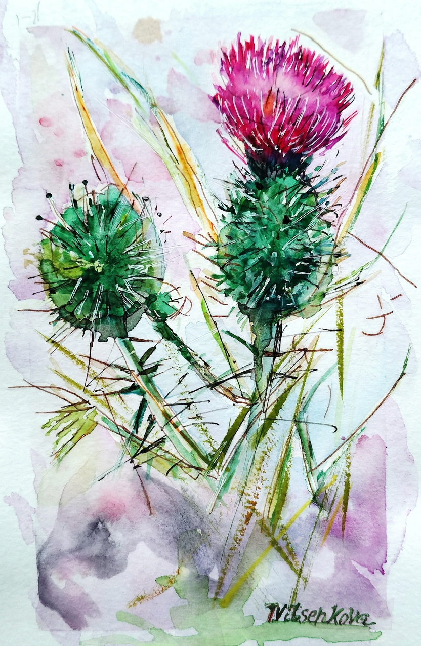
The spiky diva herself. Don’t touch.
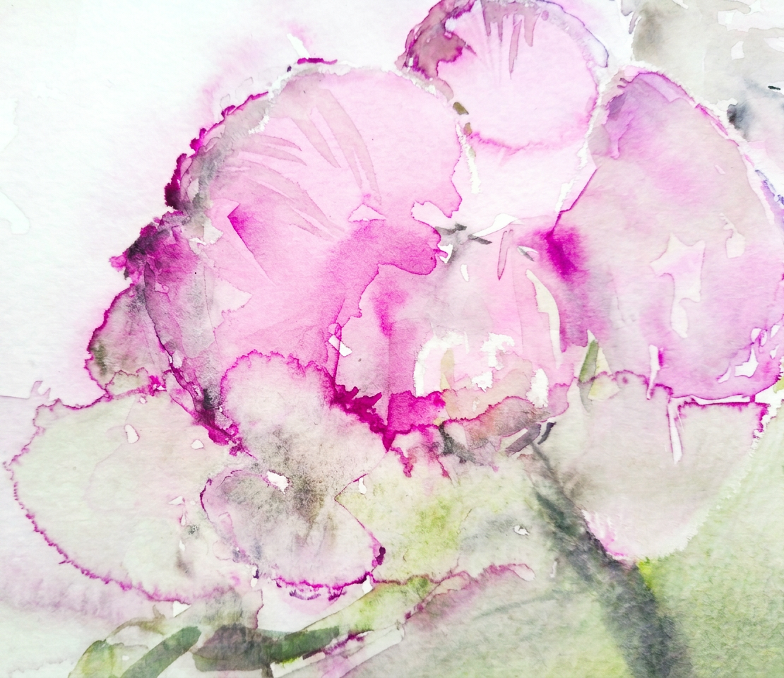
My sister asked me to paint a thistle flower that captures its personality: character, strength, inflexibility, firmness, and an almost aggressive refusal to die under any circumstances. Basically, the Rambo of the flower kingdom. Challenge accepted! I created an entire series of these botanical warriors that thrive everywhere and survive conditions that would make other flowers quit their jobs and move to Arizona.
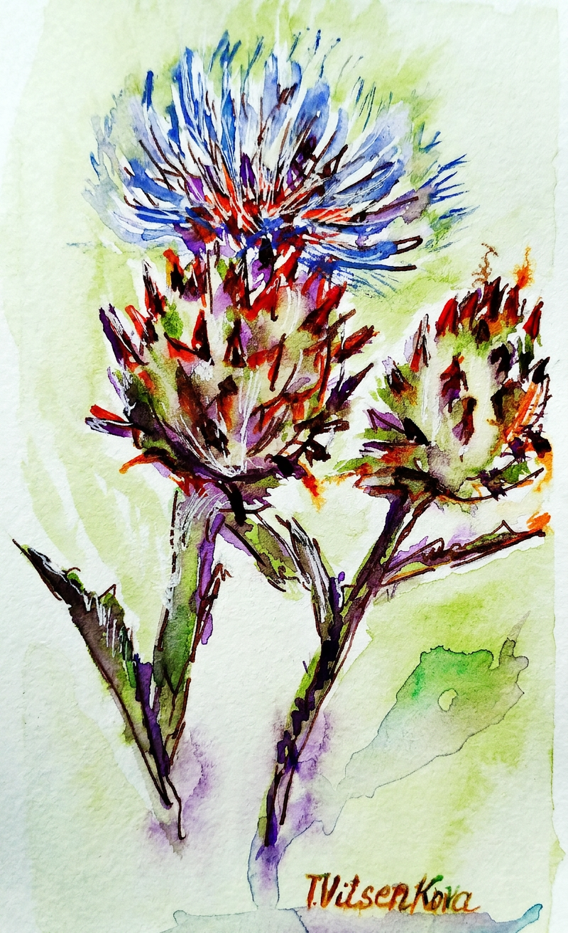
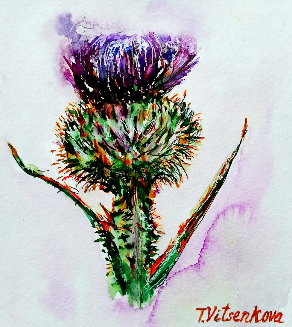
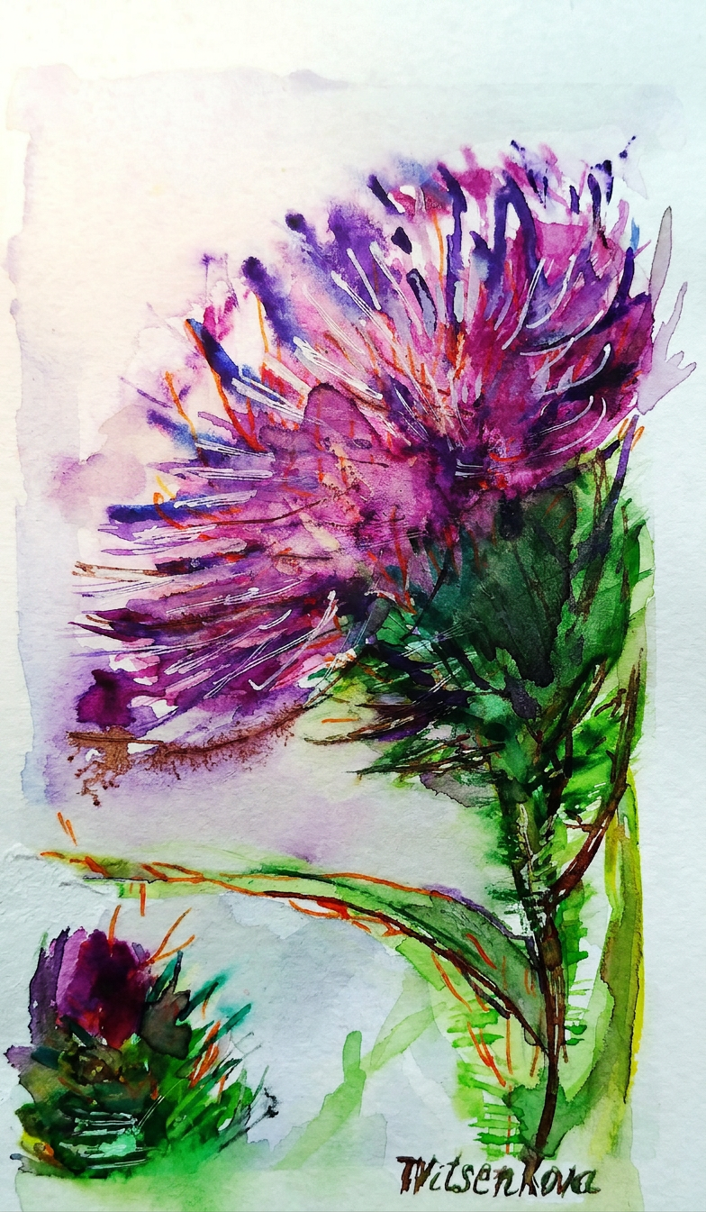
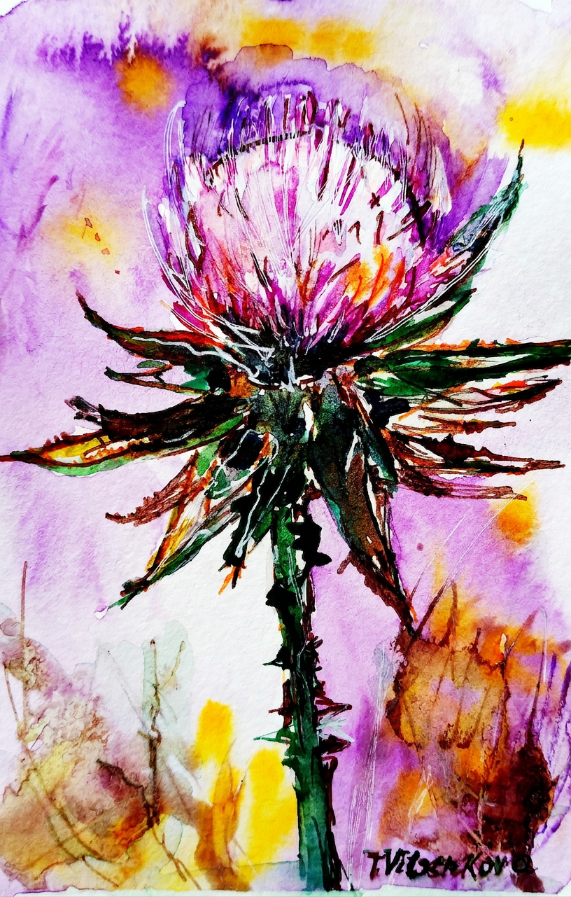
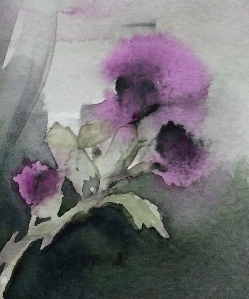
Behold: one of my first watercolor flower graphics with ink—a masterpiece created when I was still discovering my artistic voice. I wielded cooler purple and dark violet like a tiny ninja, with strategic additions of carrot orange and silver gray. (Translation: I threw colors at paper and it worked.)
Purple and orange? She woke up and chose violence.
The thistle is credited with possessing the magical ability to ward off evil spirits. So basically, it’s the flower equivalent of garlic and a cross combined. Vampires and demons should be very, very worried.
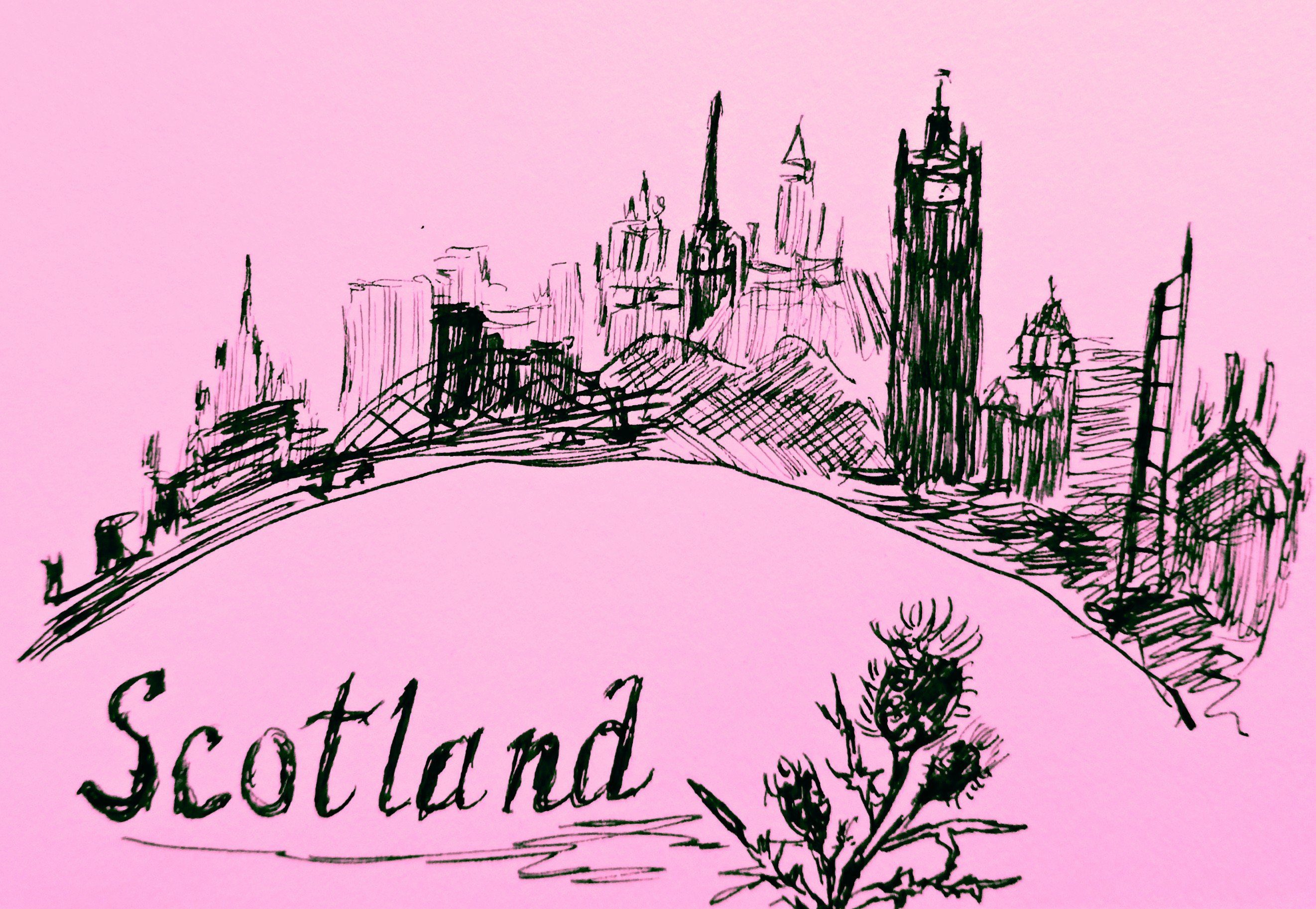
Now here’s where it gets spicy: The thistle has been Scotland’s symbol since the 13th century. Legend has it that some ambitious army decided to invade Scotland by launching a surprise night raid. Tactical genius, right? Wrong. In their infinite wisdom, the invaders removed their shoes to move stealthily through the darkness. Spoiler alert: their stealth plan came to an abrupt end when one unfortunate soldier stepped barefoot on a thistle. The resulting shriek? Loud enough to wake the sleeping Scottish soldiers, who then proceeded to win the day. And THAT, my friends, is how a tiny spiky flower saved an entire nation. You’re welcome, Scotland!
Scotland’s unsung hero. Barefoot invaders not included.
The thistle is the official emblem of the Knights of the Order of the Thistle—a group of people who basically said, “You know what this order needs? A flower that actively hurts people.” Their motto? The Latin phrase Nemo me impune lacessit, which means “No one will touch me with impunity.” (Translation: This flower has zero chill.)
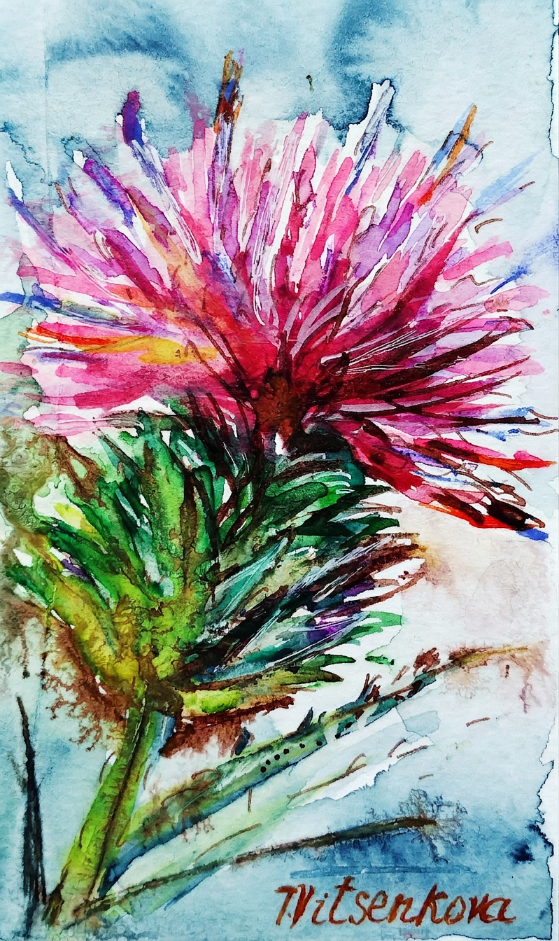
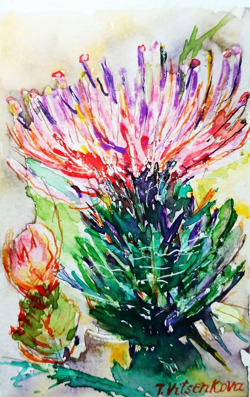
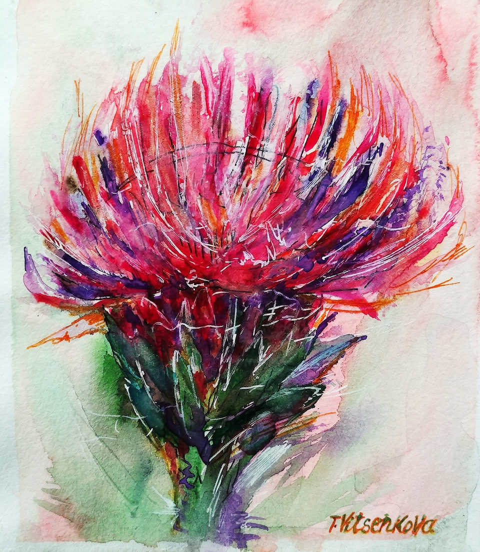
Thistle wildflower watercolor graphic alert! With ink, because subtlety is overrated. I mixed colors like I was a culinary artist: pink, milky blue opal, saffron latte, and neon colors for extra pizzazz. If your thistle painting doesn’t make people’s eyeballs tingle, are you even trying?
Pink, neon, and zero regrets.
I’m absolutely obsessed with pink thistles and their refreshingly simple color palette. A splash of plum color, some pistachio background, and boom—you’ve got botanical happiness on paper. It’s like painting flower versions of minimalist interior design.
Minimalist thistle. Maximum attitude.
Thistle watercolor wildflower painting featuring petals the color of blueberries and purple grapes. Translation: I made fruit jealous by using their colors on a flower. The audacity!
Blueberry vibes. Not edible. Learned that the hard way.
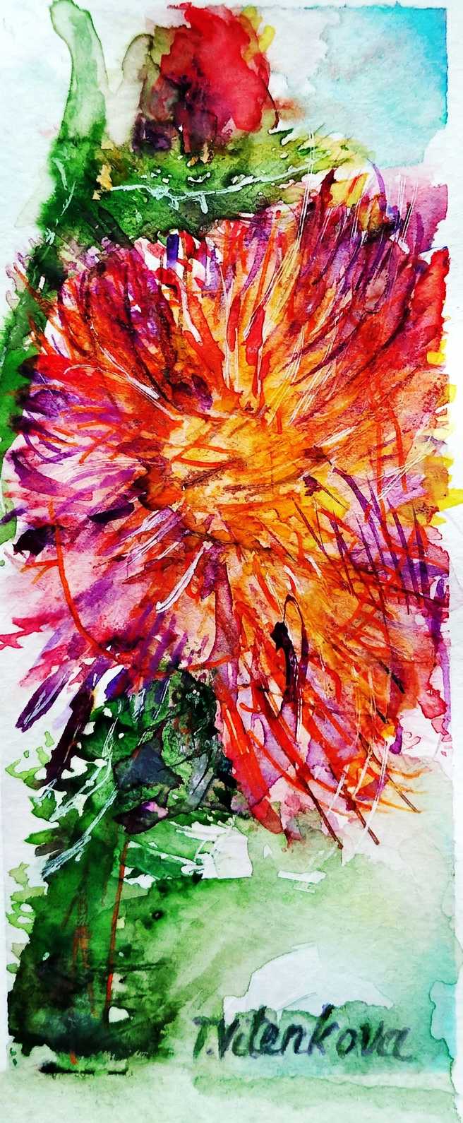
Watercolor flowers graphic extravaganza! With ink, because apparently I can’t help myself. Colors used: strawberry petals (obviously), light khaki, and a shade of flax background that somehow made the whole thing work. Art is chaos. Beautiful, intentional chaos.
Strawberry fields forever — but make it thorny.
Plot twist: Some thistles come in caramel and turmeric colors. Because apparently thistle diversity includes the entire spice rack.
Caramel and turmeric. The spice rack called, it wants its colors back.
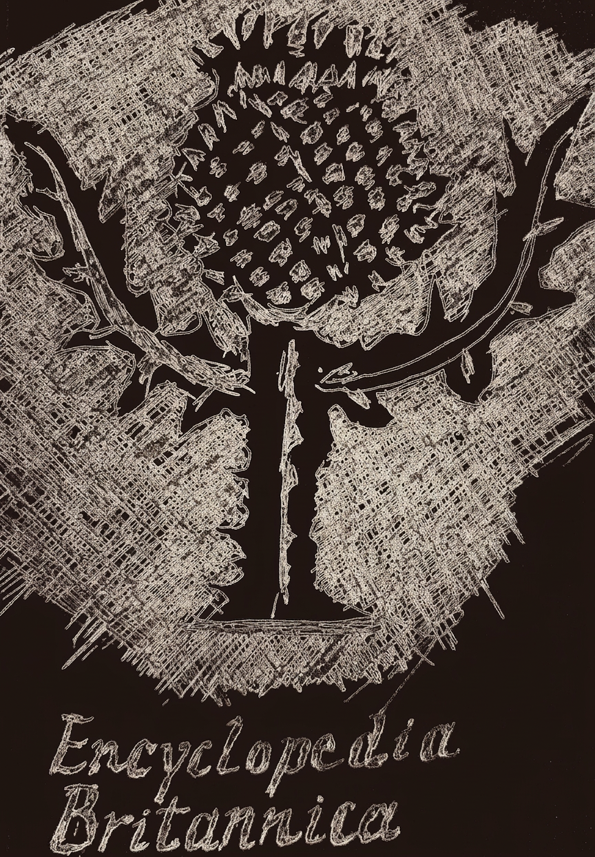
Here’s the thing about pink thistles: they’re the most popular thistle color, which is why I gathered all my pink watercolor paintings in my first post about this fabulous flower (complete with Scotland’s legendary defense narrative). And now, hold onto your berets: a thistle is not just the floral emblem of Scotland AND Lorraine—it’s ALSO the emblem of the Encyclopedia Britannica. That’s right, thistles are basically the overachievers of the plant world. They didn’t just stop at one honor. They went for three.
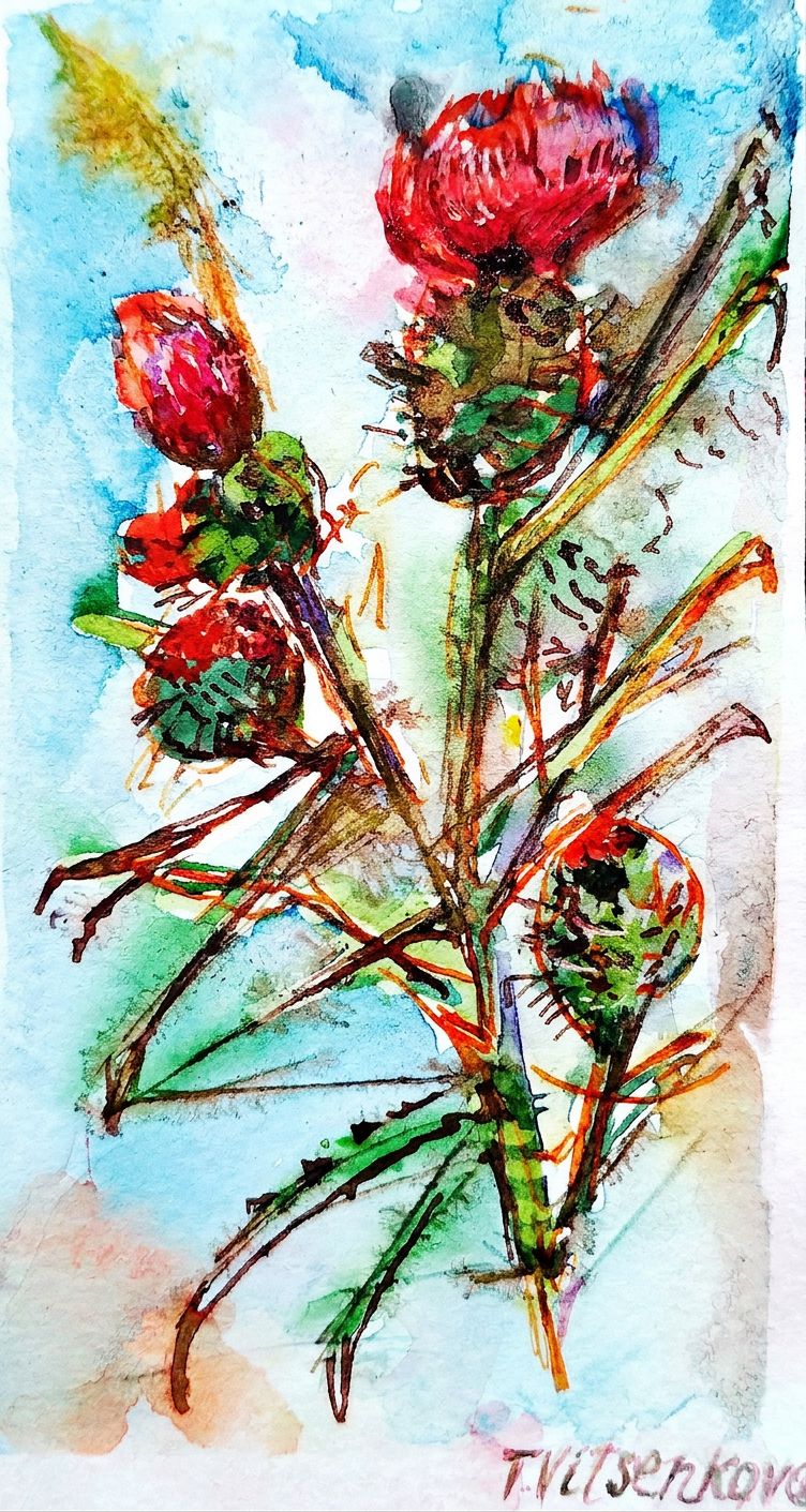
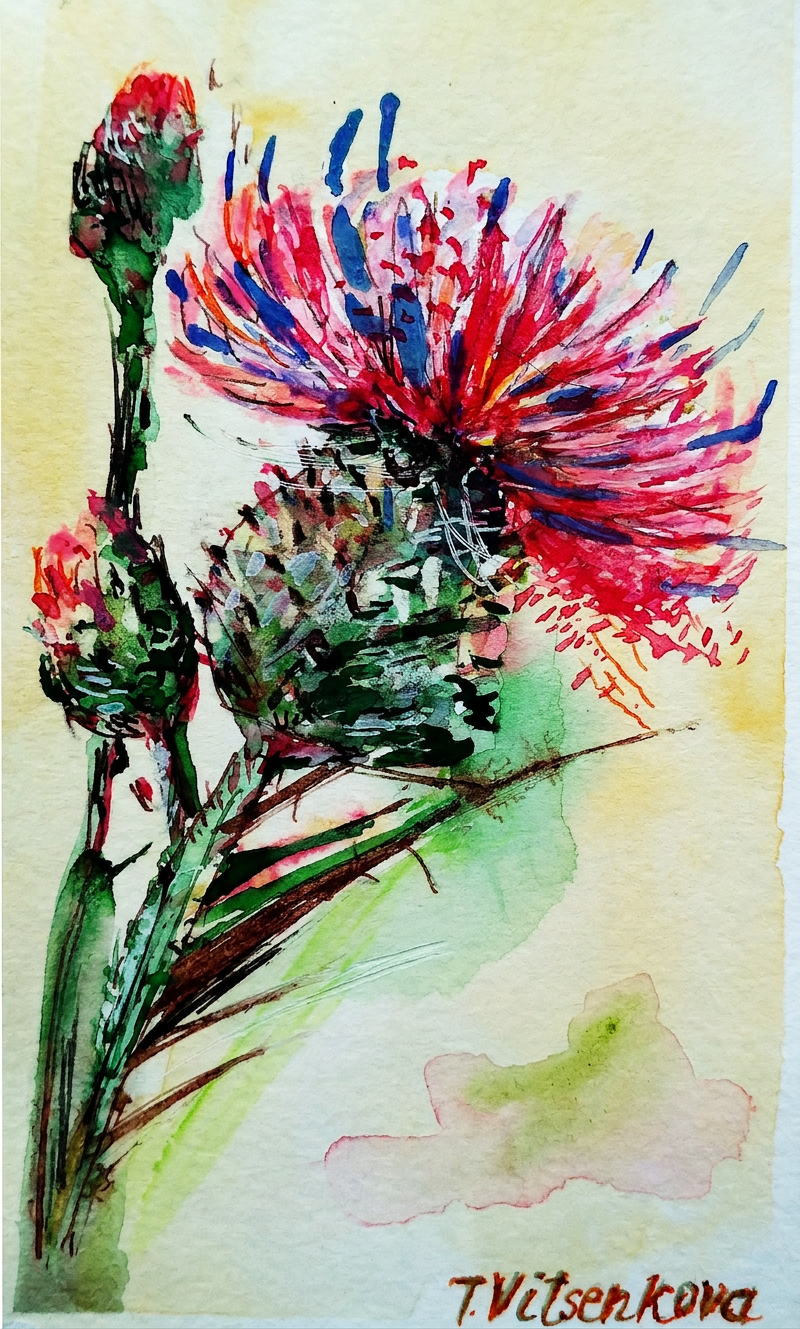
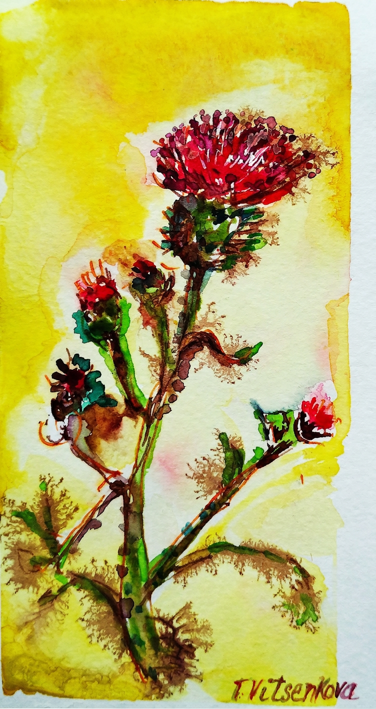
Red thistle flower and my absolute favorite city in Spain, Madrid—basically my love letter in plant form. Because apparently when I want to express passion, strength, energy, and fearlessness, I paint spiky flowers. Revolutionary, I know.
Madrid called. I answered in watercolor.
Madrid. A city with more sides to it than a geometry textbook—aristocratic, bohemian, and commercial all rolled into one impossibly stylish package. The moment you land there, something magical happens: the city whispers, “Hey, you look like you belong here,” and suddenly you feel like you actually do. Your city. Your home. The place where you’re meant to thrive (or at least enjoy really good tapas while pretending you belong).
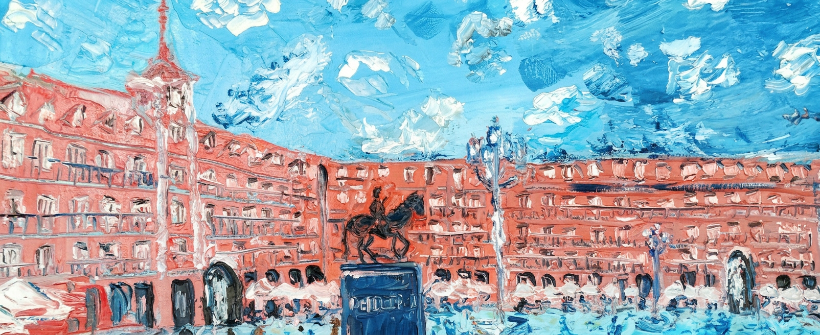
Naming just a handful of Madrid’s masterpieces would be like choosing a favorite child—borderline impossible and slightly offensive to everyone involved. But here goes: Plaza Mayor (where people-watching reaches Olympic standards), Puerto del Sol (it’s basically Grand Central Station but cooler), the Prado Museum (where you can contemplate art for hours and feel intellectually superior), the Royal Palace (proving that “bigger” sometimes actually is better), Thyssen-Bornemisza Museum of Art (for when the Prado wasn’t quite enough art for your art-hungry brain), and Retiro Park (nature’s masterpiece to balance out all the human-made masterpieces). We’ve been there more times than we’d like to admit, and it’s absolutely penciled in for our next rendezvous. Or three. :)
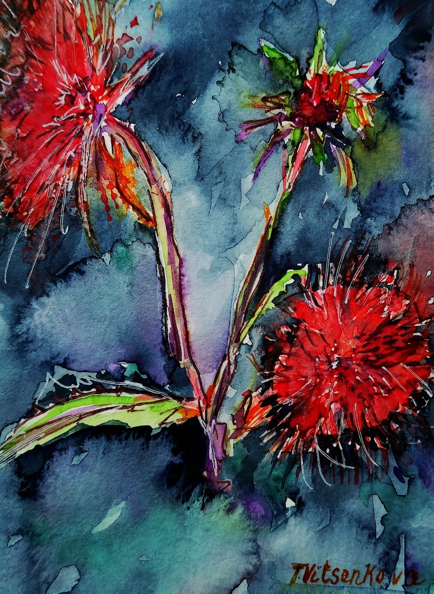
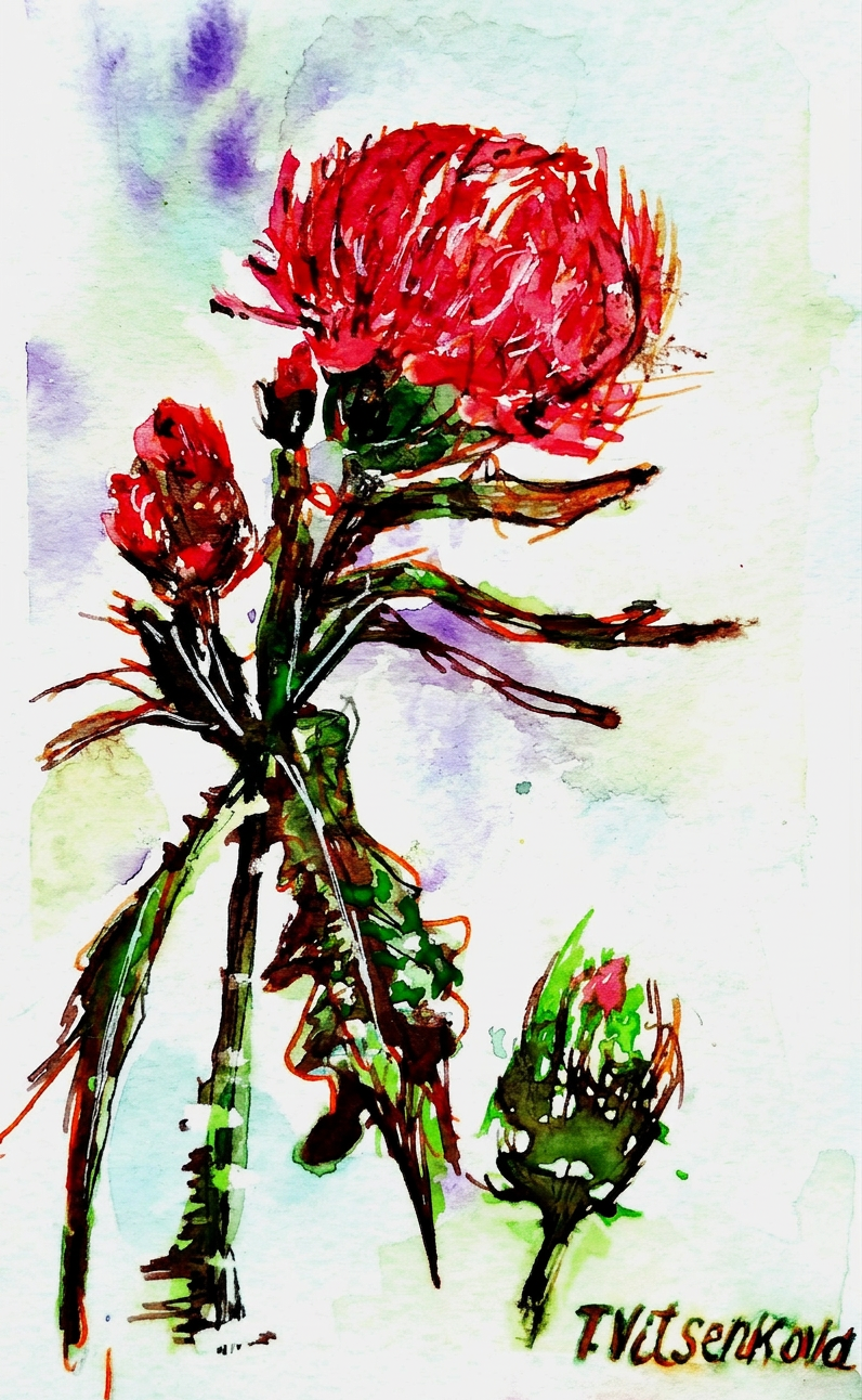
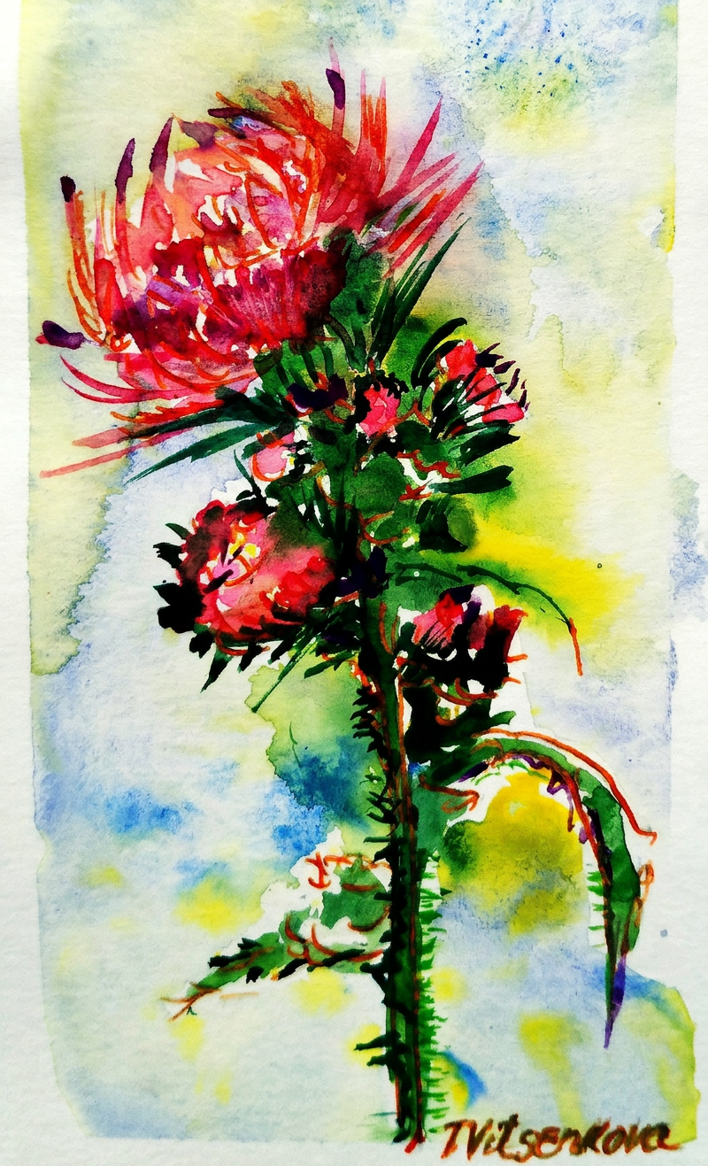
I got so inspired that I created an entire series of watercolor and ink paintings featuring vibrant red and warm peach-colored thistles, all dedicated to one of my favorite cities in Europe. Because nothing says “I love you, Madrid” quite like painting prickly flowers obsessively.
This particular thistle features petals in tomato and red cabbage tones, paired with an indigo background because apparently I’m all about dramatic color combinations and life choices.
Tomato red meets indigo. Fancy.
Here we have a thistle sporting pomegranate and scarlet petals against a lemon and coffee-colored backdrop—basically proving that flowers have better color sense than most interior designers I know.
Pomegranate. Scarlet. Basically a salad, but make it art.
A watercolor masterpiece featuring thistle with shades of raspberry and blueberry swirling together with dark blue, crowned with celery-green leaves. Bright, bold, and absolutely gorgeous. (I’m biased, but also right.)
Raspberry, blueberry, dark blue — someone was hungry while painting.
The sunny thistle: a wildflower sporting cocoa-colored petals with artistic flourishes of cognac and a moody bluish background—basically the sophisticated cousin of all the other thistles.
Cocoa and cognac. The only acceptable breakfast palette.
And finally, a thistle with amethyst and salmon-hued petals floating against creamy, tender-feeling colors. This one’s basically the introvert of the collection—softer, dreamier, and slightly less inclined to poke you.
Amethyst and salmon walk into a painting…
If you ask me, Madrid is the red color personified. The land of gazpacho, bullfighting, and flamenco basically *is* red. Passionate, vibrant, unapologetically bold. And I’m absolutely here for it. :)
Madrid in the wild. No filter needed (okay, maybe one).
All paintings belong to yours truly (aka me). No image shall be copied without permission, or the color-mixing gods will have words with you.
Bon voyage! Until our next travel adventure (and probably another painting series). Stay healthy, stay curious, and keep your eyes open for wildflowers. You never know when one might inspire your next masterpiece.
Still life and urban sketching — or as I like to call it, “procrastinating at tourist attractions with a sketchpad.”
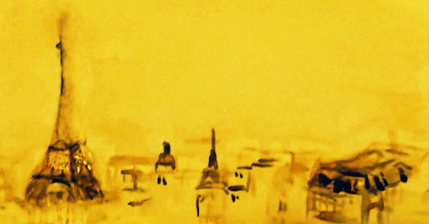
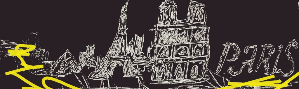
Paris. The city of love, croissants, and inexplicably rude pigeons. Here’s the thing about Paris that nobody tells you: you don’t actually need to leave your hotel room to find beauty and inspiration. Just open the window and look around — you’ll find architecture that makes your apartment back home look like a cardboard box, monuments that have been standing longer than your entire family lineage, street names that sound like songs, memorial plaques commemorating people who actually did important things (unlike me, who’s mainly known for eating an entire wheel of Camembert while crying about climate change), restaurant signs in fonts that would make a graphic designer weep with envy, and murals that prove even walls have more artistic talent than most of us. Seriously, there’s something uniquely extraordinary to discover at every street corner. Paris doesn’t just hand you beauty — it ambushes you with it when you’re least expecting it, usually right after you’ve accidentally stepped in a puddle.
Paris: where even the streets are judging your outfit.
Do you ever think about cities as flowers? Or as colors? No? Just me? Cool, cool.
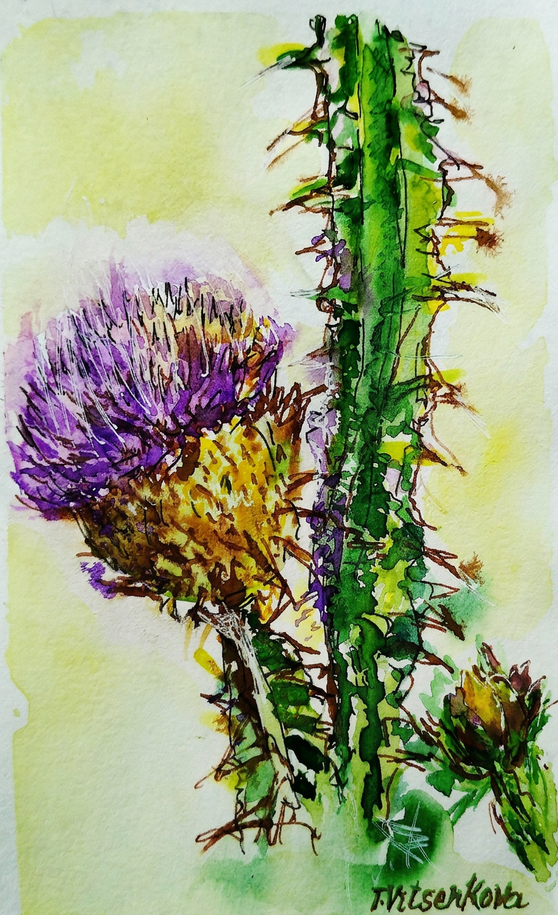
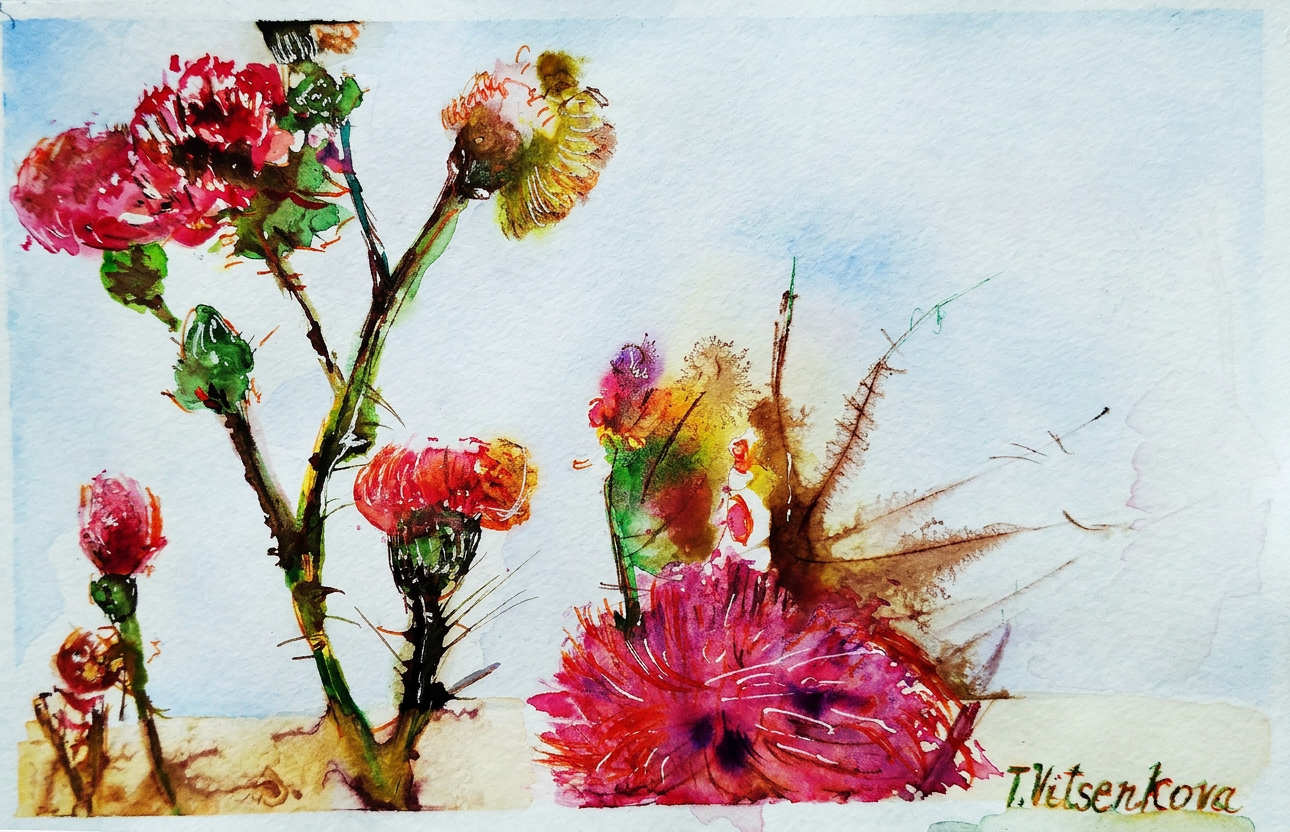
Thistle. A delightfully thorny wildflower featuring a magnificent display of eggplant and gold petals — nature’s way of saying, “I’m fancy and dangerous.” If the Luxembourg Gardens had a personality, this would be it. I’m convinced these flowers applied to art school and were accepted on their first try.
Thistle #1 — eggplant and gold. Fancy enough for the Luxembourg Gardens, too spiky for a hug.
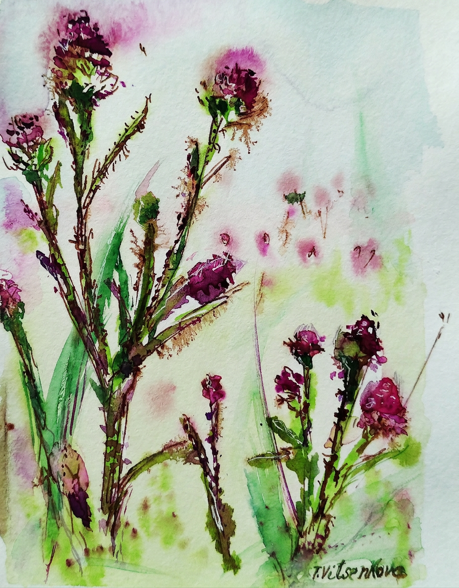
Thistle, take two. This particular specimen features sunny petals in the colors of pumpkin, orange, and beetroot — basically, if fall and autumn had a very colorful, very spiky baby. Yummy, right? (I mean, I wouldn’t recommend eating it. Paris is basically the thistle of cities — beautiful, elegant, and ready to stab you if you’re not paying attention (both literally, with its spiky architecture, and figuratively, with its devastating charm).
Thistle #2 — pumpkin and beetroot. Autumn had a baby and it’s delicious (don’t eat it).
Thistle, round three (I promise this is getting somewhere). This wildflower rocks petals in canary yellow, spicy red, and burgundy — a color palette so sophisticated it makes the Pantone Institute nervous. It immediately evokes the Opera Garnier, one of the most aggressively elegant buildings in all of Paris.
Thistle #3 — canary yellow and burgundy. Opera Garnier called, it wants its colour palette back.
Thistle, the extended remix. This version features petals of amber and purple — a combination that somehow looks like what I imagine royalty smells like. And the flower buds? They range from massive to microscopic, rather like the museums scattered throughout Paris’s city center: Musée d’Orsay (the cool one everyone’s heard of), the Louvre (the one that gives you existential dread just trying to find the bathroom), Musée de l’Orangerie (deceptively small but absolutely packed with Monet’s fever dreams), Musée Marmottan Monet (for when you want MORE Monet, because apparently one museum wasn’t enough), Musée Jacquemart-André (where rich people kept their rich person collections), and Musée de Cluny (medieval vibes and the Unicorn Tapestries, which I definitely didn’t spend three hours staring at while taking blurry photos on my phone).
Thistle #4 — amber and purple. Smells like royalty, stings like a parking ticket.
Thistle number five: The Grand Finale. This specimen features a mustard-violet flower with thorns the color of, well, apple skin. Stylish as Parisian sweeping and majestic boulevards — which is to say, it looks like it went to finishing school in Switzerland and then casually conquered Europe while sipping espresso. The vibe is undeniably “I woke up like this but also spent four hours getting ready.”
Thistle #6 — apple thorns included. Looks elegant, will absolutely draw blood.
Thistle, the encore performance. Featuring peach-colored petals against a copper and amber background — basically what the Eiffel Tower looks like in the morning when you’ve woken up early because you couldn’t sleep (jet lag is romantic, apparently). This color combination is so warm and glowy that it makes you believe in magic, or at least in the possibility that Paris might actually be worth all the hype.
Thistle #7 — peach and copper. The Eiffel Tower at 6am. Romantic and deeply unreasonable.
Bon voyage! Until the next travel adventure :) Stay healthy, stay curious, and remember: life is too short to not travel, not sketch random flowers, and not pretend you understand French when someone speaks to you at a café (just nod and smile — it works 60% of the time, every time).
Bon voyage! Don’t forget your sketchpad. Or your beret. Actually, just the sketchpad.Thistle #5 — mustard and violet. The boulevard of wildflowers.
All paintings belong to the author and are protected by the ancient artist code: look but don’t touch, admire but don’t copy, and definitely don’t use without permission or face the wrath of someone who takes their wildflowers very seriously.
Still life and urban sketching—because thistles are basically nature’s way of saying ‘don’t get too close.’
Rome is basically an open-air museum that refuses to close. Ever. The streets are littered with buildings from every architectural era imaginable, as if someone dumped 2,000 years of interior design catalogs all in one place. It’s chaos. Beautiful, Instagram-worthy chaos.
Rome: where every corner looks like a movie set. No filter needed.
Thistle in watercolor with ink—featuring a delightful palette of pumpkin, turmeric, pineapple, and brick-colored stems because apparently I was hungry while painting. It supposedly represents Rome’s Pantheon: monumental, elegant, and totally not something you’d want to hug. The whole thing is basically an antique temple dedicated to gods who would probably be confused by modern WiFi.
Thistle #1: Painted while hungry. Named after an ancient temple. Sounds about right.
Here’s the truth about Rome: it doesn’t need color. Seriously. Just slap some sepia on it and a few ‘tender shades,’ and suddenly marble fountains and statues become artistically moody. It’s like Rome hired the world’s best Instagram filter and never turned it off.
Emperor Augustus once said: ‘I found Rome a city of bricks and left it a city of marble.’ Translation: ‘I showed up and flexed so hard that everything got an upgrade.’
Thistle number two: wildflower with avocado and cherry-colored petals because apparently I was on a mood board binge. The chaotic petals remind me of the Roman Forum’s ancient ruins—you know, ruins that used to be someone’s important government building but now just vibes there mysteriously. Every time you visit, you find something new. Mostly it’s tourists like you, but sometimes it’s actually history!
Thistle #2: Avocado meets cherry. The Roman Forum approves from its mysteriously crumbled remains.
Thistle number three, now in violaceous hues (fancy word alert!). It reminds me of Borromini’s architecture in Rome—all concave curves and convex swagger with sharp angles that would make a modern architect weep. Remember Gaudí’s Barcelona houses? Same energy. But here’s the thing: Borromini’s stuff is actually calm and airy despite looking like it wants to fight you. It’s strong, persistent, and stubborn—just like a thistle that refuses to die in a sidewalk crack. Basically, I’m convinced all great architects were just looking at plants and going ‘yeah, I’ll do that but in marble.’
Thistle #3: Violaceous vibes only. Borromini would definitely swipe right.
Thistle number four: cappuccino and watermelon colored petals (yes, that color combo is as weird as it sounds). Apparently it’s channeling Trevi Fountain vibes—you know, Rome’s most famous ‘throw money in the water and make wishes’ destination. It’s made from natural materials and definitely old, which means it’s had about 500 years to collect loose change and tourist dreams. Stand too close and you feel like you’re floating. Which is either the fountain’s magic or the overwhelming crowd of selfie sticks.
Thistle #4: Cappuccino + watermelon = chaos. Throw a coin in it anyway.
Thistle number five: fiery red, chocolate, and dark grapes (the color palette of a moody wine bar). It’s giving off major Castel Sant’Angelo energy—you know, that ancient Roman pedestrian bridge covered in Bernini’s Baroque sculptures. It’s stunning, it’s old, and like every tourist photo location in Rome, it’s probably swarming with people trying to get the perfect angle.
Thistle #5: Wine bar color palette. Bernini would’ve painted it too, but he was busy.
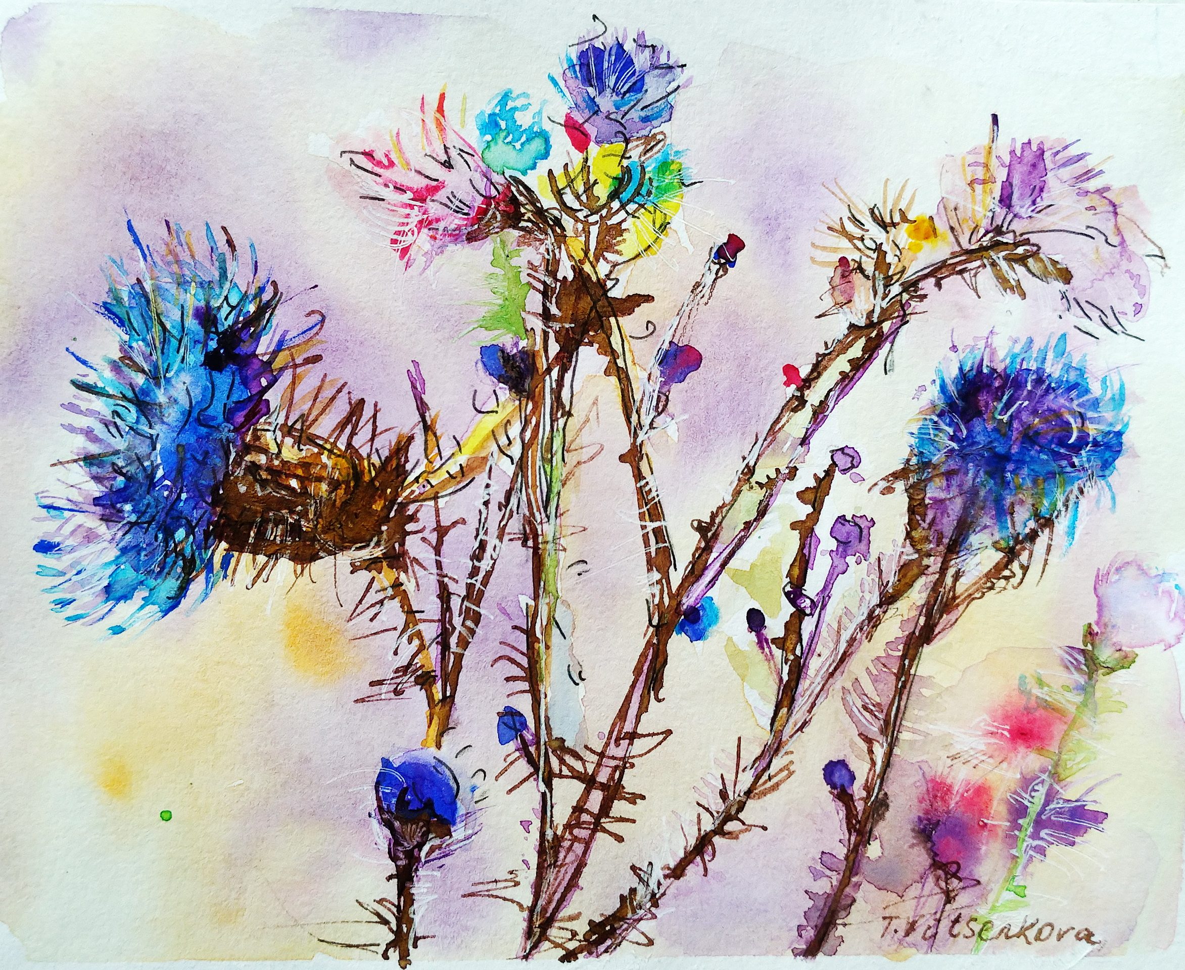
This is my final thistle post—the grand finale of my flower personality study. Here’s what I’ve learned: thistles are basically flowers with attitude problems. They represent strength, inflexibility, firmness, and they survive literally anywhere because they refuse to quit. Kind of like tourists in Rome during July. So I painted a whole series of these impossible little rebels to celebrate their survival skills and, oh yeah, they totally remind me of beautiful European architecture. Nature’s architecture is just better, fight me.
Rome: still standing after 2,000 years. Unlike my feet after day one.
All paintings belong to the author and are definitely not meant to be copied, traced, or vaguely ‘inspired by’—because yes, we’re watching you.
Bon voyage! Until the next travel adventure (and probably the next thistle obsession)! 🌍
Do you like flowers and their smell? Then your next vacation should be in France, my favorite country. Flowers are part of life everywhere, in cities, you probably won’t find houses that are not decorated with rose bushes and clematis that make a hedge.
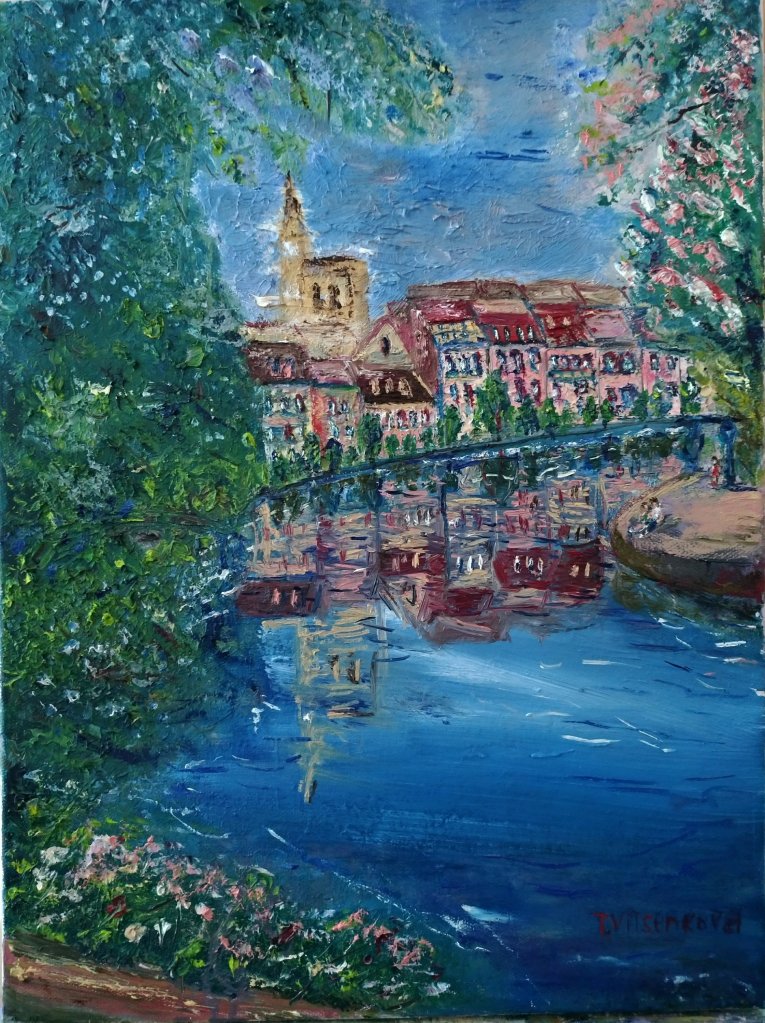
Strasbourg said ‘hold my wine’ and posed for a painting.
And between the cities, endless blooming fields stretch, which not only delight the eye, but also generate income, since flowers are used in the production of essential oils.
Impressionist painting of orchid, the delicate and exotic at the same time.
An orchid walks into a gallery. Everyone stares. It’s used to it.
An integral part of the French cultural heritage, these gardens are open to the public throughout the country. All year round, they are ready to share their secrets, especially during moments of exceptional events.
Watercolour painting of unopened bud an orchid
Flowers being modest. Rare, honestly.
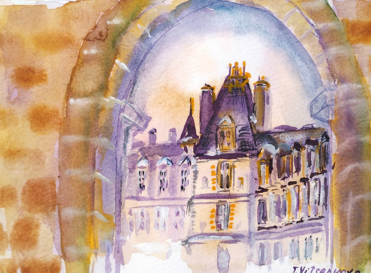
If you like castles in France, you will find lots of gardens and parks. One of my favorite is Château de Vaux-le-Vicomte, a small private palace of the 17th century, located not far from Paris. Popular for its sophisticated architecture and large surrounding park.
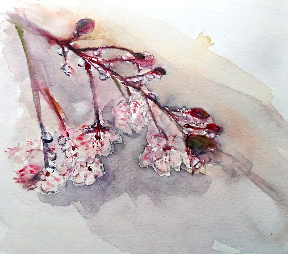
Cherry blossoms: beautiful for 10 days, smug about it forever.
The gardens and parks were in perfect harmony with the architectural complexes from which they were laid out. Spacious alleys were lined with flower beds.
Castle: Château de Vaux-le-Vicomte
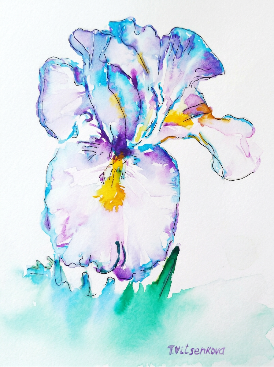
…and of course irises. Did you know that the depiction of a lily on heraldry in pre-revolutionary France is actually a stylised image of a yellow iris?
The iris — France’s national flower and certified drama queen.
For France, irises are not only beautiful flowers that are a symbol, they are also an industry. France is famous throughout the world for its perfumes and eau de parfum, and it is in them that iris essential oil is actively used to create aromatic compositions.
Bon voyage! Until the next travel.
All paintings belong to the author. No image is to be copied without permission.
Tools used for my painting. Watercolor brands Van Gogh and Cotman. Paper Canson Mix Media album 28×35 cm (11×14 in.) and Canson Watercolour album 25×35 cm (11 x 15 in.)
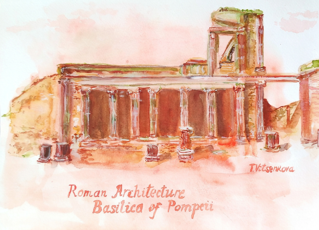
The financial public building had a very important part in the public life of ancient Romans. The ancient building has been stuccoed with white marble under Samonite’s rule and then the city became a part of the Romans colony. The Basilica was used as a site for court hearings, as well as to gather large groups to discuss some business and legal subjects and to hold public meetings. This was the place of Tribunals where the judge would reveal the law cases.
In my painting is the oldest public building in Pompeii – the Basilica. The Basilica was roofed in antiquity, but the roof has not been preserved until our days. It had Ionic capitals on the first floor and Corinthian capitals on the second floor. It consisted of two meter high podiums on top of which were six Corinthian columns. The tribunal is, amazingly, well preserved…
Imagine that you are walking inside the Basilica, enjoying the richly decorated walls with stucco like large blocks of marble, statues as you respectfully approaching the Judge who is waiting for another law-court …
Painting – Basilica of Pompeii, Roman Architecture
Year of construction- 120 BC
Address: Basilica, Pompeii
Tools used for my painting Watercolour PWC shell, Charvin revin red and sap green, Albert Durer and Faber Castell watercolour pencils. Paper Acquarello Fabriano, grana grossa rouch watercolour album, 22×30 cm (9 ×12 in.)
The magic of the holidays is in the making! Join me on this artistic adventure as I explore the captivating world of #TravelVibes #ArtAdventure
Urban sketching and Still life. Travel and Art. Urban Sketching: Exploring Parisian Life Through Art
Paris is simply an amazing place for artists and photographs. This is especially true in spring, summer, and early autumn. During these seasons, the splendor of countless flower beds and shrubs is wrapped in luxurious blossoms of amazing flowers.
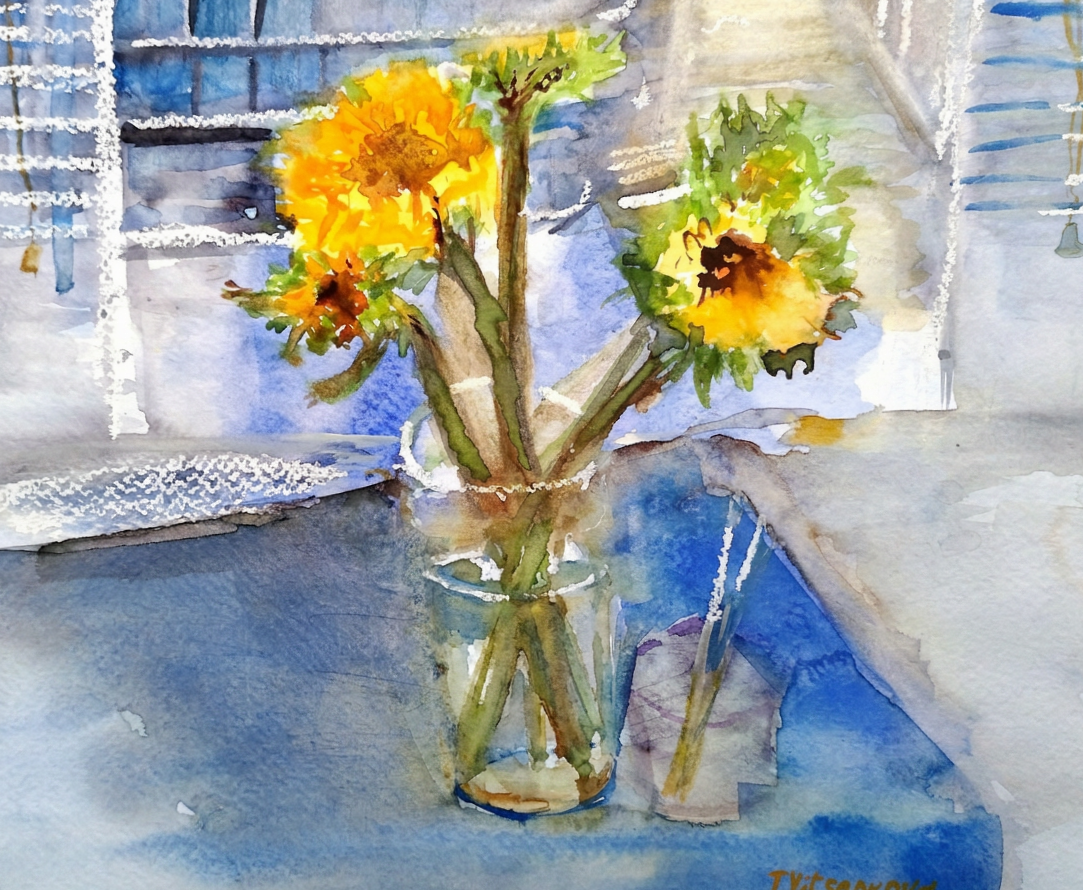
A cozy watercolor sketch of a vase with flowers and a scenic window view, capturing the essence of Parisian life.
The way Parisians buy them in many stores and Sunday markets, sell and grow at home is worth of imitation:)
I bought viola tricolor, one of my favorite flowers. I did the paintings in this post in our Parisian hotel’s room.
Watercolor painting of a charming flower shop in Paris, showcasing vibrant blooms and an inviting street scene.
Did you know that in Roman mythology, the ancient gods turned men into violas? These violas secretly spied on the bathing goddess of love – Venus:)
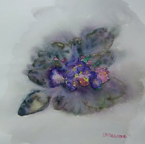
Watercolor painting of viola tricolor, capturing the delicate beauty of spring flowers.
Parisians often spend leisure time, sitting down on benches with a bottle of water, a baguette, a book or just a cigarette to take a little breath, relax after a working day or bask in the sun, going to market and flower stories and bringing these little beauties in their rooms to continue getting a feeling of being in touch with the wonderful:)
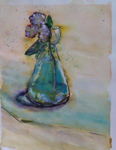
A watercolor painting of a glass vase holding viola tricolor flowers, showcasing vibrant colors and artistic flair.
Bon voyage! Until the next travel:) Stay healthy.
Tools used for my painting. Watercolour brands Van Gogh and Cotman. Paper Canson Mix Media album 28×35 cm (11×14 in.) and Canson Watercolour album 25×35 cm (11 x15 in.)
You can visit my personal website pages here. Find out more about the artwork I am offering in oil and watercolor paintings. You can also buy canvas prints, framed prints, and more artwork.
All paintings belong to the author. No image is to be copied without permission.
Another productive path is adding a story to your artwork.
Painting Peonies artwork as an example.
Telling a story with your artwork is an invitation for a dialogue with a viewer. Asking some questions help to describe feelings or mood. There are seven emotional expressions universal to people over the words – happiness, sadness, surprise, fear, anger, disgust, contempt. Which one you would like to receive from a spectator?
Example of painting that telling a happy story:)
Do you like reading and flowers? Would you like to add some fresh and relaxing look to your room? This painting Red peony will accommodate your needs. Imagine a peaceful comfy evening. Visualize a cup of warm cappuccino as a friendly hug. Add fluffy peonies to your room. Do not forget your favorite book. Voila!:)
A vibrant painting of red peonies is on display above a cozy living room setting. It invites a sense of warmth and relaxation.
Images often show your moments in a story, capturing the essence and emotions that words sometimes struggle to convey. You can select a personal moment to represent the entire narrative. A single image can evoke many memories and feelings.
Narrative art works often showcase well-known or historical tales. Sometimes, these tales are mythic. They can bring these stories to life in vivid detail.
They can represent your own imaginary story. They invite viewers to embark on a journey through your unique perspective and creativity.
This interplay between imagery and storytelling deepens our understanding of the narrative. It also fosters a personal connection between the artist and the audience. Every piece becomes a compelling invitation to engage with the art on a deeper level. :)
The magic of the holidays is in the making! Join me on this artistic adventure as I explore the captivating world of #TravelVibes #ArtAdventure
You are welcome to visit my personal website pages. There, you can find out more about the artwork I am offering in oil and watercolor paintings. You can buy canvas prints, framed prints, and more artwork.
All paintings belong to the author. No image is to be copied without permission.
Urban sketching and Still life. Travel and Art. A Colorful Journey Through Paris: Art and Nature Blended
Flowers
Paris is always the city in flowers. This city breathes in the scents of billions of flowers. Every day it explodes with a firework of floral colors. Winter, or summer, the season does not matter for flowers in Paris. The Luxembourg Gardens is the most “French” of all city parks.
A vibrant watercolor painting of blooming flowers in a rustic setting, showcasing the beauty of nature intertwined with artistry.
Only here can you see the true purpose of the green towns in Paris. You can watch how Parisians spend their free time… If you would like to become one of them, you try their …Vivre la vie:)
City parks
Go to one of the city parks. You sit comfortably on a chair near the fountain. Breathe in the aroma of roses and enjoy the freshness of greenery. Hide from the city center, which is so distant yet immeasurably close from one side.
This watercolor depicts the picturesque Luxembourg Gardens in Paris. It showcases serene landscapes. Visitors enjoy the park’s beauty.
Bright flower borders with soft ribbons frame the green lawns, and flowerbeds amaze with volumes and colors. Petunias, daisies, rudbeckia, sage, cereals, dahlias, chrys…it is the long list of flowers. Their consistent and continuous flowering pleases grateful spectators throughout the entire spring, summer and autumn seasons.
Luxembourg gardens
Luxembourg gardens in Paris is my favorite one, flower beds are especially good at any season. It’s impossible to stop looking at them! I am enjoying to visit again and again:) you see my post about Luxembourg gardens.
A cozy watercolor painting featuring a vase of flowers on a wooden table, alongside a red polka-dotted chair.
Bon voyage! Until the next travel:) Stay healthy.
You can visit my personal website pages here. Find out more about the artwork I am offering in oil and watercolor paintings. Buy canvas prints, framed prints, and more artwork.
Tools used for my painting. Watercolour brands Van Gogh and Cotman. Paper Canson Mix Media album 28×35 cm (11×14 in.) and Canson Watercolour album 25×35 cm (11 x15 in.)
All paintings belong to the author. No image is to be copied without permission.
For my artist colleagues and students. Workshops. Innovative approach to describe artwork. Trademark:)
How do you describe and prepare paints for your artworks? For example if you need a bright or light yellow color, a brand, a particular paint? I usually do test paints from my selected colors before painting . All artists would agree that watercolors from different brands with the same names for paints give us various color’s views. Sometimes it is difficult to distinguish and choose a paint even with the same name
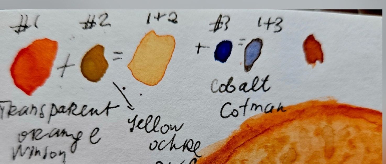
For example, brand PWC watercolor yellow ochre and Windsor yellow ochre paints look differently. You would describe paint of yellow ochre as something between yellow and brown, opaque. Raw sienna is mostly yellowish-brown and transparent.
At the same time, using yellow ochre or raw sienna, they look very alike to a viewer. The viewer does not care about the name of the paint or the brand. They need emotion.
Comparison of PWC and Winsor yellow ochre watercolor paints, showcasing their distinct shades.
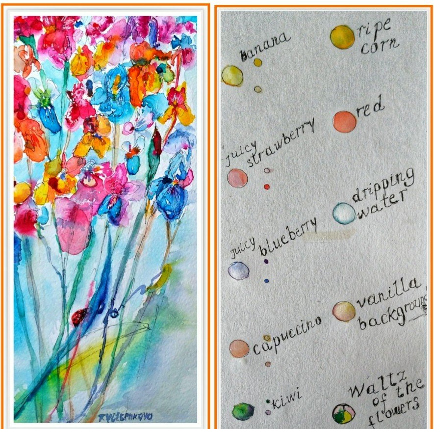
Describing a bright yellow color in your artwork as a juicy banana is effective. It gives a clue and brings a memory about a ripe fruit. This description brings you to summer, and you feel energized. So I created my own cool way to describe colors with names from nature and food, berries, veggies and fruits colors TM :)
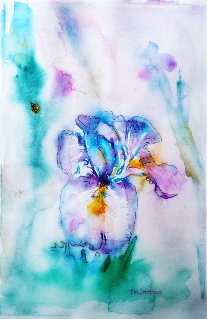
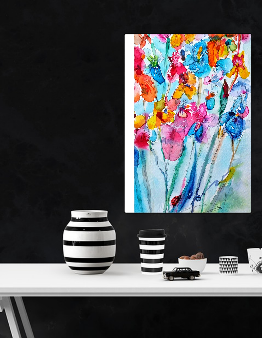
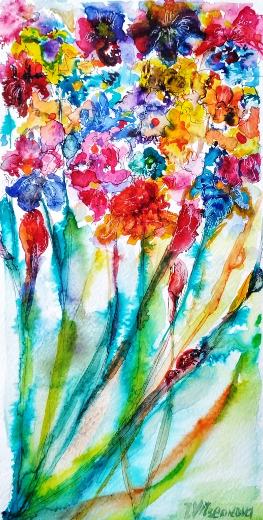
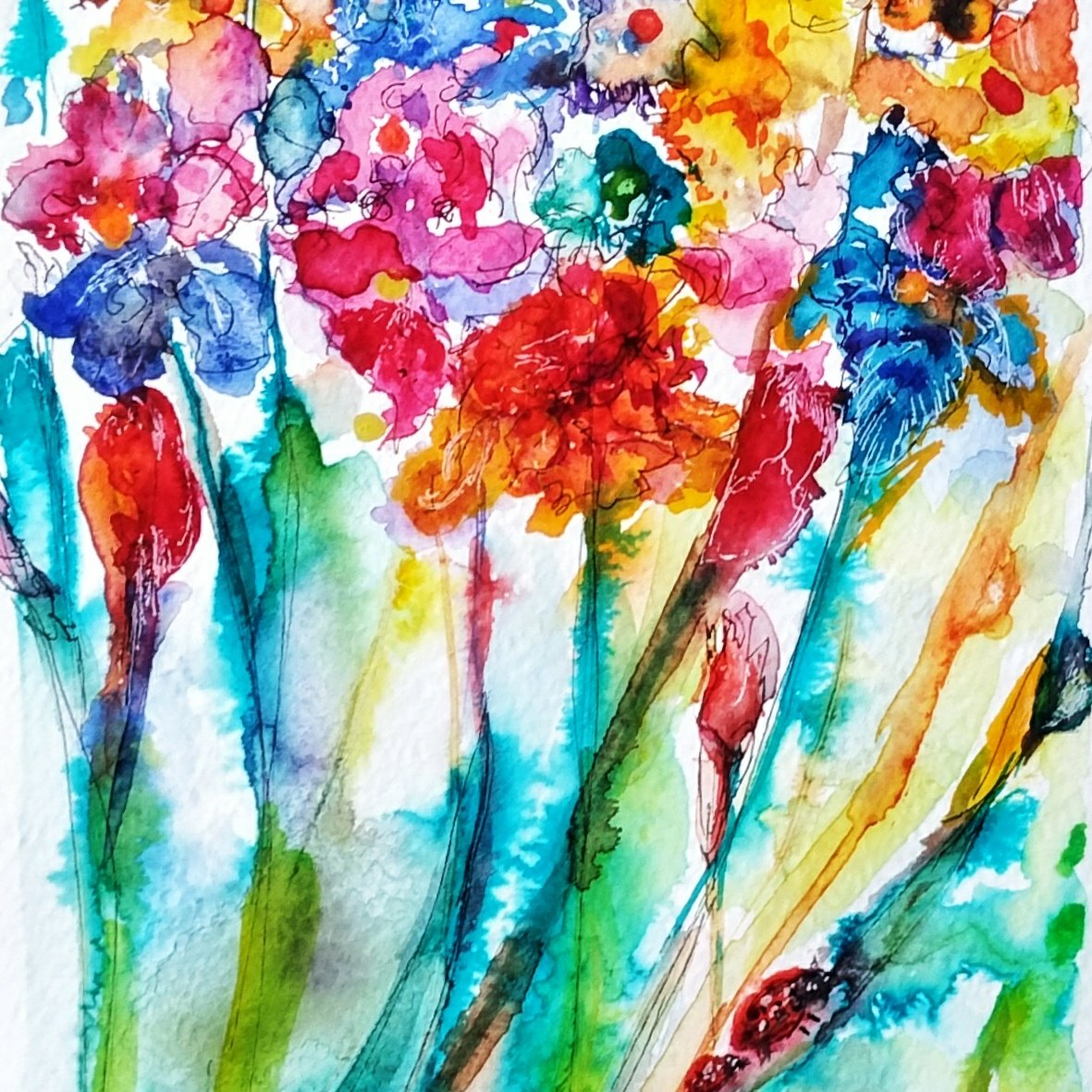
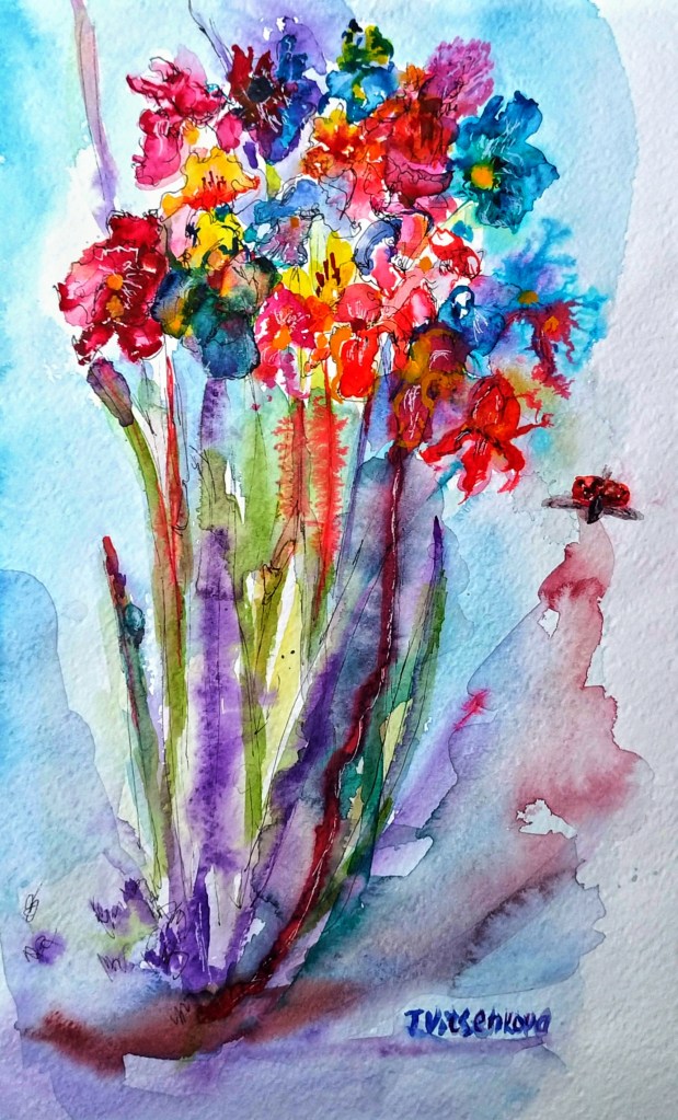
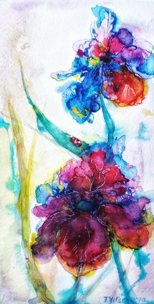
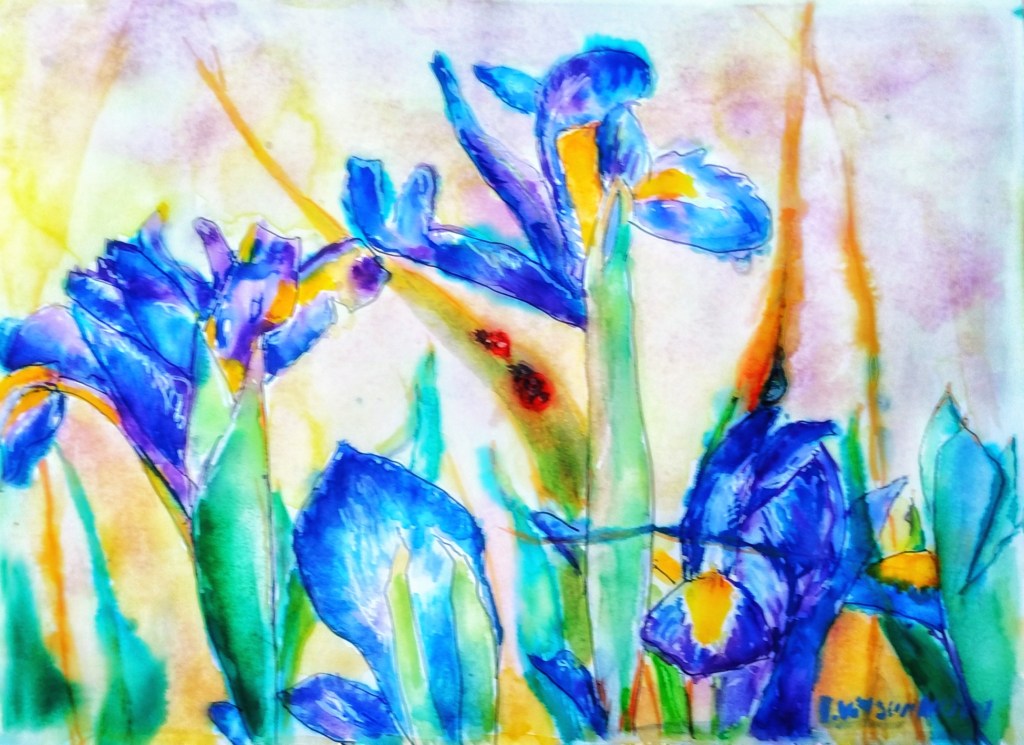
I pick paint from my Watercolour collection of paints. I choose the name of one of my favorite berries or fruit. This depends on the season and time of year. Some examples of artworks from my recent series of Iris flowers.
… juicy plum, blueberry and peach colors, long stems of mustard colors with background of corn and turmeric colors, little red ladybugs with dripping raindrops are on leaves of color of green apples …
… of juicy banana, strawberry and blueberry, long stems of colors of cappuccino and kiwi with vanilla background of ripe corn, little red ladybug with dripping raindrops are on milky leaves
Colorful watercolor artwork featuring flowers, inspired by nature and food descriptions.
Are you feeling the taste and smell of juicy bananas?:)
The magic of the holidays is in the making! Join me on this artistic adventure as I explore the captivating world of #TravelVibes #ArtAdventure
You are welcome to visit my personal website pages. There, you can find out more about the artwork I am offering in oil and watercolor paintings. You can buy canvas prints, framed prints, and more artwork.
All paintings belong to the author. No image is to be copied without permission.
Art Titles That Evoke Feelings: A Creative Guide. Tips for artists.
One of the creative paths is making a name to your artwork.
According thinker Aristotle there are five main senses. They are hearing, seeing, touching, smelling and tasting… and poets add one more, a sense of beauty.
Well, let’s start from a name for an artwork.
It should trigger one sense or imaginary few of them:)
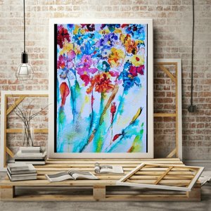
Example is one of my painting’s name Floral Jewels, linked with flowers’ beauty, treasure, joy, dream or maybe plum?:)
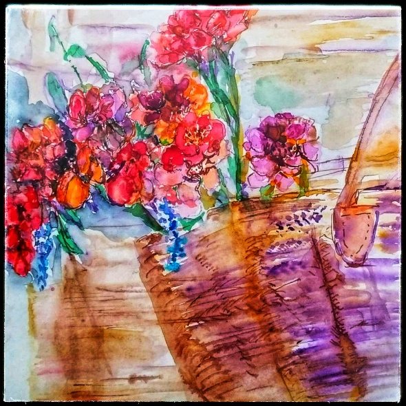
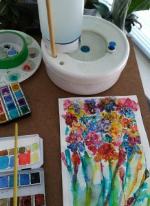
A vibrant watercolor painting featuring an explosion of colorful flowers, showcasing the beauty and joy of artistic expression.
or my next Watercolour artwork named Waltz of flowers. It releases emotions like a swirling couple at the ballroom, conjuring images of delicate petals dancing gracefully through the air.
The rhythm, ballet, or maybe lace influence it. Each brushstroke intertwines with the vibrant hues. Together they create a visual symphony that captivates the viewer.
The scene evokes a sense of joy and elegance. It invites the audience to lose themselves in the beauty of nature’s transience. Each flower embodies a fleeting moment of bliss. This is much like a fleeting glance shared between dancers under soft, twinkling chandeliers.
A vibrant watercolor painting titled ‘Waltz of Flowers’ showcases colorful floral arrangements, evocative of rhythm and emotion.
The name and image of an artwork significantly affect the viewer’s emotions. They help release feelings and encourage self-reflection. A thought-provoking title paired with the artwork prepares viewers to connect with it on a personal level.
It often guides their interpretations and emotional responses. Additionally, the visual elements within the artwork, ranging from color palettes to composition, further enhance this emotional resonance. By engaging with the art on both an intellectual and emotional level, viewers can experience a cathartic release.
This engagement allows them to confront feelings that have been otherwise suppressed. It also helps express emotions that have been ignored. In this way, art serves as a powerful medium for emotional exploration and connection.
The magic of the holidays is in the making! Join me on this artistic adventure as I explore the captivating world of #TravelVibes #ArtAdventure
You are welcome to visit my personal website pages. There, you can find out more about the artwork I am offering in oil and watercolor paintings. You can buy canvas prints, framed prints, and more artwork.
All paintings belong to the author. No image is to be copied without permission.
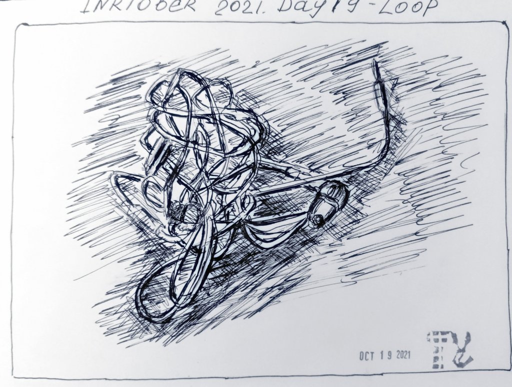
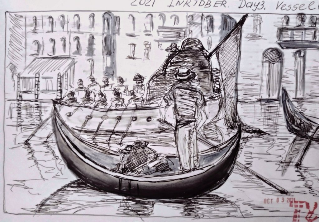
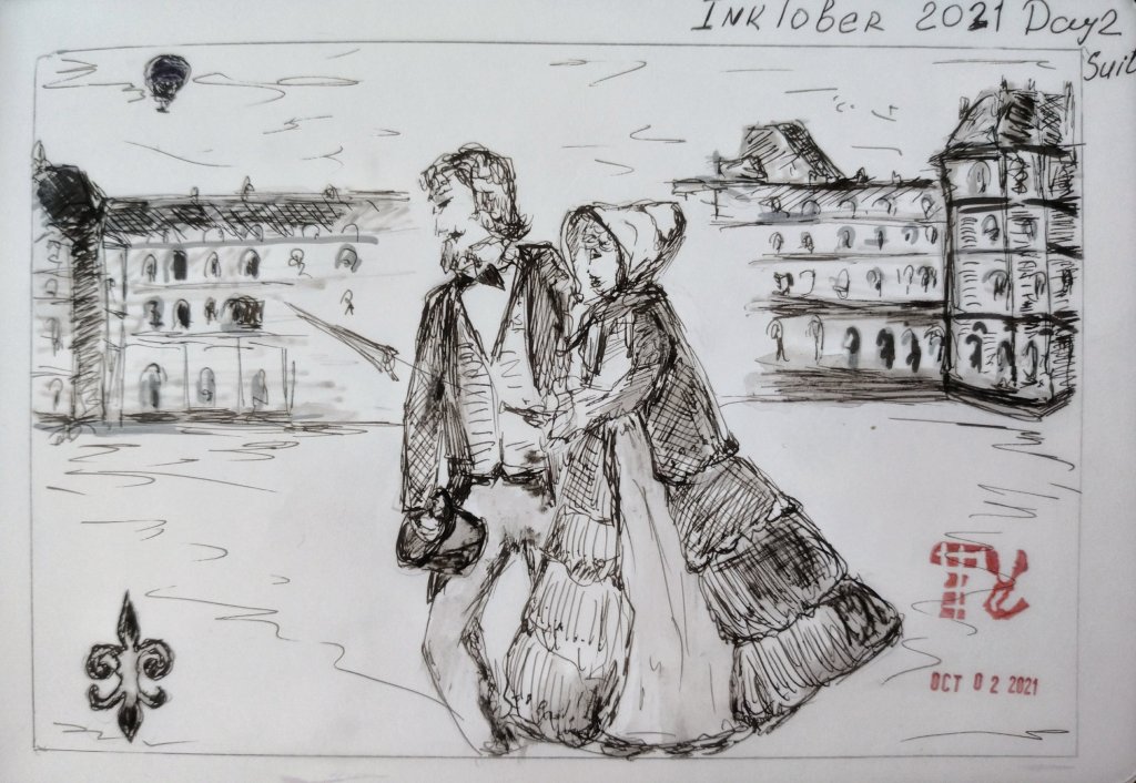
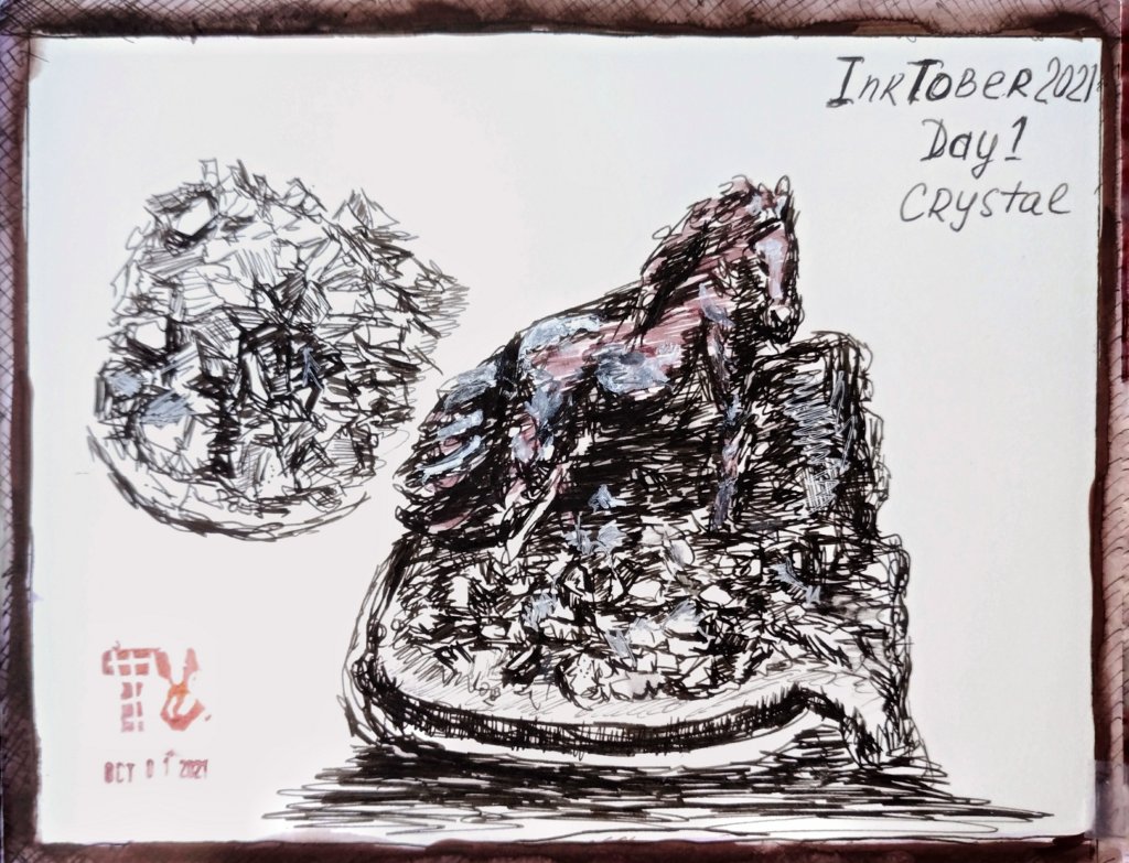
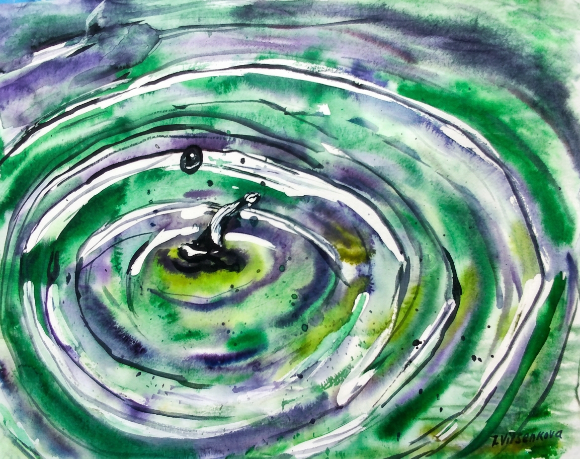
For this I was doing an ink drawing of Splat water, with splashes of water that flow down from a long green leaf. I already miss summer days:) A person can forever look at three things: how the fire burns,how the other person works and how the water flows…
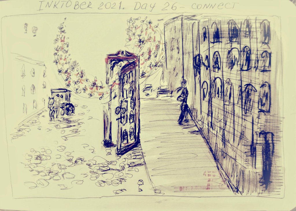
And I am ready for tomorrow’s Inktober prompt – Connect.
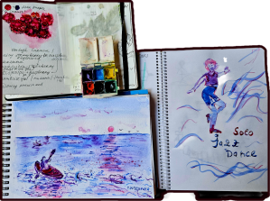
For my artist colleagues. Workshops. Holidays spirit for creative community. Join me in artistic journey: sea waves and sunrises.
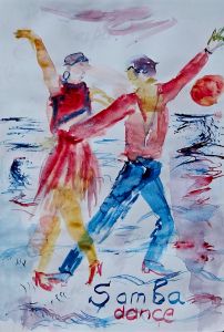
Just finished this vibrant painting of sea waves, and it instantly transported me back to a magical moment in summer. I recall finding a lively street performance in Paris. People danced samba with such energy and passion near the river Seine. It felt like the waves were dancing too! Here’s to capturing those joyful memories through art.
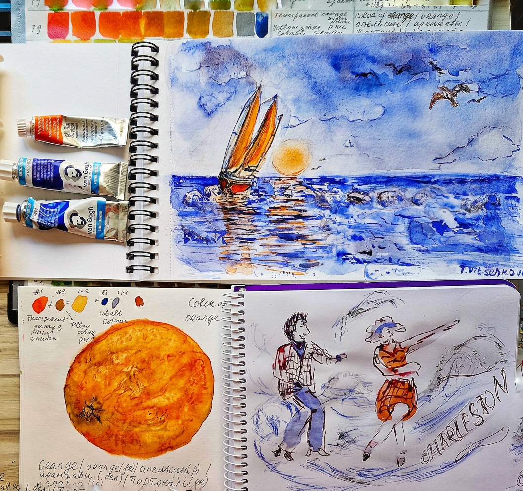
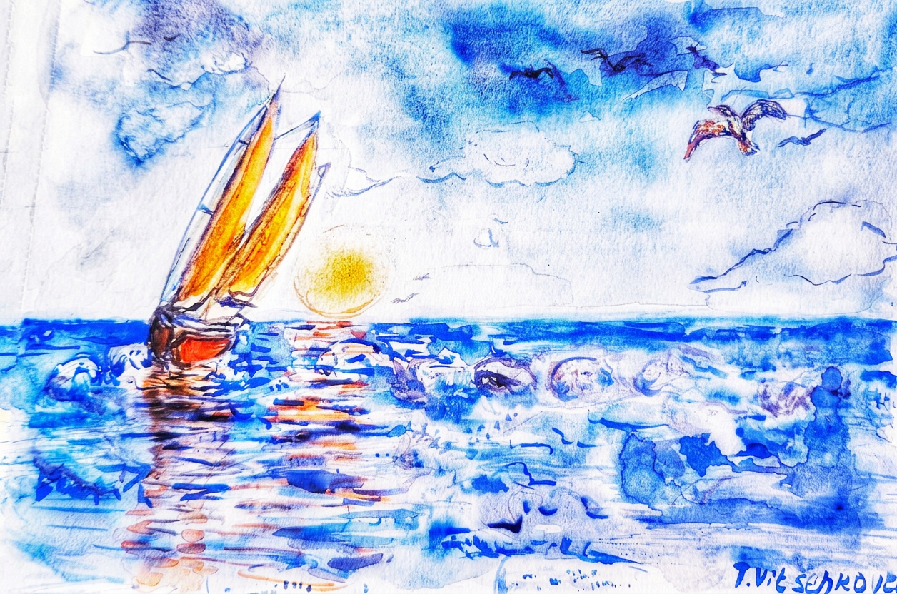
Imagine lovely warm Mediterranean sea. It’s a breathtaking scene when the sun gracefully rises languidly from the horizon. It casts a warm, peach-hued glow over the tranquil waters. The waves, much like spirited dancers performing a samba with vibrant life as they embrace the shoreline.
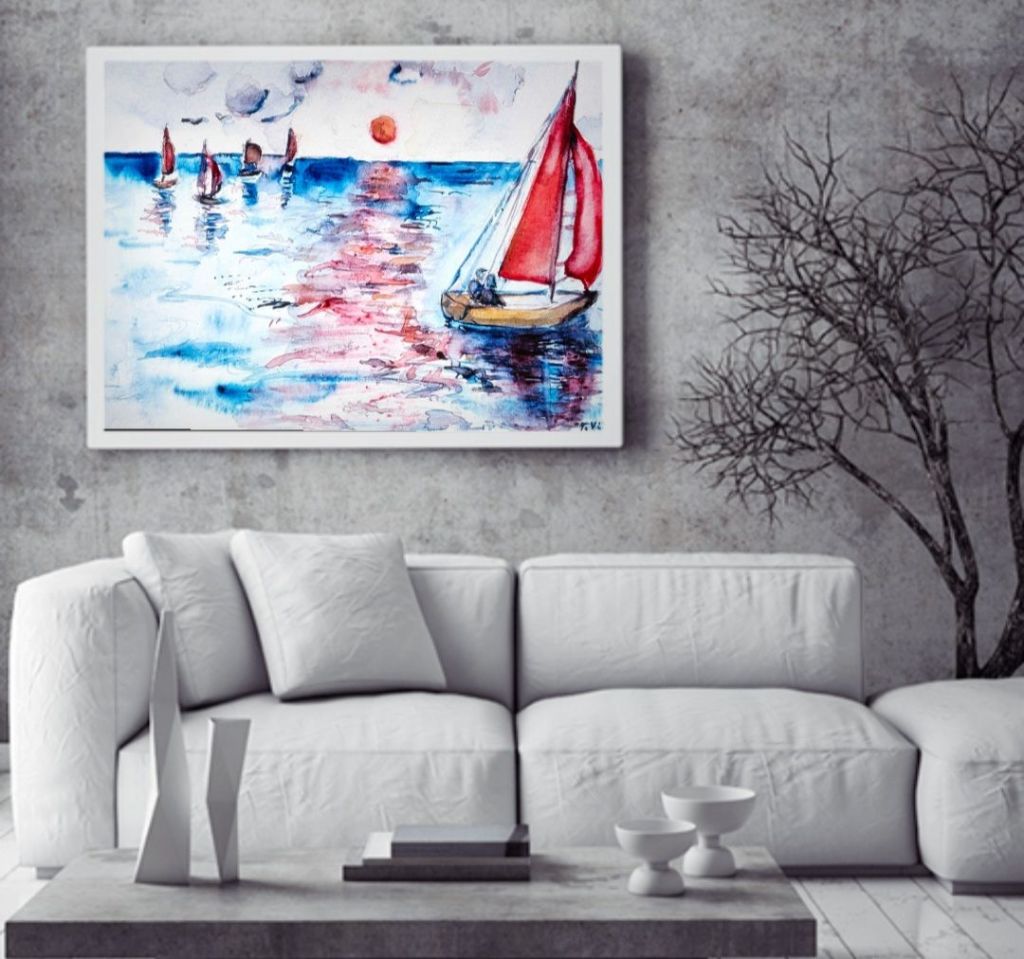
In the foreground, a majestic sailboat sways gently. Its main sail is illuminated by the peachy hue of the beginning of the day. A romantic couple is lost in each other’s gaze. They are nestled within the embrace of this idyllic moment. It is a perfect tableau of love in harmony with nature.
A watercolor painting of sailboats gliding across the shimmering waters at sunrise. It is captured in vibrant hues of red and peach.
Romance on the Water: I imagined a picture with a romantic couple sailing on the foreground. They are lost in each other’s eyes. They glide through the shimmering waters. Their sailboat reflects the vibrant hues of the sunrise, creating a perfect harmony of color and emotion.
I believe that every brushstroke holds a story. My story is about a summer day and that feeling of romantic waves and maybe the samba dance, who knows?:) What memory fuels your next masterpiece?
Let the rhythm of life inspire you to create. What’s your passion? How about dancing like nobody’s watching and painting like you’re in your favorite place? This is about me:)
Let’s celebrate this enchanting scene together. I invite you all to pick up your paints and brushes. Gather your canvases or watercolor paper. Join me in capturing this magical moment. Whether you’re a seasoned artist or a beginner, let’s unleash our creativity. Dive into the world of colors and emotions found in nature.
I love when as the sun wakes up from the horizon, it bathes the sea in enchanting hues of peach. Honestly, I can view it every morning. I never get tired of enjoying this spectacle of the sunrise over the sea. I added some lovely sailboats with vibrant sails billow against the gentle breeze. This creates an exquisite backdrop for a striking seaboard morning regatta. They are captured midst the enchanting dance of the waves. Each crest and trough swirls like the rhythmic steps of a samba. Or this is only my imagination?:)
Who’s ready to paint the magic?
In the foreground, a romantic couple is aboard the main sailboat. They share a tender moment. Their silhouettes are framed against the breathtaking sunrise. The scene is not just a vista. It is an intimate encapsulation of love and adventure. Here, the serenity of the sea meets the warmth of a setting sun.
Samba vibes and sea waves. A vibrant watercolor depiction of two dancers in a samba. It is showcasing the connection between movement and emotion against a backdrop of swirling colors.
Experience romance and creativity as you paint the waves
There are two rhythmic wonders – sea’s waves and samba dance. Imagine the vibrant hues of a peach sunrise reflecting on the waves, where art meets romance,
Every wave whispers a story! Channel your inspirations into your art—let nature and unforgettable moments shape your creativity! What stories do you have to tell?
Whether you are a seasoned painter, I welcome you to dive into this artistic journey with me. Are you a curious novice? I welcome you too. Let us celebrate the beauty of the sea and the magic of sunrises,sunsets infusing our hearts into every stroke.
Paint Your Love Story.
The sea dances with every brushstroke! Join me as we bring the energy of the waves and the warmth of the sunrise to life on paper.
Grab your brushes! We’re diving into a world of colors where waves play and couples sail. Come paint the peach skies with me, and let’s make some unforgettable memories! Join me for a colorful morning by the sea:)
Ready to unleash your inner artist?
Color palette
Inspiration from Nature: Imagine the captivating beauty of the seaboard regatta at sunrise. The sky radiates shades of peach and coral. The waves dance gracefully like a samba, inviting us to join in their joyful movement.
Art is more than just colors on a paper; it’s a celebration of experiences! Go out, explore, and let those vibrant moments inspire your creative work;)
A vibrant color palette showcasing shades of red, peach, and blue. It’s perfect for capturing the essence of a sunrise over the sea.A vibrant watercolor painting shows a serene seaside at sunset. It captures sailboats gliding over the shimmering waves. These boats sail beneath a peach-hued sky.
Soundtrack Inspiration
I was painting and listening to some vibrant songs that capture the essence of samba dance. These songs blend rhythmic beats and lively melodies. My favorite compositions for Samba Waves are “Mas, Que Nada!” – Jorge Ben Jor and “Samba de Uma Nota Só” – Antonio Carlos Jobim.
Wildlife in art
Well, this time I decided that part of my “wildlife” in the painting will be …a romantic couple and maybe some seagulls in the foreground:) Voilà!
Seeking inspiration? Look around you… Memories can turn into the most beautiful creations. Dive deep, find your magic, and paint your heart out:)
Join me in capturing the magic of a seaboard regatta and the beauty of love in our paintings!
A vibrant watercolor sketch of sailboats on serene waters at sunrise, capturing the beauty of peach-hued reflections and artistic inspiration.
A sunrise regatta. Join me for a creative journey. Capture the serenity of the sea at sunrise . #CreateYourStory
Embrace the Rhythm of the Waves: Let’s paint those waves. Feel their rhythm. Let our brushes dance like the samba they create. Each stroke can echo the gentle lapping of the waves and the warm embrace of a sunrise.
I invite you, dear friends and fellow artists, to join me in this enchanting journey. Let us gather our paints, brushes, and hearts to immortalize this picturesque scene. Together, we can translate the beauty of the seaboard regatta at sunrise onto canvas. Our creativity will flow like the waves before us.
Together We Can Create Beauty: Join me in this artistic journey and let’s inspire each other. Comment below if you’re interested in painting this beautiful scene with me!
Share Your Art: After we paint, I encourage everyone to share their creations! Let’s create a vibrant community of artists united by our love for the sea, sunrises, and the romance of life.
Thank you for reading the post. Don’t forget to like, share, and subscribe. These actions will bring you more captivating content about the history of art, nature and architecture.
Embracing the magic of imagination on this beautiful sunny day. #ArtJourney #ArtisticCommunity #ArtInspiration #CreativeJourney #CommunityPainting #CreativeLiving #DancingWaves#Imagination#NatureInspiration #RomanticArt #Samba #SeaVibes #SunriseArt #SunnyVibes #SeaView #SeaWaves #SeaboardRegatta #WildlifeArt #WavePainting
The magic of the holidays is in the making! Join me on this artistic adventure as I explore the captivating world of #TravelVibes #ArtAdventure
All paintings belong to the author. No image is to be copied without permission.
You are welcome to visit my personal website pages. There, you can find out more about the artwork I am offering in oil and watercolor paintings. You can buy canvas prints, framed prints, and more artwork.
For my artist colleagues. Workshops. Embrace Imagination in Online Art Sessions. Holidays spirit for creative community. Join me in artistic journey: sea landscapes and sunrises.
Last week, I had the absolute pleasure of hosting an online art session with my incredibly talented students. Together, we dove into a world of creativity where the theme of our artworks revolved around a lovely mystery.
The only guideline? To connect deeply with our inner child. We embraced this journey with open hearts and minds, letting go of the fear of mistakes. It was a magical experience watching my students tap into their boundless imaginations. Each stroke of their brushes revealed a unique story waiting to be told.
Each piece was a glimpse into their individual worlds, beautifully crafted through the lens of childlike curiosity !:) They brought their creativity to life and crafted their own distinctive summer sea landscapes. Look at their favorite boats glided serenely across the waves. The results were truly impressive, and it was a joy to witness the unique expressions of each artist.
_London, UK
_Toronto, Canada
Exploring the Realm of Creativity
Throughout the session, we fostered an environment of ease—encouraging spontaneity and self-expression. As the session continued, I was in awe of the varied interpretations of the theme. There are paints from vibrant colors to express joy to softer tones, evoking a sense of wonder.
I’m beyond proud of the artistry, resilience, and imagination shown by each participant. This session reminded us all that art is not just about technique, but about expressing what lies within. Here’s to more adventures in creativity together!
The Titles for artworks are amazing:
Artistic expressions of summer sea landscapes showcasing vibrant boats and serene waters.
Each stroke of paint captured the beauty of the summer sea. It also encapsulated the joy and authenticity of every participant. As their guide, I felt an overwhelming sense of pride in their achievements. The vibrant artworks emerged from our virtual studio.
The online session steps.
We started by discussing the elements of a summer sea landscape. We focused on colors, wildlife, and the movement of water. Participants then sketched their ideas and gradually transformed their visions into colorful masterpieces using various techniques like layering and blending.
It’s amazing to see how art can connect us, even while we’re apart, on different continents! I’m already looking forward to our next session and can’t wait to explore more creative horizons together. Stay tuned for updates and more artistic adventures!
Art is about feeling, freedom, and enjoyment, and these young artists truly embodied that spirit in their creations! Each stroke of their brush and every vibrant color they chose spoke volumes of their imagination and passion.
We’re excited to continue nurturing this creativity with our upcoming online art sessions
Hey, Creative Souls!
Are you tired of feeling like your artwork is just a copy of someone else? Ever left a workshop feeling unsure about your unique style? Join me in my community, where I’ll guide you to unlock your true artistic voice!
In my workshops, I focus on helping you create *completely unique pieces* that are truly yours. No two artworks will ever be the same, even if you’re sharing the space with others! Whether you want to express the beauty of nature, I’ll show you how to develop your ideas. You might also want to convey deep feelings of happiness. This process will allow you to confidently sign your name on your creation.
With my step-by-step algorithm, you will learn to break free from the fear of imitation. Plus, it’s all about having fun while we create together!
I can’t wait to see what you’ll make!
Join my Art in Travel Club and let’s explore the endless possibilities of your creativity!
And Feedback!:)
Thrilled to share that the feedback from my online art session. It is amazing to hear such kind words and support from everyone. feeling inspired to keep creating!
¨..you did such a deep-dive into how what we painted represents us so accurately, it was mind blowing. So cool!!¨
“…I really enjoyed your guidance, the fact that you repeated that we can’t make it wrong, which is quite refreshing to hear especially in a world where we have to comply with everything all the time and follow rules and standards. This felt liberating in a way”!
Thank you so much!
Embracing the magic of imagination on this beautiful sunny day. #ArtJourney #ArtisticCommunity #ArtInspiration #ArtWithPurpose #artworkshop #CommunityPainting #creativity #CreativeJourney#CreativeLiving #CreativityUnleashed #happymood#Imagination #InnerChild #OnlineArtSession #originalart #patreon#Positivevibes #SeaVibes #SunriseArt #SunnyVibes #SeaView #SeaWaves #SeaboardRegatta #WavePainting
The magic of the holidays is in the making! Join me on this artistic adventure as I explore the captivating world of #TravelVibes #ArtAdventure
You are welcome to visit my personal website pages. There, you can find out more about the artwork I am offering in oil and watercolor paintings. You can buy canvas prints, framed prints, and more artwork.
For my artist colleagues. Workshops. Holidays spirit for creative community. Join me in artistic journey: sea waves and sunrises.
First, I’ll tell you a story. Once upon a time, I went kayaking at school. Our group paddling on a lake. This lake was once artificially dug by hand, can you imagine? The youth of the city used shovels to dig it more than 80 years ago. I came with my friends to this lake and kayaking. Our classes always took place early in the morning and I saw pink sunrises in autumns’ mornings. When I painted this picture, it reminds about that time and adventure. I recalled the feeling of kayaking. You are sitting in a kayak, waist-deep in water and feel like you are a part of the water element. The waves quietly sparkle around the kayak, the kayak cuts through the water and the waves dance light jazz. You´re kayaking alone in the distance and see your friends are also in kayaks. But at that particular moment there is only you and the water dancing its morning dance and the pink sunrise.
Solo Voyage: A Jazz Overture. A watercolor painting of a kayaker enjoying a serene sunrise on the water, capturing the essence of freedom and nature.
Energy and Emotion
I usually create a vision board featuring images and words that convey the essence of freedom and nature. For this painting, I included kayaking imagery, vibrant sunrise, and jazz musical elements to inspire my creative projects. This is my process and it does work nicely for me. Voila!:)
How are coming into new ideas with your painting series?
What story do you paint in your paintings? What are you painting to recreate the scene from your memory?
Artistic exploration of jazz and nature through watercolor, capturing the essence of solo dance and serene kayaking experiences.
Color palette. Inspiration from Nature.
Two watercolor colors, Carmine and Dioxazine purple, come from the Raspberry palette. They are painted on top of one of my favorite blue colors, Cobalt. This combination gives the feeling of a comfy childhood memory. At the same time, it evokes a joyful feeling of a fresh morning while kayaking. Do you agree? If you like kayaking, what emotions were you experiencing at the time?
A watercolor painting of a kayaker on a shimmering lake, accompanied by a palette of vibrant colors and notes for inspiration.
Soundtrack Inspiration
I was painting and listening to some vibrant songs that capture the essence of solo jazz dance and music. Sea waves and jazz dance share a rhythmic nature and emotional depth. They both have the ability to communicate beyond words. Both are beautiful, natural forms of expression that show the complexity and richness of life. The connection to rhythm and movement is undeniable whether you’re standing on a shoreline. You feel the spray of splashes of water from kayak paddles on your skin. Or you watch a jazz dancer effortlessly glide across a stage. By appreciating these similarities, we can deepen our understanding of the world around us. We celebrate the art of movement in its many forms.
My favorite compositions for A Jazz overture are “Take Five” – The Dave Brubeck Quartet and “Take the a Train” – Duke Ellington Storyville Masters of Jazz – The Sampler
Memory Journal
I even started a memory journal including some childhood and vacations’ memories linked to kayaking, swimming and other water activities. It will be a combination of painting and some writing.
The first light of dawn broke. The sky transformed into a watercolor paper painted in hues of pink raspberry. It spilled warmth over the lake. The gentle and playful waves whispered a sweet jazz melody. I was alone and only my friends were far away close to the horizon. Each stroke against the water sent ripples of freedom coursing through me, a tranquil escape from a daily routine. I could almost hear the jazz melody of the waves or it just my imagination? :)
It invited me to embrace the moment—a fleeting yet infinite remembrance. These were carefree days spent dancing with nature.
Artistic representation of kayaking and jazz dance, showcasing the creative process and inspirations in watercolor.
Harmony of nature and people
I added to the painting my friends’ kayaking group. Rhythm and flow of water is musical composition produced by sea, river or lake. The ebb and flow of waves create a natural melody. Do you agree? :)
Each wave builds up and crashes down in a cyclical pattern. This is very calming and exciting at the same moment like Jazz dance with its rhythms and soft transitions.
The sea dances with every brushstroke. Join me as we bring the energy of the waves and the warmth of the sunrise to life on paper.
#PaintYourStory
Dive into the rhythm of the waves with “Solo Voyage: A Jazz Overture”! Just like the melodies of jazz, this painting captures the soul of the sea and the thrill of kayaking.
Want to learn how to create your own sea landscape masterpiece? DM me for my easy painting algorithm! Let’s make art together! #CreateYourStory
Thank you for reading the post. Don’t forget to like, share, and subscribe. These actions will bring you more captivating content about the history of art, nature and architecture.
Embracing the magic of imagination on this beautiful sunny day. #ArtJourney #ArtisticCommunity #ArtInspiration #CreativeJourney #CommunityPainting #CreativeLiving #DancingWaves#Imagination#JazzInNature#NatureInspiration #PaintWithMe #SeaVibes #SunriseArt #SunnyVibes #SeaView #SeaWaves #WavePainting
The magic of the holidays is in the making! Join me on this artistic adventure as I explore the captivating world of #TravelVibes #ArtAdventure
All paintings belong to the author. No image is to be copied without permission.
You are welcome to visit my personal website pages. There, you can find out more about the artwork I am offering in oil and watercolor paintings. You can buy canvas prints, framed prints, and more artwork.
For my artist colleagues. Workshops. Holidays spirit for creative community. Join me in artistic journey: sea waves and sunrises.
Just finished this vibrant painting of sea waves, and it instantly transported me back to a magical moment in summer. I recall finding a lively street performance in Paris. People danced samba with such energy and passion near the river Seine. It felt like the waves were dancing too! Here’s to capturing those joyful memories through art.
Imagine lovely warm Mediterranean sea. It’s a breathtaking scene when the sun gracefully rises languidly from the horizon. It casts a warm, peach-hued glow over the tranquil waters. The waves, much like spirited dancers performing a samba with vibrant life as they embrace the shoreline.
In the foreground, a majestic sailboat sways gently. Its main sail is illuminated by the peachy hue of the beginning of the day. A romantic couple is lost in each other’s gaze. They are nestled within the embrace of this idyllic moment. It is a perfect tableau of love in harmony with nature.
A watercolor painting of sailboats gliding across the shimmering waters at sunrise. It is captured in vibrant hues of red and peach.
Romance on the Water: I imagined a picture with a romantic couple sailing on the foreground. They are lost in each other’s eyes. They glide through the shimmering waters. Their sailboat reflects the vibrant hues of the sunrise, creating a perfect harmony of color and emotion.
I believe that every brushstroke holds a story. My story is about a summer day and that feeling of romantic waves and maybe the samba dance, who knows?:) What memory fuels your next masterpiece?
Let the rhythm of life inspire you to create. What’s your passion? How about dancing like nobody’s watching and painting like you’re in your favorite place? This is about me:)
Let’s celebrate this enchanting scene together. I invite you all to pick up your paints and brushes. Gather your canvases or watercolor paper. Join me in capturing this magical moment. Whether you’re a seasoned artist or a beginner, let’s unleash our creativity. Dive into the world of colors and emotions found in nature.
I love when as the sun wakes up from the horizon, it bathes the sea in enchanting hues of peach. Honestly, I can view it every morning. I never get tired of enjoying this spectacle of the sunrise over the sea. I added some lovely sailboats with vibrant sails billow against the gentle breeze. This creates an exquisite backdrop for a striking seaboard morning regatta. They are captured midst the enchanting dance of the waves. Each crest and trough swirls like the rhythmic steps of a samba. Or this is only my imagination?:)
Who’s ready to paint the magic?
In the foreground, a romantic couple is aboard the main sailboat. They share a tender moment. Their silhouettes are framed against the breathtaking sunrise. The scene is not just a vista. It is an intimate encapsulation of love and adventure. Here, the serenity of the sea meets the warmth of a setting sun.
Samba vibes and sea waves. A vibrant watercolor depiction of samba dancers celebrating life and rhythm, capturing the essence of movement and joy.
Experience romance and creativity as you paint the waves
There are two rhythmic wonders – sea’s waves and samba dance. Imagine the vibrant hues of a peach sunrise reflecting on the waves, where art meets romance,
Every wave whispers a story! Channel your inspirations into your art—let nature and unforgettable moments shape your creativity! What stories do you have to tell?
Whether you are a seasoned painter, I welcome you to dive into this artistic journey with me. Are you a curious novice? I welcome you too. Let us celebrate the beauty of the sea and the magic of sunrises,sunsets infusing our hearts into every stroke.
Paint Your Love Story.
The sea dances with every brushstroke! Join me as we bring the energy of the waves and the warmth of the sunrise to life on paper.
Grab your brushes! We’re diving into a world of colors where waves play and couples sail. Come paint the peach skies with me, and let’s make some unforgettable memories! Join me for a colorful morning by the sea:)
Ready to unleash your inner artist?
Color palette
Inspiration from Nature: Imagine the captivating beauty of the seaboard regatta at sunrise. The sky radiates shades of peach and coral. The waves dance gracefully like a samba, inviting us to join in their joyful movement.
Art is more than just colors on a paper; it’s a celebration of experiences! Go out, explore, and let those vibrant moments inspire your creative work;)
A vibrant palette showcasing a range of colors, perfect for capturing the beauty of sunrises and sea waves.A vibrant watercolor showcasing sailboats at sunset, reflecting hues of peach and red in the serene waters.
Soundtrack Inspiration
I was painting and listening to some vibrant songs that capture the essence of samba dance. These songs blend rhythmic beats and lively melodies. My favorite compositions for Samba Waves are “Mas, Que Nada!” – Jorge Ben Jor and “Samba de Uma Nota Só” – Antonio Carlos Jobim.
Wildlife in art
Well, this time I decided that part of my “wildlife” in the painting will be …a romantic couple and maybe some seagulls in the foreground:) Voilà!
Seeking inspiration? Look around you… Memories can turn into the most beautiful creations. Dive deep, find your magic, and paint your heart out:)
Join me in capturing the magic of a seaboard regatta and the beauty of love in our paintings!
A vibrant watercolor painting showcasing a sunrise regatta, with sailboats gliding over shimmering waters, reflecting hues of peach and coral.
A sunrise regatta. Join me for a creative journey. Capture the serenity of the sea at sunrise . #CreateYourStory
Embrace the Rhythm of the Waves: Let’s paint those waves. Feel their rhythm. Let our brushes dance like the samba they create. Each stroke can echo the gentle lapping of the waves and the warm embrace of a sunrise.
I invite you, dear friends and fellow artists, to join me in this enchanting journey. Let us gather our paints, brushes, and hearts to immortalize this picturesque scene. Together, we can translate the beauty of the seaboard regatta at sunrise onto canvas. Our creativity will flow like the waves before us.
Together We Can Create Beauty: Join me in this artistic journey and let’s inspire each other. Comment below if you’re interested in painting this beautiful scene with me!
Share Your Art: After we paint, I encourage everyone to share their creations! Let’s create a vibrant community of artists united by our love for the sea, sunrises, and the romance of life.
Thank you for reading the post. Don’t forget to like, share, and subscribe. These actions will bring you more captivating content about the history of art, nature and architecture.
Embracing the magic of imagination on this beautiful sunny day. #ArtJourney #ArtisticCommunity #ArtInspiration #CreativeJourney #CommunityPainting #CreativeLiving #DancingWaves#Imagination#NatureInspiration #RomanticArt #Samba #SeaVibes #SunriseArt #SunnyVibes #SeaView #SeaWaves #SeaboardRegatta #WildlifeArt #WavePainting
The magic of the holidays is in the making! Join me on this artistic adventure as I explore the captivating world of #SummerVibes #ArtAdventure
You are welcome to visit my personal website pages. There, you can find out more about the artwork I am offering in oil and watercolor paintings. You can buy canvas prints, framed prints, and more artwork.
All paintings belong to the author. No image is to be copied without permission.
For my artist colleagues. Workshops. Holidays spirit for creative community. Paint your world.
Just finished a new piece for my sea project that brings the calm of the sea to life! Check out this bird’s eye view of a bright green boat gently rocking on the waves.
This lemony beauty captures the essence of summer bliss
Under the crystal-clear water, you can spot lovely stones, softened by time and tide. The waves roll onto the shore with a grace that feels like they’re dancing to a medieval minuet. Sometimes, we need to pause and appreciate the tranquility that nature offers. Can you feel the peace? Let me know what you think!
Color palette
A vibrant yellow-greenish vessel draws attention. Its hue is a harmonious blend of yellow and indigo. This evokes the refreshing essence of lemon-lime. It is reminiscent of the delicate color of ripe green grapes.
I was using a limited palette, a mixture of indigo, yellow, ultramarine, and orange.
Soundtrack Inspiration
I once attended a festival in Venice. I found myself in a hall where actors were dancing a medieval minuet. I felt a quiet joy at that moment. I hope this image of a greenish boat rocking on the waves of the sea will evoke the same feeling.
Lost in a sea of dreams where the green boat floats and the waves dance to their own Minuet.
The waves dance softly near the boat and the rocks, creating a symphony of nature that feels like pure magic
Each gentle lapping sounds like a whisper from the sea. It invites us to pause and breathe in the beauty around us. Watching the water embrace the shore is calming. It reminds us to find peace in the rhythm of life. Here’s to chasing sunsets and soaking in every tranquil moment! My favorite compositions are “The Four Seasons: Winter, RV 297: II. Largo” – Antonio Vivaldi and “Clair de Lune” – Claude Debussy
An artistic interpretation featuring figures in motion, capturing the essence of dance against a soft, textured background.
Wildlife in art. School of Fish
Wildlife in a painting is always a cool idea. A bird’s eye view of a school of fish is truly captivating.
What’s your favorite way to bring nature into your life and art?
A captivating bird’s eye view of a school of fish in tranquil waters.
Picture yourself on that boat, feeling the warm sun and gentle breeze. What if today is the day you start creating your own magic? #CreateYourStory
I invite you to join me on this artistic journey. Together, let us create a series that celebrates the beauty of the sea. Let’s foster connection. We can inspire others to cherish the natural world around us. We’ll blend art and relaxation. Grab your paints; we’re about to make Waves
Thank you for reading the post. Don’t forget to like, share, and subscribe. These actions will bring you more captivating content about the history of art, nature and architecture.
Embracing the magic of imagination on this beautiful sunny day. #SunnyVibes #SeaDreams #Imagination”#WildlifeArt #NatureInspiration #BirdsEyeView #ArtWithPurpose #ArtInspiration #SeaView #PeacefulMoments
The magic of the holidays is in the making! Join me on this artistic adventure as I explore the captivating world of #TravelVibes #ArtAdventure
All paintings belong to the author. No image is to be copied without permission.
You are welcome to visit my personal website pages. There, you can find out more about the artwork I am offering in oil and watercolor paintings. You can buy canvas prints, framed prints, and more artwork.
✦ This is Part 2 of the Vibrant Sea Landscapes series. In Part 1 I shared the story behind this painting — the inspiration, the color palette, and the Charleston connection. Here you’ll find the full step-by-step workshop. Grab your paints!
For my artist colleagues. Workshops. Holidays spirit for creative community. Paint your world.
I documented the main stages of the painting—from sketching to layering colors. Hope you appreciate seeing the evolution of a piece. I have a simple algorithm of 10 steps. Let’s warm up first:) I feel like a child, surrounded by bright colors in my studio and at the beach:)
Step 1. Color palette
I am using a limited palette, a mixture of cobalt, ultramarine, and orange.
I’m drawing inspiration from the colors of berries and fruits. Expect vibrant hues that bring these sea landscapes to life. Let’s mix it up! Would love to hear your thoughts:)
Interestingly, in English, “orange” refers to both a fruit and a color, while other languages have separate words for each. I refer to this color as the fruit orange. “Orange sunset” sounds tasty, doesn’t it? :)
Step 2. Draftof birds
Primarily I was drawing seagulls in motion, soaring through the sky to convey a sense of freedom and movement. And occasionally I featured a hawk known as the Osprey, orsea hawk, which is known for catching fish. Never heard about this bird before… Painting is relaxing fun, always something new to learn:) Love to hear your funny stories during the painting process!
Step 3. Draft of boats
So on my photo reference the yacht is tranquil and a little bit boring. Not a problem, I added wind to my painting and voila— the yacht is moving towards distant shores.
Where is my yacht headed, and who is aboard?
Step 4. Soundtrack Inspiration
How about playing music while painting? Do you like it? I love it.
It captures the essence of sea and any imaginary story’s sounds, for this art is Charleston music! :) This rhythm can influence your brushwork and composition.
Similarly, there are some emotions linked with both the sea and the dance. How does the sight of the waves in motion resonate with you? Does it evoke joy or a sense of freedom? Maybe nostalgia?
Likewise, both are forms of expression that echo life’s rhythms. This serves as a metaphor. It merges the fluidity of sea waves with the rhythm of dance in the jazz age. Paint it like a lively Charleston—dynamic, energetic, and full of life!:)
Just listen to any Charleston music and your brush will do various brush techniques—including swirling, dabbing, and stippling—enhanced the illusion of movement in the wave paintings :)
At the end of the post, I will share my favorite list of Charleston compositions that you can find on YouTube.
Step 5. Color of yacht
Then adding color to the yacht. I chose vibrant bright orange, making it stand out against the sunset backdrop. The shadows of the yacht were painted in a mixture of ultramarine and orange.
Step 6. The 1st layer of sea, foam and waves
The foam shadow was painted with hints of a mixture of all three colors—cobalt, ultramarine, and orange—to capture the sunlight. I also left some white paper on top of the foam for contrast. Love catching the essence of the sea through art.
Step 7. The 1st layer of sky and clouds
Similarly, adding color to the sky. I was using a wet technique and adding a horizontal line. I left white spots on paper to give the clouds volume.
Step 8. The 2nd layer for sky, sea, foams and reflections
I used a gradient of warm hues for the sunset. The gradient starts with orange and lighter tones. I added blues as I moved upwards toward the sky.
For the sea, I incorporated a rich palette of blues, mixing ultramarine and cobalt to show the sea colors.
Step 9. Details for sea, yacht and birds
The main idea was to show the movement of the water. I employed swirling brush strokes to capture the water’s restless energy. The reflections in the water depict how the colors of the sunset and the yacht are mirrored beneath the waves.
Waves roll and splash joyfully. To add a bright spot, I painted an orange yacht sailing away in the strong wind.
I also added some color for seagulls circling above, their bodies glowing orange against the cloudy sky.
Step 10. Cool down
Adding some details for birds, decide what the name will be for the artwork and put the signature. Voila:)
I am capturing the essence of the sea upon my watercolor paper. Its waves are crashing gracefully. Meanwhile, an orange yacht sails onward toward the horizon of distant lands. What tale does this scene whisper?
It depicts an enchanting couple aboard the yacht. They are lost in a lively dance of the Charleston. Their laughter mingles with the sound of the waves. Who can truly say?This is my story. Can you tell me your story?:)
Every wave tells a story. Catch yours on paper! Keep an eye out for updates, sneak peeks, and finished pieces as we celebrate summer through sea landscapes.
I invite you to join me on this creative adventure. Together, let us create a series that celebrates the beauty of the sea. Let’s foster connection. We can inspire others to cherish the natural world around us. We’ll blend art and relaxation. Grab your paints; we’re about to make waves!
Thank you for reading the post. Don’t forget to like, share, and subscribe. These actions will bring you more captivating content about the history of art, nature and architecture.
Below is Soundtrack Inspiration. The list of compositions shows how the rhythm of the waves mimics the upbeat tempo of the Charleston music. Both evoke a sense of joy and liberation.
1. “Let’s twist again”-Chubby Checker California Jubilee
2. “Sway Dancing”-Rita Hayworth
3. “Hit the Road Jack”- Ray Charles
4. “It Don’t Mean a Thing (If It Ain’t Got That Swing)” – Duke Ellington
5. “Take the ‘A’ Train” – Duke Ellington
6. “Cheek to Cheek” – Ella Fitzgerald & Louis Armstrong
For my artist colleagues. Workshops. Holidays spirit for creative community. Paint your world.
Summer is officially here! I have an exciting plan to create a series of paintings depicting seascapes. I will explore these landscapes under various weather conditions, times of day, and seasons.
Some artworks will be done outdoor, on the beach (“en plein air’), while others will be created in my studio. Follow along for behind-the-scenes insights and my creative process as I navigate both worlds! Get ready for some exciting connections to dance!
What is your process of creating an imaginary artwork?
Wave in Rhythm: A sunset story is my first artwork with an imaginary sunset scene over the sea. It is illuminated by the setting sun. I captured the clouds from my photo reference that I took last week.
Waves in Rhythm: A Sunset Story. The painting is vibrant and full of colors. It depicts a sailboat with orange sails against a sunset over the sea. The artwork captures the essence of a lively Charleston dance.
Color palette. I was using a limited palette, a mixture of cobalt, ultramarine, and orange.
A vibrant color palette featuring ultramarine, transparent orange, and cobalt paints, showcasing the artist’s tools for creating seascapes.
Interestingly, in English, “orange” refers to both a fruit and a color, while other languages have separate words for each. I refer to this color as the fruit orange. “Orange sunset” sounds tasty, doesn’t it? :)
Soundtrack Inspiration
How about to play music while painting? Do you like it? I love it .
It captures the essence of sea and any imaginary story’s sounds, for this art is Charleston music! :) This rhythm can influence your brushwork and composition.
Similarly, there are some emotions linked with both the sea and the dance. How does the sight of the waves in motion resonate with you? Does it evoke joy or a sense of freedom? Maybe nostalgia?
An artistic depiction shows a couple dancing the Charleston. They are against a backdrop of dynamic waves. This scene captures the lively spirit of summer.
Likewise, both are forms of expression that echo life’s rhythms. This serves as a metaphor. It merges the fluidity of sea waves with the rhythm of dance in the jazz age. Paint it like a lively Charleston—dynamic, energetic, and full of life!:)
Just listen any Charleston music and your brush will do various brush techniques—including swirling, dabbing, and stippling—enhanced the illusion of movement in the wave paintings :)
At the end of post, I will share my favorite list of Charleston compositions that you can find on YouTube.
I am capturing the essence of the sea upon my watercolor paper. Its waves are crashing gracefully. Meanwhile, an orange yacht sails onward toward the horizon of distant lands. What tale does this scene whisper?
It depicts an enchanting couple aboard the yacht. They are lost in a lively dance of the Charleston. Their laughter mingles with the sound of the waves. Who can truly say?This is my story. Can you tell me Your story?:)
I invite you to join me on this artistic journey. Together, let us create a series that celebrates the beauty of the sea. Let’s foster connection. We can inspire others to cherish the natural world around us. We’ll blend art and relaxation. Grab your paints; we’re about to make waves!
Thank you for reading the post. Don’t forget to like, share, and subscribe. These actions will bring you more captivating content about the history of art, nature and architecture.
Every wave tells a story; Let’s make waves together! Keep an eye out for updates, sneak peeks, and finished pieces as we celebrate summer through sea landscapes.
The magic of the holidays is in the making! Join me on this artistic adventure as I explore the captivating world of #TravelVibes #ArtAdventure
All paintings belong to the author. No image is to be copied without permission.
Below is Soundtrack Inspiration. The list of compositions shows how the rhythm of the waves mimics the upbeat tempo of the Charleston music. Both evoke a sense of joy and liberation.
1. “Let’s twist again”-Chubby Checker California Jubilee
2. “Sway Dancing”-Rita Hayworth
3. “Hit the Road Jack”- Ray Charles
4. “It Don’t Mean a Thing (If It Ain’t Got That Swing)” – Duke Ellington
5. “Take the ‘A’ Train” – Duke Ellington
6. “Cheek to Cheek” – Ella Fitzgerald & Louis Armstrong
For my artist colleagues. Workshops. Holidays spirit for creative community. Paint your world.
Closed eyes, two brushes, one otherworldly being. Ready to meet a new best alien buddy? My imagination went wild after a sci-fi movie marathon and a very relaxing painting process. I obsessed with sci-fi and the magic of bringing alien worlds to life. This sentiment echoes Ray Bradbury The Martian chronicles, particularly Night meeting and movie E.T. the Extra-Terrestrial (at the end of the post, the links for the book and movie are provided.)
I’ve created an E.T.-inspired creature that’s just…well, *out of this world*. Think big eyes, adorable features, but with a twist! What do you think my little alien looks like?:) Imagine Allen, a gentle creature from another world, experiencing the beauty of nature for the very first time.
Transformation of a chaotic watercolor into a whimsical alien creature, showcasing the journey from abstract to imaginative art.
At first glance, it’s abstract. A collision of green and pink, a dance of light and shadow. But look closer… Do you see it? A creature emerges from the chaos, a being both alien and strangely familiar. I added blue to show blue colors of oceans and rivers.
This alien, painted with a touch of cosmic chaos, embodies curiosity and wonder, much like the ancient Greek gods. Is she ( I believe it’s a girl:) one of them? Her gaze reflects the beauty of our planet. The smiling sea and clear skies are part of this beauty. Those sea-blue eyes and mountain-like cheeks, head with rivers and lakes are just admiring our beautiful Earth. What do you see in her eyes?
A creative representation of an alien face intertwined with nature, embodying curiosity and connection to Earth.
The technique watercolor clausura is amazing. It sparks countless ideas. These ideas echo in your memory. Inspired by ancient Greek gods & sci-fi books and movies, my alien painting explores curiosity & wonder. My alien’s smile, reflecting the sea & sky, reminds us of the wonder in the unfamiliar. What myths & stories inspire your art?
A watercolor painting of an alien creature. It has oversize blue eyes and a colorful, Earth-like texture. The painting embodies curiosity and a connection to nature.
This creature, born from a blind painting with closed eyes, two brushes, two watercolor paints, shares that same gentle curiosity. Its eyes, pools of deep blue, seem to gaze out at our world with a mixture of wonder and understanding. Its head and cheeks are sculpted by the accidental strokes of the brush. They are like miniature mountains and rivers. They are a testament to the beauty and resilience of nature. It’s a being that seems to admire the Earth, to appreciate the very chaos from which it was born. Do you like this technique? Please share your comments – would love to read them!
Ever wondered what an alien’s perspective on Earth would be? Let’s find out! Join me in a closed-eyes painting experiment. Share your creations using #ArtChallenge.
This painting isn’t just about colors and shapes. It’s about the unexpected result and ideas you find when you let go of control. It’s about embracing the unknown.My alien, adorned with mountain ranges, invites you to share your own artistic visions. What inspires you? Let’s connect & create!
Thank you for reading the post. Don’t forget to like, share, and subscribe. These actions will bring you more captivating content about the history of art and architecture.
Unleash your inner child! Close your eyes, grab some paint, and let your emotions flow onto the canvas. You might surprise yourself with what emerges. Art Beyond Earth: Explore Sci-fi Cosmic Creativity.
The magic of the holidays is in the making! Join me on this artistic adventure as I explore the captivating world of Clausura. Let’s inspire each other! #Clausura #HolidaySpirit #ArtInspiration #CreativeCommunity
All paintings belong to the author. No image is to be copied without permission.
You are welcome to visit my personal website pages. There, you can find out more about the artwork I am offering in oil and watercolor paintings. You can buy canvas prints, framed prints, and more artwork.
For my artist colleagues. Workshops. Holiday spirit for creative community. How about to dive into a world of color?
Are you ready to unleash your inner artist and let the colors flow? In today’s post, I am exploring the captivating world of watercolor clausura. I learned this in my watercolor course many years ago. This is my favorite technique especially during this Magic Holidays period.
The watercolor painting with Clausura technique captures the serene beauty of a scuba diver. The diver explores a vibrant sea kingdom, teeming with life appearing from nowhere:)
Before and After. Scuba diving and Marine life
How? I will share my experiments with this magic technique. You need two brushes. Choose two of your favorite watercolor paints. Get some watercolor paper (300 g). Put on your favorite music with headphones. Most importantly, make sure you have time. Close your eyes and paint with two brushes, completely spontaneously!
Before. What is it? Looks like Marine life, some fishes and a face of a person;)
As the colors blend and dance across the canvas, immerse yourself in the moment. Savor the joy of artistic expression. When you’re finished, take a moment to pause and listen – the painting just whispers something special to you. And if you’re unsure of what the painting is trying to tell you, don’t worry. Try shifting your perspective – turn the painting from vertical to horizontal, or view it from top to bottom. Sometimes, the true beauty of the art reveals itself in unexpected ways.
And your watercolor clausura painting may just shock you with its oddly charming beauty—like the artsy cousin of your stick figures—much like this delightfully dramatic scene of scuba diving and marine life.
After, with imagination painting. Scuba diving and Marine life
So, grab your brushes, embrace the spontaneity, and let the music and colors guide you on a one-of-a-kind artistic journey. Are you ready to discover what your inside voice has to say through the captivating art of watercolor clausura? Let’s dive in and unleash our creativity together!
This is a spontaneous and freeing painting technique. It will ignite your creativity! To start, grab two watercolor brushes and two of your favorite colors. Whether you prefer a dry or wet paper, the choice is yours. Now, close your eyes and immerse yourself in the soothing melodies of your favorite music. Let the rhythm guide your hand as you paint.
For my artist colleagues. Workshops. Holidays spirit for creative community. Intuitive art, and timeless tale.
I am sharing my artistic journey, highlighting the process and inspirations. The creative process is spontaneous, intuitive and enjoyment! My next funny artwork has the connection between art and literature.
Before and after: a watercolor transformation showcasing the artistic journey from abstract to the detailed fox artwork.
Painting with eyes closed, using two brushes, led to a surprising “Fox & Roosters” artwork. In my earlier posts, I described the unique process of watercolor clausura. It involves painting intuitively with eyes closed, using two hands and two brushes. A suggestion for any artist, just step outside a comfort zone – you might discover hidden ideas!:)
What is it? For me it looks like a little fox with its sly eyes and sharp ears! It was inspired by La Fontaine’s “The Raven and the Fox” depicts a scene where the fox outwits the rooster:)
Honestly, before this, I had never drawn roosters or foxes. Then, I saw the outline of a cunning fox’s face. What do these outlines remind you of? I reread this fable with eternal truths, in a beautiful version of French poetry.
The resulting outlines of this experiment is the fox’s face show the triumph of cunning. It based on the beautiful French poetic La Fontaine’s fable “The Raven and the Fox”. (Le coq et le renard, II.15) . And the oldest Greek fable “The Cock, the Dog and the Fox” by Aesop. (Ο πετεινός και η αλεπού Οι Μύθοι του Αισώπου). (at the end of the post, the links for the tales are provided.)
Both fables are about the same message, the timeless and universal appeal of a truth as old as time. The rooster’s empty-handedness highlights the importance of outsmarting those who are too clever. And it leaves the fox empty-handed:)
The moral is to outwit a too cunning fox, eternal truths that can be applied in life. Appearances can be deceiving. Sometimes, the sweetest words hide the sharpest claws.
Yes, experience of the connection between art and literature is the unexpected!
Well… my imagination plus my hands themselves painted something that I would never have thought of or remembered. Art merged with poetry and classical literature. This combination gave me the opportunity for a new experience to paint unusual objects. These ideas were in my own head, which is much more interesting. If someone is lack of art ideas what to paint next topic or plot- here you go!:)
After, with imagination painting. Fox and Roosters. Don’t let a charming smile fool you:) The cunning fox’s face emerged unexpectedly, a testament to the power of imagination:) Voila
How about an idea of series of paintings with other La Fontaine fables with strong moral lessons. I think it can lead to very interesting experiment:) Where art meets fable.
Sometimes the beauty of this approach lies in its spontaneity and unexpected results. Don’t be afraid to experiment and let your imagination guide you. The combination of your intuitive painting style and your literary inspiration is a unique and powerful creative force. Hope it helps my artist colleagues with multiple ideas for paintings:)
Unleash your inner artist and experience the unexpected!
Thank you for reading the post. Don’t forget to like, share, and subscribe. These actions will bring you more captivating content about the history of art and architecture.
The magic of the holidays is in the making! Join me on this artistic adventure as I explore the captivating world of #TravelVibes #ArtAdventure
All paintings belong to the author. No image is to be copied without permission.
You are welcome to visit my personal website pages. There, you can find out more about the artwork I am offering in oil and watercolor paintings. You can buy canvas prints, framed prints, and more artwork.
For my artist colleagues. Workshops. Holidays spirit for creative community. A vibrant explosion of color, rhythm, and unexpected artistry at the Crocodile & Dance Festival!
I am continuing to create a series of wildlife artwork while “blindfolded”. I use two brushes in two hands and two paints:) I call this series watercolor clausura. There is another completely unexpected and funny accident!
What is this? Looks like a vibrant-colored and round dance:)
When I saw this sketch, it reminded me of a Matisse painting. The vibrant Matisse colors and flowing fabrics caught my attention. I also recognized the crocodile-like forms, what do you think?
Initially, it was an idea that looked like a crocodile birthday painting with Matisse’s palette. Sometimes, you need to allow yourself to be a child with pure, bright tones. It was a festival of colors, with the muzzle of a crocodile. It felt like two crocodiles were dancing. Doesn’t it resemble a dance?
This is the magic of imagination. Crocodiles and Dance Festival. Crocodiles are round dancing or maybe twist. The swirling lines and bold colors of a Matisse painting sparked my imagination. I envisioned a crocodile birthday party, where the creatures seemed to dance across the canvas.
Or maybe it is a romantic evening in a surreal dream escape? I even hear the rhythm and tempo that would suit a crocodile dance, musical piece inspired by this image. Something playful, with a slightly jazzy or Latin feel:) I even did some crocodile research! Do you know the alligators and crocodiles are not the same creatures? Their behavior, habitats, and even their movements inspired a new artistic idea:)
Before and After. Crocodiles and a Dance Festival One person sees two dancing crocodiles. Another maybe sees abstract shapes or simply a vibrant color scheme.
As the artist, I see the symbolic power of animals. Crocodiles, often linked to danger and primal power, are here transformed into playful dancers. This symbolic shift highlights the malleability of meaning. Artistic representation reshapes our understanding of the world.
Crocodiles and a Dance Festival, it is my Matisse-Inspired mashup. The first spark came from a surprising source. It was a childlike rendering of a crocodile’s birthday, reminiscent of a Matisse painting. The vibrant, pure tones conjured a different image. They suggested not just a birthday celebration but a lively dance. The almost abstract lines, characteristic of Matisse’s style, unexpectedly changed. They formed the sinuous curves of two crocodiles. The crocodiles are locked in a playful, almost balletic, embrace. Doesn’t it resemble a dance? Absolutely!
Crocodiles & Carnival! This vibrant design started as a playful idea – a Matisse-inspired crocodile birthday, bursting with pure, festival colors!
As for me, the Matisse influence is key. His bold use of color shapes the whimsical nature of this imagined festival. He simplifies forms skillfully. He evokes emotion through seemingly simple lines. The crocodiles, rendered in a style echoing Matisse’s cut-outs, as symbolic figures. They represent primal energy that harmonizes with the celebratory spirit of the dance.
For the art enthusiasts. Maybe I will do a new Matisse-Inspired crocodile dance series, do you like this idea? I will develop a series of artworks inspired by Matisse’s style. These will feature dancing crocodiles. Each piece will show a different dance style. Another idea is exploring different dance styles – from ballet to modern to folk dances, or mood, who knows? It is an amazing technique. You paint something unusual with closed eyes, both hands, and two colors. Then something magical happens. Well, it looks like Matisse meets the Nile. The “Crocodile Dance Festival” is a fusion of the unexpected. This festival promises a vibrant and unforgettable experience. It’s a testament to the power of imagination. A childlike rendering combines with an artistic vision. This collision creates something entirely new and captivating.
Art, dance, and a touch of the wild! A vibrant artwork of dancing crocodiles at the Crocodile & Dance Festival, showcasing playful colors and joyful spirits.
The Crocodile & Dance Festival promises an unforgettable experience. Share this with a friend who needs a dose of fun!
Thank you for reading the post. Don’t forget to like, share, and subscribe. These actions will bring you more captivating content about the history of art and architecture.
The magic of the holidays is in the making! Join me on this artistic adventure as I explore the captivating world of #TravelVibes #ArtAdventure
You are welcome to visit my personal website pages. There, you can find out more about the artwork I am offering in oil and watercolor paintings. You can buy canvas prints, framed prints, and more artwork.
All paintings belong to the author. No image is to be copied without permission.
For my artist colleagues. Workshops. Holidays spirit for creative community. Find your flow: Discover intuitive art.
Blindfolded, two brushes, two paints, and a whole lot of happy accidents! My baby elephant with a dreamy look was created from my memory in Rome. This happened when I looked at Bernini’s statue Elephant and Obelisk( Obelisco della Minerva).
A comparison of the watercolor technique showcasing the transformation of abstract blue strokes into a charming baby elephant portrait.
I looked at my “art” that I did with closed eyes, 2 brushes technique. My imagination helped to find that this is a baby elephant with dreamy eyes:). I looked at photos of African wildlife. I explored some surrealist art and cartoons for inspiration. This is my tip, the key is to have fun and let your creativity flow. The clausura technique with closed eyes is already a playful approach. Embrace the unexpected results. Let them guide your artistic journey. Don’t worry about creating perfect representations; focus on capturing the essence and personality of each animal in your unique style.
Before. What is it? It looks like an elephant for me:)
Painting a blue elephant with the clausura technique (blind contour painting with two brushes and closed eyes) is inherently funny. It sets a great tone for a wildlife series. Let’s brainstorm some ideas to build on this together:)
This little blue elephant with dreamy eyes channels my inner Bernini. It has less Baroque drama and more goofy charm. It is the first in a series exploring the unexpected – African wildlife! Who knew closed eyes and clausura could lead to a safari adventure? Is this a dream? Maybe it’s just the beginning of a wild ride! Usually I do not limit myself to realistic backgrounds. I am using abstract shapes, bold colors, or even incorporate found objects into the paintings.
Another tip, be brave and experiment with color palettes and different color combinations. Unexpected colors are fun!:) bright pink giraffe, a lime green lion, or an orange zebra, why not?:)
How about a “surreal safari” – animals in unexpected colors or situations. A pink giraffe in a polka-dot landscape, a lime-green lion lounging on a rainbow, etc. The clausura technique will add to the whimsical nature. As an artists we might give each animal a distinct personality. Use posture and expression to achieve this. Even with closed eyes, you can convey personality through brushstrokes.
This little baby elephant has a dreamy look. It is painted with watercolor clausura techniques. This artwork captures the quiet magic of the predawn light.
One of my rules is not to be afraid to make mistakes. Mistakes may add to the humor and charm of your work. This blue baby elephant maybe a fantastic starting point for a truly unique and memorable artistic journey , who knows?;)
A whimsical watercolor painting of a baby elephant, showcasing dreamy blues and playful brushstrokes, perfect for inspiring creativity in art.
Thank you for reading the post. Don’t forget to like, share, and subscribe. These actions will bring you more captivating content about the history of art and architecture.
The magic of the holidays is in the making! Join me on this artistic adventure as I explore the captivating world of #TravelVibes #ArtAdventure
All paintings belong to the author. No image is to be copied without permission.
You are welcome to visit my personal website pages. There, you can find out more about the artwork I am offering in oil and watercolor paintings. You can buy canvas prints, framed prints, and more artwork.
For my artist colleagues. Workshops. Holidays spirit for creative community.
Feeling stuck? Try a 2-brush, 2-paint challenge! You might surprise yourself with the beauty you uncover. and please share your creations!
Let’s continue to learn about clausura: where creativity meets tradition
Clausura: A History of Creativity. In the 16th century, the first academies of architecture and art in Europe set the groundwork for student evaluations. They assessed true knowledge and skills in a rather unusual way.
At the end of the semester, students entered separate rooms where they were locked up. This process, known as clausura, tested their creativity and abilities in drawing, painting, and sculpture. This system led to the creation of graphic images and layouts known as clauses. These clauses became the visual representation of a student’s creativity and talents. Today, clausura legacy continues through practical assessments. It also persists in creative evaluations in art and architecture schools globally.
Before and After. Wildlife, sunset and palms. Transformation of a watercolor painting, showcasing the evolution from ‘Before’ to ‘After’ with vibrant colors and artistic techniques.
Let your imagination run wild! What creatures do you see in this piece? Tell me in the comments:)
This is what I see: Golden hour magic. Two cheeky monkeys are totally captivated by the evening twilight! Painted with watercolor and the *clausura* technique, this piece captures the serenity and vibrancy of the sunset. What’s your favorite part of the day? What’s your favorite thing about sunsets? Mine is definitely the way they paint the sky! This palm tree art perfectly captures that feeling.
This painting just *happened*. It is a spontaneous explosion of color and emotion. The artwork captures more than just a scene. It conveys the pure, awe-inspiring feeling of being there.
Bringing the wild to life, one brushstroke at a time. The process of creating this piece is truly inspiring me.
The clausura history highlights how important practical assessments are. Hands-on evaluations are crucial to accurately gauge a student’s skills and abilities.
The next time you see a stunning painting, remember that it might be the result of a tradition. A breathtaking sculpture or an awe-inspiring building might also have origins in tradition. This tradition dates back to the 16th century.
Relaxing place in a home with sunset and wildlife painting
Thank you for reading the post. Don’t forget to like, share, and subscribe. These actions will bring you more captivating content about the history of art and architecture.
The magic of the holidays is in the making! Join me on this artistic adventure as I explore the captivating world of #TravelVibes #ArtAdventure
All paintings belong to the author. No image is to be copied without permission.
You are welcome to visit my personal website pages. There, you can find out more about the artwork I am offering in oil and watercolor paintings. You can buy canvas prints, framed prints, and more artwork.
For my artist colleagues. Workshops. Holidays spirit for creative community. I continue my journey with watercolor clausura technique. What I am thinking that in the realm of imagination, anything is possible. Let your creativity soar :)
What comes to mind when you hear the word “clausura”? It might be a sense of mystery, seclusion, and tranquility. But did you know that this word holds a deeper and more intriguing meaning than meets the eye?
When I learn the technique watercolor clausura, I decided to check it out what does it mean:)
It is the world of medieval castles and abbey architecture:)
Let’s delve together into the encyclopedic interpretation of the word “clause.”
It shows a sketch, a blueprint of an idea, akin to the original plan for solving an architectural problem.. or an artist’s inspiration. Furthermore, the notion of a “clause” as a sketch or plan ties into the architectural aspect of “clausura.” But how does this connect to its origins in Latin and Italian? Apparently the term “clause” can be traced back to the Latin word “clausere,” meaning “lock,”. Also it is the Italian “klouso,” which denotes “castle.” Wow!
Okay, it is time to play with watercolor paint. We imagine ourselves as some inhabitants of a monastery. Just as an architect envisions and designs a structure somewhere in a medieval time. It is like a lock securing a treasure or a castle providing refuge…
Before and After. Saxophonist in a city. The image shows a side-by-side comparison of a watercolor painting’s transformation. It highlights the creative process from abstract to detailed representation. A side-by-side comparison presents the transformation of a watercolor painting of a saxophonist. It highlights the creative process from abstract to detailed representation.
What do you see?:)In my imagination it is a city musician:)
This is one of my creative process of a street musician. My brushes were painting some colored blots by themselves. I was listening to my favorite music while sitting in a balcony and enjoying a lovely summer sunset.
Don’t just *see* the watercolor blot; *feel* it. What emotions does it evoke? Let those feelings fuel your next masterpiece, whether it’s a painting, poem, or song.
For this painting I was lost in the rhythm of the city. This watercolor painting captures the soulful sounds of a gray-haired saxophonist. It was painted using the *clausura* technique for a unique, textured feel.
Watercolor painting of a saxophonist, capturing the essence of a street musician’s soulful performance.
After. Saxophonist in a city. Watercolor painting of a gray-haired saxophonist, capturing the soulful spirit of street music against the backdrop of a city sunset.
Capturing the soulful spirit of a seasoned musician. I saw a real-life saxophonist silhouetted against a city sunset once. His music painted its own story in the air. The gray in his hair, the vibrant colors of the city, the golden hues of the setting sun… it all came together in this piece.
The magic of the holidays is in the making! Join me on this artistic adventure as I explore the captivating world of #TravelVibes #ArtAdventure
You are welcome to visit my personal website pages. There, you can find out more about the artwork I am offering in oil and watercolor paintings. You can buy canvas prints, framed prints, and more artwork.
All paintings belong to the author. No image is to be copied without permission.
For my artist colleagues. Workshops. Holidays spirit for creative community. How about to dive into a world of color?
Are you ready to unleash your inner artist and let the colors flow? In today’s post, I am exploring the captivating world of watercolor clausura. I learned this in my watercolor course many years ago. This is my favorite technique especially during this Magic Holidays period.
The watercolor painting with Clausura technique captures the serene beauty of a scuba diver. The diver explores a vibrant sea kingdom, teeming with life and it seems from nowhere:)
Before and After. Scuba diving and Marine life A vibrant watercolor painting shows a scuba diver. The diver explores a lively underwater scene filled with colorful marine life.
How? I will share my experiments with this magic technique. You need two brushes. Choose two of your favorite watercolor paints. Get some watercolor paper (300 g). Put on your favorite music with headphones. Most importantly, make sure you have time. Close your eyes and paint with two brushes, completely spontaneously!
Before. What is it? Looks like Marina life, some fishes and a face of a person;)
As the colors blend and dance across the canvas, immerse yourself in the moment. Savor the joy of artistic expression. When you’re finished, take a moment to pause and listen – the painting just whispers something special to you. And if you’re unsure of what the painting is trying to tell you, don’t worry. Try shifting your perspective – turn the painting from vertical to horizontal, or view it from top to bottom. Sometimes, the true beauty of the art reveals itself in unexpected ways.
And your watercolor clausura painting may surprise you with its unique and unusual beauty. Just like this captivating example Scuba diving and Marine life.
A vibrant watercolor painting showcasing a scuba diver exploring a lively underwater scene filled with colorful marine life.
So, grab your brushes, embrace the spontaneity, and let the music and colors guide you on a one-of-a-kind artistic journey. Are you ready to discover what your inside voice has to say through the captivating art of watercolor clausura? Let’s dive in and unleash our creativity together!
This is a spontaneous and freeing painting technique. It will ignite your creativity! To start, grab two watercolor brushes and two of your favorite colors. Whether you prefer a dry or wet paper, the choice is yours. Now, close your eyes and immerse yourself in the soothing melodies of your favorite music. Let the rhythm guide your hand as you paint.
The artistic clausura technique adds a captivating depth and dimension, making this piece truly mesmerizing. #watercolorpainting #scubadiving #underwaterworld #seakingdom #artisticclausura #oceanart #marinelife #painting #art #instaart #oceanlover #risovatmogutvse
The magic of the holidays is in the making! Join me on this artistic adventure as I explore the captivating world of #TravelVibes #ArtAdventure
You are welcome to visit my personal website pages. There, you can find out more about the artwork I am offering in oil and watercolor paintings. You can buy canvas prints, framed prints, and more artwork.
All paintings belong to the author. No image is to be copied without permission.
Athens, the city I adore—and occasionally side‑eye.
Cafes and restaurants: Taf Coffee
In Athens, coffee isn’t just a drink, it’s a way of life, a national sport, and possibly a local religion – it’s literally on every corner. If you’re anything like me, the chance to sit down with a cup and shamelessly people‑watch is one of the main joys of traveling. And since coffee shops in Athens are basically as common as traffic lights, I managed to stay both happily caffeinated and thoroughly entertained.
Taf is one of the city’s main coffee roasters and the pride of many a barista. Their coffee map spans a wide range of regions and beans with all sorts of processing methods – it’s like a world tour, but for your taste buds. You’ll find Taf beans in some of the most cutting‑edge bars in Athens, like Millybird House, which, conveniently, is only a five‑minute walk from the Goulandris Museum. Culture for the mind, specialty coffee for the soul.
Sights of Athens – this is where civilization decided to make its grand debut. Here you’ll discover what everyday life was like in the distant past and realize just how much ancient Greek culture still shapes our world. You’ll listen to captivating myths, admire jaw‑dropping architectural monuments, and probably catch yourself wondering how a city can be this old and yet this charming – and why it’s so easy to fall a little bit in love with it.
One minute you’re walking past a crumbling neoclassical balcony with laundry flapping like national flags of Chaos, the next you stumble into a rooftop bar where half the crowd looks like they’re on break from an art residency and the other half from a philosophy podcast. Graffiti here isn’t decoration; it’s an extreme sport, clinging to every available surface, including spots where you’re honestly not sure how a human even got up there. And just when you think you’ve had enough, the light hits the city in that smug golden way at sunset, someone’s uncle starts singing at a taverna, and you remember exactly why you’ll always forgive Athens for everything.
Nobody saw this coming. Anyone used to “civilized” Europe is in no way ready for the fact that Athens is way more than sirtaki and souvlaki, postcard grandpas with coffee and rosary beads, and an Acropolis forever posing in the sun. Modern Athens is like a gifted but moody teenager: bursting with energy, constantly up to something, and yet somehow always “forgetting” to clean their room. In the last few years, a flood of cool new spots has opened in Athens, and the “cultural program” is now so packed you might need a vacation from your vacation. The city wakes up late, downs a freddo espresso like it’s an Olympic sport, then spends the rest of the day honking, laughing, and double‑parking in places physics never intended. Streets change direction without warning, Google Maps just shrugs, and somehow everyone still arrives exactly on time—which in Athens means anywhere within a 45‑minute window.
Once I figured that out, though, their tiny size and feather-light weight totally won me over. I even did a quick sketch of my favorite travel palettes, complete with arrows pointing to all the little parts and what they’re for, like a nerdy art-science diagram.
Before my trip, I bought two new palettes, because obviously what an artist really needs before traveling is more fragile, colorful rectangles. I’ll admit it: I actually needed instructions on how to open them at first :)
Naturally, I decided to paint these “extras” into my sketches too, to show the size of my travel art supplies compared to my smartphone—plus a little piece of chocolate and a travel bottle of hand sanitizer, both sweet souvenirs brought from Rome by our daughter.
The whole setup made my sketchbook page look like a field guide to a very specific species of traveling artist, whose natural habitat is airport gates and café corners. I kept imagining a museum placard under the drawing: “Artistus itinerans, observed in the wild, carrying three times more paint than socks.” The Roman hand sanitizer felt very sophisticated—like, yes, my germs are now blessed by history and archaeology. Meanwhile, the chocolate didn’t last long enough to be a reliable size reference, so I had to redraw it from memory, which is maybe the most honest kind of food illustration there is. By the time I finished, I’d basically created a love letter to all the ridiculous little things I insist on bringing along ‘just in case inspiration strikes’…which, let’s be honest, it usually does right when there’s no sink, no table, and definitely no extra chocolate.
What about you—have you ever been to Athens, and what stayed with you most from your time there?
“I love the way the Greeks have squeezed so much out of everything they have: oil from olive, wine from the grape, ouzo from ouzo is made from-I don’t know and I don’t care; I’ll drink it-feta cheese from sheep’s milk and salt, mosaic from pebbles, temples from stone.”
Mary Norris “Greek to me”
Exploring the Hill of Muses, ancient ruins
Let’s start a new story about Athens, its fair tale place in the ancient city. Philopappou Hill or Hill of the Muses is the forested hilltop with full view of the Parthenon.
Here artists and poets are drawing the inspiration and creativity while watching the Acropolis. Its marble seems soft pink in the setting sun. I called it the romantic and nature Atelier in the ancient city.
Would you like a cup of coffee while reading my story?:) As Greek saying about coffee: it is a way of Life.
Athens’ morning – Coffee in Greece: A Way Of Life
The Hill is close to the famous Monastiraki neighbourhood and Acropolis, has convenient location in the city and easy to walk for enjoyable atmosphere.
Like Greeks, I was ready to absorb everything the Hill of Muses is providing: the view of the Acropolis, the sunset behind the ancient city, the smell of olive trees that are growing all over the hill, the red poppies and the stones of ancient monuments and many narrow paths leading up to top’s hill of Muses where is located the monument of Prince Philopappo.
The Hill has even Prison of Socrates and ancient ruins on of the classical 5th century BC Themistoclean Wall.
Why the Hill’s second name Hill of Muses or Nymphs?
Apparently, the hill is also known as Hill of the Muses because it is believed to have been a place where the ancient Greeks worshipped the nine Muses, the goddesses of the arts and sciences. Voila!
Before a trip to Greece, I have read Theoi Project, the website exploring Greek mythology and the gods in classical literature and art. I definitely recommend this website to anyone who is interested in legends, its link is included in the post.
The Hill in spring is full of poppies, beautiful, bright and tender. Hmm… interesting thought. How can the hill of Muses whose mother was Mnemosyne, the titan goddess of Memory and Remembrance, be strewn with poppies, flowers of oblivion? :)
View of Parthenon with poppies
The nine muses from Greek mythology are patrons of the creativity. They are inspiring all sorts of discoveries and creations, from science to drama. Inspiration is something mystical, intangible, encompassing an actor, a writer, an inventor, and a scientist.
The muses give us the chosen ones new impulses and aspirations, the pangs of creativity and love, recognition and celebrity, sometimes purely and disinterestedly, and sometimes at the cost of sacrifice and complete giving up of important things. I immersed in the captivating world of metamorphosis as Zeus and Mnemosyne with their daughters from Athens’ sky and clouds.
Sky metamorphose. Zeus and Mnemosyne with daughters Muses
The Muses were the goddesses of music, song and dance, and the source of inspiration to poets. They were also goddesses of knowledge, who remembered all things that had come to pass. Later the Muses were assigned specific artistic spheres: Kalliope (Calliope), epic poetry; Kleio (Clio), history; Ourania (Urania), astronomy; Thaleia (Thalia), comedy; Melpomene, tragedy; Polymnia (Polyhymnia), religious hymns; Erato, erotic poetry; Euterpe, lyric poetry; and Terpsikhore (Terpsichore), choral song and dance.
I have only one question Why there is no Muse for the artists?:)
I created this series of Muses in Athens, thanks to the city’s inspiration and particularly Hill of Muses:)
Mnemosyne and Zeus’ nine daughters, I sketched it from Mosaic depicting the nine muses from Augusta Treverorum, colossal mosaic, a breathtaking epitome of artistic excellence, epitomizes the enchanting power of the nine muses.
There is the grace and allure of each muse.
Greek Culinary Delights
My family was visiting the Hill of Muses several times during our trip. We were feeling relaxed after busy days, it gave us inspiration and delight to our eyes, smell, even tactility:) I touched olives, poppies, the first spring green leaves of olive trees, listened to the sounds of birds and enjoyed white wine and the desserts in the restaurant Dionysos Zonar’s, its link will be provided is this post.
Do you know if you can eat olives directly from the trees? I even picked one olive from the tree, it was very hard with bitter taste:) Apparently, to obtain a delicious snack, olives and olives are soaked for a long time and then salted or pickled. It should be done in September not in spring time but it was a funny experiment:)
Talking about traditional Greek culinary, I love poppy seeds for their distinctive flavor and simply irresistible crunch.
From my childhood I remember enjoying the baked goods with poppy seeds in the mix my mom used to cook. My favourite one was the old world poppy seed rolls…
My advice to anyone visiting or living in Athens, just let you to be reach the beauty and artistry of the Hill of Muses, imagine yourself in the company with these mystical creations. Maybe the muses will guide your own creativity and unlimited inspiration.
What are your experiences or thoughts about the Hill of Muses?:)
Bon voyage! Until the next travel:) Stay healthy.
All paintings belong to the author. No image is to be copied without permission.
Tools used for my painting. Watercolour brands Van Gogh and Cotman. Paper Canson Mix Media album 28×35 cm (11×14 in.) and Canson Watercolour album 25×35 cm (11 x15 in.)
“The Benaki is Museum in Athens, one of the best museums in Greece, the Alexandrian Greek Antonis Benakis, who donated his building and his family’s house to the state…Anyone who loves language loves the alphabet… Instead of apples and bananas and cats, the book’s illustrations are pieces from the collection of the Benaki; alpha is for airplane (αεροπλάνο ), beta is for book (βιβλίο), gamma is for gorgon (γοργόνα).”
I am going to share my first impression from the ancient city Athens with you in this post. It has been in the back drawer for more than a year, but now is the time! Even if you are not going to Greece, read it over coffee – it gives you the feeling that you are walking along the pavements of an ancient city.
The Benaki museum is one of interesting places in Athens Kerameikos neighbourhood, I suggest going for their cafe on the terrace to enjoy the view while sipping the Greek coffee: and enjoy the classical falafel with peppermint as species.
It was so unusual and unexpected that our first thing to do in Athens was the Benaki museum vs. Acropolis or others #1 from the recommended lists for travellers. I have read about Benaki museum in the book “Greek to me” by Mary Norris. And Benaki Museum appears one of my favourite museum of Greek culture.
From the rich collection of Prehistoric, Ancient Green and Roman, one of the museum’s statue that impressed me was Eros and Psyche, and the myth telling about about truly love. The bone plaque with a relief representation that repeats the Hellenistic combination of Eros and Psyche was one of my highlight for that day. The myths of ancient Greece have inspired countless artists over the centuries. From Renaissance artists to modern filmmakers, Psyche and Eros (or “Cupid”) have served as sources of inspiration and have been represented in many great and sometimes lesser works of art in many variations. My art is about metamorphosis of sky and clouds on that sunny day that transformed to Psyche and Eros:)
The Legend of Psyche and Eros is a touching love story gifted to the world by the rich Greek mythology.
Athens has everything I enjoy in my life – top level museums, homemade great food with aroma species, ancient statues and architecture, rich music concerts, some luxury, shopping, a young street life and lovely musical language of Ellada.
Spring in Athens is so beautiful! Especially if you equip yourself with the right guide and know where to watch the sunset, where to drink wine and what museums not to miss and where to go in the area.
” With it rank upon rank of icons and its collections of sculpture, pottery, jewelry, silver – from the archaic to the modern -the Benaki is a world-class museum
“Greek to me” by Mary Norris
Bon voyage! Until the next travel:) Stay healthy.
All paintings belong to the author. No image is to be copied without permission.
“I love to fly, especially this moment, The plane is getting ready, charging runway, the engine is screaming, the pressure is rising, you’re back in the seat and you are in air – Everything is behind you.”
Kevin Kline and Meg Ryan, chat in the Take off scene in the movie French kiss
Why do people love travelling, airports, and obsessively planning their next vacation months in advance? Because deep down, everyone wants an educational cultural journey packed with art, architecture, fresh air, and a whole collection of brand-new emotions—plus the minor detail of escaping their everyday problems and pretending life admin doesn’t exist for a while.
The moment you arrive at the airport, you’re no longer fully in your home country, but you’re not in the next one yet either—you’re floating in that magical limbo called “duty-free territory,” where time, money, and calories don’t really count. The air buzzes with a wild cocktail of cultures, customs, and nationalities, all politely trying to figure out how boarding groups work.
On the road or at any airport—especially during international flights—the unspoken rule is that you’re allowed to talk to your temporary neighbours as if you’ve known them for years, then never see them again. One minute you’re discussing life goals with a stranger; the next, you’re both pretending not to know each other at baggage claim.
Airport services make this whole experience dangerously convenient. You can order your favourite food right to your gate while you chat with people from all over the world, or you can go full introspective artist and enjoy some quiet time painting—a view of the gate, for instance, or the runway outside the window—carefully sketching it all in your travel book like a wandering creative genius between flights.
This time, I set my sights on Greece—because if you’re going to get lost, it might as well be among ruins and beaches. I made a very ambitious list of places to visit and, naturally, we ended up saving most of them for “next time” and, let’s be honest, probably for the rest of our lives :)
Five senses – touch, smell, sight, hearing and taste lead us to knowledge of the country, its customs, people, cuisine and us. This is why I love travel and art.
Touch flowers and their velvet petals
Smell coffee and paint it in any location, urban and museums’ cafes using my customized coffee palette
Sight. Enjoy Athens and other places’ architecture, blue sea and sky as combination of Ellada’s beauty. Only in Greece, when I am looking at the sky and clouds, I imagine ancient Greek myths and their gods’ adventures…and you?:)
Hearing. Listen to music of Yanni instrumental music, the pianist, composer and one of the kindest musician in the world, enjoying the voice of Maria Callas’ in Tosca, the unique and intriguing Butterfly and of course the Traviata epic, one of the great modern sopranos Helena Paparizou and … Athens’ cats, loved and adored by locals and tourists, saying (or singing) majuu when you are passing by:)
Taste. Enjoy traditional bread and Greek food with aroma of Mediterranean spices.
Usually I am doing artistic warm up exercise at home, foretasting new feelings of smell, taste, hearing, sight and touch while preparing my palette and tools that will be my partners in the journey. For my Greek trip I prepared customized Ellada palette, with specific blue colours for sky and sea, ochre and sienna for tender colours of columns, for spring flowers I added some reds, pink and violets and…special palette for coffee:) Yep coffee in Greece is the mysterious action.
Looking forward to new exciting days of Art and Travel club in Greece!
#creating goodmood paintings
Bon voyage! Until the next travel:)
All paintings belong to the author. No image is to be copied without permission.
Tools used for my painting. Watercolour brands Van Gogh and Cotman. Paper Canson Mix Media album 28×35 cm (11×14 in.) and Canson Watercolour album 25×35 cm (11 x 15 in.)
Beautiful 🌸 gifts from one of my talented art students.
I am so grateful to have such incredible students curious about exploring – and making – their own art with me and helping me learn more in the process with them.
thank you to all of you who inspire me to continue making and sharing and teaching art❤️
Floral modern home decor. This print makes the perfect gift for the summer and Europe’s lovers. Now available in 3 sizes. Fine art print of original watercolour painting. Ultra smooth,non-glare,heavy weight paper for long lasting and professional paper, smudge resistant, water resistant, fade resistant.frame is not included. You might order Fine art print of original watercolour painting. 13″ x 19″ print, matte paper- $25, 8.5″ x 11″ for $20 glossy paper or Art card , matter paper for $5
Red and pink peonies are in a straw basket on a wood door, watercolour painted, impressionism, 45 x 30 cm, 17 x 11 in
Floral modern home decor. This print makes the perfect gift for the summer and Europe’s lovers. Now available in 3 sizes. Fine art print of original watercolour painting. Ultra smooth,non-glare,heavy weight paper for long lasting and professional paper, smudge resistant, water resistant, fade resistant.frame is not included. You might order Fine art print of original watercolour painting. 13″ x 19″ print, matte paper- $25, 8.5″ x 11″ for $20 glossy paper or Art card , matter paper for $5
Red peonies are on the book, glasses and a cup of cappuccino, watercolour painted, impressionism, 30 x 23 cm, 11 x 9 inches
Do you like reading and flowers? Would you like to add some fresh and relaxing look to your room? This painting Red peonies will accommodate your needs. Imagine a peaceful comfy evening, a cap of warm cappuccino as a friendly hug, adding fluffy peonies to your room and do not forget your favorite book.
Voilà :)
Red peonies, the book, glasses and a cup of cappuccino, watercolor painted, impressionism, 30 x 23 cm, 11 x 9 in.
Floral modern home decor. This print makes the perfect gift for the summer and Europe’s lovers. Now available in 3 sizes. Fine art print of original watercolour painting. Ultra smooth,non-glare,heavy weight paper for long lasting and professional paper, smudge resistant, water resistant, fade resistant.frame is not included. You might order Fine art print of original watercolour painting. 13″ x 19″ print, matte paper- $25, 8.5″ x 11″ for $20 glossy paper or Art card , matter paper for $5
Cappuccino, red peonies and a book
Do you like reading and flowers? Would you like to add some fresh and relaxing look to your room? This painting Red peonies will accommodate your needs. Imagine a peaceful comfy evening, a cap of warm cappuccino as a friendly hug, adding fluffy peonies to your room and do not forget your favourite book. Red peonies are on the book, glasses and a cup of cappuccino, watercolour painted, impressionism, 30 x 23 cm, 11 x 9 inches
Impressionist watercolour painting of orchid, the delicate and exotic
#goodmood paintings
Floral modern home decor. This print makes the perfect gift for the summer and Europe’s lovers. Now available in 3 sizes. Fine art print of original watercolour painting. Ultra smooth,non-glare,heavy weight paper for long lasting and professional paper, smudge resistant, water resistant, fade resistant.frame is not included. You might order Fine art print of original watercolour painting. 13″ x 19″ print, matte paper- $25, 8.5″ x 11″ for $20 glossy paper or Art card , matter paper for $5
Beautiful spring cherry flowers with drops of water are painted in an impressionism style watercolor floral fantasy for your enjoyment, 35 x25 cm, 13″x10″, $75
Floral modern home decor. This print makes the perfect gift for the summer and Europe’s lovers. Now available in 3 sizes. Fine art print of original watercolour painting. Ultra smooth,non-glare,heavy weight paper for long lasting and professional paper, smudge resistant, water resistant, fade resistant.frame is not included. You might order Fine art print of original watercolour painting. 13″ x 19″ print, matte paper- $25, 8.5″ x 11″ for $20 glossy paper or Art card , matter paper for $5
France, Vaux le Vicomte chateau, for your enjoyment is painted in an impressionism style
A view to stunning Vaux le Vicomte château that later inspired the famous Versailles. I imagined that beautiful ladies with little coloured umbrellas from 17th century are walking at the park. It was 1 day trip from Paris.On summer evenings, costume candles are held here by candlelight, we will definitely return to the Chalet. 13x 18, 5″x7″, $75
Floral modern home decor. This print makes the perfect gift for the summer and Europe’s lovers. Now available in 3 sizes. Fine art print of original watercolour painting. Ultra smooth,non-glare,heavy weight paper for long lasting and professional paper, smudge resistant, water resistant, fade resistant.frame is not included. You might order Fine art print of original watercolour painting. 13″ x 19″ print, matte paper- $25, 8.5″ x 11″ for $20 glossy paper or Art card , matter paper for $5
Impressionist fantasy. Bridge above river gives romantic view with reflections of city’s building and people on street. The original painting was done in France, Strasbourg. 30 X 40 OIL.
Floral modern home decor. This print makes the perfect gift for the summer and Europe’s lovers. Now available in 3 sizes. Fine art print of original watercolour painting. Ultra smooth,non-glare,heavy weight paper for long lasting and professional paper, smudge resistant, water resistant, fade resistant.frame is not included. You might order Fine art print of original watercolour painting. 13″ x 19″ print, matte paper- $25, 8.5″ x 11″ for $20 glossy paper or Art card , matter paper for $5
Watercolor floral fantasy for your enjoyment is painted in an impressionism style. Unopened bud of orchid, the delicate and exotic at the same time:)
Floral modern home decor. This print makes the perfect gift for the summer and Europe’s lovers. Now available in 3 sizes. Fine art print of original watercolour painting. Ultra smooth,non-glare,heavy weight paper for long lasting and professional paper, smudge resistant, water resistant, fade resistant.frame is not included. You might order Fine art print of original watercolour painting. 13″ x 19″ print, matte paper- $25, 8.5″ x 11″ for $20 glossy paper or Art card , matter paper for $5
Beautiful summer irises of colours of juicy banana, strawberry and blueberry, long stems of colors of cappuccino and kiwi with vanilla background of ripe corn, little red ladybug with dripping raindrops are on leaves of milky colour are painted in an impressionism style watercolor floral fantasy for your enjoyment, size 14×30 cm, 5″x11″, $100
Beautiful summer irises of yellow canary’, cherry and raspberry colours, long stems of orange and celery with citric background of juicy peas and sea depth, little red ladybugs with dripping lilaceous raindrops are on milky leaves are painted in an impressionism style watercolor floral fantasy for your enjoyment, size 17 x30 cm,6″x11″, $100
Floral modern home decor. This print makes the perfect gift for the summer and Europe’s lovers. Now available in 3 sizes. Fine art print of original watercolour painting. Ultra smooth,non-glare,heavy weight paper for long lasting and professional paper, smudge resistant, water resistant, fade resistant.frame is not included. You might order Fine art print of original watercolour painting. 13″ x 19″ print, matte paper- $25, 8.5″ x 11″ for $20 glossy paper or Art card , matter paper for $5
Beautiful summer irises of yellow canary’, cherry and raspberry colours, long stems of orange and celery with citric background of juicy peas and sea depth, little red ladybugs with dripping lilaceous raindrops are on milky leaves are painted in an impressionism style watercolor floral fantasy for your enjoyment, size 17 x30 cm,6″x11″, $100
Beautiful summer irises of juicy pomegranate, lemon and ocean colors, long stems of burgundy colors, terrarium moss and raisins figs with wine background of cappuccino, little red ladybug with dripping raindrops are on olive leaves are painted in an impressionism style watercolor floral fantasy for your enjoyment, size 17 x 30 cm, 6″X 11″, $100
Floral modern home decor. This print makes the perfect gift for the summer and Europe’s lovers. Now available in 3 sizes. Fine art print of original watercolour painting. Ultra smooth,non-glare,heavy weight paper for long lasting and professional paper, smudge resistant, water resistant, fade resistant.frame is not included. You might order Fine art print of original watercolour painting. 13″ x 19″ print, matte paper- $25, 8.5″ x 11″ for $20 glossy paper or Art card , matter paper for $5
Beautiful summer irises of juicy eggplant, ripe watermelon pulp, beetroot and blueberry colors, long stems of celery colors with background of smoke lilac and mustard, little red ladybug and blue butterfly with dripping raindrops are on leaves of broccoli’s color are painted in an impressionism style watercolor floral fantasy for your enjoyment, size 14 x28 cm, 5″x 11″, $100
Floral modern home decor. This print makes the perfect gift for the summer and Europe’s lovers. Now available in 3 sizes. Fine art print of original watercolour painting. Ultra smooth,non-glare,heavy weight paper for long lasting and professional paper, smudge resistant, water resistant, fade resistant.frame is not included. You might order Fine art print of original watercolour painting. 13″ x 19″ print, matte paper- $25, 8.5″ x 11″ for $20 glossy paper or Art card , matter paper for $5
Beautiful summer irises of juicy pumpkin, blue currant and burgundy grapes ‘colors, long stems of spring green colors and pineapple with sunny background, little red ladybugs with dripping raindrops are on violet leaves are painted in an impressionism style watercolor floral fantasy for your enjoyment, size 23×30 cm, 9″x11″, $100
Floral modern home decor. This print makes the perfect gift for the summer and Europe’s lovers. Now available in 3 sizes. Fine art print of original watercolour painting. Ultra smooth,non-glare,heavy weight paper for long lasting and professional paper, smudge resistant, water resistant, fade resistant.frame is not included. You might order Fine art print of original watercolour painting. 13″ x 19″ print, matte paper- $25, 8.5″ x 11″ for $20 glossy paper or Art card , matter paper for $5
Beautiful summer irises of juicy plum, blueberry and peach colors, long stems of mustard colors with background of corn and turmeric colors, little red ladybugs with dripping raindrops are on leaves of colour of green apples are painted in an impressionism style watercolor floral fantasy for your enjoyment, size 20 x 15cm,7″x5″, $75
Floral modern home decor. This print makes the perfect gift for the summer and Europe’s lovers. Now available in 3 sizes. Fine art print of original watercolour painting. Ultra smooth,non-glare,heavy weight paper for long lasting and professional paper, smudge resistant, water resistant, fade resistant.frame is not included. You might order Fine art print of original watercolour painting. 13″ x 19″ print, matte paper- $25, 8.5″ x 11″ for $20 glossy paper or Art card , matter paper for $5
Beautiful summer irises of juicy fig’s skin, lilac and azure colours, with gold beard are painted in a cozy midday. Long stems of juicy cucumber’s color with creamy background of color of amethyst, little orange ladybug with dripping raindrops are on leaves of green grapes’ color are painted in an impressionism style watercolor floral fantasy for your enjoyment 7″ x 11″, 18 x 28 cm, $100
Psst! I’m smelling spring in the air (and it smells nothing like pollen allergies, thank goodness for my imagination). It’s coming, and honestly, it can’t come fast enough. Ready for a whirlwind tour? We’re starting in the charming city of Arles, France, where people dress better than me just going to the grocery store. Then we’ll zoom over to the dramatic cliffs near Victoria in Canada (bring vertigo medication!), and finish with the impossibly picturesque little town of Eze near Monaco. Plus, some artworks I’ve randomly created throughout the year because apparently I can’t pick a season and stick with it. Spring is almost here—hooray!
Legend has it that the gods, taking pity on sunflower-deprived humans, created sunflowers so we’d never be without the sun. Because apparently the actual sun wasn’t enough. These botanical mood rings literally follow the sun around all day—rain, shine, or when you’re too tired to get out of bed. No wonder sunflowers symbolize joy, loyalty, and optimism. If only we humans could be as dedicated. Also, dignity. Yes, dignity. Sunflowers are very dignified about their sun-chasing lifestyle.
During my pilgrimage to the glorious (and admittedly a bit overrated but still gorgeous) town of Arles in Provence, I threw myself into painting a sunflower bouquet in a vase with Van Gogh’s spirit channeled through my paintbrush. I even added a glass with artist brushes nearby because nothing says “I’m a serious artist” like surrounding yourself with your painting tools in an artfully chaotic way.
Van Gogh called. He wants his flowers back.
There are actually many undiscovered places where flowers bloom in weird and wonderful landscapes. This painting showcases stunning tulips perched precariously above a cliff overlooking the Pacific Ocean on Vancouver Island. Yes, these flowers are living their best lives on a literal edge. No pressure, though.
Fun fact: The tulip’s name comes from the Persian word for “turban,” which means someone somewhere thought these flowers looked like hats. And honestly? I see it. Each color means something too—red tulips scream “I love you”, while I imagine yellow tulips whisper “I love you but like, casually.”
Tulips living dangerously. No safety net. No regrets.
Personally? Tulips are my spirit flower. They symbolize spring, fresh starts, freedom, and that inexplicable joy you feel when you don’t have to wear seventeen layers of clothing anymore. Pure happiness in flower form.
Orange and violet tulips: nature showing off again.
Now, what about painting cacti perched above the Mediterranean Sea alongside gorgeous stone women statues? (Asking for a friend… who is me.)
Cacti, sea views, stone ladies. Basically a dream vacation.
#VanGogh (or as I like to call it, “Channeling My Inner Van Gogh”) paper—specifically The National Gallery watercolour paper album, which I highly recommend if you also want to pretend you’re as talented as a tortured genius. It’s basically bottled confidence. For more of my chaotic artistic musings, check the link in my bio. Bon voyage! Until the next travel adventure!
All paintings belong to the author. No image is to be copied without permission.
The tools of my trade (because adulting means having hobbies that require specific, expensive supplies): Watercolour brands Van Gogh and Cotman. Paper: Canson Mix Media album 28×35 cm (11×14 in.) and Canson Watercolour album 25×35 cm (11 x 15 in.). Yes, I’m fancy about my paper. Yes, it matters.
Celebrating Creativity: Wine and Paint Night Experience
So proud of the team:) Wine and paint night with team of 4 intelligent and creative people.
Celebrating creativity at a wine and paint night with the team, showcasing beautiful watercolor masterpieces.
We are using next Watercolour paints
We combined Cotman cadmium red and cadmium red pale paints.
For green colour, we used Cotman Sap green and Van Gogh Hoocker’s green deep.
Our paper album is Fabriano Acquarello cold pressed 300 g/m2.
A collage of watercolor paintings created during a team wine and paint night, showcasing creativity and advanced glazing techniques.
Technique was advanced, glazing with 3 layers. I am so proud of these master pieces! Will continue to create workshops, already have several ideas.
Celebrating creativity with a wine and paint night, showcasing our team’s beautiful watercolor masterpieces!
A talented artist showcasing her watercolor painting during a creative team night.The magic of the holidays is in the making! Join me on this artistic adventure as I explore the captivating world of #TravelVibes #ArtAdventure
You are welcome to visit my personal website pages. There, you can find out more about the artwork I am offering in oil and watercolor paintings. You can buy canvas prints, framed prints, and more artwork.
Original watercolour painting in wooden frame painted as part of art
A peony was growing as a Queen of Flowers, beautifully collared, some places in red, some in pink, and some in tender violet. Impressionism style, watercolour painted. 15″ x 11″, 40 x 30 cm. Price included original wooden framepainted as part of the art painting
#goodmood paintings. Watercolour paintings. Art and Travel
You might order Fine art print of original watercolour painting. 13″ x 19″ print, matte paper- $25, 8.5″ x 11″ for $20 glossy paper or Art card , matter paper for $5
Do you like fishing in a beautiful lake in the golden fall? Would you like to add some bright and fresh look to your room? This painting Canada. Romantic weekend Golden Fall will accommodate your needs. Remembrance Day and Halloween season has its own beauty. The painting was done in fall, with view of bright gold, red and green leaves of forest’s trees with leaves of golden autumn, yellow, green and red colors. The lake and sky’s autumn landscape gave romantic impression in Toronto, Canada. In the middle of the lake it was a boat with romantic couple in a lovely day. Bright original watercolour and ink painting, impressionism style, size 16″ x 12″. 40 cm x 30 cm. Oil artwork.
#goodmood paintings. Watercolour paintings. Art and Travel
You might order Fine art print of original watercolour painting. 13″ x 19″ print, matte paper- $25, 8.5″ x 11″ for $20 glossy paper or Art card , matter paper for $5
Victorian style: Romance of womanhood and nobility.. Why are we so fond of looking at people in those things and remembering the sweet, good old with her exalted passions and noble manners? Walking in Paris, Montmartre and occasionally noticed a café, and people in bright clothes of nineteen century, beautiful ladies’ dresses and men in Napoleon’s army uniforms and elegant suites. And then there is vice versa: just tourists in modern civil clothes look wildly, like legates of some distant, technologically advanced planet. And these two world exist and are moving along the narrow alleys of a strange, dream city in parallel!
Bright original watercolour and ink painting, impressionism style, size 11″ x 9″, 30 cm x 23 cm. Watercolour artwork, varnished and without glass. Includes original watercolour panel.
Watercolour artwork, varnished and without glare of the glass. Includes original panel for watercolour artwork
Travel and Art based on Inktober 31 days=31 drawings fun challenge. The last Inktober 2021 prompt is Risk.
For this prompt I did the ink drawing of the First Spasewalk by Alexei Leonov in 1965 in spacecraft Vostok-2. It was not only First space walk but an act of bravery of a human. The first of the earthlings to go out into outer space may well have failed to return to their home planet… In addition, Leonov was the artist and did his space’s paintings right on a space ship looking outside to the Earth!:) There couple links about Alexei Leonov, the artist and the astronaut are below.
My favorite expression is “Risk is a noble cause:) All astronauts are Heroes and romantics at the same time:) There is a movie Spacewalk (2017) with English sibtitles.Highly recommend it.
This was the last of Inktober 2021 prompts’ ink drawing. It was the 1st year of participating in the challenge and I finished all 31 prompts for Inktober 2021. Well, did I learnt something from this Challenge? It was easy? Did I enjoy the process? Will I do it again in future, the same way or differently? First of all, I’ve learnt some new English words:) Secondly, an ink drawings was my quite rare tool before. Usually I am painting with watercolour and oil. My progress is better that I even expected, and next, I am glad that I didn’t check it out other artists’ drawings for a prompt before I painted. It was a good decision do not mix it with my own ideas about a subject, and it was interesting to see other ideas afterwords. As an example, prompt Connect I did completely different from my collegues:))) And mainly, during Inktober I was “travelling” through my memory, dreams, our vacation photos in France, Spain, Italy, USA, Canada, Belarus, Germany, Greece and travelling with Time Machine and Space (imaginary!:). And all my Inktober ink drawings are telling their own stories and dreaming about some future advantages, and in future I will do my daily sketches with my new favourite tool Ink!:). The main conclusion, I love this challenge, a little bit proud that I didn’t stop in the middle of the month (it was not easy for me and distiplinary challenge:), and I will do Inktober and other Challenges in the following years.
All paintings belong to the author. No image is to be copied without permission.
You can visit my personal website pages here and find out more about the artwork I am offering in oil and watercolor paintings; purchase canvas prints, framed prints, and more artwork.
My favourite art store in Toronto Deserres, Spadina Ave
For Inktober prompt Slitcher I did an ink drawing of ice skaters. This joy that you experience from sliding … fast and not very … Lightness, smiles!Beautiful lighting, music and a huge amount of endorphins – hormones of happiness – are released into your body and you are full of optimism and joy:)
How long have you been skating? Last winter? Or many years ago, as a child? Cutting through the air, rushing on skates is fun that charges us with positive and makes us feel so fast and light:)
I am looking forward for skating here, in Toronto this winter!:)
And I am ready for tomorrow’s Inktober prompt – Risk.
All paintings belong to the author. No image is to be copied without permission.
You can visit my personal website pages here and find out more about the artwork I am offering in oil and watercolor paintings; purchase canvas prints, framed prints, and more artwork.
My favourite art store in Toronto Deserres, Spadina Ave
For prompt Patch I am doing a wax seal stamp on an old envelope. Why envelopes with a wax seal stamp are full of romance?:)This is what exudes antiquity, palace coups, conspiracies and secrets. These are love letters, secret messages that were not supposed to be read by those to whom they were not intended. All envelopes were sealed with a wax seal by that time. It was the “password” on the mailbox for many centuries, which could only be cracked by skilled hands:) The antic cybersecurity was committing to protect their private secters…
And I am ready for tomorrow’s Inktober prompt – Slither.
You can visit my personal website pages here and find out more about the artwork I am offering in oil and watercolor paintings; purchase canvas prints, framed prints, and more artwork.
All paintings belong to the author. No image is to be copied without permission.
Ink drawing of spark on red embers. Barbeque might just be the most delicious food on the planet. We did it this fall in Bruce Peninsula in Ontario, Canada. Most people like to watch the flame cover, sparks gleam, firewood crackles and yammy barbeque will warm up you on a cold evening.
All paintings belong to the author. No image is to be copied without permission.
You can visit my personal website pages here and find out more about the artwork I am offering in oil and watercolor paintings; purchase canvas prints, framed prints, and more artwork.
I did some kind of surrealistic and impressionist ink drawing for prompt CONNECTion in between past, current and future worlds. The painting shows an imaginary door with floral plume of daisy petals that leads into another world, a parallel reality of times past. A curious mind will always find a path, a door, a way to explore others worlds.
How was it to live in previous centuries? And what will our future look like? And where is that DOOR that lets us peek into the other realities? These are among many questions one could ask in a question of finding interesting answers.
“The most beautiful things we can experience is the mysterious” Albert Einstein.
A link to my original painting is below.
And I am ready for tomorrow’s Inktober prompt – Spark.
I am doing an ink drawing of opposite meaning of extinct:) There is active and non -Extinct, long-dormant volcano of Vesuvius with the foreground of city Pompeii. Today, Mount Vesuvius is the only volcano on the European mainland. Mount Vesuvius eruption, which covered the nearly-restored city with blanket of ash and lava in 79 AD.
I would like to go back to this city with background of formidable and majestic volcano in Pompeii.
And I am ready for tomorrow’s Inktober prompt – Splat.
For the prompt Leak I did some sort of philosophical drawing of “leakage” of flowing time out of a wood watch. It is surrealistic ink drawing of hour and minute hands of watch that are “tightened” with a scotch tape. The idea came to me when we visited Dalí Theatre-Museum Figueres in Spain. Dali’s painting The Persistence of Memory is one of the my favorite work of Surrealism. Live in the moment:)
Realize deeply that the present moment is all you have. Make the NOW the primary focus of your life. Eckhart Tolle, The Power of Now: A Guide
And I am ready for tomorrow’s Inktober prompt – Extinct.
You are welcome to visit my personal website pages. There, you can find out more about the artwork I am offering in oil and watercolor paintings. You can buy canvas prints, framed prints, and more artwork.
All paintings belong to the author. No image is to be copied without permission.
For prompt Open I am doing an ink drawing of an Open window to the city of Rome with the Colosseum as background. A white dove sitting on a balcony and enjoying the Eternal city. Scientists believe space travel is possible. You just need a portal, for example a window…voilà and you are in Rome or Paris or another your dream place:) My Yales’ course the Roman Archtecture is helping imagine it:)
For the prompt Fuzzy I imagined a foggy morning, forest glade with some summer flowers, everything is a little bit sleepy and fuzzy… You might get lost in the fog and find yourself in a mysterious world, where different amazing creatures live:)
And I am ready for tomorrow’s Inktober prompt – Open.
I was doing an ink drawing of a little sprout I saw once in Rome. A small green bud made its way between the big and heavy stones in the ancient pavement.
And I am ready for tomorrow’s Inktober prompt – Fuzzy.
For the prompt Loop I am doing an ank drawing of my interwined headphones:) How they can get so tangled in loops and knots when although they lie peacefully in my bag:)
Do you know a joke about Bluetooth? – You will only know that your phone was picked up by a pickpocket when the bus leaves the stop … haha, still like my headphones beside their “loops”:)
And I am ready for tomorrow’s Inktober prompt – Sprout
Do you like warm summer evenings when the moon starts to light up? It gives fresh, romantic and cozy look. A lunar path appears on the water surface, lighting up the landscape with its warm brilliance.
The link to my original oil painting Lunar track on the southern night is below
The next Inktober prompt is Compass. I am doing an ink drawing of compass we used to have at home, I was playing with it when I was a kid. From my childhood’s memory, it was a piece of art, nice to touch with a cover with a velvet cushion. It was a classical compass, my dad was explaining how to use it, it was the masterpiece… What a pity that now we do not use a compass, everything is built into our smartphones:)
And I am ready for tomorrow’s Inktober prompt – Collide
My next Inktober ink drawing is about a Helmet, part of Armoury museum in Mougins, France. It has the huge collection of ancient helmets. Soldiers lived, fought, and died in this equipment, and much of it bears the scars of battle from ancient military campaigns in past.
Next Inktober prompt is Pick. I did an ink drawing of Greek papyrus with TO DO tick mark for the travel bucket list:) It is my last year’s failed trip because of the pandemia and a planned trip in the future to the Greece, one of the most amazing and unique in its beauty countries in Europe. Travel Checkmark list is helpful for all travellers who is in love with history, architecture and voyage, ticks will help do not to miss anything and remember everything, have experience as many emotions as possible, so that there is something to dream about the next trip!:)
And I am ready for tomorrow’s Inktober prompt – Helmet.
Next Inktober prompt is Roof. For this prompt I have some ideas, thank you to my husband’s photos of many places we visited:) I will add a link to his site.
Firstly, it is the Roof of beautiful Milan’s Cathedral with its graceful spiers and pointed turrets that are directed into the sky, and slightly pinkish marble walls are decorated with many sculptural images. Secondly, an ink drawing of extraordinary roofs in Provence, south of France. The warm and cozy brown, orange and yellowish shades of roofs with background of the blue water of the Mediterranean Sea are one of my coming art project:) Another option, the “roof” of yellow and red colours leaves’ trees in any Ontario places in Canada. The trees’ brushes are like ceillings for roads when you drive or walk. This nature “roof” looks the same in Canada and in my motherland Belarus or any place in Earth. And next idea brings me to the “decision” for this prompt that includes both Roof and Autumn, 2 in 1!:)
For the prompt Roof I am doing an ink drawing of lovely roofs of the pastoral town Rottenburg ob der Tauber in Germany we stayed once in the fall. Here, you can enjoy viewing of the little houses’ roofs with background of golden trees’ leaves that nature itself painted land in the Northen Bavaria. Rothenburg ob der Tauber is the place …its like you are in an alternative universe or you have gone back in time:)
This is the site with images belong to and can be purchased from Vlad Vitsenkou
And I am ready for tomorrow’s Inktober prompt – Pick
I am doing an ink drawing of one of fascinating sculptute in Paris. It is completed after the book “The man who passed through walls”/”Le passer muraille” by Marcel Aymé. It tells of the adventures of a “little” person in a ministry who realized that he can walk through walls:). He became a powerful man, what happened next? One day, the man was stuck in the wall… The sculpture’s figure coming out from a high wall, looks very intriguing… I recommend to read this book and visit the Place Marcel-Aymé in Monmartre’s Paris when you travel to Paris next time:)
For prompt Sour I am doing an ink drawing of one mythical creature Leshy from slavic mythology. It is very popular character in Belarusian fairy tales that I remember from my childhood. “The Witcher” has many bad sour and tempered faces, like the forest itself. In all fairy tales Leshy is the forest’s owner, this is his house and all the animals are his wards. Leshy jokes over people, leads them into the thicket, frightens, leads astray, makes noise, whistles, claps his hands. Sometimes in fairy tales, the Leshy is nice character who helps those who get lost out of the forest, protects the heroes from wolves and bears:)
And I am ready for tomorrow’s Inktober prompt – Stuck.
My interpretation of this world for my Inktober 2022 is “choose something from a number of alternatives, typically after careful thought.” Well, I am chosing an ink drawing of … French charcuterie:)
French cuisine is not a collection of dishes, but a ceremonial, a feast is a moment of communication,it is a part of French culture. When people have lunch or dinner together, they share it with each other. The food we eat matters not only for the body, but also for the mind. I pick ballotines, pâtés, and confit, wine, a cheese,ham a baguette, as the maginicifient French charcuterie.
And I am ready for tomorrow’s Inktober prompt – Sour.
A rainy Saturday afternoon encouraged me to draw some sort of social ink drawing for Inktober 2021. Pressure and manipulation of public opinion to a person, pressure from a city, pressure from the employer…And it would be great to break the “fetters” from a manipulator and manage your life by yourself:)
And I am ready for tomorrow’s Inktober prompt – Pick.
For prompt Watch I was doing ink drawing of the interior clock of the D’Orsay museum in Paris. The clock is in between the museum building and sky, it looks out over the river Seine and garden Jardin des Tuileries. Looking through the clock, you can enjoy the magificient capital of France.
At first the Musée d’Orsay was a train station, the Gare d’Orsay built for the Universal Exposition of 1900. The clock is actually a reminder from the train station that overlooked the platforms of the rail station a century ago.
I love the D’Orsay clock because they’re so large, they also function as a window. How many important and romantic meetings have taken place under this clock, who knows?:)
For prompt Fan I was doing ink drawing of my fan that we bought during our European traveling in Barcelona in Poble Espanyol – Spanish village. There are so many artistic and elegant souvenirs in this place:) I do recommend shopping here…
Fan, in addition to the obvious usage to create a stream of air around the face, neck and shoulders when it’s hot, is also used to be the art of flirting.
So, if a lady touched her lips and heart with an open fan, she would say: “You are my ideal.” If she applied the fan with her right hand to her left cheek, then, alas, she made it clear that courtship was useless. It used be a real fan language that allowed a woman to conduct a love affair without resorting to words and letters that could expose her:)
And I am ready for tomorrow’s Inktober prompt – Watch.
For prompt Spirit I was doing ink drawing of a spiritual Dream Catcher with background of the Grand Canyon in USA. A dream catcher is a symbol of armor and protection among numerous indigenous cultures and tribes. It’s a handmade willow hoop woven to a web or literally, a net with feathers.
The dream catcher is a talisman that is ptotecting people from bad dreams. The Canadian and American aboriginal cultures believe that both good and bad dreams fill the air at night.
Someone said that Soulmates cherish each other’s feelings and believe in each other’s dreams. Cool, isn’t it?:)
And I am ready for tomorrow’s Inktober prompt – Fan.
For prompt Raven I was doing ink drawing of a raven sitting on a street lamp next to the Louvre museum in Paris.
It was an old and wise raven who was looking down on all the tourists queuing up at the museum. Perhaps this bird remembers events that happened in France 300 years ago, who knows?:)
And I am ready for tomorrow’s Inktober prompt – Spirit.
For this prompt I was doing a drawing with trees’ roots intertwined into knots in this enchanted forest. We visited Jones waterfall on Ontario, Canada and were impressed by it by view of these trees’ “knots”…
There is a raging and rumbling waterfall right in the forest. Well.. it was a combination of a scary fair tale’s feelings to overlook many huge intertwined roots in knots of gigantic trees on the edge of the abyss and at the same time a magic view of the waterfall.. I do recommend to visit this place to everyone:)
I added a little bit burnt sienna and peat brown ink for adding some autumn’s atmosphere for my drawing.
And I am ready for tomorrow’s Inktober prompt – Raven
For my drawings and painting I usually need a story or memory behind it. For prompt Vessel I had some sort of dilemma:)
My 1st option was to do a drawing from life a part of Toronto’s street sculpture with only sinking vessel’s stern is viewable for pedestrians. Yes, it was a good option for ink drawing but it would be a little bit sad one for Inktober…
The 2nd option was a boat that is peacefully swaying on the waves. I used to love watching a boat in Frejus, French riviera during our vacation in France. It would be a good option with a summer vessel’s drawing.
The third option was a gondola with beautiful boats on the Venetian festival Regata Storica. There are many bright colourful vessels with people in elegant historical costumes during competition on Grand Chanal.
Well.. a “story” from Toronto’s street sculpture or a boat from summer vacation in France or Italian festival’s boats? I chose the fall’s festival with some vessels:) My husband’s photo would be the reference for my drawing. I definitely started to receive fun in the game of Inktober!:)
Hope that I convey the atmosphere of magical days when the weather is still warm and cozy, lots of locals and tourists are gathering to enjoy the Venetian competition between teams in beautiful colourful vessels with background of Venetian architecture. The historical festival is giving an additional feeling for the city, a unique and exciting way to get in touch with the spirit of this ancient city and one of its best known traditions: Venetian rowing.
And I am ready for tomorrow’s Inktober prompt – Knot.
Suit is very important part of appearance of any person, it is showing the epoch when a person lived, their gender, society status, etc.
Well, my favorite 19 century and the city of Paris as a place will be my story’s drawing.
I need a time machine to go there and to do my drawing from their real life’s elegent suits, frock coats and cylinders for men and wearing long flowing dresses with high collars and puffed sleeves, skirts with layer upon layer of lace for women.
…It was an iconic era for France and fashion . Yes, France is famous for is fashion forever:)
For this drawing I chose using ink and Fabel Castell markers to add some vintage atmosphere.
And I am ready for tomorrow’s Inktober prompt – Vessel.
For Inktober I bought two new albums and tested both, Rhodia and Clairefontaine Goldline. Both have great quality of paper,hmm not easy desicision..:)
I chose Rhodia ink album, Noodler’s ink and Lamy pen for my Inktober 31 days maraphon 2021. Let’s start FUN!:)
The October 1st prompt is Crystal. I choose our daughter’s souvenir from Denver, USA as my reference to draw a crystal. A little iron horse is standing on a postament made from ametist.
Crystal of ametist has interesting option to refract light and its dark view has magical power to this stone, looks like very fregile and light but it is strong and beautiful. Did you know that crystals were used by some medieval poets as a way to question desire and the wonder of love?:)
My discovery that ink drawing is easy to do with Lines and Spots and enjoy the process:) And one more thought, next time during my travelling I will buy more souverirs, they are the best memory:)
I am adding my stamp with logo of Travel and Art that I did by myself and date for my records.
And I am ready for tomorrow’s Inktober prompt – Suit.
This is the 1st time I decided to participate in the famous global challenge Inktober 31 days maraphon. Let’s start FUN!:) Here is the official site with prompts and rules https://inktober.com/
My drawings Inktober will be based on some little stories about travel, happened in past and planning future ones. It will be about my favourite places in France, Italy, Spain, motherland Belarus and my current home country Canada, maybe I will discover new places with my virtual travel and art.
Who knows it will be an easy or hard journey for future 31 days or after couple days my regular full time job tasks will stop my optimism to do daily drawings and posts and move it away with Toronto fall windy weather.. will see:)
My goal is attempt to learn something new and be part of my colleagues artists in all countries. I am inviting everybody to join our community:)
I am planning to use watercolor paper and black ink, maybe will add some light tones with other ink’s colours or some watercolours, will see how it goes. The October 1st prompt is Crystal, until tomorrow:)
All paintings belong to the author. No image is to be copied without permission.
You can visit my personal website pages here and find out more about the artwork I am offering in oil and watercolor paintings; purchase canvas prints, framed prints, and more artwork.
My favourite art store in Toronto Deserres, Spadina Ave
When Romans made Pompeii the city for their retired veterans, they needed to entertain people. The Pompeii entertainment district had several buildings such as a Theatre, Music hall and Pompeii’s Amphitheatre. I chose to paint the Amphitheatre that was completed in 80 BC; it is the oldest well-preserved stone amphitheater.
For my watercolor reference’s painting of the Pompeii’s Amphitheatre, I used the Google Earth app to view the building from a bird’s eye view. Imagine 20000 Roman veterans sitting in this arena and watching the shows in their Entertainment District. Ancient Pompeii’s citizens gathered here to watch gladiators fight one another or wild animals.
This is another example of a masterful use of concrete. The amphitheater with a staircase so unique, its design had not been repeated anywhere ever again. Although the fanning on top of the stairs that protected it against the rain has not survived until our days, what remains is a painting with the amphitheater with its staircase and the fanning hanging on top of it.
The Amphitheatre is one of the predecessors of Rome’s Coliseum and all other amphitheatres in the world. How did the Roman architects design this amazing building? A unique amphitheater creation of Roman architects. As opposed to the ancient Greeks, the Romans did not seek out a particularly fitting hill for an amphitheater that would suit the angled tribune seats. Instead, they would dig out a giant hole in the ground and use the ground level for the arena. All the dug up soil would be flattened and spread out around the diameter of the amphitheater hole and reinforced with concrete. These amphitheaters would hold up to 20,000 viewers!
Painting – Pompeii’s Amphitheater, Roman Architecture
Year of construction – 80 BC
Address: Amphitheatre, Pompeii
Tools used for my painting Watercolour Van Gogh cobalt blue, lemon yellow and cadmium orange, Albert Durer and Faber Castell watercolour pencils. Paper Acquarello Fabriano, grana grossa rough watercolour album, 22×30 cm (9 ×12 in.)
The magic of the holidays is in the making! Join me on this artistic adventure as I explore the captivating world of #TravelVibes #ArtAdventure
All paintings belong to the author. No image is to be copied without permission.
Visiting ancient Pompeii is like traveling back in time. It is a ghost town near city of Naples the Mediterranean sea. You are immediately transported to 79 AD as you walk along the streets of the ancient city, enter houses, feeling the era and the tragedy of that time.
I was painting Pompeii’s Temple of Jupiter with the background of the long-dormant volcano of Vesuvius. It was a small resort town in the 1st century BC. In 62 AD, the earthquake struck, and the city of Pompeii was shaken to the foundation, followed by 17 years of hard work to bring it back to life, only to be followed by the Mount Vesuvius eruption, which covered the nearly-restored city with a blanket of ash and lava in 79 AD.
Interestingly enough, the history of Pompeii is much longer than the Roman Pompeii. It was founded in 8 century BC during the Iron Age. It was overseen by an italic tribe called Oscans, then Samnite. For the next 1.5 century, the construction of most buildings in Pompeii had also begun and the city had well established villas. During this period, there was a very high civilization which included trade with Greek cities, among them Neapolis (Naples). The city fell to Rome in 89 BC and became a Roman colony in 80 BC. Samnite’s property was confiscated by the Roman veterans that settled here. And a new page of history began… My family visited Pompeii several years ago with the Trafalgar tour and loved the well preserved city- museum under the sky.
Painting – Pompeii, background Mount Vesuvius, Roman Architecture
Year of construction- 8 century
Address: Pompeii
Tools used for my painting Watercolour Cotman madler red, Charvin bleu royal, Albert Durer and Faber Castell watercolour pencils. Paper National Gallery watercolour album, 22×30 cm (9 ×12 in.)
The magic of the holidays is in the making! Join me on this artistic adventure as I explore the captivating world of #TravelVibes #ArtAdventure
All paintings belong to the author. No image is to be copied without permission.
The massive site spans a mountainside, built with Roman cement and remains a rare example of an intact pagan temple complex. Developing in Roman architecture later in Trajan Forum in the 2nd century AD would not be possible without experimentation in concrete that took place in Palestrina, UNESCO city. There are remains of the hemicycles with very attractive opus incertum work and embracing arms of the Barberini Palace, theatre staircase leading into it a kind of a pyramid with the goddess at the apex.
My painting is about the ancient Entertainment district with amazing complex of Sanctuary of Fortuna, the ancient market and shops, a theatre, a shopping mall, a Mecca for Romans of its day, on this hillside. Strolling past the hill with lots of terraces, with the remains of shops, you can imagine fashion lovers who went shopping, and then they could go to the theatre there. In combination with the nature on the hill, the view is fascinating and beautiful…I added blue sky colour and clean lemon yellow to my watercolour painting. The temple was dedicated to Goddess Isis and Fortune. The architecture of this monument symbolizes both of them because Isis is the loyalty, and Fortune brings good luck. I think this is why this amazing complex has survived, and multiplied and pleased, as people remember and worship this unique place.
Another revolutionary discovery for the city as UNESCO World Heritage Sites that Roman architects were able to achieve for the building was their solution for the terrace on the hill. They made the upper part of the capitol columns with an angle that made it possible for the higher level of the columns to stand at the top of the lower level. Roman architects went further than Greek and Etruscan architects; they abandoned the traditional architecture and had the willingness to change things. Concrete architecture experiments prove once again they can have a lasting impact on the architecture
Address: Via Colle Pastino 20, 00036, Palestrina, Italy
Tools used for my painting Watercolour Cotman terra de siena and viridian Corman, Charvin bleu royal, Derwent, Albert Durer and Faber Castell watercolour pencils. Paper Van Gogh, National gallery watercolour album, 22×30 cm (9 ×12 in.)
The magic of the holidays is in the making! Join me on this artistic adventure as I explore the captivating world of #TravelVibes #ArtAdventure
All paintings belong to the author. No image is to be copied without permission.
Sanctuaries and the expressive potential of Roman concrete construction. 3-3
This lecture was about two Sanctuaries, they were meant to attract large numbers of people to visit the Temples, shopping areas, souvenir shops, theatre. The Sanctuary of Hercules at Tivoli had columns placed engaged or attached, the prototype for the Coliseum in Rome, with the actual street Via Tiburtina that was leaving from Rome to Tivoli so people can’t miss it. Not just to walk through it but to see something that really amazes the eye.
My painting is about a Roman place of the Sanctuary of the Temple of Jupiter, Anxur of Terratine and its internal corridor of the Sanctuary of Jupiter, where the podium is well preserved. I was attracted by the reference in the professor’s photo, where the doors smoothly merged into one another. This reminded me of sci-fi movies where you see some doors receding to another planet or century or place…
This revolutionary design was used in many other architectural monuments. It’s not just about the view of the doors that look as if they are diminishing in size, although they aren’t in reality but also the idea of creating exciting visual experiences as you walk through something. There are rounded entrances, as if it’s a corridor of time, coming to us from the future to the past or vice versa. It’s a magical phenomenon that fascinates through the creation of vista and panorama with mirroring doors that lead you to where you wish to travel: whether to the past or the future with something new to learn and return with new knowledge.
All roads lead to Rome – Alain de Lille
Bon voyage! Until the next travel:)
Painting- Temple of Jupiter, Anxur of Terratine, Roman Architecture
Tools used for my painting Watercolour Cotman terra de siena and viridian Corman, Charvin bleu royal, Derwent, Albert Durer and Faber Castell watercolour pencils. Paper Van Gogh, National gallery watercolour album, 22×30 cm (9 ×12 in.)
The magic of the holidays is in the making! Join me on this artistic adventure as I explore the captivating world of #TravelVibes #ArtAdventure
Defensive Stone walls and regular town planning, Roman Architecture. 2-3.
The wall around Rome itself and Rome was encircled by Servian Walls in Rome dates to 373 BC. Romans were colonizing towns in Italy, and they were putting walls around them. Gate of Falerii Novi is one of the small town’s ancient walls near Rome that was built in 241 B.C. The quite spectacular arch was completed in extraordinary creative and innovative way in Roman architecture. It all begins here in the arch of the gate and the wall of Falerii Novi according to the Roman Architecture course. Romans started to think making of urban spaces and places during this particular period. They were very careful about their selection of materials, reddish brown tufa and grey peperino stones, in order to emphasize this distinction in texture and in color. They started to use the alternating square and rectangular blocks as well as the scheme of headers and stretchers for this wall.
The painting is about Gate of Falerii Novi, one of the earliest and masterfully done arch in Roman architecture. The architect has achieved is to take a series of wedge shaped blocks, it was here that stone cutting began. What is unique, because it is neatly laid out in order (long to short) and it is so elegantly done that everything is still perfectly preserved. The Romans were concerned that the barbarians could attack and destroy their cities, not only Rome, but also their small other cities, and through gaining experience, continued to make revolutionary discoveries in architecture.
Beauty and tenderness and strength that preserve the inviolability of the Roman era, which attracts me from high school, I see echoes of those first Roman gates in any world building including Toronto. It is a perfect one-day trip from Rome.
How can I ever miss such a trip before? I hope to paint En plein air this monument soon and to gaze up at and enjoy the Gate of Falerii Novi that was built more than twenty two centuries ago.
Painting — Gate of Falerii Novi, Roman Architecture
Year of construction — 241 BC
Address — Falerii, Lazio, Italy
Tools used for my painting Watercolour Charvin ochre rouge + violet-Cotman dioxazine purple, Derwent, Albert Durer and Faber Castell watercolour pencils. Paper Fluid 100, cold press watercolour album, 22×30 cm (9 ×12 in.))
The magic of the holidays is in the making! Join me on this artistic adventure as I explore the captivating world of #TravelVibes #ArtAdventure
All paintings belong to the author. No image is to be copied without permission.
I continue the painting for my course Yale’s course Roman Architecture https://www.coursera.org/learn/roman-architecture. Rome, the Temple of Jupiter Optimus Maximus Capitolinus, Roman Architecture. 2-2.
I should admit that the information from this lecture is my favourite one so far from the course. The temple of Jupiter, Juno and Minerva, was built under the rule of the Etruscan King Tarquinius Priscus and completed by his grandson king Tarquinius Superbus on the Capitoline Hill in the sixth century BC. Design of the building had a huge impact for Roman and world architecture. There was a vast and beautiful Temple dedicated to three gods- Jupiter and his two female goddess companions, Minerva, the goddess of art, wisdom, medicine, commerce, handicrafts, poetry and Juno, the goddess who protected the nation as a whole and also kept special watch over all aspects of women’s lives.
I understand why it was such a beautiful Temple… because two out of three parts were dedicated to the female goddesses, and each god had a single cella. The Temple had the triple entrance way into three cellas of the structure. Democracy and equality for the 6th century BC, do you agree? The main temple was rebuilt several times, and all the time a colossal structure towered over the city with importance as a cultural, religious and civic center of Rome. The Temple was as beautiful as a miracle. I will add two quotes about the building from the Yale Roman Architecture course to this post:
Roman emperor Constantia’s II in the 4 century AD articulates its grandeur well: “beside the Temple of Jupiter everything else is like earth compared to heaven”.
Cicero, after the great fire of 83 B.C. and the rebuilding of the Temple of Jupiter OMG in marble: “Let us feel that conflagration to have been the will of heaven, and its purpose not to destroy the temple of Almighty Jupiter, but to demand of us one more splendid and magnificent!”
My painting is about the Chief temple of ancient Rome, the most important temple completed with mud brick for the podium and for the walls, wood and a red terracotta roof.
Painting- Rome, Temple of Jupiter OMG, Capitolini Triad, Roman Architecture. Year of construction- Precisely in 509. Address Via del Tempio di Giove, 18, 00186 Roma RM, Italy
Rome, Temple of Jupiter OMG, Capitolini Triad
An absolute discovery for me was that the Temple was built prior to the construction of the Parthenon in Athens (447 B.C.). Romans looked back to other nations’ architecture, what had been done by the Greeks and what had been done by the Etruscans. Romans picked and chose what they liked in each and they brought that together in an entirely new creation, with their own culture and religion. Roman architects mixed it up and created a distinctive style, that we know now as the Roman temple. Another interesting fact is that the religious service took place outside, the priest would officiate outside the temple, and very few were allowed to go inside to see sacred cult statues.
The temple was the only building that survived after the raiding of the barbarians in the 3rd century AD. The temple stood for about 1000 years. The remains can still be seen in the Piazzale Caffarelli, now part of the Capitoline Museums, and of its garden in Rome. Our family was several times in the museum, walked along this part of the museum and did not even suspect what miracle of architecture we were passing by, we hope to return back soon and enjoy the remains of the greatest architectural project in the 6th century BC.
All roads lead to Rome – Alain de Lille
Bon voyage! Until the next travel:)
The magic of the holidays is in the making! Join me on this artistic adventure as I explore the captivating world of #TravelVibes #ArtAdventure
All paintings belong to the author. No image is to be copied without permission.
Tools used for my painting Watercolour Charvin Savannah + Van Gogh ultramarine, Derwent, Albert Durer and Faber Castell watercolour pencils. Paper Acquarello Fabriano, grana grossa rough watercolour album, 22×30 cm (9 ×12 in.)
The first experiments in Roman concrete construction. 3-2
There was an ancient large warehouse on the banks of the Tiber River in Rome. This site was found due to archaeological research in Rome. Scientists used the great Roman historian Livy’s notes, who was writing about Porticus Aemilia in the age of Augustus. In addition, the marble Map of Rome, partly readable, was helping this discovery. In the lecture there was a restored view of the Basilica Aemilia and how it looked like. It was made of concrete and it had barrel vaults that opened the walls up, created piers, and arches above those piers, so both axial movements through the building were available but also with lateral movement, revolutionary architecture.
For my painting I found a video on YouTube with Roman archeological professor at the heart of the ancient Porticus Aemilia. I added some murky greenish waters of the Tiber, as the Google earth app always shows the river with green vs. blue color. The Porticus Aemilia had four tiers rising up ever so slightly along the slope, with barrel vault, arched doorways, as well as the arched windows. The ancient four-story storage’s building had excellent architectural additions.
It was a beautiful building near the river with the light penetrating everywhere, unlike the boring gloomy modern warehouses. Roman architects were using their revolutionary solutions of using concrete. This design would be difficult to make out of stone, but concrete did its thing. Voila:)
All roads lead to Rome – Alain de Lille
Bon voyage! Until the next travel:)
Painting- Rome, Porticus Aemilia, Roman Architecture
The magic of the holidays is in the making! Join me on this artistic adventure as I explore the captivating world of #TravelVibes #ArtAdventure
All paintings belong to the author. No image is to be copied without permission.
Tools used for my painting Watercolour Cotman terra de siena and viridian Corman, Charvin bleu royal, Derwent, Albert Durer and Faber Castell watercolour pencils. Paper Van Gogh, National gallery watercolour album, 22×30 cm (9 ×12 in.)
The advent of the Corinthian Order Roman Architecture. 2-5.
In Tivoli, not far from Rome, there is a gentle, feminine temple of Vesta that is beautifully situated over a particularly verdant area of Tivoli. It is very well preserved and still has details of ancient walls and columns. The temple was built in the 1st century BC on the hill of the ancient acropolis of the city of Tibur, formerly called Tivoli. The city was under the Etruscan king’s rule and also had Greek artistic traditions. In combination it had a strong influence on local art and architecture.
My painting is about this feminine Temple, I did it with very delicate, very soft paints; my favourite colors smoothly flow and complement each other. The Temple of Vesta with its base of the structure that grows out of the rock, harmoniously continues it, and rushes to the graceful round rotunda on the ten columns of the Corinth. The frieze is decorated with reliefs depicting bull skulls, a tribute to the Roman tradition of sacrifice, and heavy garlands hanging from them. A cella is inscribed in the circumference of the rotunda, the core of all the buildings, the place where the ceremonies were carried out. The dome of the rotunda had a hole for the smoke of the sacred fire that burned here in honour of Vesta with delicate, lace and aerial structure.
The columns were invented by the Greeks and Romans and used all three types – Doric, Ionic and Corinthian. The Corinthian column is equally beautiful from all sides due to its harmony and it was more popular in Roman Architecture. The Temple is located on a hill that fits perfectly into the landscape, like a young girl, with curls; reminiscent of a popular widespread Italian flower. The column looks the same and beautiful from all angles with harmony that, objectively, makes it the best
Painting – Temple of Vesta, Tivoli, Roman Architecture
Year of construction 1st century BC
Address: Piazza Tempio di Vesta, 6, 00019 Tivoli RM, Italy
Tools used for my painting Watercolour Cotman terra de siena and viridian Corman, Charvin bleu royal, Derwent, Albert Durer and Faber Castell watercolour pencils. Paper Van Gogh, National gallery watercolour album, 22×30 cm (9 ×12 in.)
The Hellenization of late Republican temple, Roman Architecture. 2-4.
The Temple of Portunus is located in the former of the Forum Boarium, nowadays it is on the Piazza della Bocca della Verità, very popular place of the Mouth of Truth from the movie Roman Holiday with stars Audrey Hepburn and Gregory Peck.
It used to be a major commercial area along the banks of the Tiber in antiquity. In the Republican times here was a small port nearby from the side of the Tiber and market, where a lively livestock trade was carried on.
My painting is about the Temple of Portunus; the reference was my husband’s photo from our trip to Rome several years ago. From a distance the impression is that the whole building was made out of stone. The temple of Portunus by Tiber with their columns encircle the structure but is engaging into the wall. It characterizes the Ionic order, called spiral volutes. Greeks’ ionic capitals created for this type of column decoration like a hairstyle, the front parts of them with curls (ionic cymatium) and fruit garlands, and flutes were drawn along the entire trunk, descending like folds on the dress of bride ;) This is another example that Roman architects looked at Etruscan and Greek precedents, decided what they liked and mixed it up the way it best represented their own culture and religion. Another revolutionary step of Roman Architecture for this Temple was using roman concrete construction inside of the podium. This is the reason why Temple of Portunus is one of the few ancient buildings that have managed to stay intact until today.
In the middle ages the temple of Portunus was recreated to a Christian church, and this is another reason why it has been perfectly preserved. In this course the Professor showed the 19th century painting of the temple of Portunus with some architectural changes by this time. Nowadays we can see that the Temple was renovated closer to the original design of the structure, very important for the future preservation of Roman architecture.
In the ancient Roman mythology Portunus was considered the god of doors, keys and honeycomb, the guard of entrances and exits. I would like to go back and visit not just the outside and inside and I see everything with my own eyes. And I hope that the ancient god Portunus will open the door of its Temple for us.
All roads lead to Rome- Alain de Lille
Bon voyage! Until the next travel:)
Painting – Temple of Portunus, Rome, Roman Architecture
Year of construction – between 120 and 80 BC
Address – Piazza della Bocca della Verità, 00186 Roma RM, Italy
Tools used for my painting Watercolour siena, burnt siena Van Gogh, perm red light, lemon yellow, viridian Cotman Charvin ochre rouge + violet-Cotman dioxazine purple, Derwent, Albert Durer and Faber Castell watercolour pencils. Paper Acquarello watercolour album. Fabriano, grana grossa rough watercolour album, 22×30 cm (9 ×12 in.)
Δ
document.getElementById( "ak_js_106" ).setAttribute( "value", ( new Date() ).getTime() );
The magic of the holidays is in the making! Join me on this artistic adventure as I explore the captivating world of #TravelVibes #ArtAdventure
You are welcome to visit my personal website pages. There, you can find out more about the artwork I am offering in oil and watercolor paintings. You can buy canvas prints, framed prints, and more artwork.
All paintings belong to the author. No image is to be copied without permission.
Do you miss #Rome? Do you *really* like #Rome, or are you just saying that to sound cultured? And be honest—did you cancel your trip to #Rome last year because of the lockdown, or were you secretly relieved to stay home in your pajamas?
This month I’m channeling my inner Renaissance artist by painting exclusively about my favorite Roman locations. Which sounds fancy until you realize I’m basically just an excuse to procrastinate on adulting while drawing old buildings and winter decorations.
Rome in winter: where Christmas lights are so aggressively festive near the Spanish Steps that you need sunglasses at 6 PM. It’s basically a giant beacon saying “come take a 500-year-old selfie.”
When Rome said ‘festive’, it didn’t mean a string of IKEA lights.
Christmas in Rome is a fairy tale—the kind that, once you’ve experienced it, you’ll bore your friends about for the rest of your life. (Sorry, friends.) At Christmas, Rome transforms into what I can only describe as “architectural Instagram on steroids.” It drowns in decorations, garlands, and holiday sculptures so elegant you feel inadequate for not draping tinsel over your life with the same level of sophistication.
Decorations so elegant they make your hometown Christmas tree feel personally attacked.
Rome’s Capitoline Hill: where the streets are basically a chaotic timeline of architectural styles from “when Romans ruled everything” to “last Tuesday.” Pro tip: rent a horse carriage and pretend you’re royalty. (Spoiler: the pigeons don’t care.) Rome’s iconic parasol pines—with their top-heavy silhouettes that defy all laws of physics and good taste—are one of many things that make this city utterly unique. I spent 45 minutes trying to draw one without it toppling over in my sketch. The pine won.
Even Rome’s pigeons are judging you for not dressing up.
Bon voyage! Until the next travel adventure (or lockdown forces us inside again). Stay healthy and possibly more disciplined than I am.
All paintings belong to the author. No image is to be copied without permission. Also, please don’t use my work as reference for your “I can fake being an artist” TikTok series—I see you out there.
Tools I used for these paintings (aka the expensive habit I can’t quit): Watercolour—Charvin and Van Gogh brands (because I apparently have fancy taste in pigments), Pastel GrayPas Expressionist (the artsy cousin nobody talks about), Derwent watercolour pencils (for when I want precision), and Faber Castell artist pens (the pens that actually work after spending $8). Paper: Strathmore Watercolour and Mixed Media albums, 15×20 cm (6×8 in.), which is the perfect size for carrying around while pretending to be a “serious artist.”
This post is a collection of my October daily sketches, but we’re jumping straight to winter. Because why follow a calendar like normal people?
Toronto’s winter is basically nature’s way of saying “time to stay indoors and contemplate your life choices.” Think snow, think wind, think your home suddenly becomes a cozy fortress where you can enjoy the view from your window while secretly judging people who actually venture outside. There’s ice skating (bring your bruises), and a festive Christmas-New Years atmosphere that makes you forget your heating bill exists.
Fair warning: All paintings in this post are refugees from previous seasons. Consider them time travelers.
Ontario Place in winter, immortalized in oil. Pro tip: If you squint really hard at this painting, you can spot the CN Tower looming in the distance—you know, that charming 0.5 km tall landmark that Toronto residents can see from literally everywhere, even from their nightmares.
Spot the CN Tower. No seriously, it’s in there somewhere.
Winter at Toronto Music Garden downtown? Chef’s kiss. Fancy lights everywhere, a stunning CN Tower backdrop, and—here’s the plot twist—a couple of bright yellow summer beach chairs just casually hanging out on the frozen Ontario lake, apparently on strike from summer and refusing to acknowledge they’re in the wrong season.
Beach chairs on ice. Summer is in denial.
Queens Quay West and Spadina: The year is ending, and Toronto’s streetcar is basically in a mad dash to the finish line! This imaginary masterpiece features a Toronto tram hurtling toward the New Year like it’s late for a very important date, complete with Christmas sled deer (yes, deer—stay with me), flying gifts, and a suspiciously placed bucket of champagne just waiting to get obliterated by a speeding tram. What could go wrong? Happy Holidays will be welcoming… especially this year :)
Yet another Toronto Music Garden watercolor! Featuring: one lonesome snowman, striking a philosophical pose with the CN Tower as his existential backdrop, and a shimmering silver Christmas ball judging his life choices. This was painted during a winter when Toronto actually got snow—yes, that rare, mythical phenomenon. Spoiler: snow doesn’t usually crash this far south near Ontario lake. When it does, locals act like they’ve discovered a new planet.
Or maybe it was a family having the time of their lives, engaged in the ancient tradition of hurling snowballs at each other and collaborating on a frosty monument to their own architectural ambitions.
Behold: A breathtakingly frosty twilight of downtown Toronto—complete with the Financial district’s fortress of high-risers, a cameo by the CN Tower, and Thompson Hall photobombing the party. I even threw in some gold powder because subtlety is overrated.
Gold dust included. You’re welcome.Toronto in winter. Beautiful. Cold. Very cold.
Holiday vibes, zero heating bills pictured.
Gold fantasy extravaganza featuring the CN Tower, Thompson Hall, and Christmas balls so large they probably require their own zip codes.
Romantic. Festive. Definitely not freezing.
The romantic holiday painting with the beautiful night view of Toronto, featuring cheerful downtown during the holiday season. Clock counts down minutes to the New Year, Champagne is ready.
…and winter sunset skyline of Toronto downtown with CN Tower and Rogers centre. My dream shows lots of Christmas balls up in the air with my favorite places in Toronto – CN Tower, Rogers centre, Zoo, ROM Museum, Thompson Hall, Union station, AGO Museum, Pearson airport balls. Everybody can find their interesting places and buildings in the city. Watercolour painting with the landmarks and museums of the City on the Christmas balls, impressionism
Blue hour. Deep thoughts. Frozen toes.
The Toronto Music Garden at night, now in moody blue. Very brooding. Very mysterious. Very “I’m contemplating why I’m standing outside in the snow.”
The snowman has seen things. He stares into the void.
Fingers crossed that my Toronto posts successfully convince you that this city is beautiful and welcoming! (The winter part is negotiable.)
Bon voyage! Until the next adventure :) Stay healthy, stay warm, stay away from icy patches.
All paintings belong to the author. No image is to be copied without permission. (Yes, I’m watching.)
Tools used for my painting: Watercolour by Charvin and Van Gogh brands (yes, THE Van Gogh—no big deal), Derwent watercolour pencils that cost more than my rent, and Faber Castell artist pens for the details. Paper by Strathmore Watercolour and Mixed Media albums, 15×20 cm (6×8 in.) – perfect for when you want your masterpieces portable-sized.
Welcome to the grand finale of my daily “travel and art” expedition through my home city Toronto—specifically October, when the weather couldn’t decide if it was summer or fall and everyone just wore a hoodie with the faint hope they’d covered all their bases. This post is about my neighborhood and that delightful little oasis called the Music Garden, where I pretend I’m culturally sophisticated when really I just wanted a place to sketch away from distracting squirrels.
Yes, that lamp is judging you.
The current unusual year with #stayhome and #lockdown is giving me the “opportunity” (read: forced chance) to discover the bright and friendly place I live in. Turns out when you can’t leave your city, you get really creative about appreciating it. Who knew?
The tram that never waited for anyone.
This painting is mostly for fun :) Honestly, the main subject is that bright yellow street sign screaming “Sidewalk maybe slippery” at the pedestrians—because nothing says “artistic endeavor” like immortalizing municipal warnings in watercolor. I may or may not have laughed while painting it.
I used to trudge this way every morning to my office like a regular working human. Not this year! Almost all locals are now professional Zoom dwellers, except for our essential and frontline workers—thank you, seriously! This particular bridge? It’s on Spadina avenue at Front street, where I stand looking artistically contemplative while secretly plotting which coffee shop to revisit.
Nature doing its best impression of a painting.
Still prettier than my apartment.
The Music Garden is still blooming, stubbornly refusing to acknowledge that autumn exists. Apparently Mother Nature didn’t get the memo about the seasonal calendar this year, which honestly? Respect.
The garden, unbothered, thriving, iconic.
My fall “travel and art” adventure in October’s Toronto has officially concluded. Turns out there are buckets of lovely places in and around the city if you’re brave enough to venture beyond your kitchen during a lockdown. (Spoiler: I was.)
High Park in fall. No filter needed — but I used one anyway.
I documented some of my daily sketches this month, capturing my “art office” in all its chaotic glory—you know, that corner where I pretend to look professional while surrounded by paint-stained brushes, mysterious crumbs, and at least three empty coffee cups. It’s organized chaos. Mostly chaos.
Bon voyage! Until the next adventure :) Stay healthy—and more importantly, stay creative!
All paintings belong to the author. No image is to be copied without permission. (Yes, I’m protective of my work. You would be too if you’d spent this much time not getting paid for it.)
Tools used for my painting: Watercolor by Charvin and Van Gogh (the fancy stuff that makes you feel fancy for approximately 0.5 seconds before you drip it on your sleeve). Derwent watercolor pencils and Faber Castell artist pens (because I like to mix media and confuse myself). Paper: Strathmore Watercolor and Mixed Media albums, 15×20 cm (6×8 in.)—perfect for when you want to create art but also maintain your sanity by keeping it to a manageable size.
My daily sketches’ journey in October 2020 is very close to the end. The next chapter is Old #Toronto.
Gooderham and Worts Distillery National Historic Site of Canada with industrial skyline of pitched roofs, turrets, chimney stacks and parapet.
When every chimney has retired but still dresses for the occasion.
Brick by brick, century by century — still standing, still judging your latte choices.
Old buildings staring down the new ones like: ‘We were here first.’
There are abandoned buildings with modern city’s buildings as background. Paintings were done as mixed of watercolour pencils, watercolour paints and acrylic, above added oil to add some texture for bricks.
I added cum clouds for peaceful sky and keep the interest in the scene to substitute buildings’ pipes that do not smoke anymore.
Abandoned? Prefer ‘vintage and unbothered.’
Cobblestones: lovingly restored. Tourist elbows: free of charge.
A lovingly rebuilt historic district that’s now so touristy, even the cobblestones are posing for selfies—yet somehow the old spirit still refuses to check out.
Canada Malting Site .It is one of two remaining silos in Toronto’s Harbourfront in Ontario, Canada. It is almost 100 years.
The museum and house Sir William Campbell is a vibrant public space where members of Toronto’ communities giving life to the words “freedom of expression.” Painting was done as combination of fountain pen with watercolour paints.
Almost 100 years old and still not on TikTok. Respect.
Toronto’s CN Tower, casually photobombing downtown with its reflection on the surrounding buildings, has been the city’s superstar landmark for the last 45 years. That basically makes it ancient history by our young country and city standards. CN originally stood for Canadian National, the railway company that decided, “You know what would be fun? A *massive* tower.” At over half a kilometer tall (555 m), the CN Tower spent more than three decades as the reigning champ of tallest building, tower, and freestanding structure—because apparently “really, really tall thing” needed multiple categories.
The CN Tower refused to be painted directly. A diva to the last pixel.
I decided to be “original” and painted this famous building, the CN Tower, not directly, but as a reflection in the fancy high-rises that try very hard to look taller than Canada’s tallest landmark:) I splashed in deep blue and juicy raspberry colours for a slightly over-the-top romantic vibe. This early-dawn scene was painted in the morning before work hours—because coffee and sunrise apparently make me think I’m a landscape poet with a paintbrush.
Bon voyage! Until the next travel:) All paintings belong to the author. No image is to be copied without permission.
Tools used for my painting Watercolour used Charvin and Van Gogh brands, Derwent watercolour pencils and Faber Castell artist pens. Paper Strathmore Watercolour and Mixed Media albums, 15×20 cm (6×8 in.)
Daily sketches in downtown Toronto with some funny sculptures. In this post I am adding 3 interesting sculptures and architecture that are located at one park, very convenient for the artists, locals and tourists:)
Dog Fountain at Berczy park. 2020 new reality. I saw some disposable masks on the sculptures of dogs. It is still one of the favorite meet point for friends in the city:) I added coolers of sour cream, tobacco and cappuccino to add warmth of the last days of the Indian summer.
Toronto downtown beautiful Flatiron building by architector Derek Besant. It has a narrow angle from one side, but I like its facade on Berczy park, overlooking the square, like the wrapped edges of autumn leaves. I using colors salmon + rose + vanilla
And another weird and fanciful sculpture of hands out of the ground. Maybe they are life-giving hands of the Earth?:) In my painting I used matte and very deep black with indigo, grass is an autumn shade of flax. The background is the peach-colored building Flatiron building at Berczy park.
All paintings belong to the author. No image is to be copied without permission
Tools used for my painting Watercolour used Charvin and Van Gogh brands, Derwent watercolour pencils and Faber Castell artist pens. Paper Strathmore Watercolour and Mixed Media albums, 15×20 cm (6×8 in.)
My “travelling and art” journey in my city of Toronto, and the next chapter is some… weird sculptures:) The idea is to enjoy a city and study its history and architecture while walking around the city and making sketches.
“Between the eyes” Toronto street sculpture, Ontario. We know how the smile of the Cheshire Cat looks like from the book Alice’s Adventures popularized by Lewis Carroll. My guess that the sculpture shows how the Cheshire Cat’s eyes look like:) I added some silver powder to my painting with sea-colored and raspberry paints for the buildings on Yonge street.
Another weird and funny statue is “Rising” in downtown of Toronto, at University avenue. I would say that it is a combination of an animal …maybe an elk or.. a deer or… an elephant in combination with the branches of forest’ trees. The “Rising” like the Atlant carries on himself the whole colossus of a high rise building. I added spicy brown color to the wall that gives some warmth to the cold silver’s colour of the statue.
The next interesting composition called “Fair grounds”, consists of four pairs of stainless chairs in the middle of a street Wellington W. at John st. One pair of the chairs is “looking” in the same direction, representing a “familiar/family” relationship. The 2nd pair is “arguing” as they are set back to back, just like when two people don’t want to look at or talk to each other. The 3rd pair is “friends”: they are set facing each other, just like friends who sit down to have a chat. And the last pair is set near each other but they are looking in different directions – just like “strangers” would.
Some of these chairs are elegant, some are simple, and each has a unique style, just like people… Next time you walk by these, have a seat at this unique composition. It’d be interesting to see which pair of chairs you would chose: “Family”, “Arguing”, “Friends” or “Strangers”?:)
And adding the bright sketch of Red canoe. Why I am adding this drawing to the post with the weird statues? Because this red boat is standing on top of my neighborhood’s hill!:) Nice warm weather is helping for outdoor art. Enjoying the sun and fresh air and local sketching exersises!:)
Bon voyage! Until the next travel:)
All paintings belong to the author. No image is to be copied without permission.
Tools used for my painting Watercolour used Charvin and Van Gogh brands, Derwent watercolour pencils and Faber Castell artist pens. Paper Strathmore Watercolour and Mixed Media albums, 15×20 cm (6×8 in.)
I am starting a new journey. This time it will be “travelling” in my own city. I am planning to do daily sketches of city of Toronto, showing my preferred places, sometimes bright spots on its streets, sometimes… weird sculptures:)))) , the multicultural megapolis that is in harmony with its people.
Woodpecker Column – Toronto, Ontario at the Metro Toronto Convention Centre.
Metro Convention Centre’s woodpecker. This bird symbolizes construction, hardworking people of Ontario. It is prophetic bird, symbol of magical power, guardian of kings and trees. Even in mythology, the woodpecker is dedicated to Zeus (Jupiter), Ares (Mars), Sylvanu. In the eternal city of Rome, the woodpecker is said to have guarded Romulus and Remus, according legends.
Monument of culturalism. The statue of a man who uses all his strength to tighten the meridians of globe in this multinational city. On the “meridians” one can notice some birds perched up.
This is a place where residents or visitors of Toronto arrive or leave by subway, tram, bus, train, or airport. It is the heart of Toronto with its historical Union station. The statistics say that it has an average of 200,000 passengers passing through it each day. However, during the lockdown, that number was only 10% of its usual stat. In my hope for the best (and healthy) future, I captured the moment when the sky har the mixture of chocolate and rose hues. To complement it, I added some shades of coffee and vanilla to the sculpture.
Bike share Toronto. Who doesn’t know these famous bicycles in the streets of Toronto the colour of green apple? There are stations all over the city, including near the Harbour Centre, CN Tower and Rogers centre. You can rent a bicycle and spend a great time cycling for example near Ontario lake.
Bon voyage! Until the next travel:) Stay healthy.
All paintings belong to the author. No image is to be copied without permission.
You can visit my personal website pages here and find out more about the artwork I am offering in oil and watercolor paintings; purchase canvas prints, framed prints, and more artwork.
My favourite art store in Toronto is Deserres @Spadina avenue.
Tools used for my painting Watercolour used Charvin and Van Gogh brands, Derwent watercolour pencils and Faber Castell artist pens. Paper Strathmore Watercolour and Mixed Media albums, 15×20 cm (6×8 in.)
Still life and urban sketching. Where I convince tiny flowers to sit still for their portraits while dodging pigeons in European streets.
Why do I love daisies? Because they’re basically flower emojis that actually exist. Adorable, cheerful, and completely indifferent to my sketching abilities.
Daisies in the wild. They had no idea I was about to make them famous.
I genuinely hope to return to a truly cozy Norman village in the near future. You know, the kind where every cobblestone has probably been stepped on by centuries of people who knew how to properly enjoy apple cider and weren’t obsessed with their phone cameras. Picture this: leisurely evening strolls down the main street, gawking at the kind of farm architecture that makes you question every design choice you’ve ever made, ducking into tiny restaurants that smell like butter and dreams, and pairing crisp apple cider with slices of camembert so good you’ll question why you’ve wasted money on cheese your whole life.
White daisies: looking effortlessly elegant since forever. Unlike me before coffee.
Here’s a fun daisy fact that I definitely verified on Wikipedia (so you know it’s true): the word “daisy” is the French word “marguerite,” which sounds way more exotic and romantic. In Greek, it means “pearl” — which explains why they’re basically the Beyoncé of flowers. The English “daisy” comes from Old English “daeges eage,” meaning “day’s eye.” Our word “day” comes from “dawn,” so basically daisies are just flower alarm clocks. The term “day’s eye” refers to how the flower opens its petals in the morning and closes them at night, like a tiny botanical snooze button. Cute? Absolutely. Slightly controlling? Let’s not judge.
Early summer morning — the kind where everything is still wet with dew and the moist grass looks almost black in the shadow. This is the moment I attempted to paint marguérites (fancy name, same flower) in watercolor. Featuring the majestic shasta daisy: nature’s way of saying “I’m delightful AND low-maintenance.”
Watercolor daisies. Took 2 hours. They still look happier than I do on Mondays.
Plot twist: in the Middle Ages, daisies were called the “Romanov Flower.” Honestly, they should still go by that name. It makes them sound like royalty instead of something a five-year-old picked for you because you were standing still long enough.
In ancient Egypt, daisies were dedicated to Ra, the sun god. Clearly, ancient Egyptians had excellent taste and questionable work priorities. Meanwhile, the Greek name translates to “white flower,” which honestly is just giving up on poetry entirely.
Summer daisies at golden hour. Even flowers know how to pose better than most people.
Unpopular opinion: the whole “he loves me, he loves me not” petal-plucking game is deeply pessimistic and needs a rebrand. My version goes: “he loves me, he loves me dearly, he loves me tenderly, he loves me passionately, he loves me…” (you get the idea). This way, your mood is GUARANTEED to be good, and the daisy feels validated that she didn’t sacrifice her petals for nothing. The daisy is pleased. The daisy is wise. The daisy says: “Guess the right way, love and be loved.” So believe the daisy, because it will absolutely confirm that your person loves you! (Even if the original game said otherwise. Trust the flower, not the math.) 😊
Still life. The daisy was still. I was not.
Another watercolor masterpiece starring the glamorous Gerbera daisy, nature’s way of saying “regular daisies, but make it EXTRA.”
Want to nerd out about Giverny? (And honestly, who doesn’t?) Check out the Foundation Monet at fondation-monet.com/en/giverny/ — it’s basically a pilgrimage site for everyone who has ever been emotionally affected by water lilies and French gardens.
Can’t find it? No problem. Giverny’s address is 84 rue Claude Monet, 27620 Giverny. GPS coordinates probably not required, since it’s the place where literally everyone is taking the same photo.
Bon voyage! Until the next adventure. Stay happy, and hug a daisy for me.
All paintings belong to the author. No image is to be copied without permission. (The author has very strong feelings about this and also a decent lawyer.)
Daisies have already helped millions of lovesick romantics settle the eternal question: does this person actually like me, or are they just being nice? (Spoiler: the flower doesn’t know either, but at least it looks pretty while lying.)
Recited solemnly while engaged in the delicate art of aggressive petal plucking—because apparently, we decided flowers could predict love better than therapy ever could.
He loves me, He loves me not. He loves me, He loves me not. He loves me, He loves me not…
(Narrator voice: “The flower had no opinions on the matter.”)
Petals: the original dating app. No wifi required.
Watercolour painting of a flower plume of daisy petals—captured before they could escape the romantic nonsense being projected onto them.
Giverny. With the arrival of spring, the first flowers appear in Claude Monet’s garden—hyacinths, daffodils, pansies, and daisies all staging a botanical fashion show that makes the rest of us look bad by comparison.
Monet’s garden in spring — where even the flowers are better dressed than you.
Giverny is a small village in Normandy where the home and garden of the famous impressionist painter Claude Monet is located—basically the botanical equivalent of a celebrity mansion, except the residents are flowers and the paparazzi are just a bunch of very serious garden enthusiasts.
A summer hat painting. For when you want to look chic but a daisy already stole your spotlight.
Watercolour painting: a bird’s-eye view of daisies—painted from the perspective of someone who probably should have been working, but got distracted by flowers instead (relatable).
Bird’s-eye view of daisies. They had no idea they were being watched. Classic daisies.
#workfromhome goals: We are dreaming, planning future vacations around the world, and learning other languages. In my example, French—because nothing says “I’m productive” like avoiding actual work by becoming weirdly fluent in compliments and croissant-related vocabulary. :)
Fantasy. French countryside vibes. Currently unavailable to anyone with a job and responsibilities.
You might visit the Foundation Monet website to learn more about Giverny—or you could just stare at it longingly on the internet for free like most of us mortals do. http://fondation-monet.com/en/giverny/
Giverny address: 84 rue Claude Monet 27620 Giverny
(GPS is optional; just follow the trail of art students and disappointed daisy pluckers.)
Bon voyage! Until the next travel adventure—may your daisies be abundant and your romantic outcomes less dependent on flower petals. :)
All paintings belong to the author. No image is to be copied without permission—unlike the daisies, which are free to be plucked and interrogated by anyone with questions about their romantic future.
This post is about Paris, my favorite city in the world—and yes, I’m fully aware I’m in a long-term relationship with a place. I’ve gathered some of my paintings from over a decade to prove my obsession, complete with dramatic descriptions. It’s all about fantasy, mysterious love, and, naturally, its overly famous but still irresistible Eiffel Tower. What’s your favorite place? And if you’re an artist, do you paint it from pure imagination, or do you secretly rely on references and then pretend it was all in your head? Please share your experience so I know I’m not the only one hopelessly in love with a city.
Paris fantasy. Flying above the clouds
Fantasy, soaring above the clouds in impressionist style—because apparently, we can’t wait for airplanes that actually work yet! 😄 Why bother with gravity-defying metal tubes when your dreams come with a free upgrades package? I fly a lot (yes, I enjoy the mediocre airline pretzels), and I absolutely love staring at clouds from below—whether I’m grounded or awkwardly pressed against a tiny window at 35,000 feet.
Up, up, and away — Paris from the clouds.
Paris, pink sunset near the Eiffel tower
#Paris on a summer evening. A gentle pink sunset and lanterns. An interesting fact about the #EiffelTower is that most marriage proposals by lovers are made on or near the Eiffel Tower.
Pink skies and moody waters. Paris doing what Paris does.
Paris. Bridge
I painted this from my summer photos, but mostly from memory (because apparently my brain has better graphic design software than Photoshop). In the evening, when the contrast hits just right—the water’s gone all moody and dark, the city’s basically invisible on my end, but the sky’s still showing off in hot pink—add some dramatic storm clouds above the city, and boom! You’ve got visual drama that even soap operas can’t compete with.
Bridges, locks, and a whole lot of love.
Paris. Door between Worlds. Surrealism
This is one of my favorite paintings Paris. Door between Worlds. Surrealism
The door to another era. Knock if you dare.
“The most beautiful things we can experience are the mysterious.” —Albert Einstein (who clearly never saw Twitter comment sections).
Ten years ago in Paris, I spotted a group of people dressed in full 19th-century cosplay—sorry, I meant “authentic period clothing”—for a fancy party. What absolutely floored me wasn’t just their fancy getups, but the fact that they actually talked to each other without checking their phones every 2.3 seconds! Revolutionary concept, right? They gave each other their undivided attention like civilization hadn’t completely collapsed. It hit me then: in our hyper-speed modern life, we’ve basically become professional phone-checkers who occasionally remember how to have actual conversations.
The painting features an imaginary door adorned with a fabulous floral plume of daisy petals (very extra, I know) that opens into another world—a parallel reality of times gone by. Because curious minds are stubborn that way; they’ll always find the door, the window, or the slightly ajar trapdoor to peek into alternative universes.
So here’s the existential menu: How did people actually live in previous centuries? What’s our future going to look like? And most importantly, where’s that door we can sneak through to glimpse other realities? These are the burning questions that keep artists awake at 3 AM instead of sleeping like normal people.
Eiffel Tower in Red
Here’s a fun fact about the Eiffel Tower: it’s basically the world’s fanciest engagement prop. Most lovers end up popping the question on it (or at least within selfie distance). So now you know exactly where to take your boyfriend or girlfriend on vacation if you want to gently nudge them toward daydreams of a shared future, overflowing with love! Just be warned: it can be windy, freezing, and absolutely packed with tourists—so your big romantic moment may come with chattering teeth, photobombers, and a lot of “Excuse me, can you move a little to the left?”
The one, the only. You know who.
Rainy Paris Eiffel tower
Rainy Paris and its romantic streets with the Eiffel Tower patiently waiting in the distance (possibly hoping someone remembered they existed).
Rainy Paris—where the drizzle is basically a character in its own right.
When I was painting this painting, I was simultaneously reading Ernest Hemingway’s ‘Moveable Feast’ (multitasking at its finest!). We lived through our one-week Christmas-New Year vacation near the Eiffel Tower—you know, that modest little structure that basically announces “You’re definitely in Paris!” from literally every street corner. Every café, every crossroad, every suspicious alleyway screams Eiffel tower It was cold and slushy (Paris in winter: beautiful but absolutely freezing!), yet somehow the city was stunning anyway. Who knew misery could be so photogenic?
Christmas window in Paris
Christmas window in Paris featuring the star of the show: a very judgmental cat.
We attended a Dali exhibition at the Pompidou Centre while standing in what felt like an eternal line to enter the museum. But the wait was worth it! The view of Paris was absolutely spellbinding. For a magical moment, I just wanted to be that little cat sitting in a warm room, surrounded by the sweet smell of a chocolate Christmas tree, admiring the Parisian winter from a cozy windowsill. Paris, you are officially my dream destination!
Christmas window in Paris
Romantic Paris Notre Dame on the island de la Cite
5 in 1—because one painting is never enough when you’re having this much fun!
Romantic Paris Notre Dame on the island de la Cite
Our magnificent Seine River boat cruise revealed a completely different Paris—the one you’ll never discover by just walking around like a confused tourist! We hit all the greatest hits: Notre Dame Cathedral, the Eiffel Tower (again!), the d’Orsay Museum, and the Louvre. Then there’s Pont de l’Archevêché (Archbishop’s Bridge), connecting Notre-Dame’s backside (Île de la Cité) to the Latin Quarter. Plot twist: This is actually the “real” lovers’ bridge, covered in thousands of locks—way more romantic than you’d think for a bridge that’s literally about locks!
I painted this as Modular Art (fancy term for “polyptych”), which is basically one image split into five fabulous sections. Fun historical fact: Ancient Greece and Rome were doing this modular thing in their homes way back when—so we’re basically time-traveling with art here! The brilliant part? All five sections share one cohesive storyline, color scheme, and painting method, creating this trippy effect where the image feels alive and three-dimensional. This creates visual movement that makes your brain do backflips! It’s basically interior design’s way of saying, “Hey, I’m modern and exclusive!” You can display all five sections together as one epic masterpiece, or separate them for five different mini-stories about the City of Love. Flexibility? We’ve got it!
Did you know the Eiffel Tower is one of the most popular spots on Earth for marriage proposals—and it’s all about the atmosphere and romance? We’re curious: what’s *your* favorite place in the world, and what made it such an unforgettable, artistic vacation for you—was it the architecture, the museums, the street art, the local crafts, or something totally unexpected?
Bon voyage! Until our next adventure (hopefully with better airport pretzels!) 😊
Artist’s toolkit for this magnificent creation: Watercolour (Charvin and Van Gogh brands—only the best!), Pastel GrayPas Expressionist, Derwent watercolour pencils, and Faber Castell artist pens. Paper: Strathmore Watercolour and Mixed Media albums. Size: 25×30 cm (because bigger is always better, but not always practical!).
Even a regular #MondayMorning could be enjoyable and relaxing—especially when #WorkingFromHome means you can attend Zoom calls in your pajamas. This is the view from my downtown Toronto home office: a dark rye sandwich piled high with salmon (nature’s way of saying “I’m fancy”), a small cup of coffee (the fuel that makes Mondays bearable), and the burning question on every artist’s mind: “What else could an artist possibly need?” Well, possibly some watercolour paint. And maybe a shower. But mostly coffee.
Salmon on rye: because adulting requires at least one fancy breakfast decision.
Paintings with oil pastel: A small cup of coffee for a busy-morning breakfast—because nothing says “healthy nutrition” like caffeinated courage and hope in a ceramic vessel.
Coffee: officially a still life subject AND a survival strategy.
Wild flowers in a vase: fighting back against Toronto grey, one petal at a time.
Paintings with oil pastel. Coffee aromas come in all different flavours: fruity, caramelized, sometimes nutty, and occasionally burnt (which tastes suspiciously like Monday morning mistakes). It always energizes me. I take a few precious moments every morning to savour my coffee while watching the vibrant young Toronto hustle and bustle outside my window—basically, I spy on everyone else’s productivity while I’m still in my pajamas. Living the dream!
A cup of coffee and flowers—what could be better in the morning? Absolutely nothing, unless you count oxygen and consciousness. I add some bright and delicate colours to the grey downtown city landscape of #Toronto to prove that life doesn’t have to be monotone—a wild summer flower bouquet in a vase, basically nature’s rebellion against urban beige.
Bon voyage! Until the next adventure :) Stay healthy, stay caffeinated, and for heaven’s sake, use sunscreen—your future self will thank you.
All paintings belong to the author. No image is to be copied without permission. (Yes, even if you think you can sneak it past the internet. You can’t. We all know about screenshots.)
Summer vacation is basically nature’s way of saying “Go forth and create art!” So naturally, the only sensible thing to do is pack paint supplies and pretend you’re not sweating through your shirt. What do you actually need to paint masterpieces in the great outdoors? Just some simple art tools and the delusion that you won’t spill watercolors all over your lap.
Love the summer feeling with this hat
Behold! My beloved art bag—the tiny vessel that somehow holds a travel brush, a modest watercolor paint box, a sketchbook for doodling my failures, AND a silk scarf. That scarf serves dual purposes: it makes me look artistically sophisticated and doubles as a mask when I need to hide from other hikers questioning my life choices.
The whole studio. It fits in a bag. Take that, real artists.
So there I was at #Toronto #downtown, perched on the shore of #Ontario lake, racing against an impending #downpour because apparently I make terrible weather-based decisions. The park was eerily quiet—that perfectly calm, slightly ominous feeling right before a storm hits, with only a few boats gently creaking and swaying on the waves, as if they, too, were nervously waiting for nature’s tantrum to begin.
Boats patiently waiting for the storm. Relatable.
I could literally smell the ozone (which sounds more dramatic than it actually is), so I wisely abandoned ship and sprinted away just before the rain started its assault. But plot twist: I totally captured the pre-storm atmosphere in my painting—see those actual raindrops? I didn’t accidentally get water on the paper; those are intentional artistic choices. I absolutely love summer storms, even when they’re chasing me away like an angry mob.
Those dots are raindrops. On purpose. Obviously.
#Ontario #Kawarta #lakes—This watercolor was painted directly on a boat during a warm summer evening while my husband was fishing approximately one foot away from me in the same tiny boat. The artistic process is truly romantic, except for when you realize you’re both taking up maximum space and someone’s going to accidentally knock over the paint water.
Painted this while my husband caught fish. We both tried our best.
My mission: capture the soft, dreamy evening hues of a charming little cottage on the shore, surrounded by lush green leaves and moody monochrome stones. The lake and those two birches on the high shore? They took me straight back to #Belarus, my motherland—minus the actual traveling part, which is the real dream during #lockdown.
A cottage so cosy it made me homesick for a place I’ve never lived.
Bon voyage, you absolute legends! Until our next adventure. Now go forth and create some art before something terrible happens on the weather front!
All paintings belong to the author and are protected by the international law of “I made this and you can’t copy it.” No image is to be copied without permission. Seriously, don’t do it.
My favourite vacation part is walking in Rome and its seven hills. In my posts today I choose my favourite watercolor paintings that I did in different years and different seasons, but always with LOVE for Rome!
The Seven Hills of Rome—it is like seven sisters or brothers , they are together from ancient time . Palatine, Aventine, Capitoline,Quirinal, Viminal, Esquiline and Caelian .Palatine is the posh trendsetter where emperors liked their views,
Aventine is the chill, slightly rebellious hill of outsiders and secret clubs, Capitoline is the dramatic overachiever packed with temples and power politics, Quirinal is the respectable neighbor who went from quiet hill to high-end address, Viminal is the cozy introvert and smallest of the bunch, Esquiline is the artsy hill that mixed gardens, grand houses, and the occasional creepy cemetery, and Caelian is the leafy, underrated friend with old elites and ancient mansions.
Together they formed the historic core of Rome, starting as separate hilltop hangouts that eventually merged and were wrapped inside the ancient Servian Walls.
Pine trees in the foreground and Castel Sant’Angelo
Rome, hills
Capitolini Hill is my favorite—probably because it makes me feel fancy just saying the name. Honestly, it sounds like the kind of place where you’re required to stroll instead of walk, dramatically gaze into the distance for no reason, and pretend you’re on your way to an important art auction even if you’re just hunting for gelato.
Rome, a large tree trunk
Each hill has its own mood: early mornings on the Aventine feel quiet and secret, while evenings on the Pincian glow with golden light and long, soft shadows. In spring the city smells of blossoms and fresh rain on stone; in summer the colors grow bright and sharp; in autumn the facades turn deeper and warmer; even in winter there is a gentle, silver light that makes every dome and rooftop look poetic.
Lush urban park with tall cypress and pine treesRoman cityscapeTerrace at Pincio Hill in the Borghese Gardens, Romeromantic evening Sant’Angelo Bridge in Rome
As I walk, I stop often to sketch, letting the rhythm of my steps guide my brushstrokes later, when I turn quick impressions into full watercolor scenes. I layer transparent washes to catch the light on ancient walls, add small, careful details to the windows and cobblestones, and try to keep the feeling of movement and wandering in every painting, so each one carries a little piece of my heart and my endless passion for Rome. What about you—where does your own passion lead you, and which cities do you love to return to again and again?
Visiting Carnival in Venice is the kind of over-the-top, feather-filled spectacle that blows every other life event out of the water. But if you’re an artist, it imprints on your brain so hard you’ll be raving about it for the rest of your days. Cold? Raining? Who cares—I was too busy trying to paint every mask in sight before they ran away.
Watercolor painting of a seated figure in a flowing purple cloak and white Venetian carnival mask, holding a small dark object, with an ornate latticed window in the background
Half my sketches look like the subjects suddenly remembered they were late for a gondola and bolted mid-brushstroke. By the end, my camera roll was full, my sketchbook was soaked, and I was seriously considering listing “chasing sequins in a downpour” as a new artistic discipline on my resume.
A colorful expressionist painting of three figures in 18th-century Venetian costumes gathered around a table, with a portrait labeled ‘Casanova’ hanging on the wall behind them. The figures wear ornate blue military-style jackets and tricorn hats, and a dish is visible on the table in the foregroundA bearded artist in a tall red hat, standing beside an easel.
Later I stumbled across Prendergast’s painting, tried to copy it like a total art thief, and ended up absolutely loving the result. Somehow my “master plan” to fake it turned into me squinting at brushstrokes, muttering about color palettes like a wannabe curator, and realizing I might actually be… into this whole painting thing. By the time I was done, I wasn’t sure if I’d honored the original or committed a stylish crime of passion, but I knew I couldn’t wait to “borrow inspiration” again.
after Printergast painting Watercolour painting of a rainy day in a Venetian piazza with crowds of people carrying colourful umbrellas in red, pink, blue, and orange crossing an arched stone bridge.
Love Prindergast’ Venetian paintings Umbrellas in Rain and Bridge. I miss these beautiful colourful dresses and umbrellas. I painted my versions of these paintings.
the crowded Venetian bridge, the parasol-carrying figures in period costume, the gas lamp, and the architectural backdrop, with a note that it’s painted after Prentergast
Venice is famous for its moody fog, romantic canals, and so many bridges you’ll start to wonder if the streets ever existed at all—or if Google Maps is just playing an elaborate prank on you. It’s the kind of place where you can get lost three times on the way to breakfast and still feel like you’re in a movie set, dodging pigeons in the piazza and pretending you totally meant to end up in a dead-end alleyway. And just when you think it can’t get any more surreal, along comes Venice Carnival, with masked strangers, lavish costumes, and the constant suspicion that the person in the feathered mask might actually recognize you. Have you ever watched or taken part in the Venice Carnival yourself?
Summer is here! Are you one of those people who gets bizarrely excited about local markets while traveling? Because I am definitely guilty. My favorite one in Rome is practically next door to the Vatican (meaning I can repent immediately after overspending on berries). It’s called Mercato Trionfale, and yes, the address is coming up—patience, my friend!
Our family camped out in a Vatican-adjacent hotel, and we visited Mercato Trionfale so often the vendors probably thought we were casing the joint. But no—we were just on a top-secret berry reconnaissance mission. Berry shopping was our favorite activity. Yes, that’s how wild we live.
For this post, I hunted down the brightest, most absurdly colorful paintings from the market—because apparently I’m obsessed with painting fruit. And not just any fruit, mind you. Only Italian berries would do. My standards are ridiculous, I know.
(And yes, watermelon technically counts as a berry—yes, really. The internet didn’t lie to you this time.)
A watermelon is technically a berry. Botany is a liar and I love it.
Now, cherries. I absolutely adore Italian cherries, especially because they somehow trigger my most sentimental memories. Apparently, my brain associates their aroma with my parents’ summer house—you know, that magical place where there was always a bowl of bright, juicy cherries on the table, sometimes sweet, sometimes shockingly sour (the betrayal!). The smell of cherries instantly transports me to endless summer evenings at the cottage, all leisurely and carefree. Cherries basically smell like bottled joy and femininity and everything summer is supposed to be. Romantic, right? (I’ll wait while you roll your eyes.)
Sweet. Sour. Zero warning. Cherries are the trust-fall of fruit.
My daughter texted me this photo of their breakfast in Positano, Italy—perched dramatically above the Mediterranean Sea with berries, fruit, and orange juice spread out like they were posing for Vogue. Naturally, I was instantly jealous. So, I did what any reasonable artist does: I added myself to the scene by painting in my sketchbook and favorite Staedtler pencil. Problem solved! Now it’s basically like I was there (in my imagination, which is just as good, right?). Fingers crossed my dream trip actually happens someday!
My daughter’s breakfast view. I painted myself into it.
And then there are grapes. Fun fact #1: they’re also berries. Fun fact #2: apparently they’ve been lounging around Earth for 65 million years. Now, here’s where it gets delightfully ridiculous. According to a (probably made-up) ancient legend, grapes showed up eons ago as the children of Earth and Sun. Back then, they didn’t take months to ripen like spoiled celebrities—nope, they went from morning to sunset in one day, like productivity on steroids. The ones that ripened by dawn got the rosy blush from the morning sky and turned pink. The afternoon bunch hoarded the sun’s gold rays and went golden yellow. And the latecomers? They borrowed the Southern night’s dark, velvety blue tones and went deep purple. Essentially, grapes are just showing off their gradient wardrobe collection.
Grapes: 65 million years old, still unbothered, still gorgeous.
And that, my friends, is why grapes come in so many fabulous colors. Voilà! Nature’s color palette at its most extra.
Bon voyage! Until the next travel misadventure! (And stay healthy—berries help with that.)
All paintings belong to the author. No image is to be copied without permission. (Yes, I’m watching. I have eyes.)
Nerdy tools section: All these beauties were painted with Watercolour brands Van Gogh and Cotman. Paper: Canson Mix Media album 28×35 cm (11×14 in.) and Canson Watercolour album 25×35 cm (11×15 in.). Yes, I’m that person with the fancy supplies. Don’t judge.
Mercato Trionfale address (for your pilgrimage): Via la Goletta, 1, Rome. GPS coordinates recommended to avoid wandering around like a lost tourist. (Though we all know you’re going to wander anyway—that’s half the fun.)
#lemon #art #travel #Italy (aka my holy trinity of happiness)
Yellow, sour, fragrant… and absolutely the diva of the citrus world. In tea with sugar? *Chef’s kiss.* It’s pleasant. Also full of vitamins (or so I tell myself between paintings). And its name is LEMON! Perhaps each of us, both adults and children, knows this bright, yellow citrus fruit—unless you’ve been living under a Mediterranean rock your whole life.
Still life. Still delicious. Still not edible.
It was in Italy (the land of carbs, art, and lemons galore) where my family dragged me around the Italian “boot” from top to toe several years ago. Because nothing says “family vacation” like touring every inch of a country! The painting happened in the south of Italy, in one of those charming little towns where time moves slower and espresso is cheaper than water. Naturally.
Rome wasn’t built in a day, but this lemon was painted in one. (Lies. It took three.)
Our next stop was the north of Italy, literally the “top of the boot” (geography humor—I’m here all week). Lemon trees were EVERYWHERE on the Borromean islands, like someone’s obsessed Pinterest board came to life. The backdrop? Mountains. Swiss mountains. Beautiful, indifferent, Swiss mountains that made the lemons look even more golden and smug.
Lemon trees: nature’s way of saying ‘you’re in Italy now, calm down.’
The lemons were HUGE. Like, absurdly huge. And their aroma? Everywhere. It was less “fresh citrus scent” and more “olfactory assault in the best way possible.” I still remember the weight of those yellow orbs in my hand—fruit so heavy it could double as a gym weight. Nature’s dumbbell.
Shall we have tea with lemon now? Or should we just sit and contemplate the sheer absurdity of how a little yellow fruit has consumed my entire artistic existence?
Tea. Lemon. Existential peace. You know the vibe.
According to legend (and I’m not making this up, mythology nerds), the aromatic fruits the color of the sun were gifted to Hera’s wedding when she married Zeus. Because if Zeus’s new wife wanted to stay young and beautiful forever, obviously you give her lemons. Logic. The ancient Greeks apparently believed: “Its aroma amuses the mind, the peel and grains are good for the heart, the flesh is excellent food, and the juice quenches thirst.” Basically, lemons are fruit’s overachiever. They’re doing cardio, aesthetics therapy, AND hydration all at once.
All paintings belong to the author. Seriously, don’t copy them. I’m watching. (Jk, but also—don’t.)
Tools used for my paintings: Watercolour brands Van Gogh and Cotman (because why choose when you can be indecisive?). Derwent watercolour pencils for when I need surgical precision on my lemon chaos. Paper from Canson Mix Media albums (28×35 cm / 11×14 in.) and Canson Watercolour albums (25×35 cm / 11×15 in.)—basically, I invested in better paper than I invest in my actual life stability.
Bon voyage! Until the next travel adventure (hopefully with fewer lemons and more personal growth, but let’s be realistic). Stay healthy, stay hydrated, and may your tea always have the perfect squeeze of lemon.
Do you like the smell of oranges as I like it? Sweetish, light, slightly tart and such a sunny smell of orange peel.
Still life with oranges. The oranges were not harmed. The painting took forever.
Oranges remind me about the sunny summer days and New Year’s eve at the same time—which is a bit confusing if you think about it. My mom used to put these little bright balls on the Christmas trees as additional decorations. Later we ate the oranges (because what else would you do with fruit on a Christmas tree?), and the smell was the mixture of summer’s aroma and pine needles’ smell. It was like someone blended vacation and holidays into one delicious, contradictory scent. Such a holiday feeling from these fruits—honestly, oranges deserve a marketing team.
More oranges. Yes, there’s a theme.
This spring we are on hold for travelling (thanks for that, world). I continue “flying” through our family images via my paintings—which is a fancy way of saying I’ve become a professional procrastinator with a paintbrush. My paintings are the versions of some summer photos in Spain, because apparently traveling through a screen is the new normal. Spanish cities have whole alleys of orange trees. I mean, entire streets of them. It’s like someone took a nature documentary and just… paved over it.
Spain called. It smelled like citrus.
Orange paradises with the smell of flowering orange trees are in the cities and their gardens: Barcelona, Cordoba, Madrid, Seville… If you’re looking for a reason to visit Spain besides the architecture, paella, and charming people, well, here it is—an entire country that smells like a delightful citrus dream. Seriously, they should bottle this and sell it as an air freshener. “Spanish Orange Bliss: Guaranteed to make your commute more bearable.”
Painted in Spain. Eaten shortly after.
Cordoba: where the streets are paved with orange trees and good decisions.
There are many interesting legends associated with the orange. One of them claims that it was not an apple, but an orange, that was the forbidden fruit that served as the reason for the expulsion of our ancestors from paradise. Think about it—if Adam and Eve had just been offered an apple like the biblical told us, fine. But an orange? That’s oddly specific. And honestly? If I were Eve, I probably would have eaten it too. Have you tasted an orange? They’re incredible.
The forbidden fruit, allegedly. Worth every consequence.
According to the legend, Eve was succumbing to the temptation of the snake tempter and tasted the fruit of an orange from the tree of knowledge—because apparently tempters have taste. She offered it to Adam, and the archangels blew their trumpets and showered her head with the snow-white, fragrant flowers of an orange tree (orange blossom). It was a moment of divine appreciation, honestly—even the angels were like, “Yeah, okay, that orange move was pretty good, but here are the consequences anyway.” Classic biblical irony. After this delicious episode, Adam and Eve were expelled from the Garden of Eden. So basically, we all owe our suffering to oranges. You’re welcome, humanity.
Orange still life
Last orange. For now. (It wasn’t the last orange.)
Bon voyage! Until the next travel :) if you find yourself in Spain, send me orange blossom perfume back, would you?)
Tools used for my painting: Watercolour brands Van Gogh and Cotman (because apparently orange fruit deserves fancy art supplies). Paper Canson Mix Media album 28×35 cm (11×14 in.) and Canson Watercolour album 25×35 cm (11×15 in.)—basically, I bought a lot of paper to paint the same fruit in different ways. It’s called commitment. Or obsession. Probably both.
All paintings belong to the author. No image is to be copied without permission. (Yes, I’m talking to you—put that orange painting down!).
Rome. You know, that place where tourists arrive and immediately lose their minds over the one thing Romans have been casually ignoring for literally centuries: oranges hanging from trees. On actual trees:)
Lovely oranges- juicy
Orange trees minding their own business on a Rome street, casually photobombing motorcycles and architecture like they own the place. Spoiler: they kind of do.
Rome in May. The oranges are thriving. The tourists are not.
If you venture to Rome (and let’s be real, who wouldn’t?), prepare your schnoz for a fresh, jasmine-adjacent aroma that will make you question every candle you’ve ever bought. Visit in May? Congratulations! You’ve hit the citrus lottery—blooming orange trees will be photobombing every selfie you take on Rome’s charming streets.
Still life with oranges. They posed. We did not ask.
The Doria Pamphili Garden in Rome is the perfect place to collapse dramatically between museum tours, all while inhaling the intoxicating fragrance and gawking at the aggressively vibrant oranges hanging overhead. It’s like nature installed a mood enhancer specifically for exhausted art lovers.
Doria Pamphili Garden — where art lovers go to dramatically recover.
According to ancient Greek legend (and what’s more reliable than ancient mythology, am I right?), Gaea straight-up gifterd golden orange orchards to Hera as a wedding present when she married Zeus. Their first night of newlywed bliss? Three hundred years. Talk about going the distance! Now that’s a honeymoon.
Hera’s wedding gift. Three hundred years of honeymoon sold separately.
The couple had access to magical spring water—basically the ancient equivalent of a spa day—which kept Hera perpetually refreshed and virginal (plot twist: marriage!). And to make sure nobody crashed their citrus paradise, they hired the Hesperids and a monstrous dragon as bouncers. Talk about taking ‘No Trespassing’ to mythological extremes.
More oranges. Because apparently one painting wasn’t enough.
Spoiler: also oranges.
Oranges’ recipe for the salad we devoured in Rome like it had personally offended us. Main ingredients? Arugula (the fancy lettuce), feta cheese (the salty stuff), oranges (obviously), and olives (because why not). For dressing: red wine vinegar, honey, and olive oil—basically, liquid gold. The result? A light, refreshingly bright salad so good you’ll forget how much you hate summer heat. You’re welcome.
The salad’s main character. Bow down.
Bon voyage! Until the next adventure! Keep your sense of humor (and your appetite) sharp. Stay healthy, stay weird, and always look up to see what fruit-related adventure the universe has in store.
All paintings and sarcasm belong to the author. No image or witty observation is to be copied without permission (they’re copyrighted treasures, thank you very much).
Doria Pamphili Gallery—it’s on Via del Corso in Rome, if you ever need an excuse to eat more salad surrounded by Renaissance paintings and smug orange trees.
The behind-the-scenes reveal: my artistic arsenal includes watercolor brands Van Gogh and Cotman (because yes, we splash out on the fancy stuff). For sketching, I abuse Strathmore Watercolor albums (14×21 cm / 5.5×8.5 in.) and Acquarello (12.5×18 cm). Studio albums? Canson Mix Media (28×35 cm / 11×14 in.) and Canson Watercolor (25×35 cm / 11×15 in.)—basically enough paper to create my own forest, which ironically I’m using to draw pictures of trees. The irony is exquisite.
Behold: Billy Bishop Toronto City Airport, the adorably tiny airfield tucked on Toronto Island like a boutique coffee shop in a corporate office park. This spring, however, 2020 decided to crash the party—and by crash, I mean everything literally stopped. No boats. No airplanes. No noise. Just the lake doing its best impression of a yoga retreat while the world had a collective panic attack. Spoiler alert: it was eerily peaceful.
It feels so unusual to see this normally busy lake so quiet and empty. As I work on these three paintings – morning, late morning/noon, and afternoon – a few people pause at a little distance, gently saying hello and offering kind words of support to us as artists. Their warmth has touched me, and I know I will carry the memory of this day with me for a long time.
Morning. The lake is barely awake. Same.
A watercolour painting I did at noon by Ontario Lake (which, let’s be honest, was probably the most exciting thing happening in Toronto that day).
Late morning. The light warmed up. So did the lake.
Afternoon vibes: the lake is serving calm waves with a side of tired, melancholic yellow sun—nature’s way of saying, “Yeah, I’m exhausted too. Let’s just rest.” By evening, Ontario Lake had achieved what none of us could: the zen state of not caring about literally anything.
Afternoon. Everything glowing, everything shifting. Nature, clocking in.
Leonardo da Vinci, history’s ultimate Renaissance overachiever, was obsessed with water. He called it “vetturale di natura”—”the vehicle of nature.” Translation: the man understood that water is basically nature’s delivery service, and honestly? He wasn’t wrong. Water shows up, does all the work, and everyone else takes the credit.
Bon voyage! Until our next adventure (hopefully with fewer apocalyptic vibes). Stay healthy and keep painting!
All paintings are mine. Like, I actually made them with my own two hands. No stealing, copycats! Seriously though, I worked hard on these—respect the artist hustle.
My artist toolkit of choice: Van Gogh and Cotman watercolours (for when you want your paintings to have that authentic starry-night-versus-budget-friendly chaos), plus a Canson Mix Media album at 28×35 cm (11×14 in.)—the Goldilocks size of art paper.
There’s an old joke—and I’m about to prove its timelessness—that there are only three things worth watching forever: fire, water, and other people working. (Presumably while you avoid doing any of those three yourself.)
Me, pretending this 5-min walk counts as ‘travel’.
So there I was, “travelling” to Ontario Lake—which is basically a five-minute walk from my downtown Toronto apartment, but let’s call it travel and feel adventurous—doing art between sips of coffee and existential dread.
Spring morning fog was performing its usual magic trick: making water ripples look like they’ve achieved enlightenment before 9 AM, while I was still figuring out which end of the paintbrush to hold.
Fog: nature’s way of saying ‘not a morning person either’.
Here’s where it gets philosophical (buckle up): when I throw a rock into the water and watch those perfect circles expand outward, I’m basically witnessing the universe’s most patient motivational poster. Each ripple is like the water’s way of saying, “Hey, something happened here. Everything matters.” Which is beautiful, except when you realize most of my “important actions” are just throwing rocks at nature. Still counts as meaning-making, right?
Throwing rocks at water. This is my art practice. I’m serious.
But here’s the kicker—and this is where my brain decided to get uncomfortably deep—if you DON’T look at the circles, if you just throw the rock and walk away, then the whole thing is pointless. It’s not the throwing that matters; it’s witnessing the ripples. Which is basically life, except we’re all terrible at the “witnessing” part because we’re too busy scrolling through our phones. (No judgment. I’m absolutely guilty of this.)
The lake’s reflection — two skylines for the price of zero effort.
Think about it: all our accomplishments, our achievements, our “I finally got my life together” moments—they’re all like circles on the water. Here today, dispersed by tomorrow, absorbed back into the lake of indifference. The point isn’t that they disappear; the point is that we actually LOOKED at them, that we paid attention to our own ripples. We cared about what we left behind. Which, admittedly, is a lot more meaningful than most of what I do on a Tuesday afternoon—and that’s precisely why this spring is giving me permission to be delightfully philosophical about it. :)
The lake’s waves are pulling off their own art project—reflecting trees, buildings, the skyline—basically acting as nature’s Instagram filter, but with better composition and no ads.
Some spring raindrops plunge into the lake like tiny philosophers themselves, joining the water’s existential crisis. (The lake is very moody this time of year.)
Nature’s Instagram filter. No ads. No sponsored content. Just vibes.
Reflection of trees and water in the lake—basically nature’s way of saying, “Let me show you everything twice so you don’t miss it the first time.”
Ripples: the universe’s polite reminder that something happened here.
Raindrops joining the lake’s existential crisis. Relatable.
Claude Monet—a man who clearly understood obsession—once said: “The essence of the motif is the mirror of water, whose appearance alters at every moment.” Which is a fancy way of saying, “Water is always changing, so you better pay attention.” He gets it. He spent years painting the same water lilies from every possible angle because he understood that meaning isn’t fixed. It’s fluid. (I’ll see myself out.)
Bon voyage to you, dear reader! May your next travel adventure be as profound as a pebble hitting water—or at least half as pretentious. Until next time, stay healthy and keep looking at your ripples! :)
All paintings belong to the author. No image is to be copied without permission. (The ripples, however, are free for everyone.)
The tools I use for my paintings—including Watercolour brands Van Gogh and Cotman, plus Canson Mix Media and Watercolour albums (sizes 28×35 cm and 25×35 cm). Everything an artist needs to obsess over water ripples professionally!

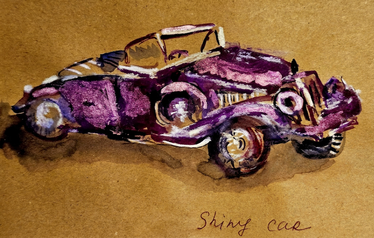
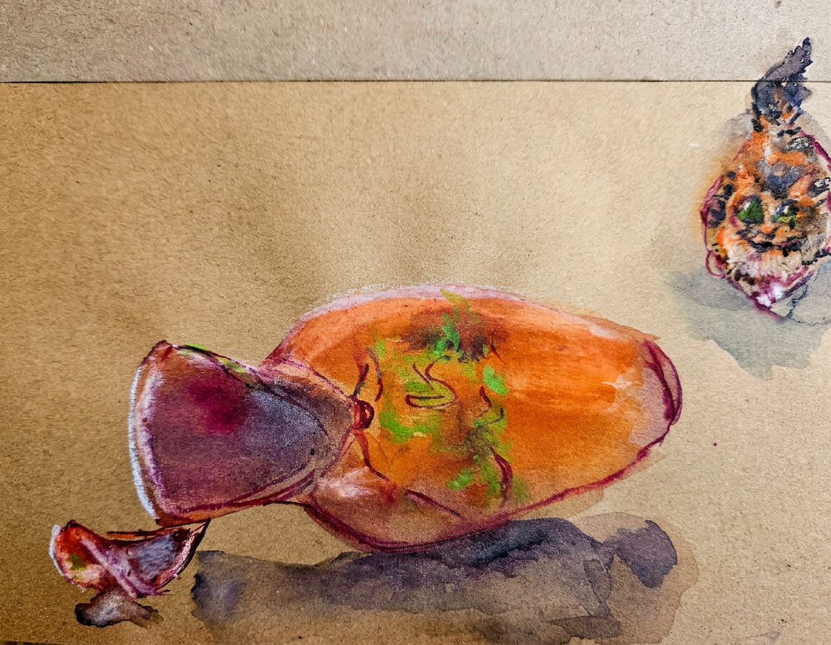
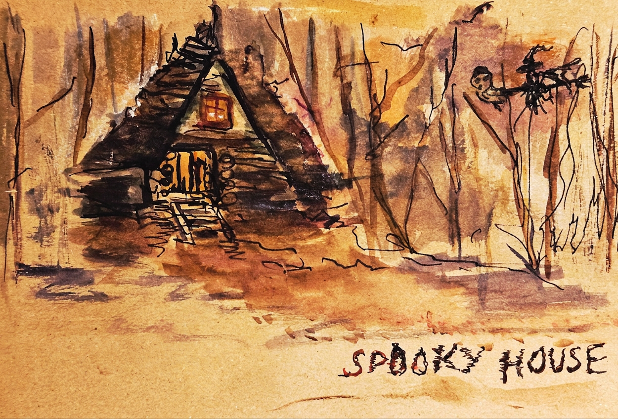
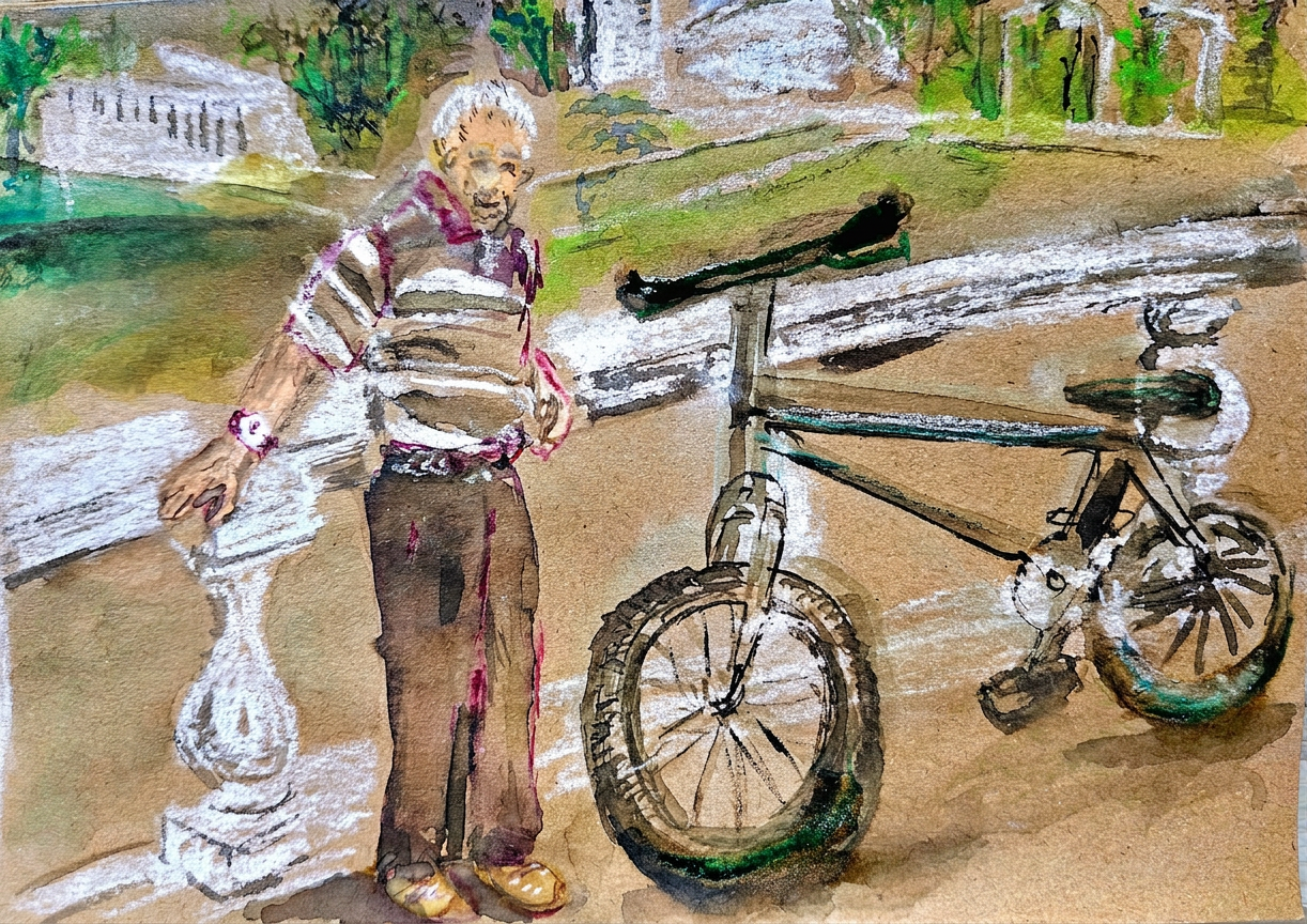

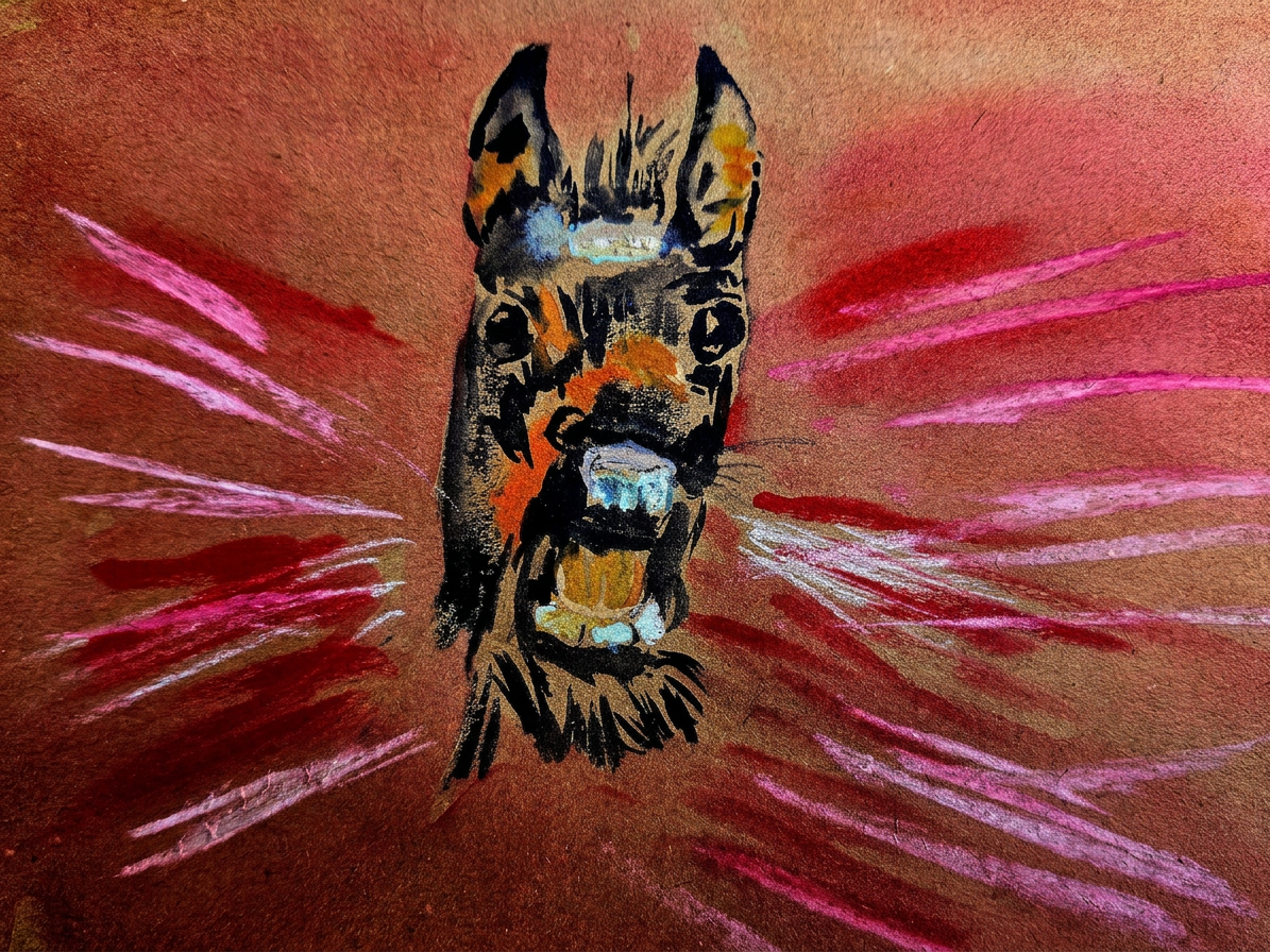
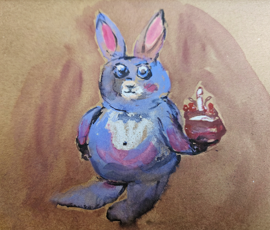

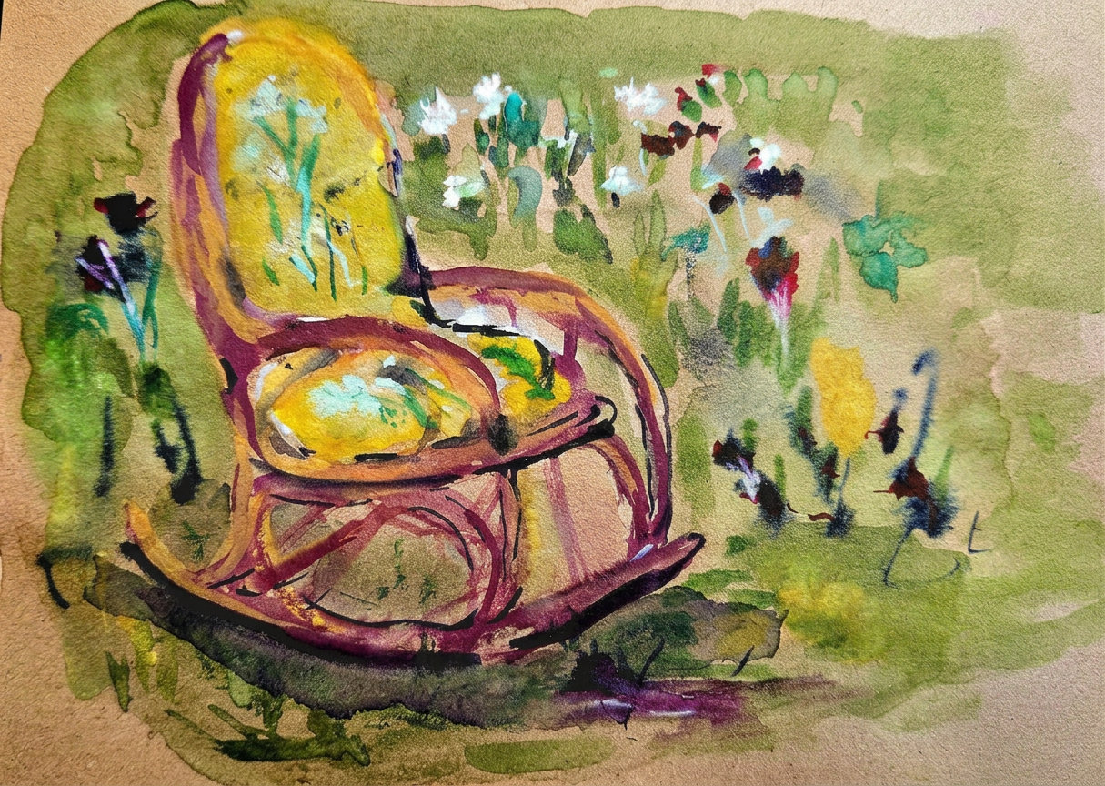


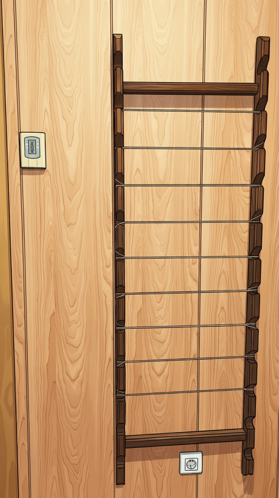
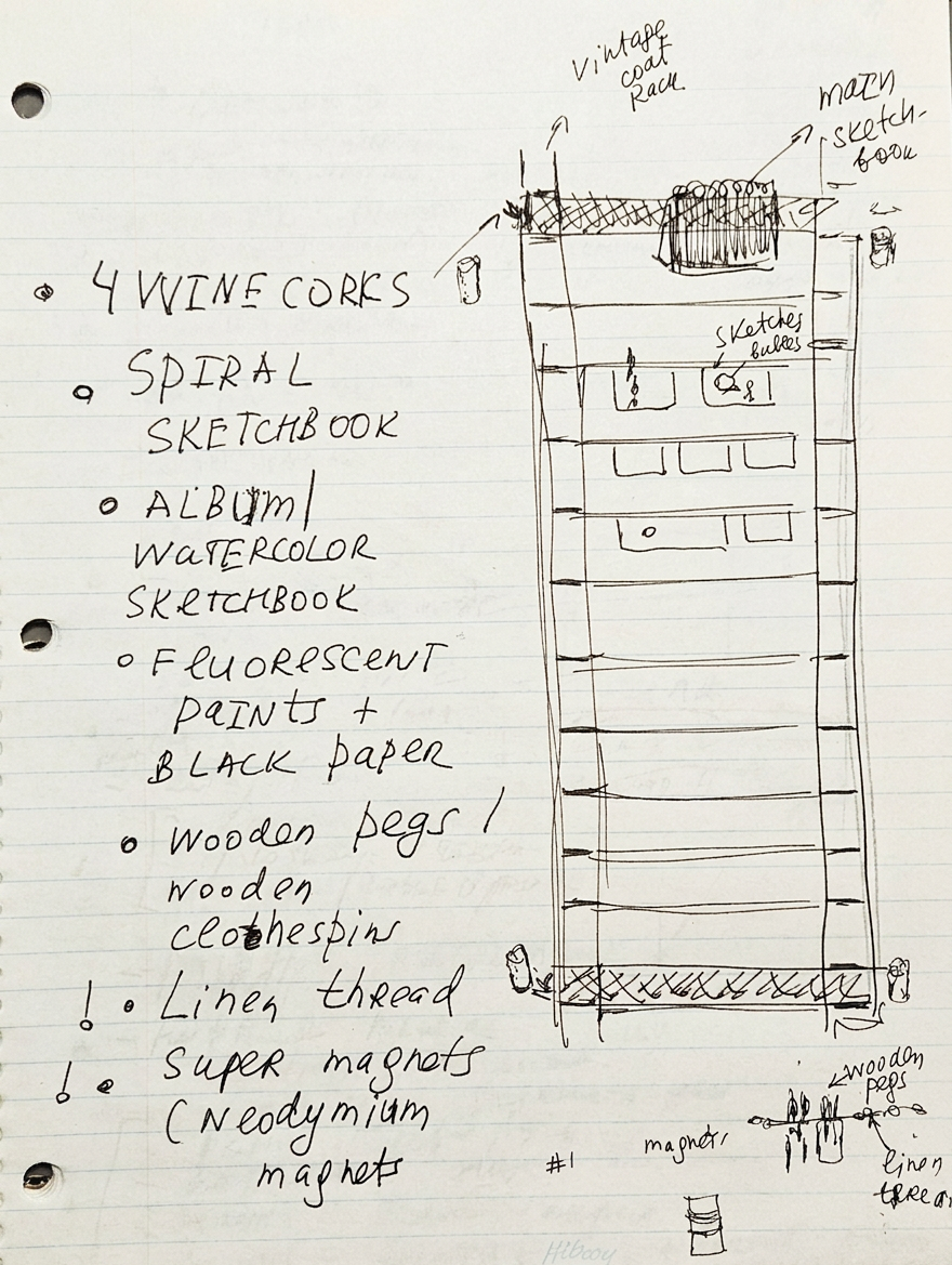
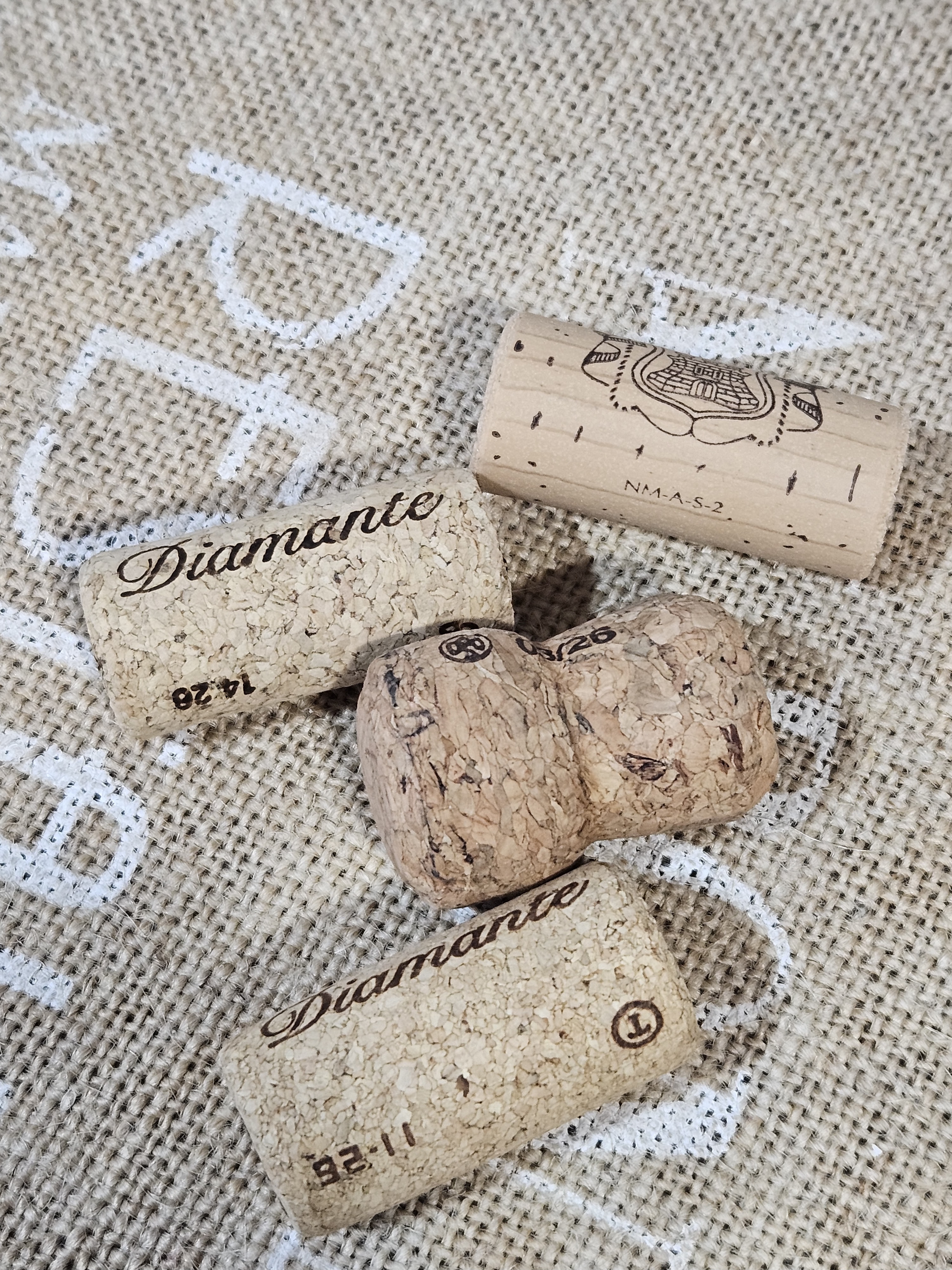
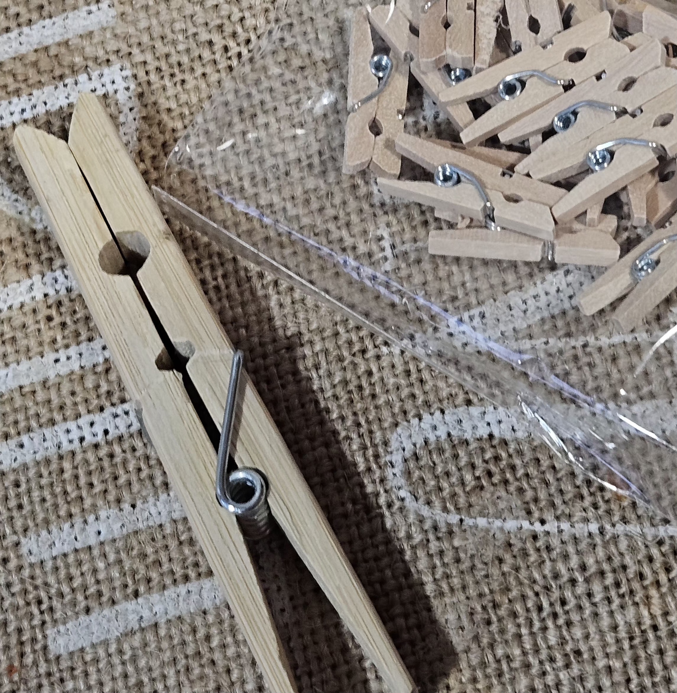
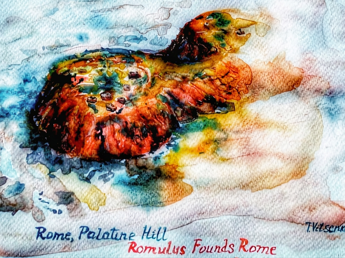
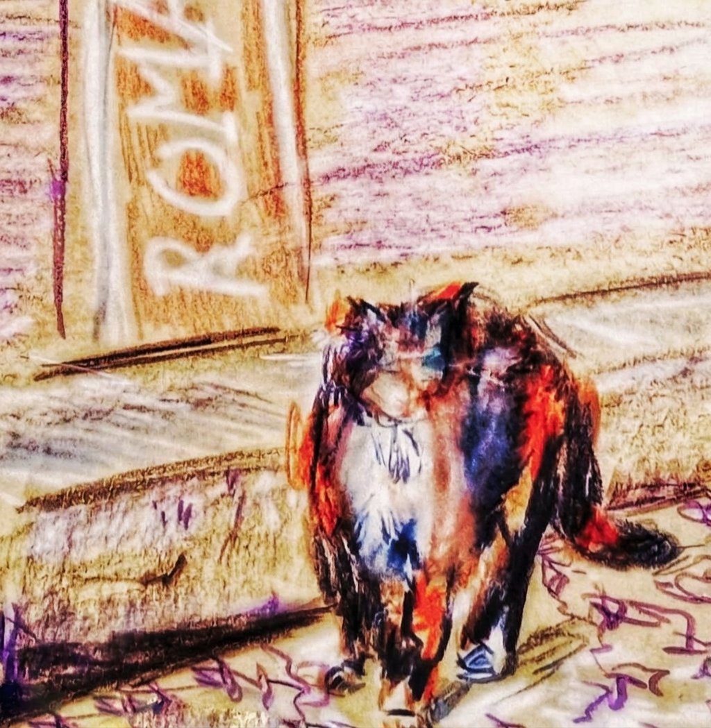
 Join me on this artistic adventure as I explore the captivating world of #TravelVibes #ArtAdventure