Still life and urban sketching? More like “still hiding behind art supplies and questionable architectural doodles.”
Are you a flower person? Do you prefer the show-offs—those high-maintenance roses that demand constant attention? Or are you team humble-but-underrated daisy? Pink and fragrant? Wilted and questionable? There’s a flower personality out there for everyone, and no judgment here.
Three peonies walk into a painting. Nobody leaves.
So this summer, I enrolled in a Flowers painting course—a decision that absolutely upended everything I thought I knew about myself as an artist. Turns out, I’d been dodging still life like it was a personal insult for years. Plot twist: flowers are actually incredible. Who knew? (Apparently, everyone but me.) Through watercolor, ink, and an embarrassing amount of trial-and-error (hello, muddy brown petals), I discovered that my supposed “non-negotiable” artistic preferences were basically fiction. This course demolished my creative self-image in the best way possible, and I’m here to share all the glorious discoveries—and occasional disasters—in these flower-filled posts.
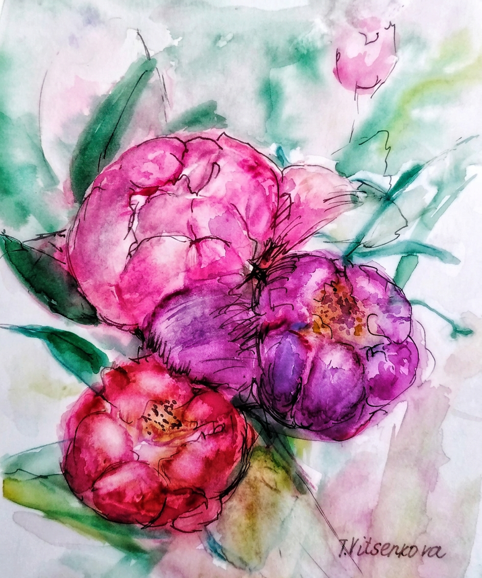
Three pink peonies in a garden, immortalized in watercolor and ink—because apparently, I decided to get fancy with my subject matter this year.
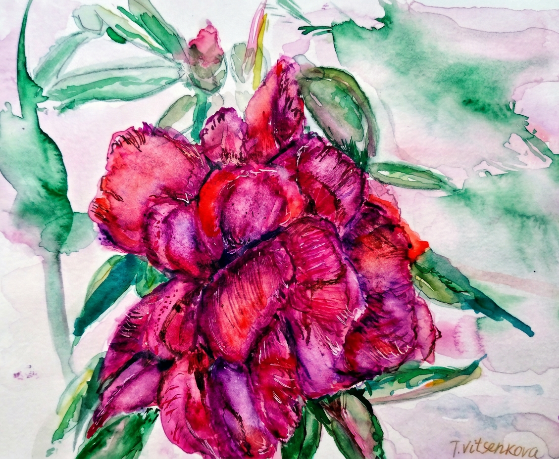
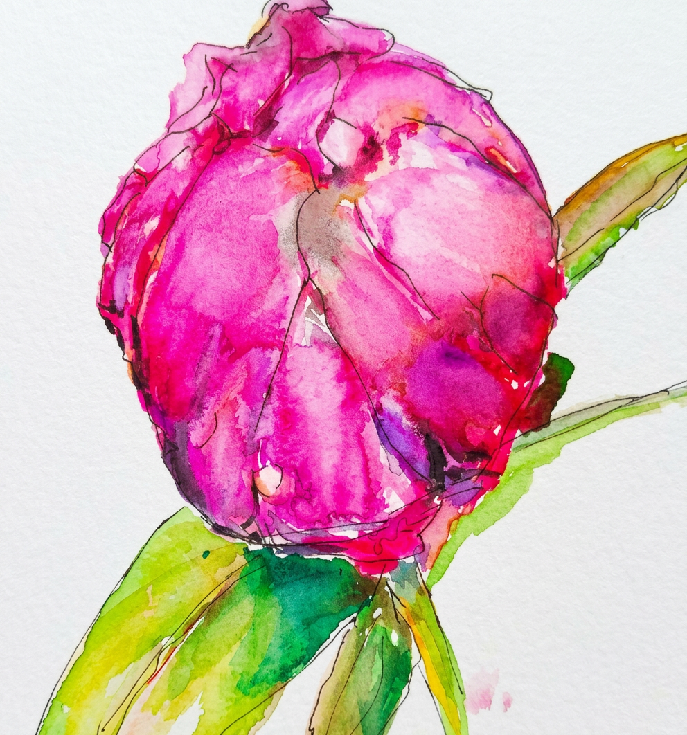
One peony, no filter, zero chill.
Bon voyage! Until the next creative adventure (and the next time I convince myself I can paint something completely outside my comfort zone). Stay healthy and keep those flowers watered—they’re needier than I am.
All paintings belong to me. Seriously, don’t steal them. I’ll know.
Tools used for this painting extravaganza: Watercolours by Charvin and Van Gogh (the fancy kids), GrayPas Expressionist pastels (for when I need drama), Derwent watercolor pencils (reliable sidekicks), and Faber Castell artist pens (the MVPs). Paper: Strathmore Watercolour and Mixed Media albums, 15×20 cm (6×8 in.)—perfectly sized for my wildly ambitious vision and limited attention span.
Floral Obsession: Still Life, Urban Sketching, and the Great Peony Conspiracy
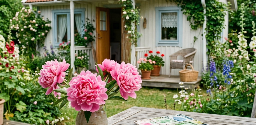
Let me tell you about the time I became irrationally obsessed with peonies. Why peonies, you ask? Well, my mom had enough of these pompous pink showstoppers around my parents’ summer house to start a floral beauty pageant. I loved their tiny, adorable pink hats (yes, I’m calling them hats) and their scent—which basically smelled like summer decided to become a fragrance and live in a flower. Naturally, I had to paint them obsessively.
Picture this: A peony serving looks like a Queen at her coronation ball—because apparently these flowers didn’t get the memo that humility exists. Draped in regal reds, blushing pinks, and tender violets, each petal screams “I’m fancy, look at me!” So I painted one in impressionism style with watercolor, trying to capture that whole “I woke up like this” vibe. Spoiler alert: it took me way longer than I expected.
She’s pink, she’s proud, she’s basically royalty
Fast forward to now: I’m practically planning my next European adventure as a glorified flower reconnaissance mission. Armed with fresh art supplies and an unhealthy obsession with botanical subjects, I’m ready to sketch and paint my way through Europe—watercolor and ink in hand, zero chill about flowers. My travel companions are probably rolling their eyes. That’s their loss.
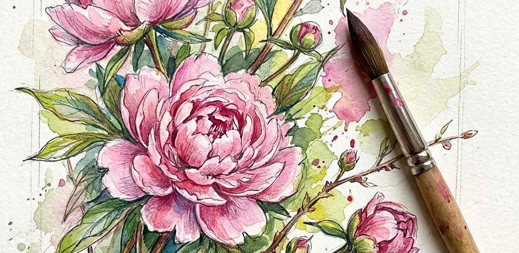
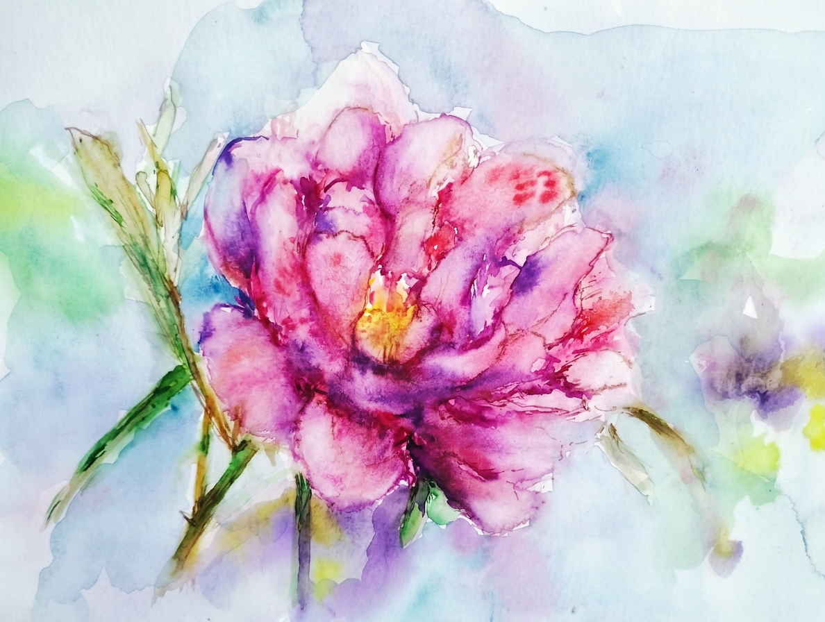
Behold: a tender pink peony in all its impressionistic glory, captured in watercolor. Yes, I made it slightly dramatic. It seemed appropriate given how peonies carry themselves.
Still pink. Still judging you. Still perfect.
Bon voyage to you! Until the next travel adventure (probably somewhere there are flowers to paint). Stay witty, and remember: life’s too short not to have strong opinions about flowers.
All paintings belong to the author and are protected by the sacred code of “don’t steal my flowers.” No image is to be copied without permission.
For the curious minds wondering about my artistic arsenal: I wielded watercolors from the fancy brands (Charvin and Van Gogh—yes, I went full art history nerd), pastels from GrayPas Expressionist, Derwent watercolor pencils (the real MVPs), and Faber Castell artist pens. My canvas of choice? Strathmore Watercolor and Mixed Media albums, 15×20 cm (6×8 in.)—AKA the perfect size for portable flower obsession.
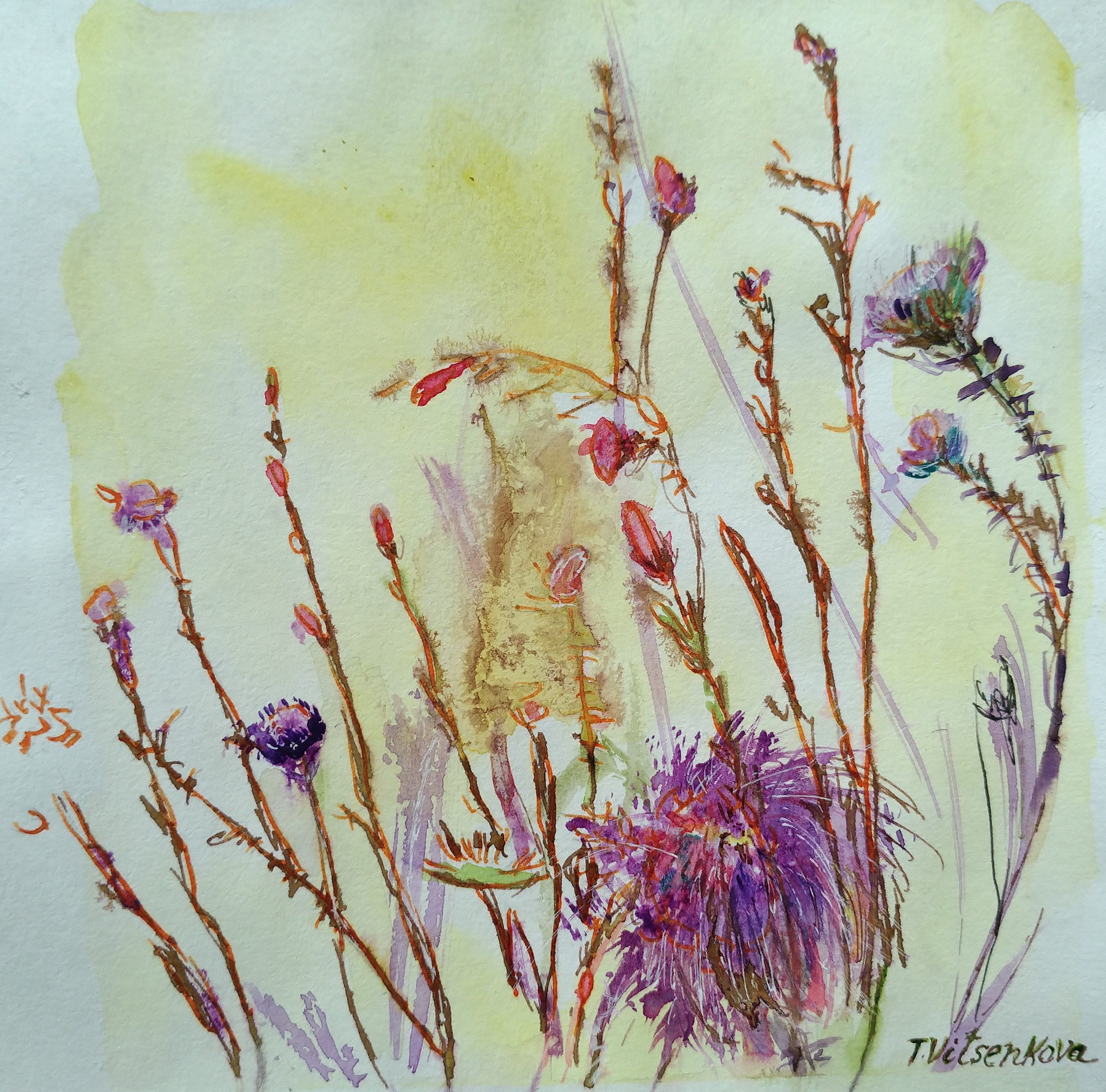
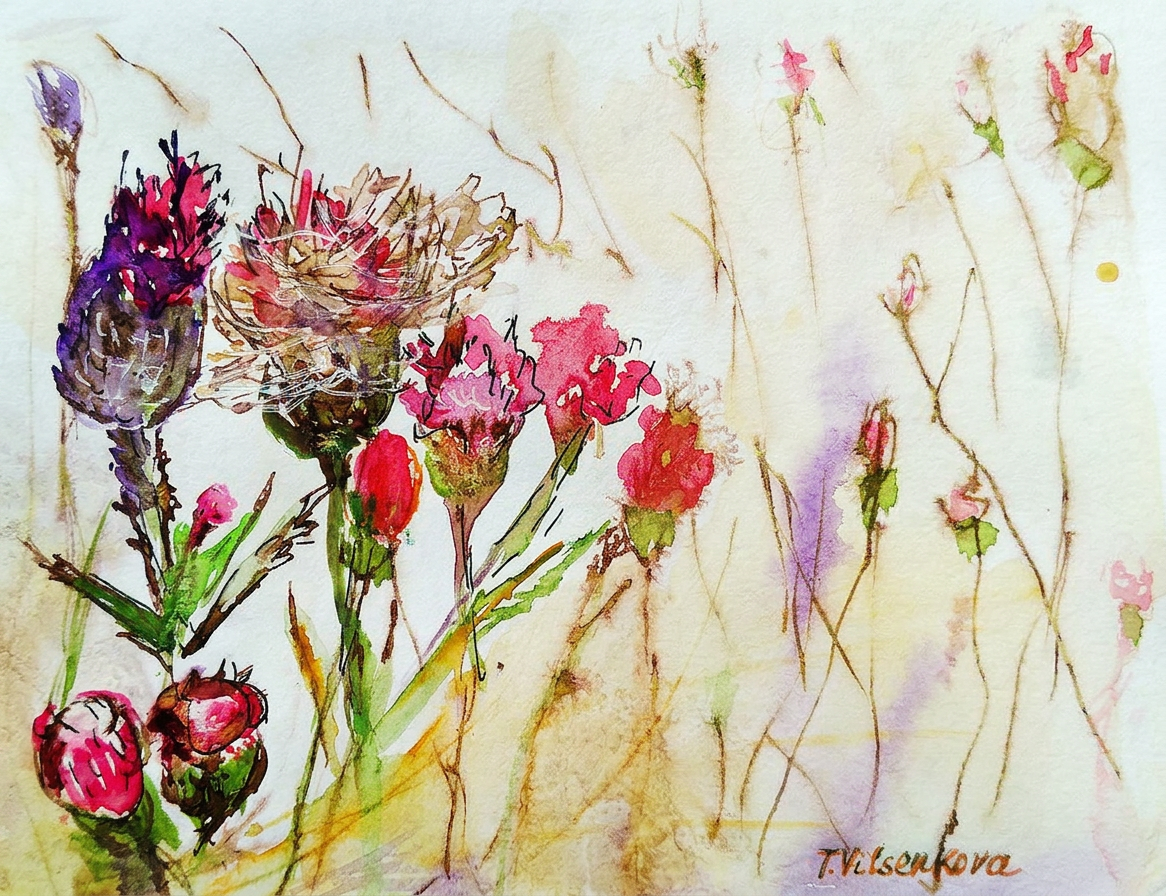
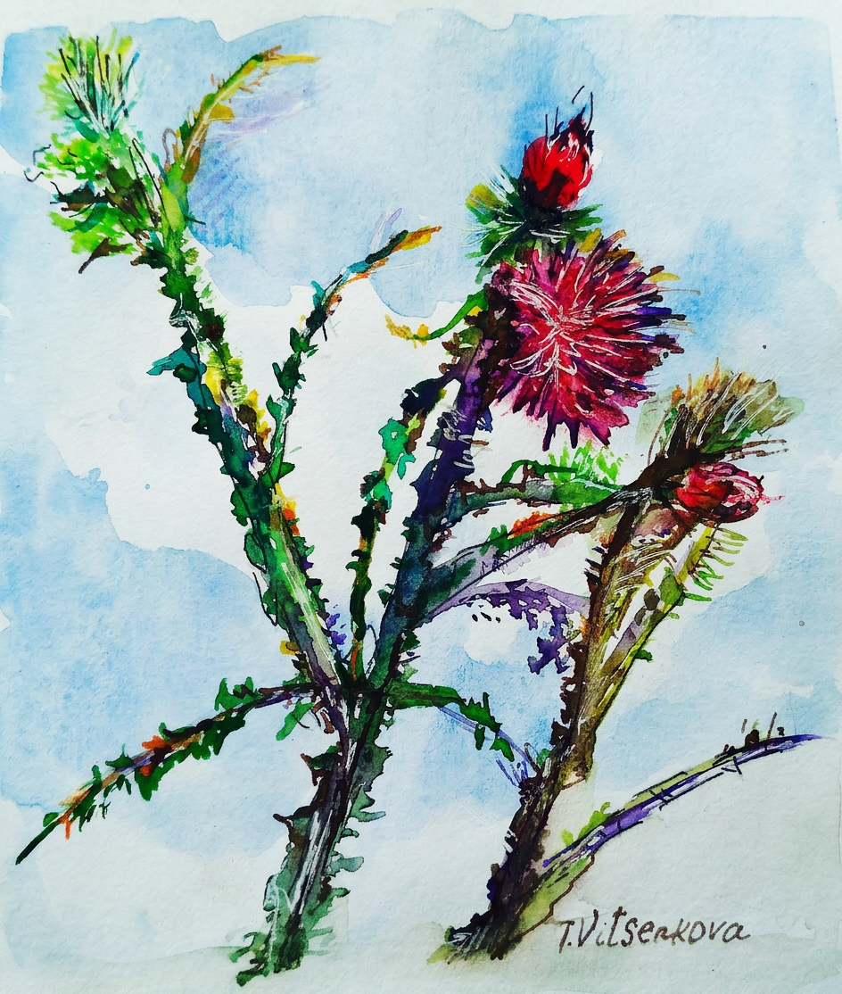
Still life and urban sketching—because thistles are basically nature’s way of saying ‘don’t get too close.’
Rome is basically an open-air museum that refuses to close. Ever. The streets are littered with buildings from every architectural era imaginable, as if someone dumped 2,000 years of interior design catalogs all in one place. It’s chaos. Beautiful, Instagram-worthy chaos.
Rome: where every corner looks like a movie set. No filter needed.
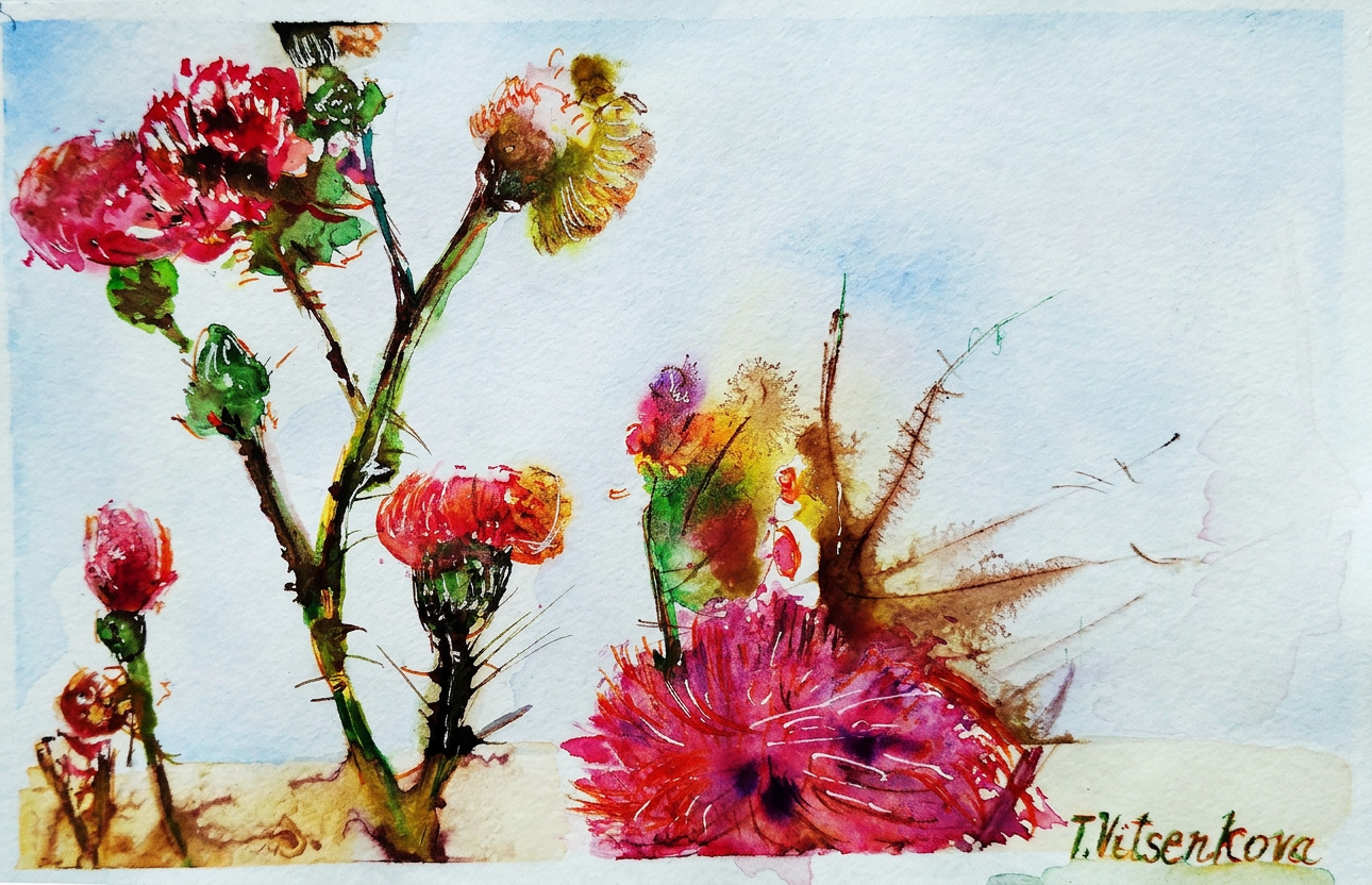
Thistle in watercolor with ink—featuring a delightful palette of pumpkin, turmeric, pineapple, and brick-colored stems because apparently I was hungry while painting. It supposedly represents Rome’s Pantheon: monumental, elegant, and totally not something you’d want to hug. The whole thing is basically an antique temple dedicated to gods who would probably be confused by modern WiFi.
Thistle #1: Painted while hungry. Named after an ancient temple. Sounds about right.
Here’s the truth about Rome: it doesn’t need color. Seriously. Just slap some sepia on it and a few ‘tender shades,’ and suddenly marble fountains and statues become artistically moody. It’s like Rome hired the world’s best Instagram filter and never turned it off.
Emperor Augustus once said: ‘I found Rome a city of bricks and left it a city of marble.’ Translation: ‘I showed up and flexed so hard that everything got an upgrade.’
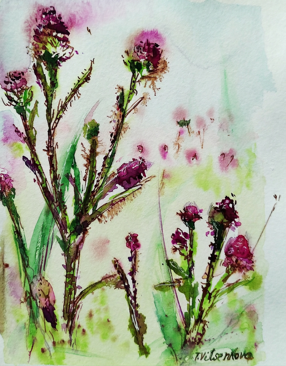
Thistle number two: wildflower with avocado and cherry-colored petals because apparently I was on a mood board binge. The chaotic petals remind me of the Roman Forum’s ancient ruins—you know, ruins that used to be someone’s important government building but now just vibes there mysteriously. Every time you visit, you find something new. Mostly it’s tourists like you, but sometimes it’s actually history!
Thistle #2: Avocado meets cherry. The Roman Forum approves from its mysteriously crumbled remains.
Thistle number three, now in violaceous hues (fancy word alert!). It reminds me of Borromini’s architecture in Rome—all concave curves and convex swagger with sharp angles that would make a modern architect weep. Remember Gaudí’s Barcelona houses? Same energy. But here’s the thing: Borromini’s stuff is actually calm and airy despite looking like it wants to fight you. It’s strong, persistent, and stubborn—just like a thistle that refuses to die in a sidewalk crack. Basically, I’m convinced all great architects were just looking at plants and going ‘yeah, I’ll do that but in marble.’
Thistle #3: Violaceous vibes only. Borromini would definitely swipe right.
Thistle number four: cappuccino and watermelon colored petals (yes, that color combo is as weird as it sounds). Apparently it’s channeling Trevi Fountain vibes—you know, Rome’s most famous ‘throw money in the water and make wishes’ destination. It’s made from natural materials and definitely old, which means it’s had about 500 years to collect loose change and tourist dreams. Stand too close and you feel like you’re floating. Which is either the fountain’s magic or the overwhelming crowd of selfie sticks.
Thistle #4: Cappuccino + watermelon = chaos. Throw a coin in it anyway.
Thistle number five: fiery red, chocolate, and dark grapes (the color palette of a moody wine bar). It’s giving off major Castel Sant’Angelo energy—you know, that ancient Roman pedestrian bridge covered in Bernini’s Baroque sculptures. It’s stunning, it’s old, and like every tourist photo location in Rome, it’s probably swarming with people trying to get the perfect angle.
Thistle #5: Wine bar color palette. Bernini would’ve painted it too, but he was busy.
This is my final thistle post—the grand finale of my flower personality study. Here’s what I’ve learned: thistles are basically flowers with attitude problems. They represent strength, inflexibility, firmness, and they survive literally anywhere because they refuse to quit. Kind of like tourists in Rome during July. So I painted a whole series of these impossible little rebels to celebrate their survival skills and, oh yeah, they totally remind me of beautiful European architecture. Nature’s architecture is just better, fight me.
Rome: still standing after 2,000 years. Unlike my feet after day one.
All paintings belong to the author and are definitely not meant to be copied, traced, or vaguely ‘inspired by’—because yes, we’re watching you.
Bon voyage! Until the next travel adventure (and probably the next thistle obsession)! 🌍