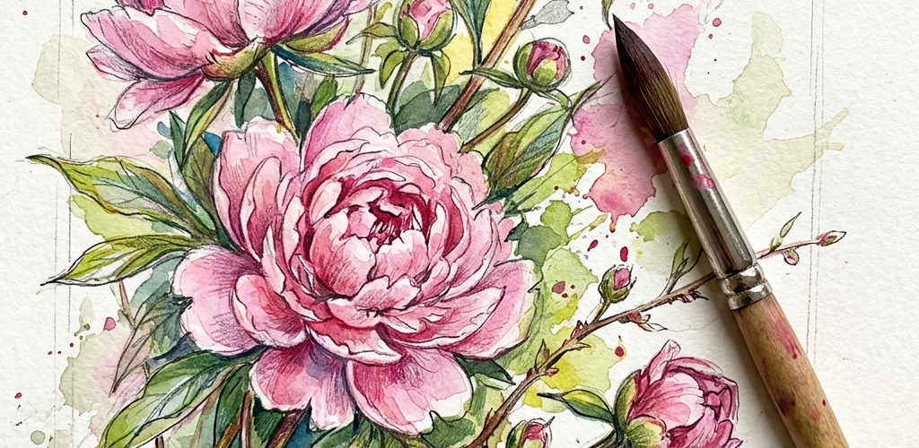
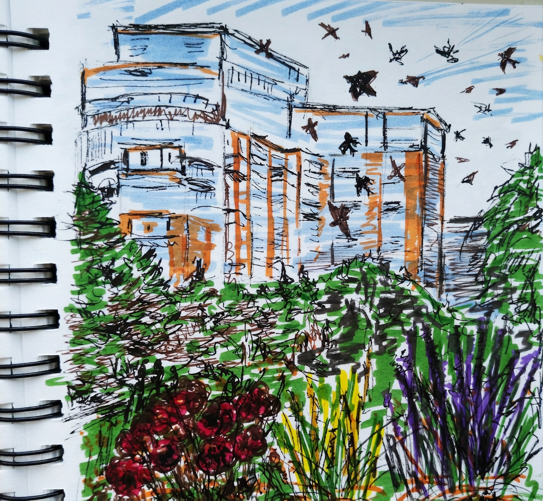
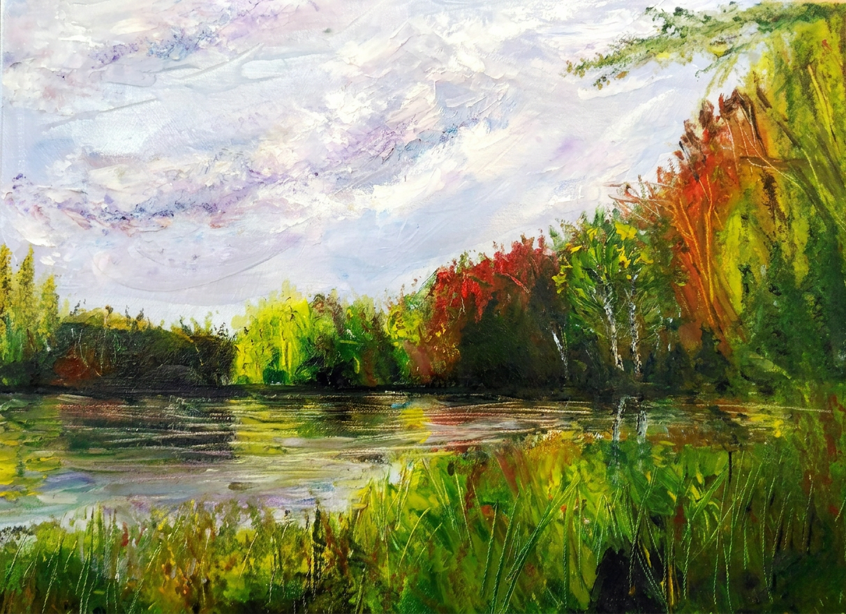
Still life and urban sketching? More like “still hiding behind art supplies and questionable architectural doodles.”
Are you a flower person? Do you prefer the show-offs—those high-maintenance roses that demand constant attention? Or are you team humble-but-underrated daisy? Pink and fragrant? Wilted and questionable? There’s a flower personality out there for everyone, and no judgment here.
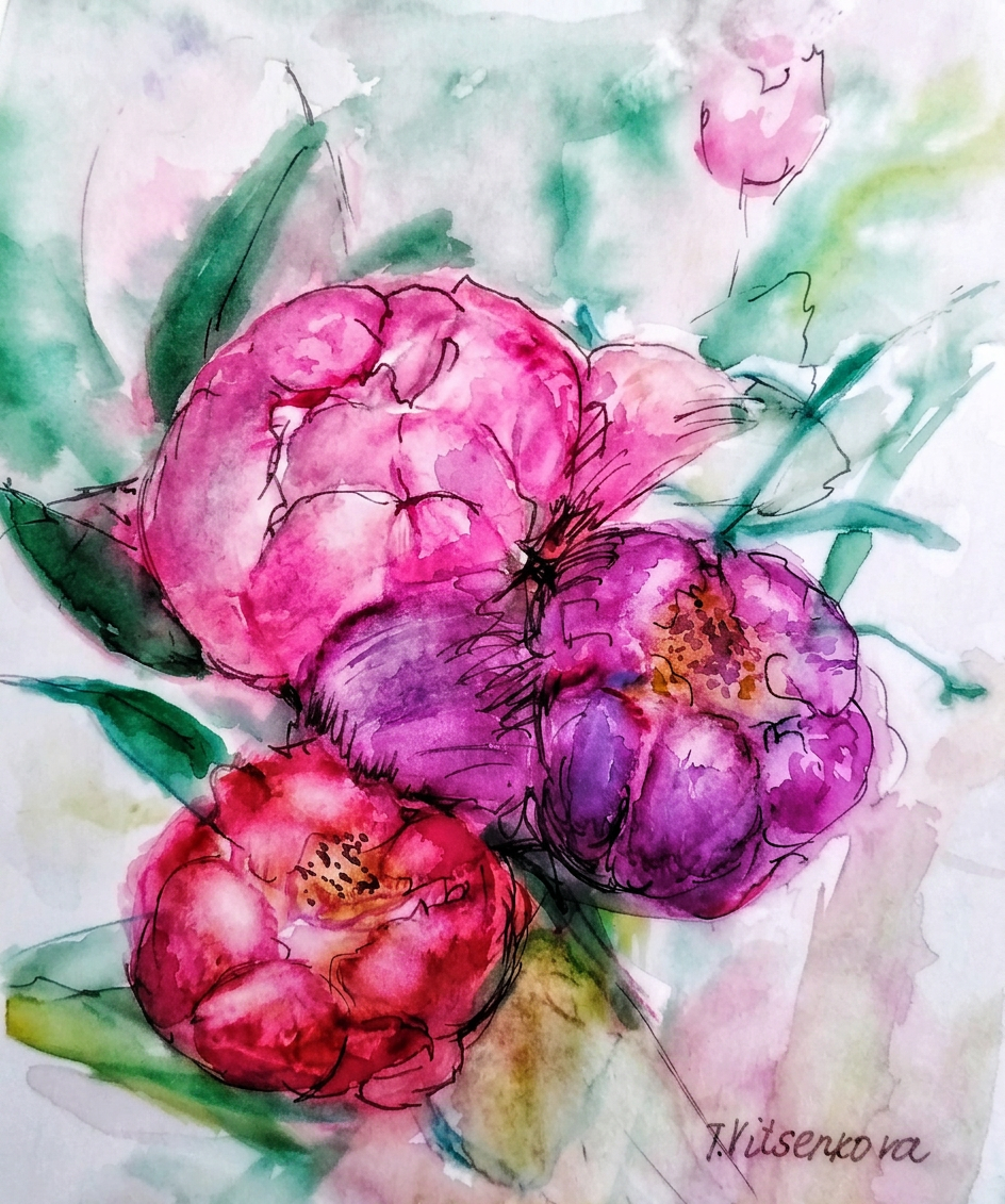
Three peonies walk into a painting. Nobody leaves.
So this summer, I enrolled in a Flowers painting course—a decision that absolutely upended everything I thought I knew about myself as an artist. Turns out, I’d been dodging still life like it was a personal insult for years. Plot twist: flowers are actually incredible. Who knew? (Apparently, everyone but me.) Through watercolor, ink, and an embarrassing amount of trial-and-error (hello, muddy brown petals), I discovered that my supposed “non-negotiable” artistic preferences were basically fiction. This course demolished my creative self-image in the best way possible, and I’m here to share all the glorious discoveries—and occasional disasters—in these flower-filled posts.
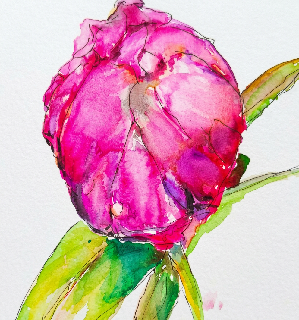
Three pink peonies in a garden, immortalized in watercolor and ink—because apparently, I decided to get fancy with my subject matter this year.
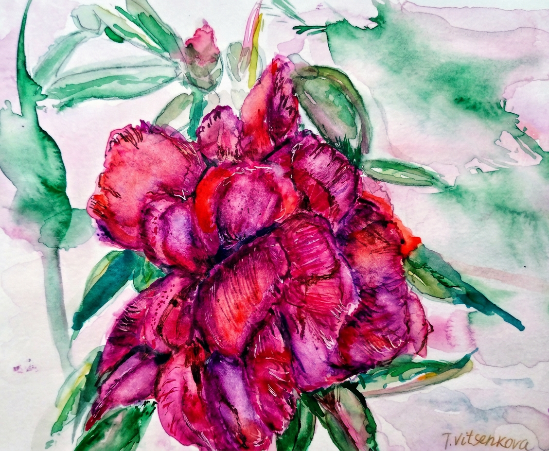
One peony, no filter, zero chill.
Bon voyage! Until the next creative adventure (and the next time I convince myself I can paint something completely outside my comfort zone). Stay healthy and keep those flowers watered—they’re needier than I am.
All paintings belong to me. Seriously, don’t steal them. I’ll know.
Tools used for this painting extravaganza: Watercolours by Charvin and Van Gogh (the fancy kids), GrayPas Expressionist pastels (for when I need drama), Derwent watercolor pencils (reliable sidekicks), and Faber Castell artist pens (the MVPs). Paper: Strathmore Watercolour and Mixed Media albums, 15×20 cm (6×8 in.)—perfectly sized for my wildly ambitious vision and limited attention span.
Floral Obsession: Still Life, Urban Sketching, and the Great Peony Conspiracy
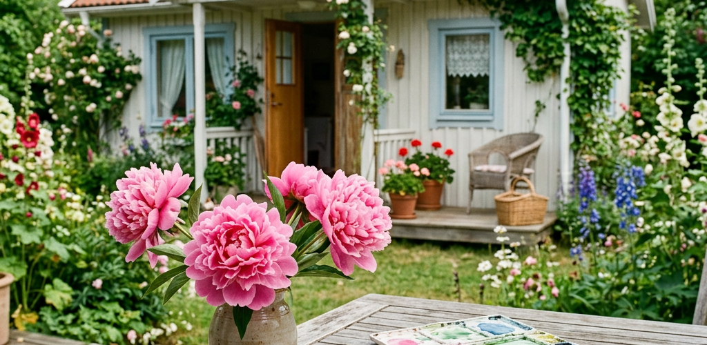
Let me tell you about the time I became irrationally obsessed with peonies. Why peonies, you ask? Well, my mom had enough of these pompous pink showstoppers around my parents’ summer house to start a floral beauty pageant. I loved their tiny, adorable pink hats (yes, I’m calling them hats) and their scent—which basically smelled like summer decided to become a fragrance and live in a flower. Naturally, I had to paint them obsessively.
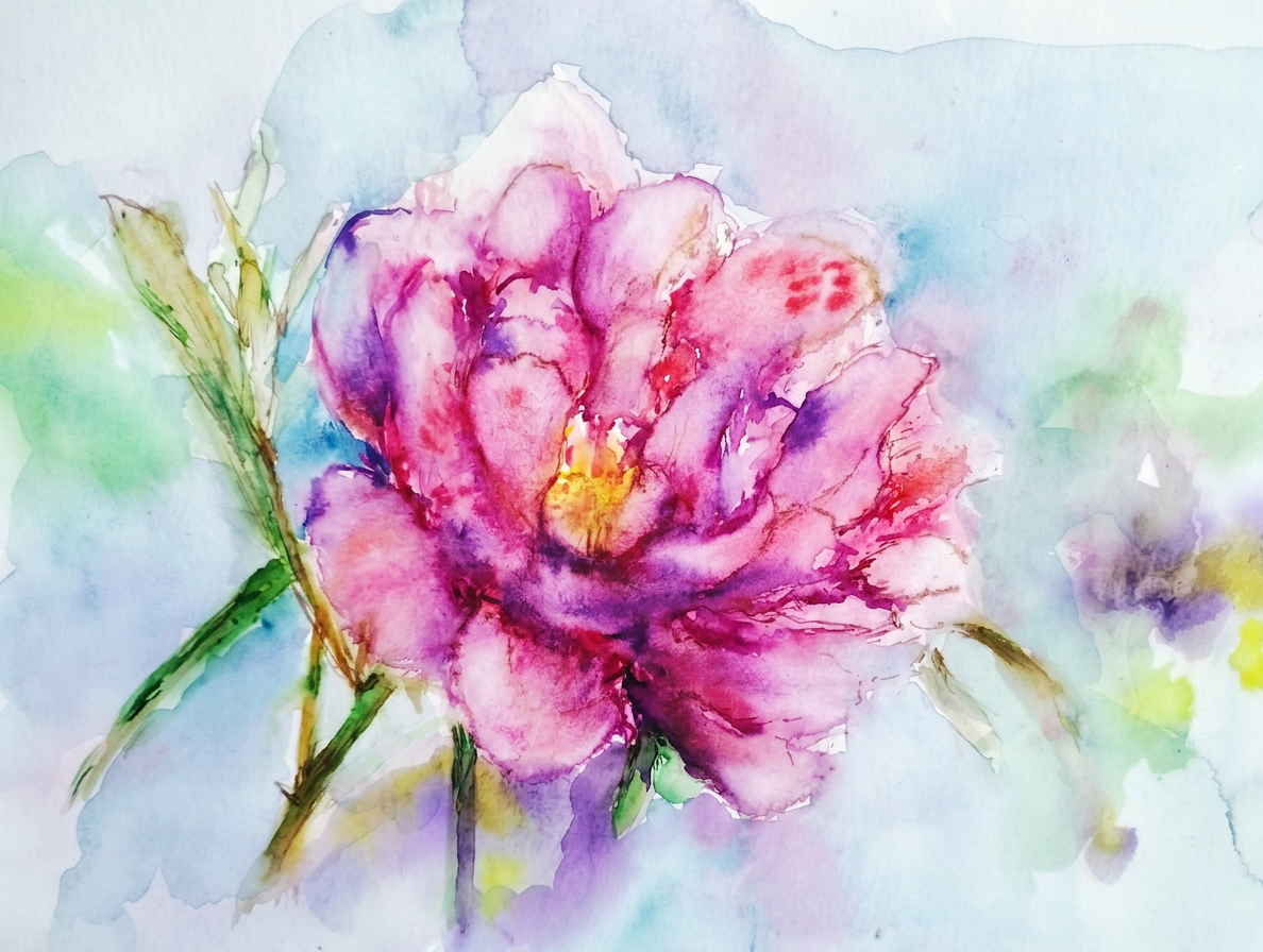
Picture this: A peony serving looks like a Queen at her coronation ball—because apparently these flowers didn’t get the memo that humility exists. Draped in regal reds, blushing pinks, and tender violets, each petal screams “I’m fancy, look at me!” So I painted one in impressionism style with watercolor, trying to capture that whole “I woke up like this” vibe. Spoiler alert: it took me way longer than I expected.
She’s pink, she’s proud, she’s basically royalty
Fast forward to now: I’m practically planning my next European adventure as a glorified flower reconnaissance mission. Armed with fresh art supplies and an unhealthy obsession with botanical subjects, I’m ready to sketch and paint my way through Europe—watercolor and ink in hand, zero chill about flowers. My travel companions are probably rolling their eyes. That’s their loss.
Behold: a tender pink peony in all its impressionistic glory, captured in watercolor. Yes, I made it slightly dramatic. It seemed appropriate given how peonies carry themselves.
Still pink. Still judging you. Still perfect.
Bon voyage to you! Until the next travel adventure (probably somewhere there are flowers to paint). Stay witty, and remember: life’s too short not to have strong opinions about flowers.
All paintings belong to the author and are protected by the sacred code of “don’t steal my flowers.” No image is to be copied without permission.
For the curious minds wondering about my artistic arsenal: I wielded watercolors from the fancy brands (Charvin and Van Gogh—yes, I went full art history nerd), pastels from GrayPas Expressionist, Derwent watercolor pencils (the real MVPs), and Faber Castell artist pens. My canvas of choice? Strathmore Watercolor and Mixed Media albums, 15×20 cm (6×8 in.)—AKA the perfect size for portable flower obsession.
Still life and urban sketching. Because apparently, I can’t sit still OR leave my house without a sketchpad.
So Leonardo da Vinci’s Notebook told me something rather inconvenient: artists need to constantly find new things to paint or draw. (Thanks a lot, Leonardo—no pressure!) Thus began my endless quest to think outside the box that I’m apparently always painting inside. This summer, I had a minor epiphany: watercolor graphic technique is NOT just fancy coloring books. Shocking, I know. It was a small discovery that spiraled into full-blown artistic obsession, and now here we are.
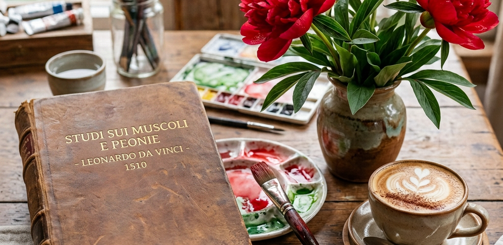
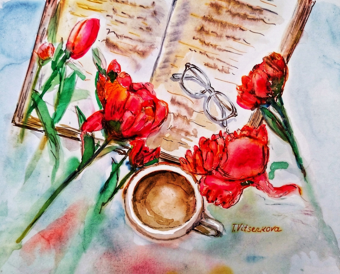
My still life muse? Bright reddish peonies, obviously. I arranged them artfully on my treasured Leonardo da Vinci book, added my glasses (for the intellectual look), threw in a cup of cappuccino (for the vibes), and created what I can only describe as a masterpiece of self-indulgence. Voilà! Another watercolor and ink painting in my beloved impressionist style was born.
Watercolor fantasy. Cappuccino and red peonies and a book
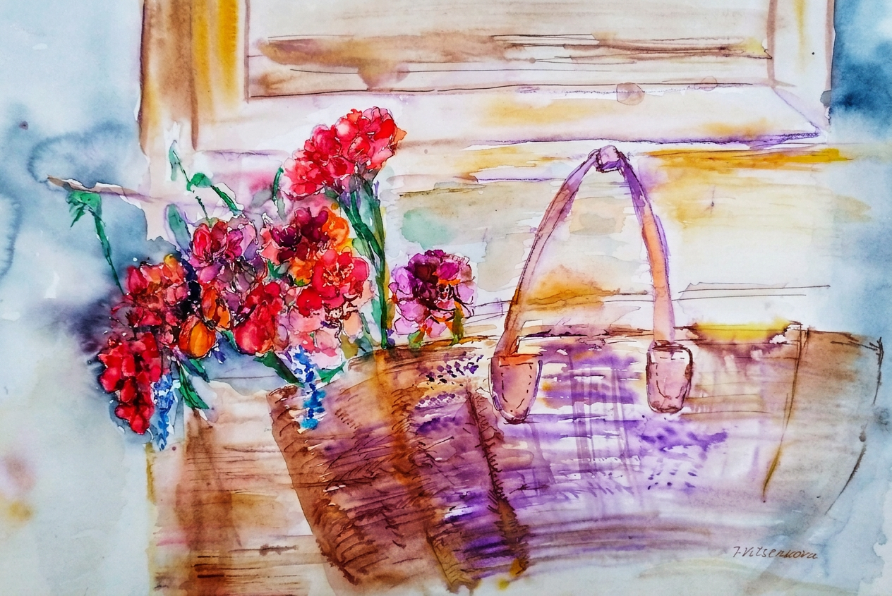
Just imagine it: a warm Mediterranean evening, you’re wandering charming cobblestone streets, and voila—red and pink peonies spill from a straw basket on some picturesque wood door or window. That’s watercolor and ink, my friend. That’s impressionism at its finest. That’s also my elaborate fantasy about our future travels to southern France, Italy, or possibly Greece (I’m not picky when it comes to vacation dreams). Who knows where wanderlust will take us? :)
Summer flower fantasy.
Shout-out to my daughter for the phenomenal gift: Leonardo’s Notebook. This book is basically the gift that keeps on giving—centuries-old wisdom from a guy who was basically good at everything. It’s like having a Renaissance master constantly looking over your shoulder with 500-year-old advice. Terrifying and inspiring in equal measure.
Bon voyage! Until the next adventure awaits! Stay healthy and hydrated (your skin will thank you when you’re sketching in the Mediterranean sun).
All paintings belong to the author. Seriously, don’t copy them. I mean it. My lawyer says I have to say that. Just go make your own masterpiece!
Tools used for my painting: Watercolors by Charvin and Van Gogh (because apparently only the best will do for this artist’s delusions). Pastels by GrayPas Expressionist (the feisty cousin of regular pastels). Derwent watercolor pencils and Faber Castell artist pens (because one type of pen is never enough). Paper: Strathmore Watercolor and Mixed Media albums in that perfect 15×20 cm (6×8 inch) size—not too big, not too small, just right for my control-freak tendencies.
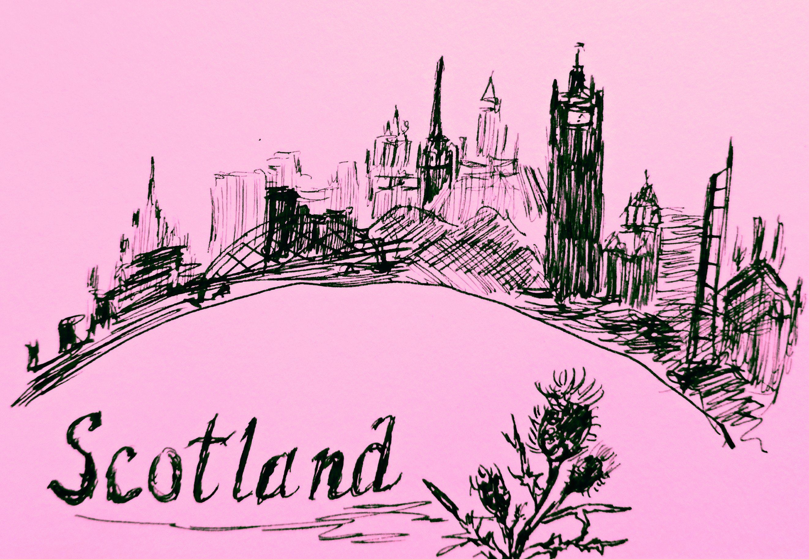
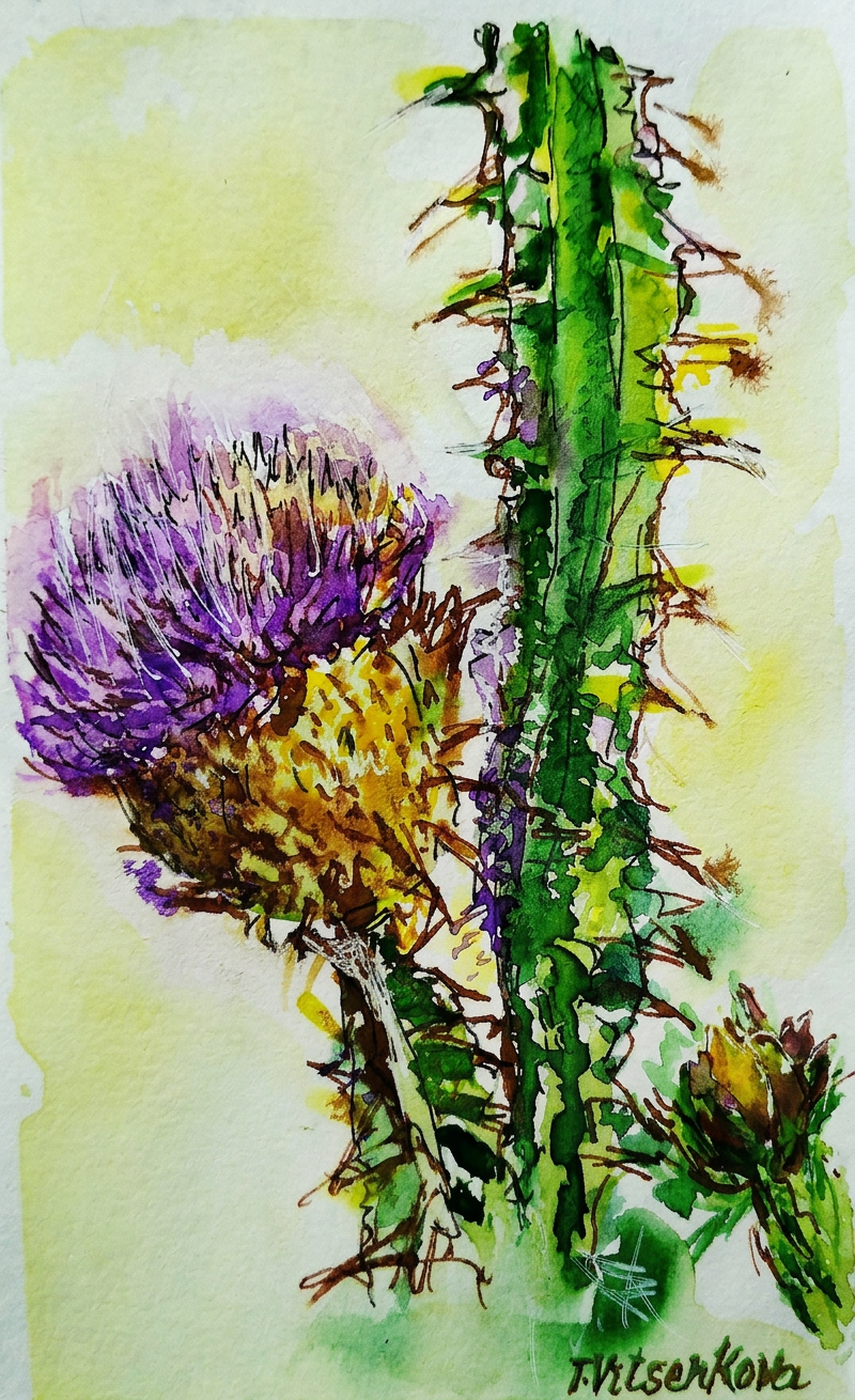
Still life and urban sketching (with extra thorns)
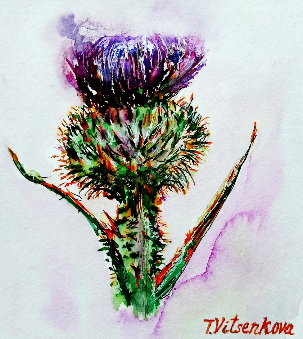
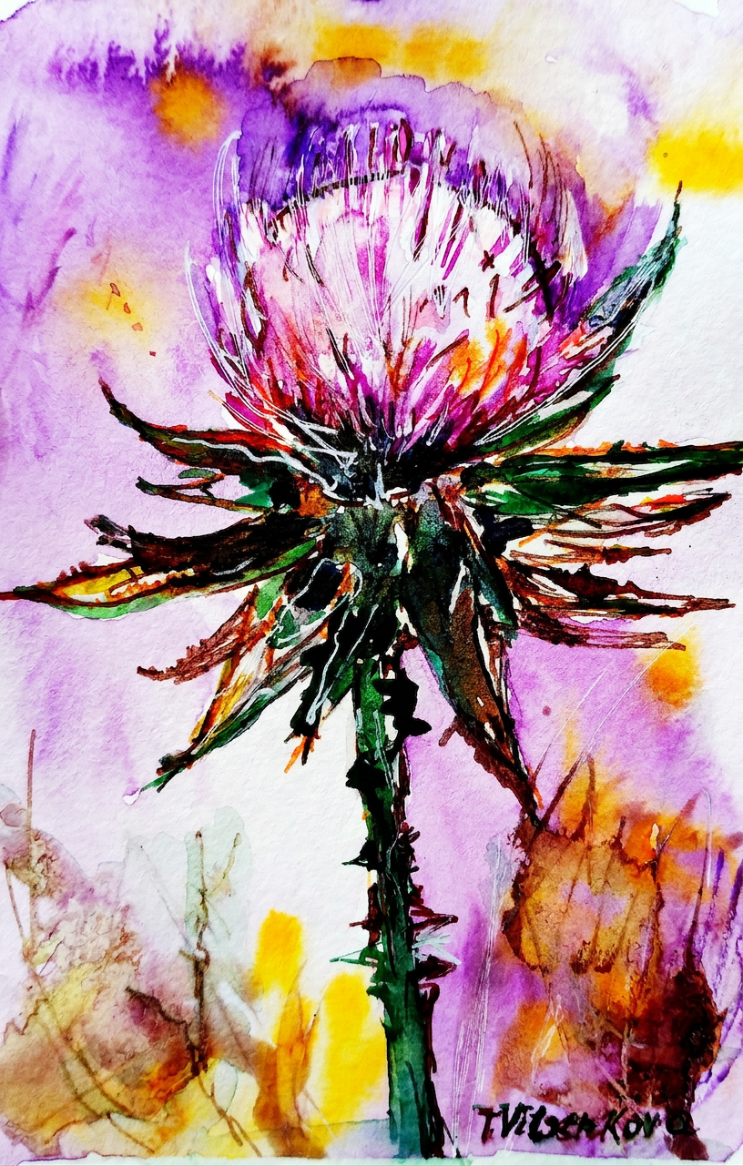
The spiky diva herself. Don’t touch.
My sister asked me to paint a thistle flower that captures its personality: character, strength, inflexibility, firmness, and an almost aggressive refusal to die under any circumstances. Basically, the Rambo of the flower kingdom. Challenge accepted! I created an entire series of these botanical warriors that thrive everywhere and survive conditions that would make other flowers quit their jobs and move to Arizona.
Behold: one of my first watercolor flower graphics with ink—a masterpiece created when I was still discovering my artistic voice. I wielded cooler purple and dark violet like a tiny ninja, with strategic additions of carrot orange and silver gray. (Translation: I threw colors at paper and it worked.)
Purple and orange? She woke up and chose violence.
The thistle is credited with possessing the magical ability to ward off evil spirits. So basically, it’s the flower equivalent of garlic and a cross combined. Vampires and demons should be very, very worried.
Now here’s where it gets spicy: The thistle has been Scotland’s symbol since the 13th century. Legend has it that some ambitious army decided to invade Scotland by launching a surprise night raid. Tactical genius, right? Wrong. In their infinite wisdom, the invaders removed their shoes to move stealthily through the darkness. Spoiler alert: their stealth plan came to an abrupt end when one unfortunate soldier stepped barefoot on a thistle. The resulting shriek? Loud enough to wake the sleeping Scottish soldiers, who then proceeded to win the day. And THAT, my friends, is how a tiny spiky flower saved an entire nation. You’re welcome, Scotland!
Scotland’s unsung hero. Barefoot invaders not included.
The thistle is the official emblem of the Knights of the Order of the Thistle—a group of people who basically said, “You know what this order needs? A flower that actively hurts people.” Their motto? The Latin phrase Nemo me impune lacessit, which means “No one will touch me with impunity.” (Translation: This flower has zero chill.)
Thistle wildflower watercolor graphic alert! With ink, because subtlety is overrated. I mixed colors like I was a culinary artist: pink, milky blue opal, saffron latte, and neon colors for extra pizzazz. If your thistle painting doesn’t make people’s eyeballs tingle, are you even trying?
Pink, neon, and zero regrets.
I’m absolutely obsessed with pink thistles and their refreshingly simple color palette. A splash of plum color, some pistachio background, and boom—you’ve got botanical happiness on paper. It’s like painting flower versions of minimalist interior design.
Minimalist thistle. Maximum attitude.
Thistle watercolor wildflower painting featuring petals the color of blueberries and purple grapes. Translation: I made fruit jealous by using their colors on a flower. The audacity!
Blueberry vibes. Not edible. Learned that the hard way.
Watercolor flowers graphic extravaganza! With ink, because apparently I can’t help myself. Colors used: strawberry petals (obviously), light khaki, and a shade of flax background that somehow made the whole thing work. Art is chaos. Beautiful, intentional chaos.
Strawberry fields forever — but make it thorny.
Plot twist: Some thistles come in caramel and turmeric colors. Because apparently thistle diversity includes the entire spice rack.
Caramel and turmeric. The spice rack called, it wants its colors back.
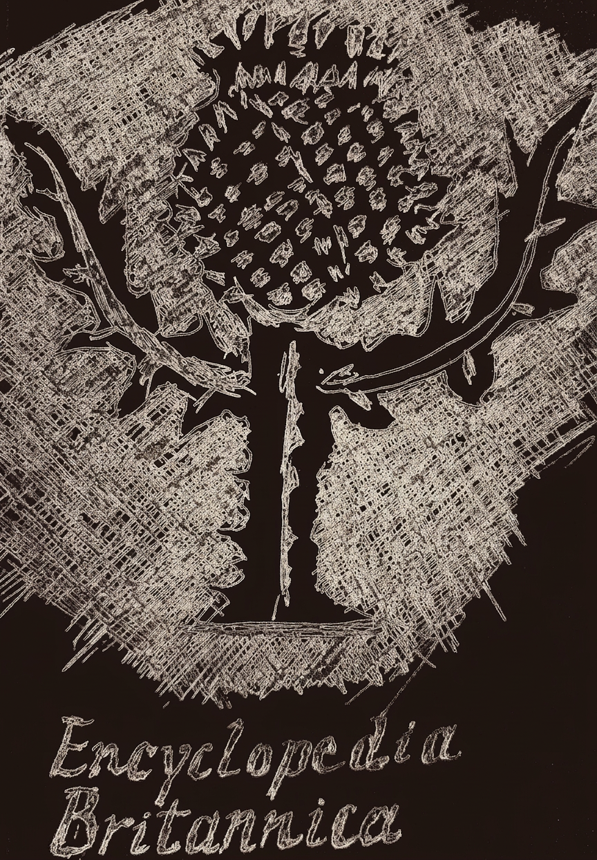
Here’s the thing about pink thistles: they’re the most popular thistle color, which is why I gathered all my pink watercolor paintings in my first post about this fabulous flower (complete with Scotland’s legendary defense narrative). And now, hold onto your berets: a thistle is not just the floral emblem of Scotland AND Lorraine—it’s ALSO the emblem of the Encyclopedia Britannica. That’s right, thistles are basically the overachievers of the plant world. They didn’t just stop at one honor. They went for three.
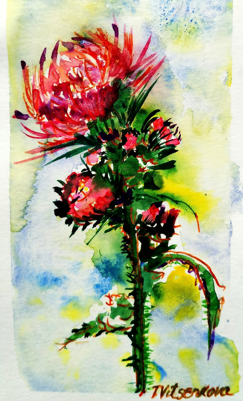
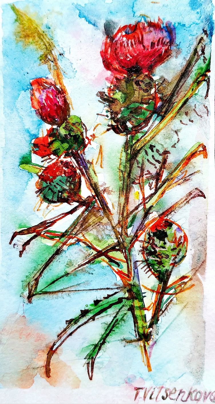
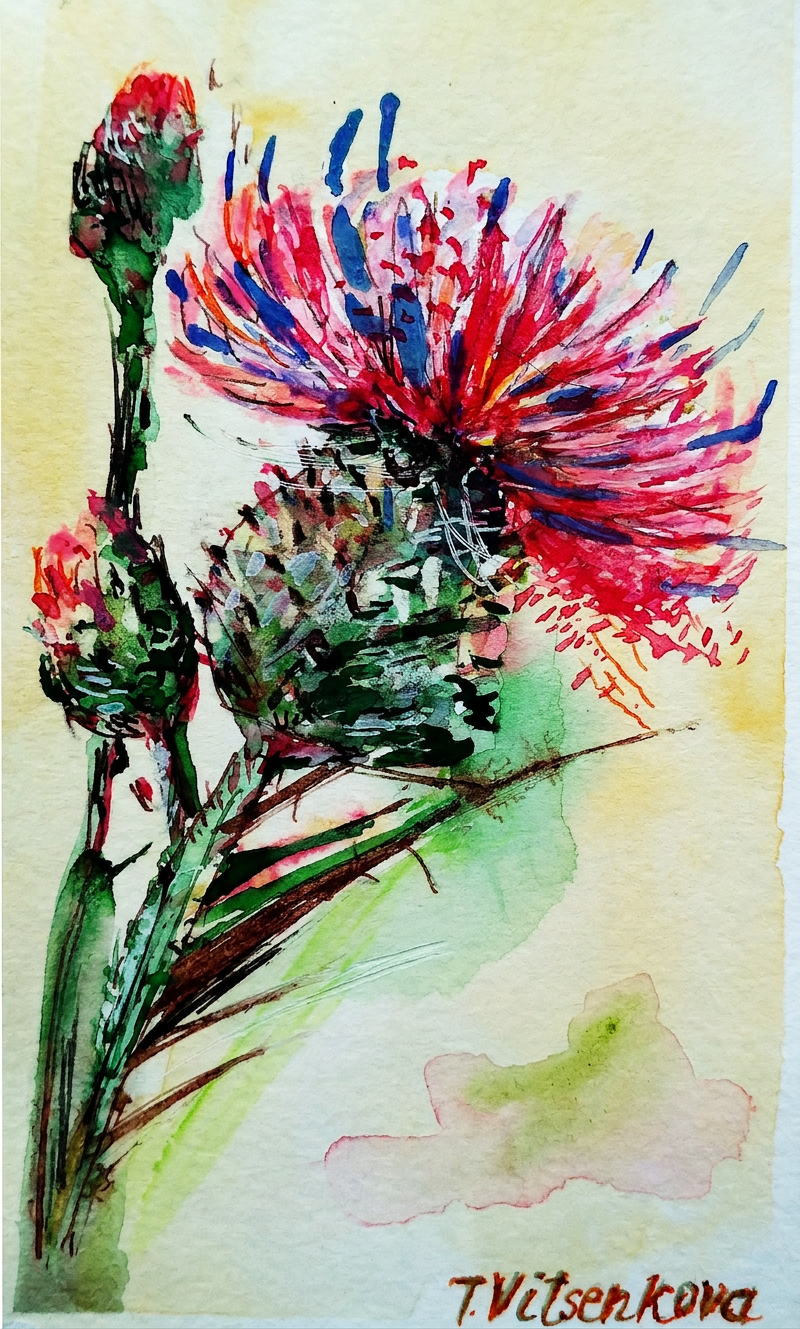
Red thistle flower and my absolute favorite city in Spain, Madrid—basically my love letter in plant form. Because apparently when I want to express passion, strength, energy, and fearlessness, I paint spiky flowers. Revolutionary, I know.
Madrid called. I answered in watercolor.
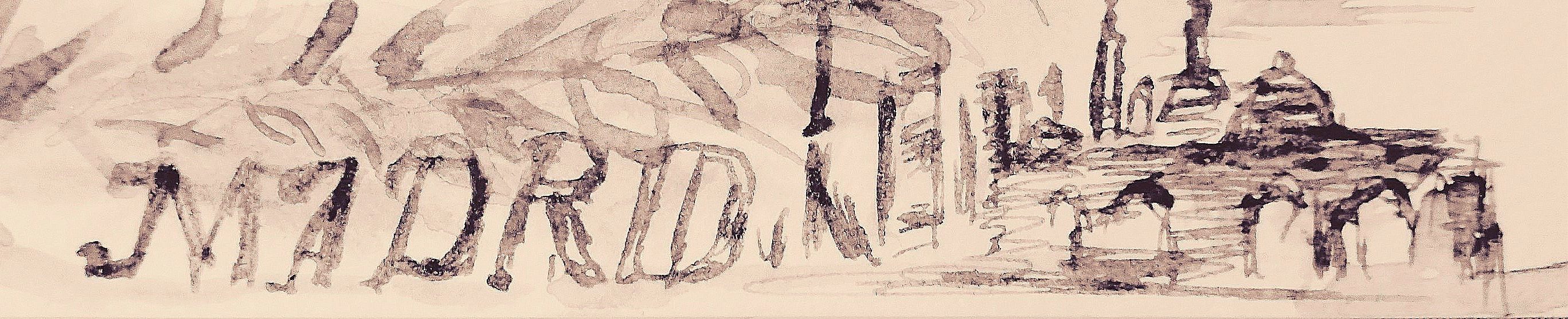
Madrid. A city with more sides to it than a geometry textbook—aristocratic, bohemian, and commercial all rolled into one impossibly stylish package. The moment you land there, something magical happens: the city whispers, “Hey, you look like you belong here,” and suddenly you feel like you actually do. Your city. Your home. The place where you’re meant to thrive (or at least enjoy really good tapas while pretending you belong).
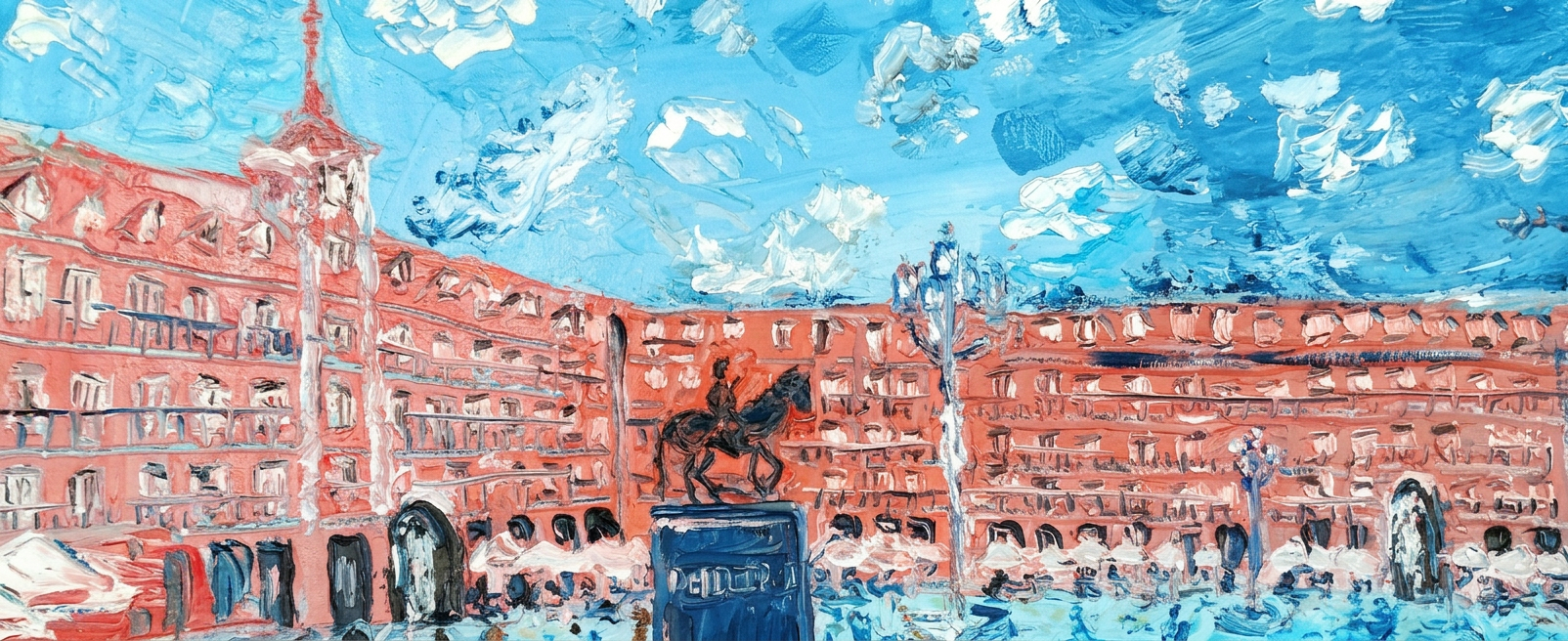
Naming just a handful of Madrid’s masterpieces would be like choosing a favorite child—borderline impossible and slightly offensive to everyone involved. But here goes: Plaza Mayor (where people-watching reaches Olympic standards), Puerto del Sol (it’s basically Grand Central Station but cooler), the Prado Museum (where you can contemplate art for hours and feel intellectually superior), the Royal Palace (proving that “bigger” sometimes actually is better), Thyssen-Bornemisza Museum of Art (for when the Prado wasn’t quite enough art for your art-hungry brain), and Retiro Park (nature’s masterpiece to balance out all the human-made masterpieces). We’ve been there more times than we’d like to admit, and it’s absolutely penciled in for our next rendezvous. Or three. :)
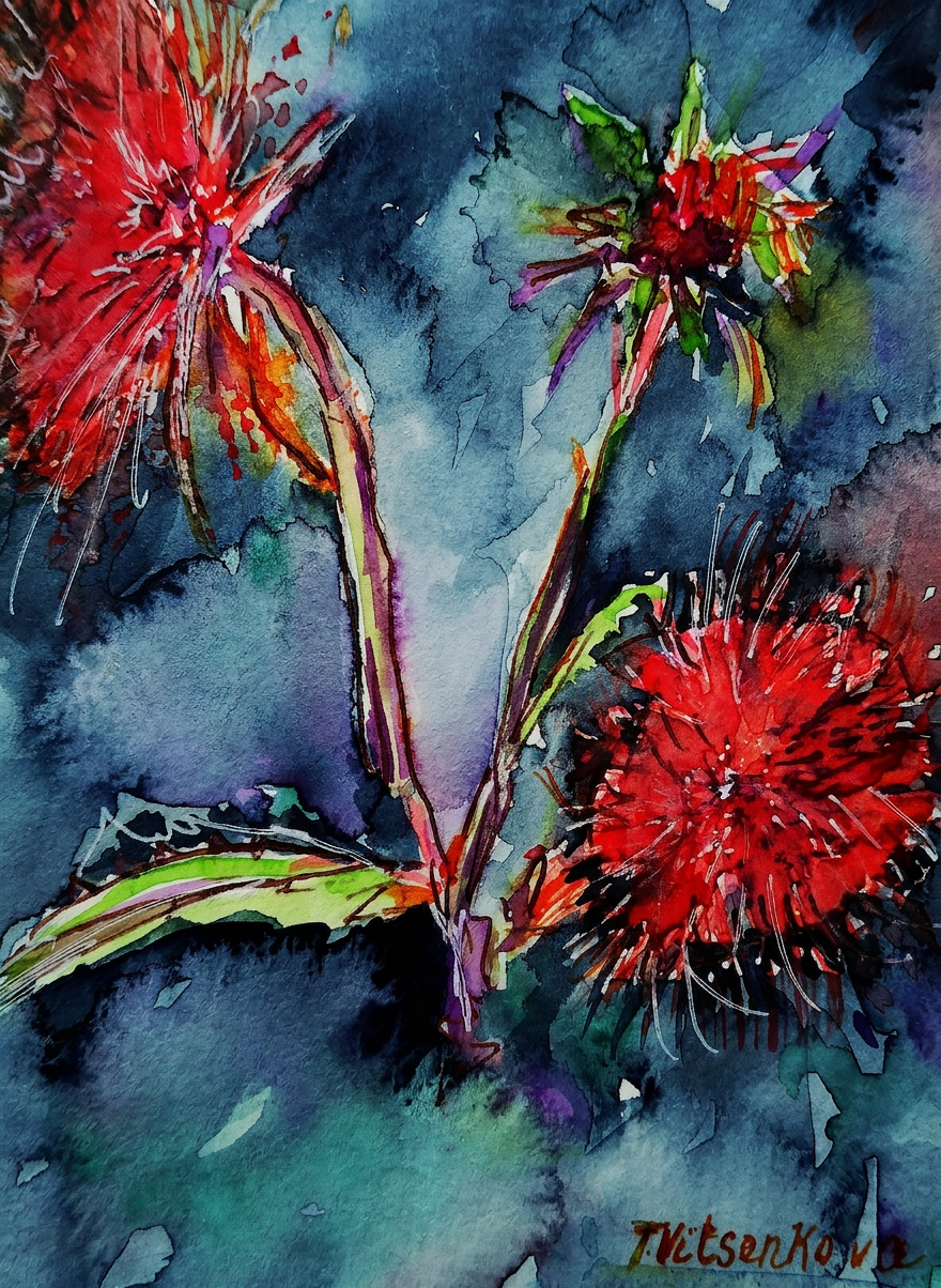
I got so inspired that I created an entire series of watercolor and ink paintings featuring vibrant red and warm peach-colored thistles, all dedicated to one of my favorite cities in Europe. Because nothing says “I love you, Madrid” quite like painting prickly flowers obsessively.
This particular thistle features petals in tomato and red cabbage tones, paired with an indigo background because apparently I’m all about dramatic color combinations and life choices.
Tomato red meets indigo. Fancy.
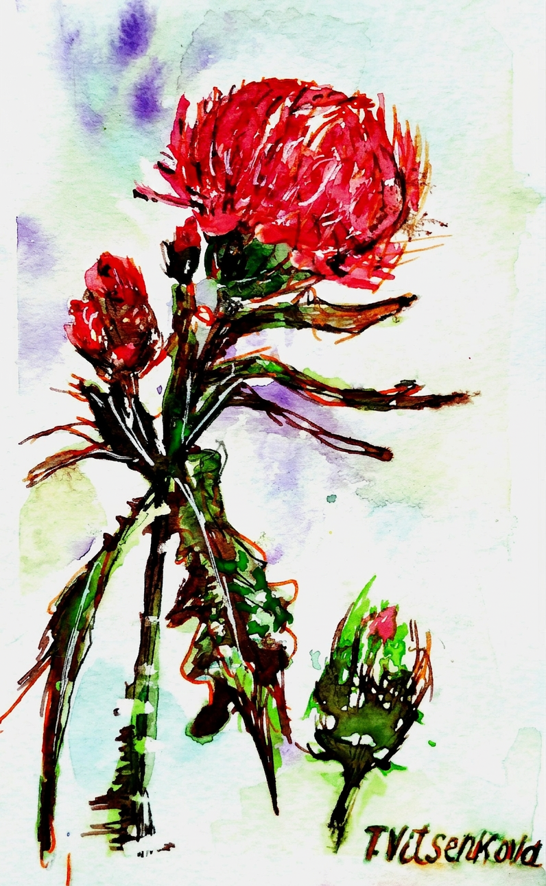
Here we have a thistle sporting pomegranate and scarlet petals against a lemon and coffee-colored backdrop—basically proving that flowers have better color sense than most interior designers I know.
Pomegranate. Scarlet. Basically a salad, but make it art.
A watercolor masterpiece featuring thistle with shades of raspberry and blueberry swirling together with dark blue, crowned with celery-green leaves. Bright, bold, and absolutely gorgeous. (I’m biased, but also right.)
Raspberry, blueberry, dark blue — someone was hungry while painting.
The sunny thistle: a wildflower sporting cocoa-colored petals with artistic flourishes of cognac and a moody bluish background—basically the sophisticated cousin of all the other thistles.
Cocoa and cognac. The only acceptable breakfast palette.
And finally, a thistle with amethyst and salmon-hued petals floating against creamy, tender-feeling colors. This one’s basically the introvert of the collection—softer, dreamier, and slightly less inclined to poke you.
Amethyst and salmon walk into a painting…
If you ask me, Madrid is the red color personified. The land of gazpacho, bullfighting, and flamenco basically *is* red. Passionate, vibrant, unapologetically bold. And I’m absolutely here for it. :)
Madrid in the wild. No filter needed (okay, maybe one).
All paintings belong to yours truly (aka me). No image shall be copied without permission, or the color-mixing gods will have words with you.
Bon voyage! Until our next travel adventure (and probably another painting series). Stay healthy, stay curious, and keep your eyes open for wildflowers. You never know when one might inspire your next masterpiece.
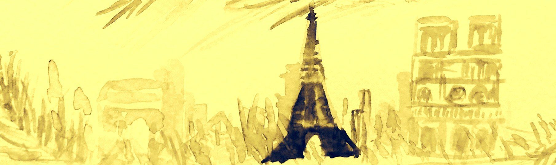
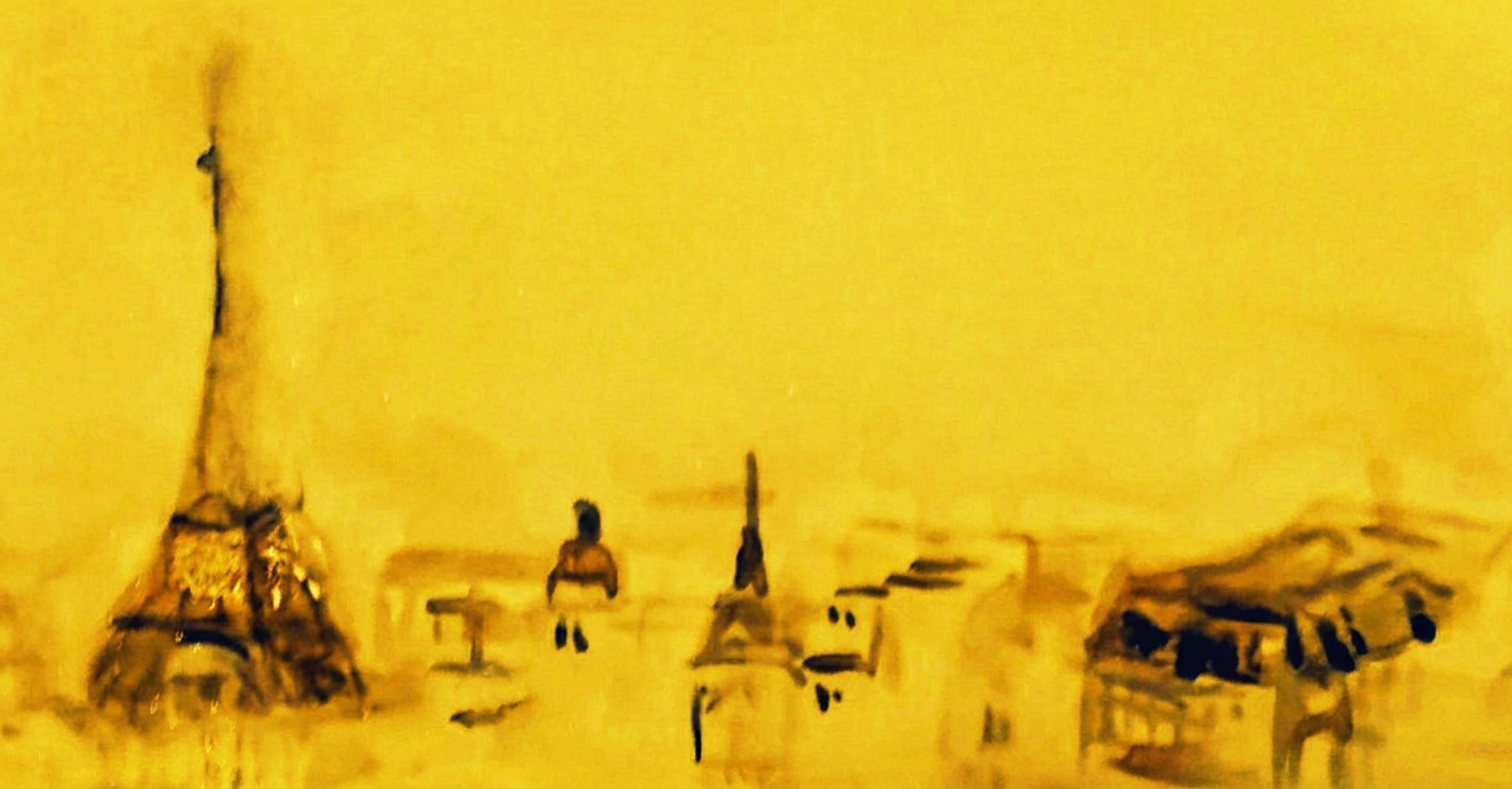
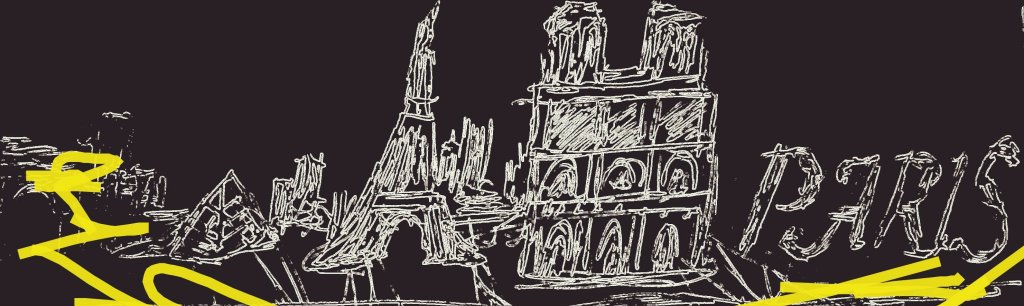
Still life and urban sketching — or as I like to call it, “procrastinating at tourist attractions with a sketchpad.”
Paris. The city of love, croissants, and inexplicably rude pigeons. Here’s the thing about Paris that nobody tells you: you don’t actually need to leave your hotel room to find beauty and inspiration. Just open the window and look around — you’ll find architecture that makes your apartment back home look like a cardboard box, monuments that have been standing longer than your entire family lineage, street names that sound like songs, memorial plaques commemorating people who actually did important things (unlike me, who’s mainly known for eating an entire wheel of Camembert while crying about climate change), restaurant signs in fonts that would make a graphic designer weep with envy, and murals that prove even walls have more artistic talent than most of us. Seriously, there’s something uniquely extraordinary to discover at every street corner. Paris doesn’t just hand you beauty — it ambushes you with it when you’re least expecting it, usually right after you’ve accidentally stepped in a puddle.
Paris: where even the streets are judging your outfit.
Do you ever think about cities as flowers? Or as colors? No? Just me? Cool, cool.
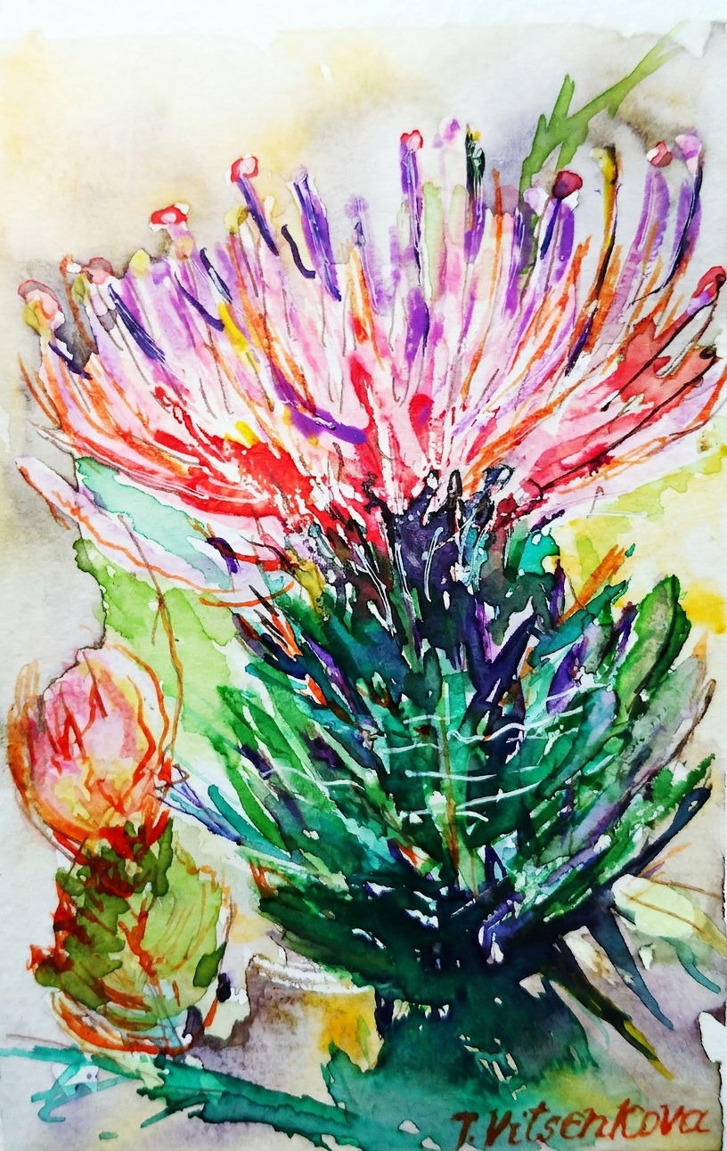
Thistle. A delightfully thorny wildflower featuring a magnificent display of eggplant and gold petals — nature’s way of saying, “I’m fancy and dangerous.” If the Luxembourg Gardens had a personality, this would be it. I’m convinced these flowers applied to art school and were accepted on their first try.
Thistle #1 — eggplant and gold. Fancy enough for the Luxembourg Gardens, too spiky for a hug.
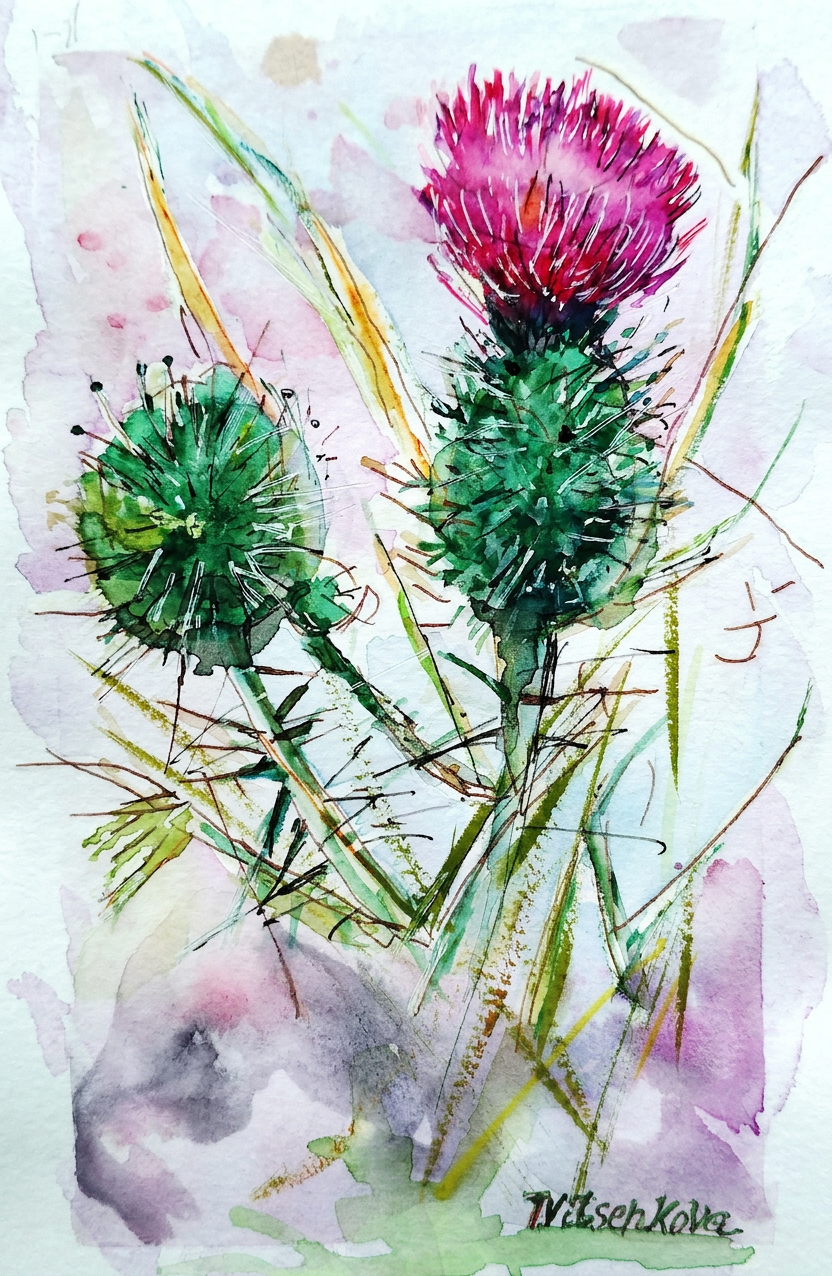
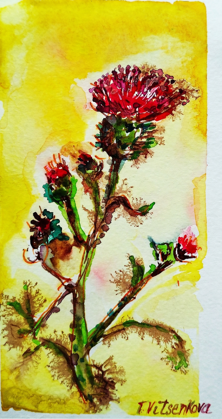
Thistle, take two. This particular specimen features sunny petals in the colors of pumpkin, orange, and beetroot — basically, if fall and autumn had a very colorful, very spiky baby. Yummy, right? (I mean, I wouldn’t recommend eating it. Paris is basically the thistle of cities — beautiful, elegant, and ready to stab you if you’re not paying attention (both literally, with its spiky architecture, and figuratively, with its devastating charm).
Thistle #2 — pumpkin and beetroot. Autumn had a baby and it’s delicious (don’t eat it).
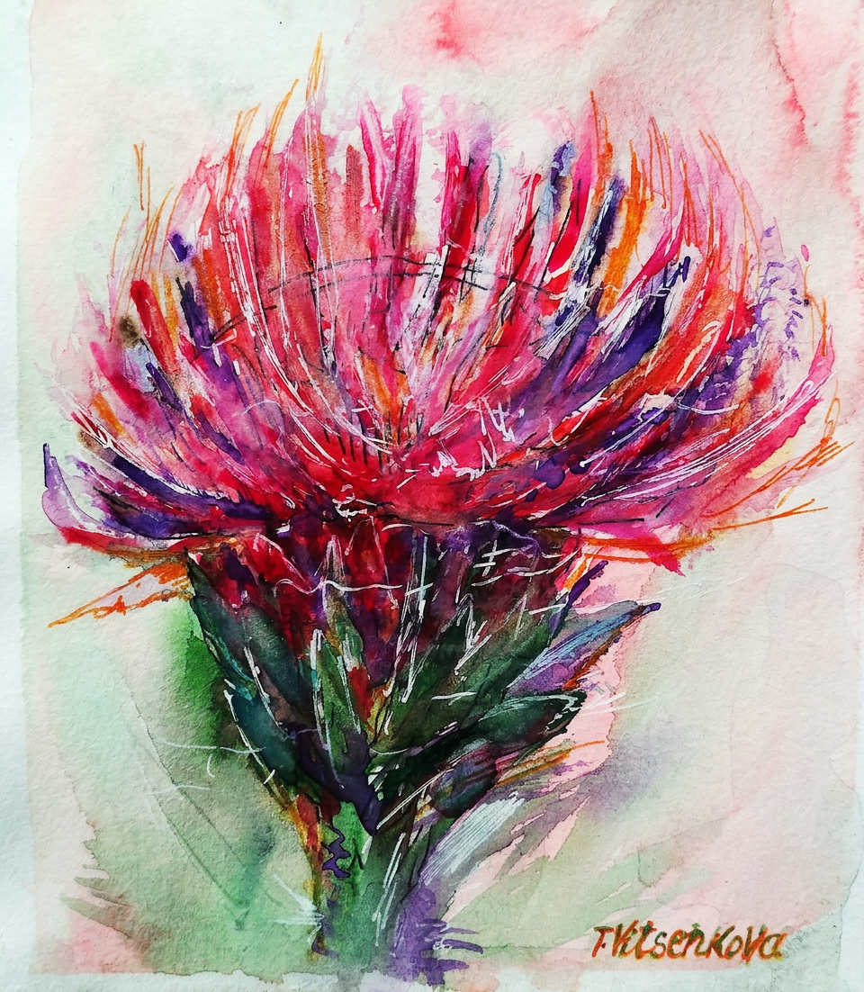
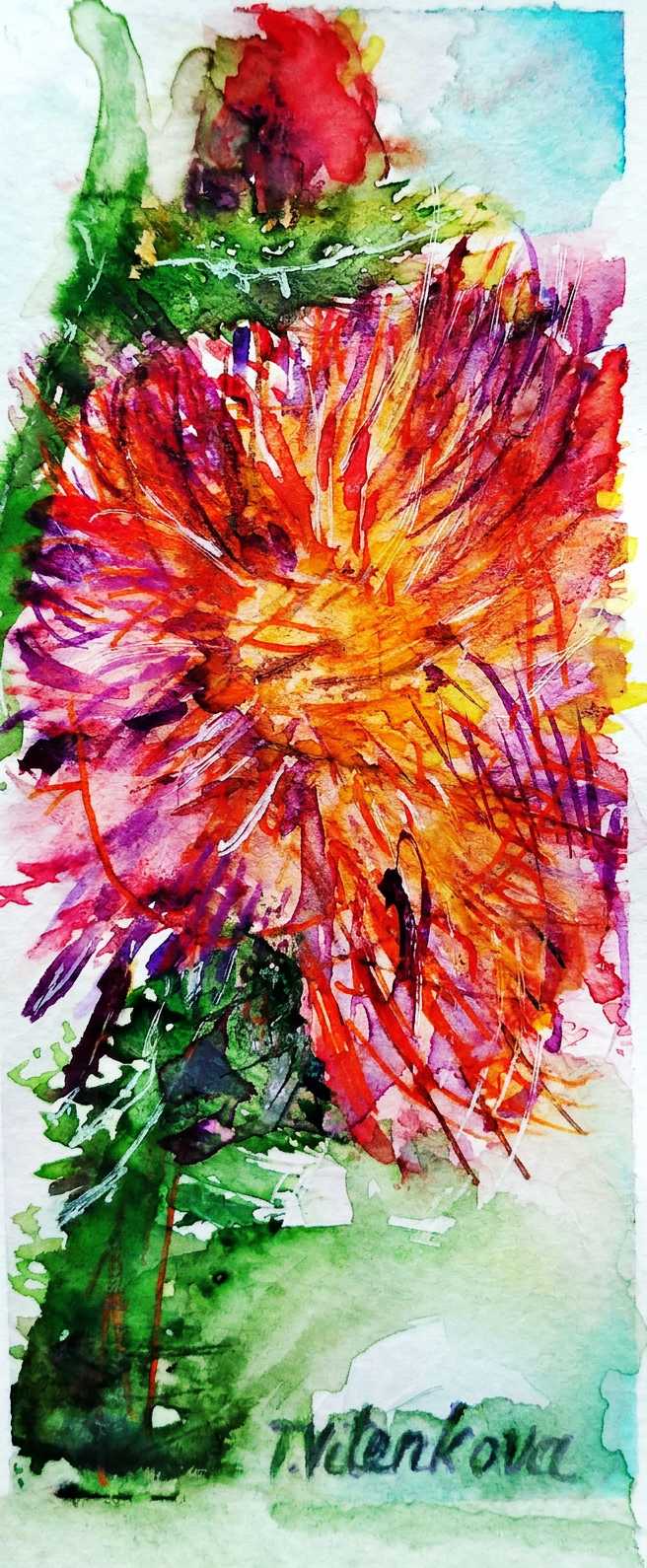
Thistle, round three (I promise this is getting somewhere). This wildflower rocks petals in canary yellow, spicy red, and burgundy — a color palette so sophisticated it makes the Pantone Institute nervous. It immediately evokes the Opera Garnier, one of the most aggressively elegant buildings in all of Paris.
Thistle #3 — canary yellow and burgundy. Opera Garnier called, it wants its colour palette back.
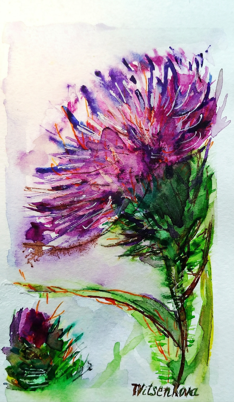
Thistle, the extended remix. This version features petals of amber and purple — a combination that somehow looks like what I imagine royalty smells like. And the flower buds? They range from massive to microscopic, rather like the museums scattered throughout Paris’s city center: Musée d’Orsay (the cool one everyone’s heard of), the Louvre (the one that gives you existential dread just trying to find the bathroom), Musée de l’Orangerie (deceptively small but absolutely packed with Monet’s fever dreams), Musée Marmottan Monet (for when you want MORE Monet, because apparently one museum wasn’t enough), Musée Jacquemart-André (where rich people kept their rich person collections), and Musée de Cluny (medieval vibes and the Unicorn Tapestries, which I definitely didn’t spend three hours staring at while taking blurry photos on my phone).
Thistle #4 — amber and purple. Smells like royalty, stings like a parking ticket.
Thistle number five: The Grand Finale. This specimen features a mustard-violet flower with thorns the color of, well, apple skin. Stylish as Parisian sweeping and majestic boulevards — which is to say, it looks like it went to finishing school in Switzerland and then casually conquered Europe while sipping espresso. The vibe is undeniably “I woke up like this but also spent four hours getting ready.”
Thistle #6 — apple thorns included. Looks elegant, will absolutely draw blood.
Thistle, the encore performance. Featuring peach-colored petals against a copper and amber background — basically what the Eiffel Tower looks like in the morning when you’ve woken up early because you couldn’t sleep (jet lag is romantic, apparently). This color combination is so warm and glowy that it makes you believe in magic, or at least in the possibility that Paris might actually be worth all the hype.
Thistle #7 — peach and copper. The Eiffel Tower at 6am. Romantic and deeply unreasonable.
Bon voyage! Until the next travel adventure :) Stay healthy, stay curious, and remember: life is too short to not travel, not sketch random flowers, and not pretend you understand French when someone speaks to you at a café (just nod and smile — it works 60% of the time, every time).
Bon voyage! Don’t forget your sketchpad. Or your beret. Actually, just the sketchpad.Thistle #5 — mustard and violet. The boulevard of wildflowers.
All paintings belong to the author and are protected by the ancient artist code: look but don’t touch, admire but don’t copy, and definitely don’t use without permission or face the wrath of someone who takes their wildflowers very seriously.
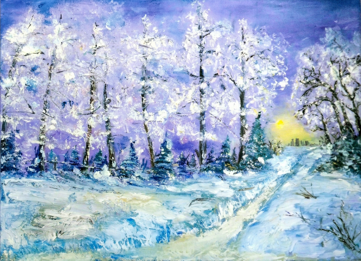
This post is a collection of my October daily sketches, but we’re jumping straight to winter. Because why follow a calendar like normal people?
Toronto’s winter is basically nature’s way of saying “time to stay indoors and contemplate your life choices.” Think snow, think wind, think your home suddenly becomes a cozy fortress where you can enjoy the view from your window while secretly judging people who actually venture outside. There’s ice skating (bring your bruises), and a festive Christmas-New Years atmosphere that makes you forget your heating bill exists.
Fair warning: All paintings in this post are refugees from previous seasons. Consider them time travelers.
Ontario Place in winter, immortalized in oil. Pro tip: If you squint really hard at this painting, you can spot the CN Tower looming in the distance—you know, that charming 0.5 km tall landmark that Toronto residents can see from literally everywhere, even from their nightmares.
Spot the CN Tower. No seriously, it’s in there somewhere.
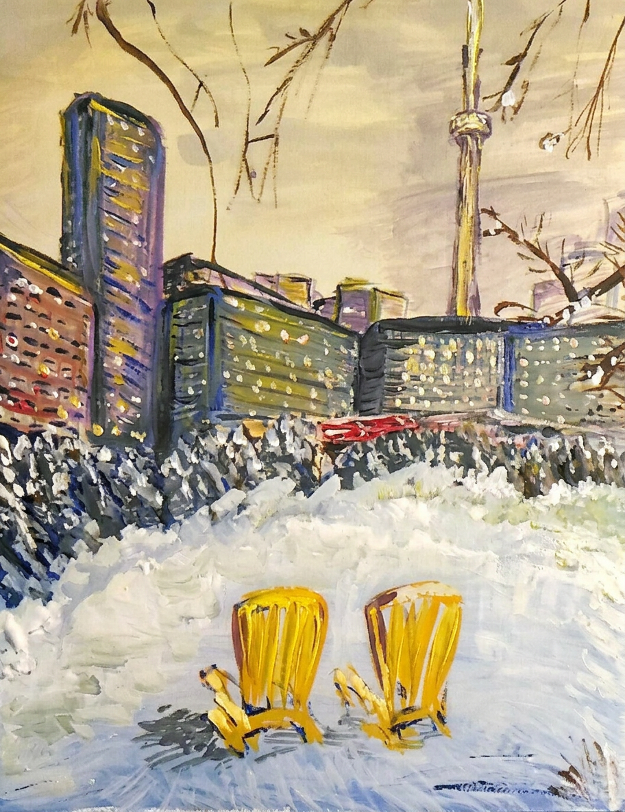
Winter at Toronto Music Garden downtown? Chef’s kiss. Fancy lights everywhere, a stunning CN Tower backdrop, and—here’s the plot twist—a couple of bright yellow summer beach chairs just casually hanging out on the frozen Ontario lake, apparently on strike from summer and refusing to acknowledge they’re in the wrong season.
Beach chairs on ice. Summer is in denial.
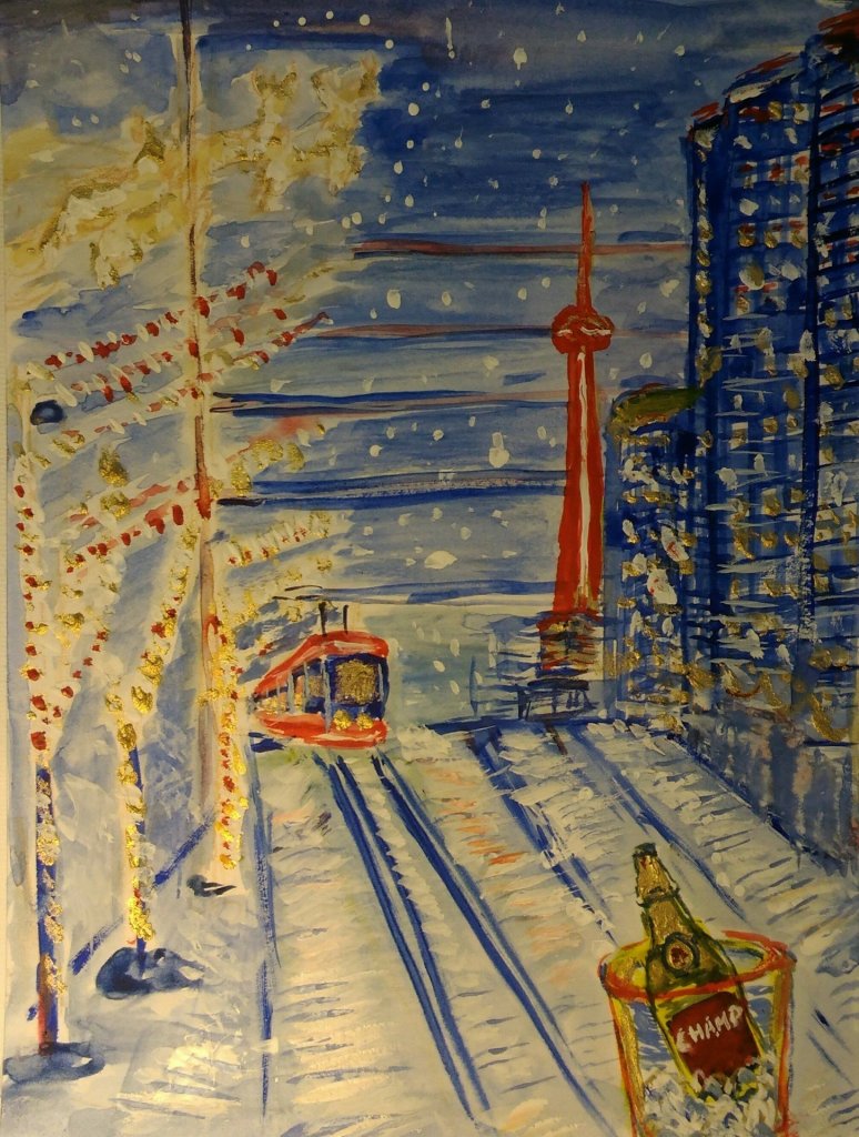
Queens Quay West and Spadina: The year is ending, and Toronto’s streetcar is basically in a mad dash to the finish line! This imaginary masterpiece features a Toronto tram hurtling toward the New Year like it’s late for a very important date, complete with Christmas sled deer (yes, deer—stay with me), flying gifts, and a suspiciously placed bucket of champagne just waiting to get obliterated by a speeding tram. What could go wrong? Happy Holidays will be welcoming… especially this year :)
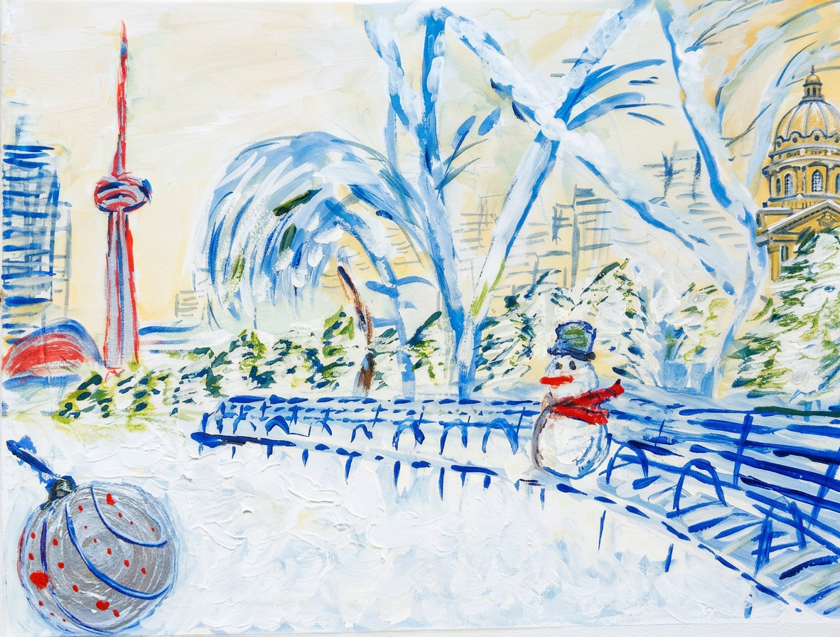
Yet another Toronto Music Garden watercolor! Featuring: one lonesome snowman, striking a philosophical pose with the CN Tower as his existential backdrop, and a shimmering silver Christmas ball judging his life choices. This was painted during a winter when Toronto actually got snow—yes, that rare, mythical phenomenon. Spoiler: snow doesn’t usually crash this far south near Ontario lake. When it does, locals act like they’ve discovered a new planet.
Or maybe it was a family having the time of their lives, engaged in the ancient tradition of hurling snowballs at each other and collaborating on a frosty monument to their own architectural ambitions.
Behold: A breathtakingly frosty twilight of downtown Toronto—complete with the Financial district’s fortress of high-risers, a cameo by the CN Tower, and Thompson Hall photobombing the party. I even threw in some gold powder because subtlety is overrated.
Gold dust included. You’re welcome.Toronto in winter. Beautiful. Cold. Very cold.
Holiday vibes, zero heating bills pictured.
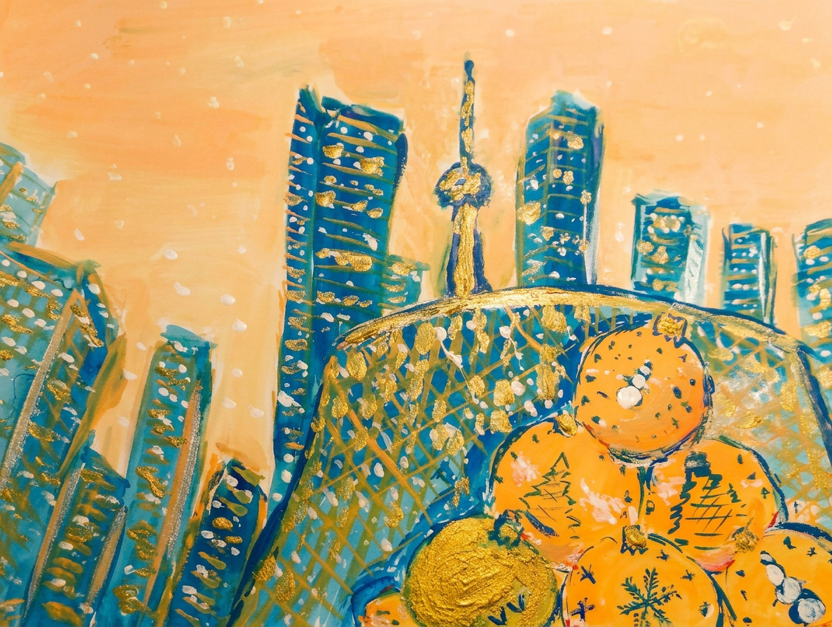
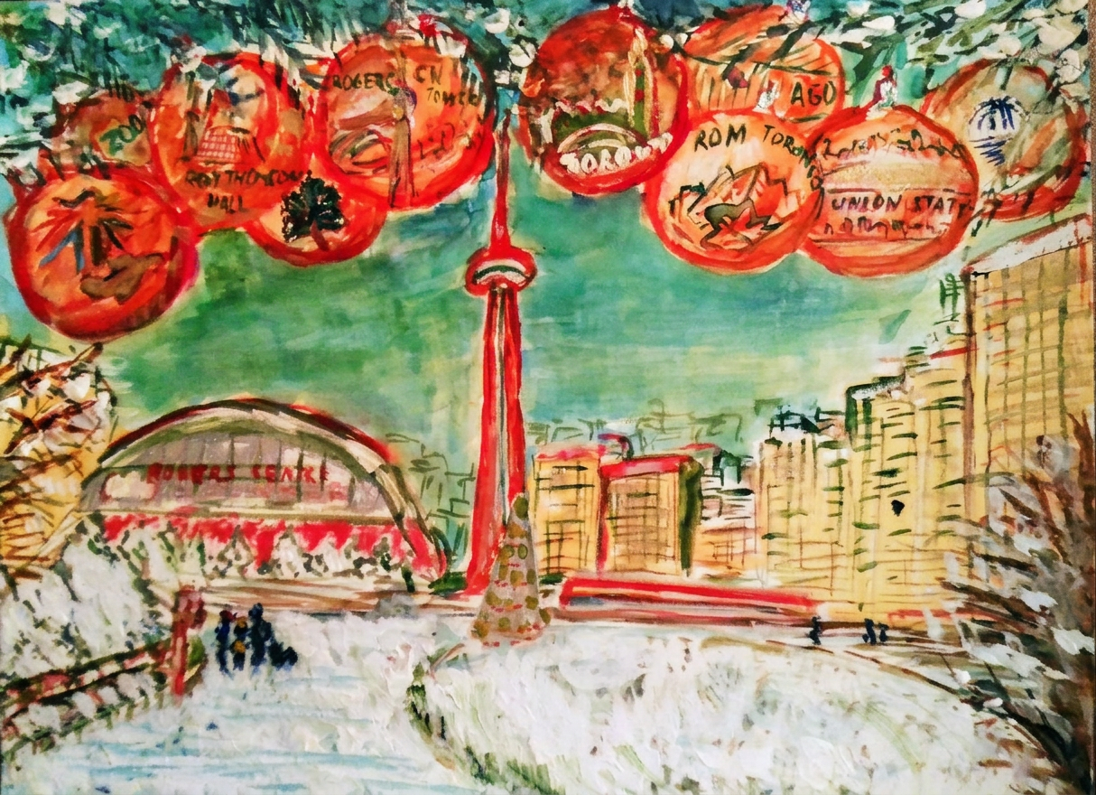
Gold fantasy extravaganza featuring the CN Tower, Thompson Hall, and Christmas balls so large they probably require their own zip codes.
Romantic. Festive. Definitely not freezing.
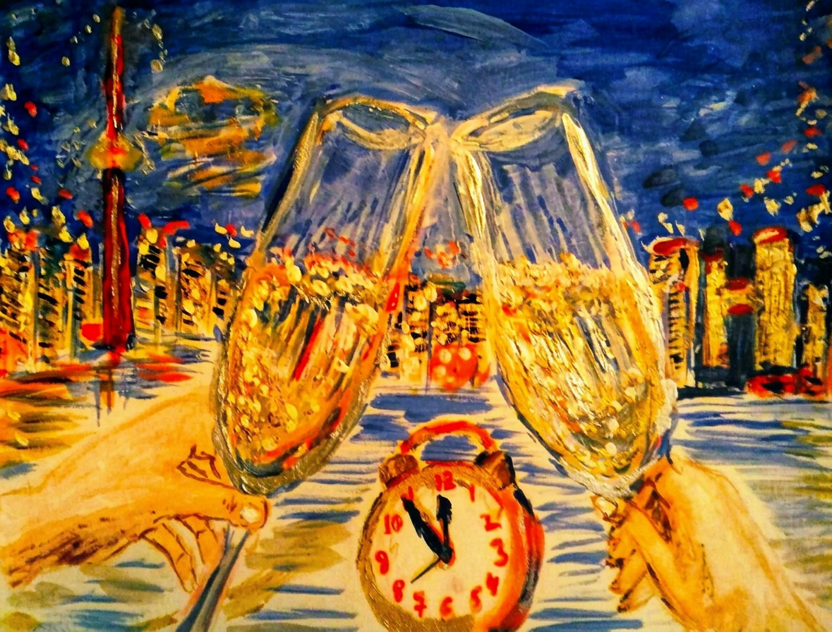
The romantic holiday painting with the beautiful night view of Toronto, featuring cheerful downtown during the holiday season. Clock counts down minutes to the New Year, Champagne is ready.
…and winter sunset skyline of Toronto downtown with CN Tower and Rogers centre. My dream shows lots of Christmas balls up in the air with my favorite places in Toronto – CN Tower, Rogers centre, Zoo, ROM Museum, Thompson Hall, Union station, AGO Museum, Pearson airport balls. Everybody can find their interesting places and buildings in the city. Watercolour painting with the landmarks and museums of the City on the Christmas balls, impressionism
Blue hour. Deep thoughts. Frozen toes.
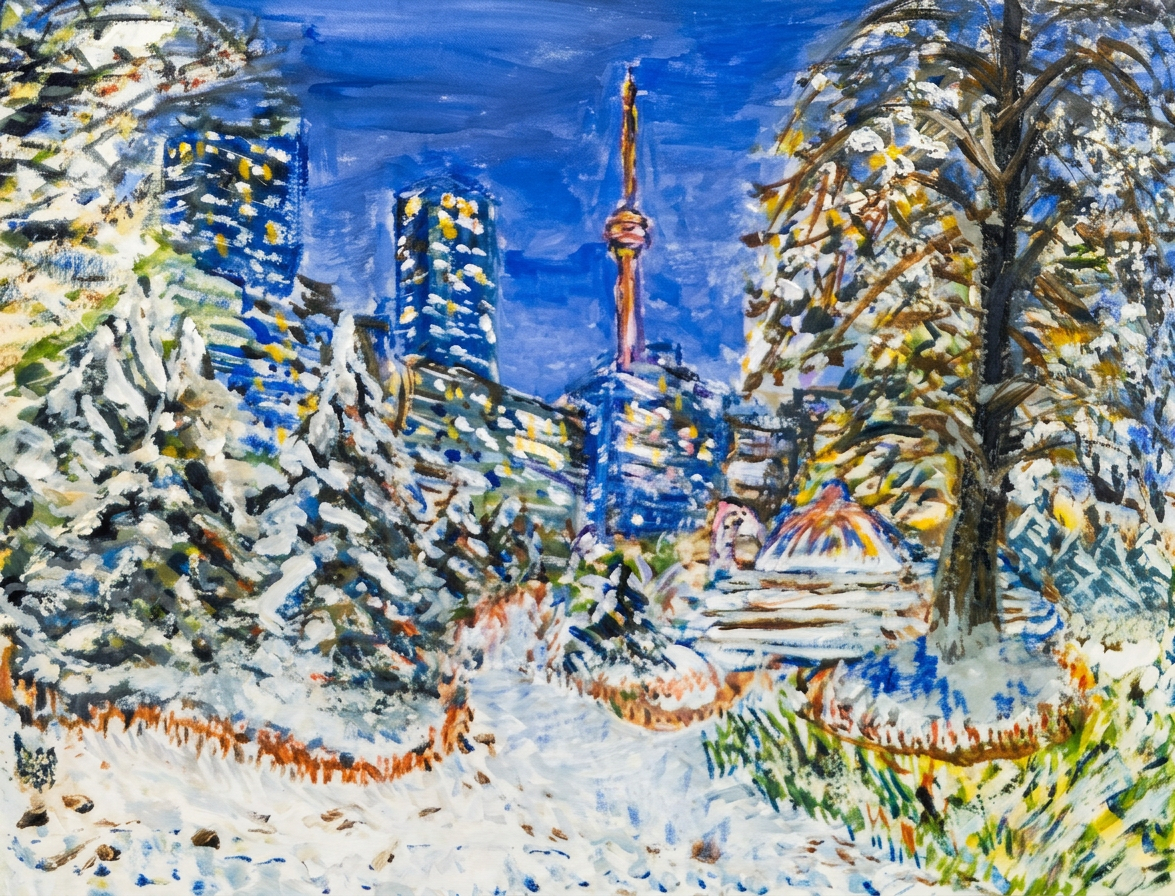
The Toronto Music Garden at night, now in moody blue. Very brooding. Very mysterious. Very “I’m contemplating why I’m standing outside in the snow.”
The snowman has seen things. He stares into the void.
Fingers crossed that my Toronto posts successfully convince you that this city is beautiful and welcoming! (The winter part is negotiable.)
Bon voyage! Until the next adventure :) Stay healthy, stay warm, stay away from icy patches.
All paintings belong to the author. No image is to be copied without permission. (Yes, I’m watching.)
Tools used for my painting: Watercolour by Charvin and Van Gogh brands (yes, THE Van Gogh—no big deal), Derwent watercolour pencils that cost more than my rent, and Faber Castell artist pens for the details. Paper by Strathmore Watercolour and Mixed Media albums, 15×20 cm (6×8 in.) – perfect for when you want your masterpieces portable-sized.
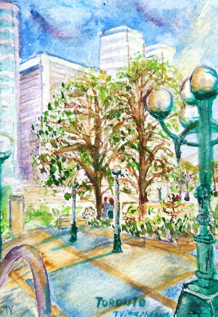
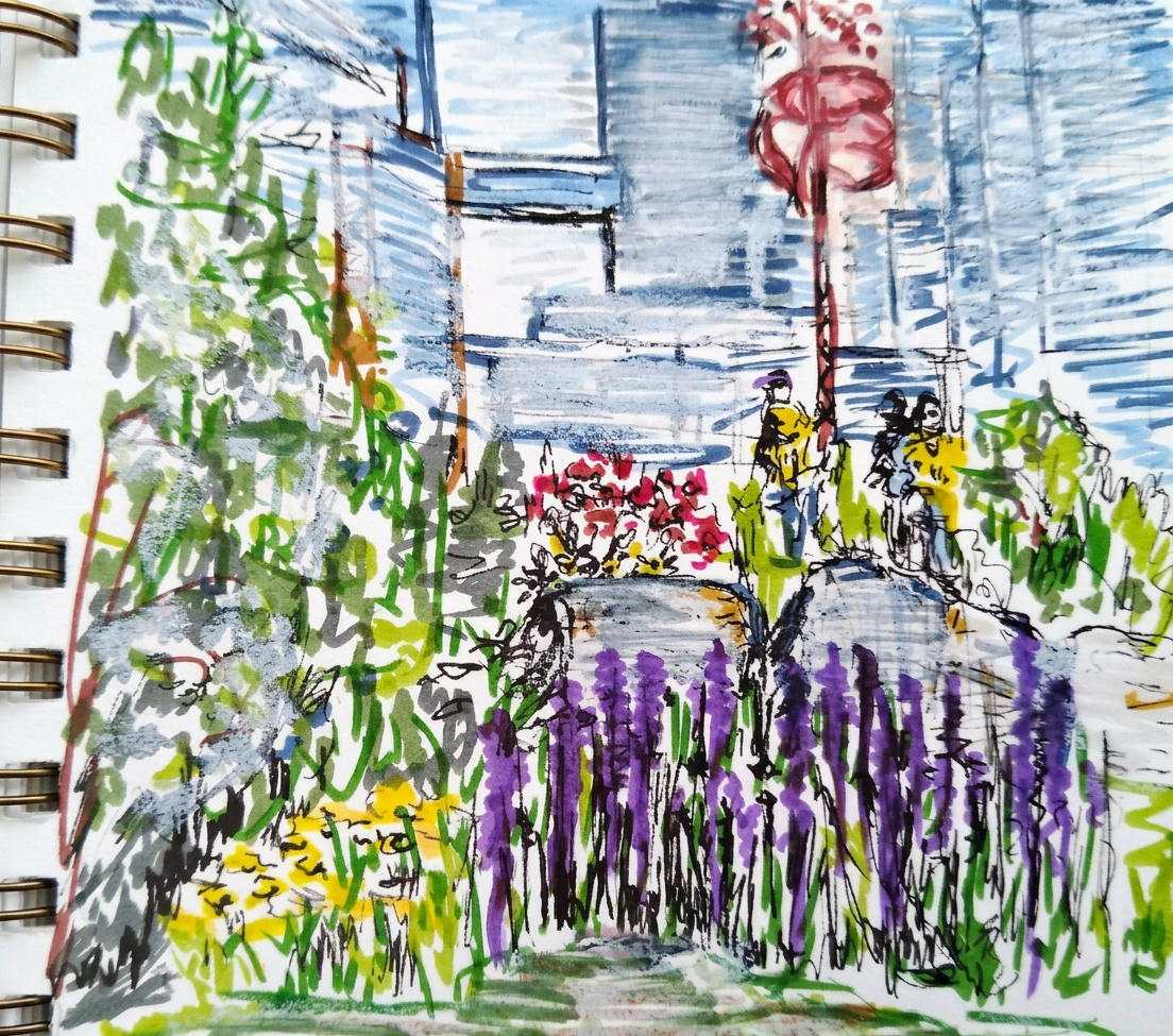
Welcome to the grand finale of my daily “travel and art” expedition through my home city Toronto—specifically October, when the weather couldn’t decide if it was summer or fall and everyone just wore a hoodie with the faint hope they’d covered all their bases. This post is about my neighborhood and that delightful little oasis called the Music Garden, where I pretend I’m culturally sophisticated when really I just wanted a place to sketch away from distracting squirrels.
Yes, that lamp is judging you.
The current unusual year with #stayhome and #lockdown is giving me the “opportunity” (read: forced chance) to discover the bright and friendly place I live in. Turns out when you can’t leave your city, you get really creative about appreciating it. Who knew?
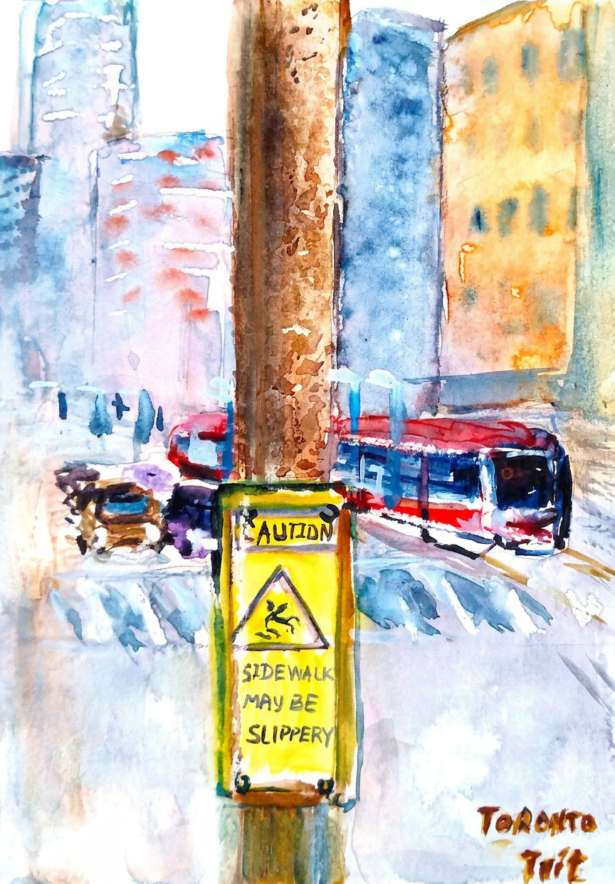
The tram that never waited for anyone.
This painting is mostly for fun :) Honestly, the main subject is that bright yellow street sign screaming “Sidewalk maybe slippery” at the pedestrians—because nothing says “artistic endeavor” like immortalizing municipal warnings in watercolor. I may or may not have laughed while painting it.
I used to trudge this way every morning to my office like a regular working human. Not this year! Almost all locals are now professional Zoom dwellers, except for our essential and frontline workers—thank you, seriously! This particular bridge? It’s on Spadina avenue at Front street, where I stand looking artistically contemplative while secretly plotting which coffee shop to revisit.
Nature doing its best impression of a painting.
Still prettier than my apartment.
The Music Garden is still blooming, stubbornly refusing to acknowledge that autumn exists. Apparently Mother Nature didn’t get the memo about the seasonal calendar this year, which honestly? Respect.
The garden, unbothered, thriving, iconic.
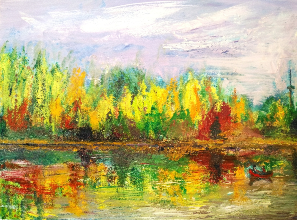
My fall “travel and art” adventure in October’s Toronto has officially concluded. Turns out there are buckets of lovely places in and around the city if you’re brave enough to venture beyond your kitchen during a lockdown. (Spoiler: I was.)
High Park in fall. No filter needed — but I used one anyway.
I documented some of my daily sketches this month, capturing my “art office” in all its chaotic glory—you know, that corner where I pretend to look professional while surrounded by paint-stained brushes, mysterious crumbs, and at least three empty coffee cups. It’s organized chaos. Mostly chaos.
Bon voyage! Until the next adventure :) Stay healthy—and more importantly, stay creative!
All paintings belong to the author. No image is to be copied without permission. (Yes, I’m protective of my work. You would be too if you’d spent this much time not getting paid for it.)
Tools used for my painting: Watercolor by Charvin and Van Gogh (the fancy stuff that makes you feel fancy for approximately 0.5 seconds before you drip it on your sleeve). Derwent watercolor pencils and Faber Castell artist pens (because I like to mix media and confuse myself). Paper: Strathmore Watercolor and Mixed Media albums, 15×20 cm (6×8 in.)—perfect for when you want to create art but also maintain your sanity by keeping it to a manageable size.