Do you love watermelones – it is all about this berry. I posted my favourite paintings, juicy!
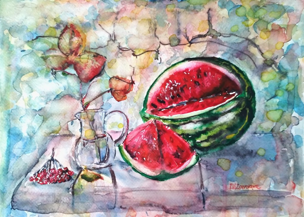
Watermelon, the king of summer and autumn dessert. Juicy watermelon on a table with a glass, autumn leaves and berries are adding warm relaxing night atmosphere. Marble original watercolor and ink painting, impressionism style.
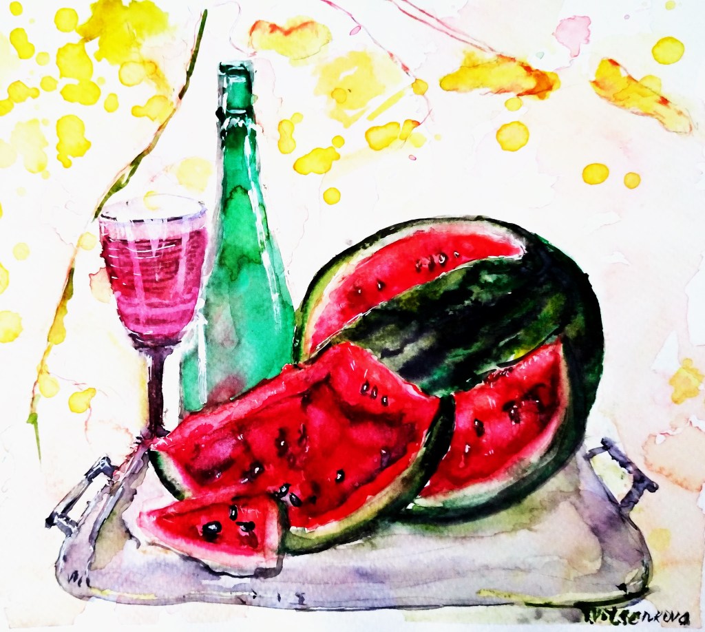
Another one. Juicy watermelon on a silver tray, glass with a bottle of wine on a summer day. Bright original watercolor and ink painting, impressionism style
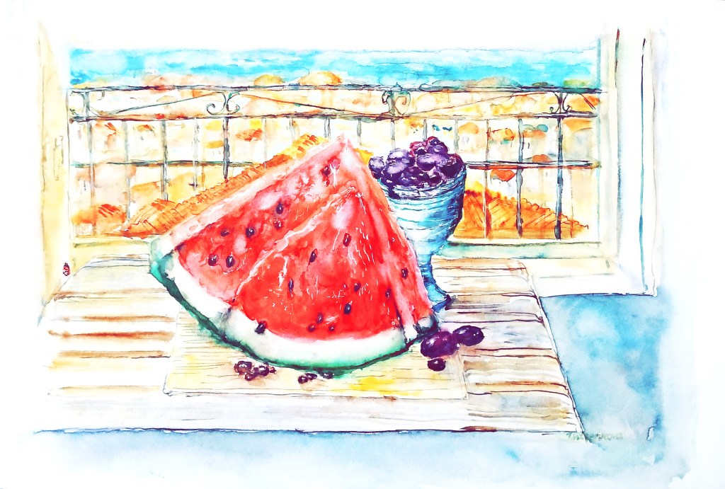
Watermelon and violet grapes in summer with a city and sea in background
Want to give your room that “I’m on vacation, but sadly still paying rent” vibe? This painting brings you the laid‑back, midday calm of a southern Mediterranean city any time of year—no plane ticket, sunscreen, or jet lag required. Juicy slices of watermelon lounge on the table next to violet grapes chilling in a glass, like they’re posing for a fruit fashion shoot. This still life whispers of sunny, warm days and gloriously lazy weekends. Through the window and from the balcony, you can spot a town with red roofs and a blue sea in the distance—basically the view you’d pick on a booking site. An original watercolor impressionist painting, perfect for when you want your walls to relax even more than you do.
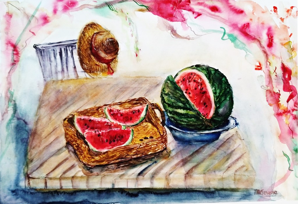
Want to give your room a chill, laid‑back vibe? This painting is basically a permanent summer vacation for your walls, serving up that lazy midday atmosphere of a southern Mediterranean city all year round. It’s ready to handle all your relaxation requirements. We’re talking juicy slices of watermelon piled into a straw basket and scattered on a plate, like someone just walked away mid-snack. I even threw in a chair with a straw hat (yes, with flowers) casually hanging off it, sitting on a porchway wrapped in blooms. This still life is a sunny reminder of warm weather, slow weekends, and the art of doing absolutely nothing. Original watercolor and ink impressionism painting.
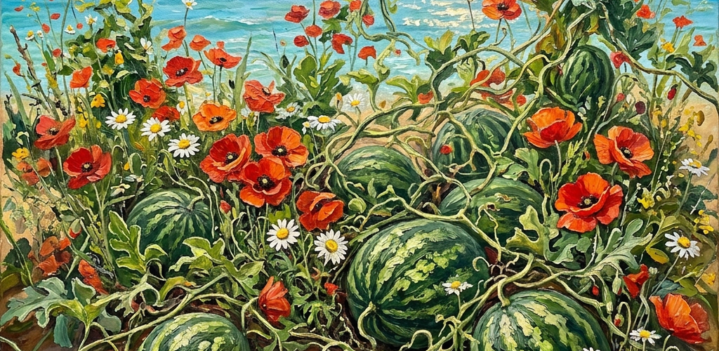
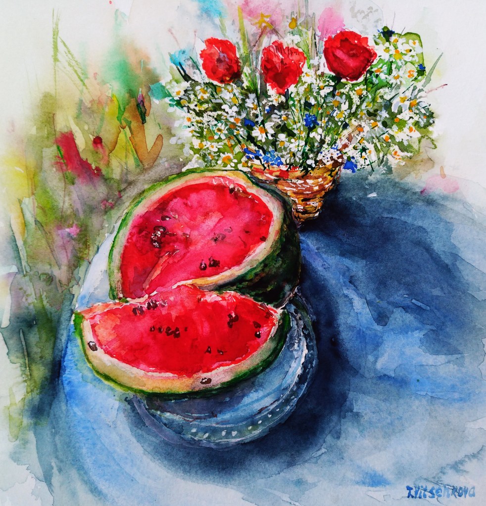
Watermelon, poppies, and daisies. Watercolor and ink original painting. Watermelon with flowers in a straw basket, featuring poppies and daisies.
Ever tried juggling juicy watermelons and wild paint strokes at the same time? Tell us all about your most disastrously brilliant summer art experiments :)
All paintings belong to the author. No image is to be copied without permission
Bon voyage! Until the next travel:) Stay healthy.
All paintings belong to the author. No image is to be copied without permission.
Tools used for my painting Watercolour used Charvin and Van Gogh brands, Pastel GrayPas Expressionist, Derwent watercolour pencils and Faber Castell artist pens. Paper Strathmore Watercolour and Mixed Media albums, 15×20 cm (6×8 in.)
17 years of art experience and a pile of degrees, yet here I am at London Art College, sitting like a total freshman. (Honestly, that’s a ready-made punchline.)
It’s a generational engineering trauma: my family is physically incapable of simply buying a ready-made product. Fellow cheapskate artists will appreciate this 10/10.
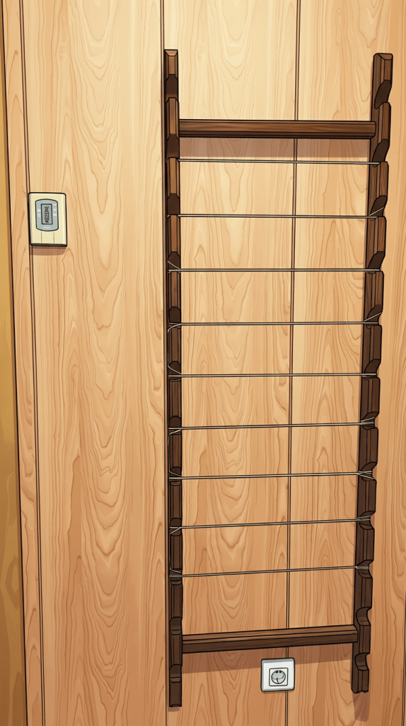
Welcome to my mini-series, where I’m transforming a heavy oak hanger into a custom studio storyboard panel. Armed with an engineering degree, an illustrator’s eye, and a few everyday items, I’m building a creative workspace from scratch—one detail, texture, and sketch at a time.
Skipping boring, ready-made store options to flex my own designer storyboard…
So, it’s an old coat rack instead of the big online retail giants, turned into a storyboard that works like a puppet theater where you can slide frames up and down.
Creating StoryBoard Panel
I was not sure how to name this old-fashioned hanger, forgotten part of previous owners of my apartment. Maybe the Brief Hanger? Or the Draft Board? Finally the name was chosen as StoryBoard Panel because I am going to create new stories about my friends, characters and maybe animals…
Welcome – StoryBoard Panel
And to wrap it up: who’s with me on this crazy ride? Who else feels that urgent, genetic need to look at a piece of useless junk laying around the house and think: “Yeah, I can definitely build something out of that”? What about you?
Well, I do have a Vintage coat rack / Wooden base. Then what do I need else?
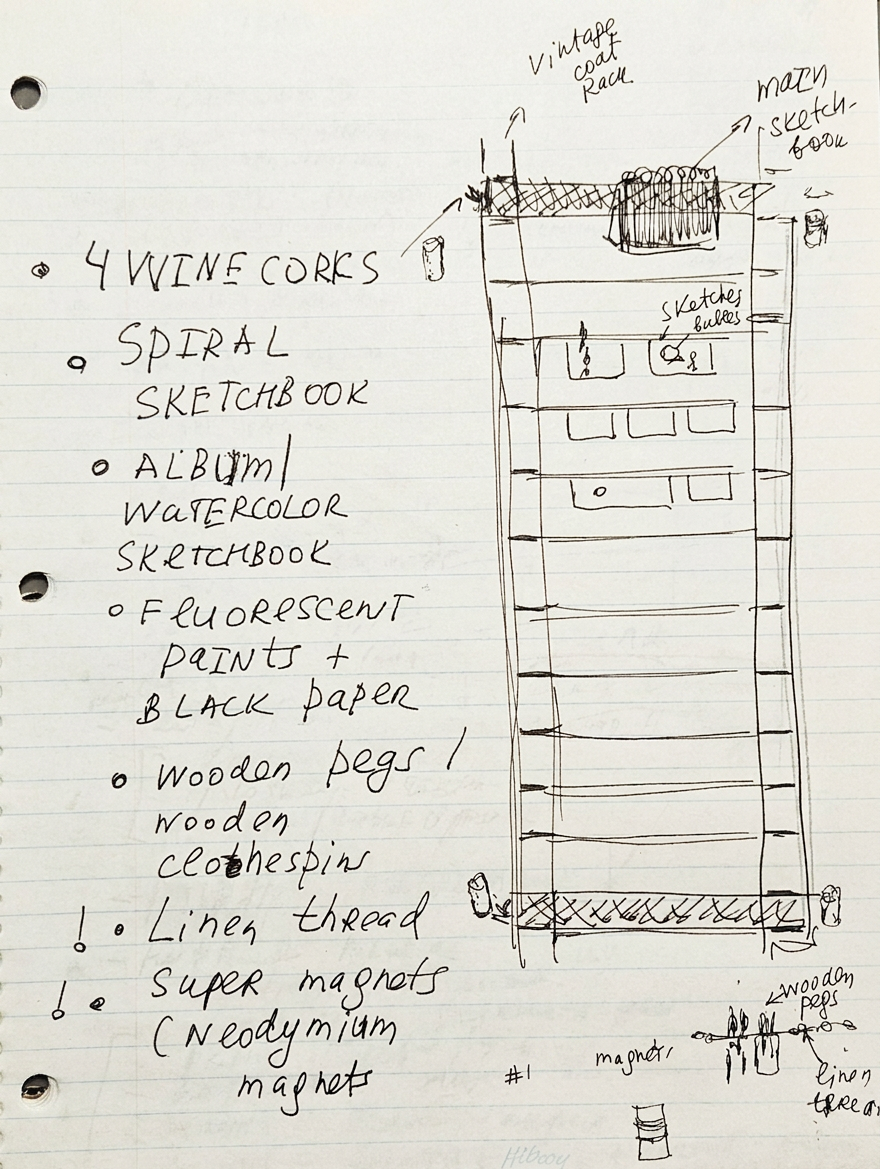
My plan
Spiral sketchbook: This is where the magic (and the chaos) starts before I tear it apart.
Structural engineering, but make it wine.
3-color sketchbook & black paper: For when regular white paper is just too mainstream and boring.
Fluorescent paints: To make my ideas literally glow in the dark and pop off the page.
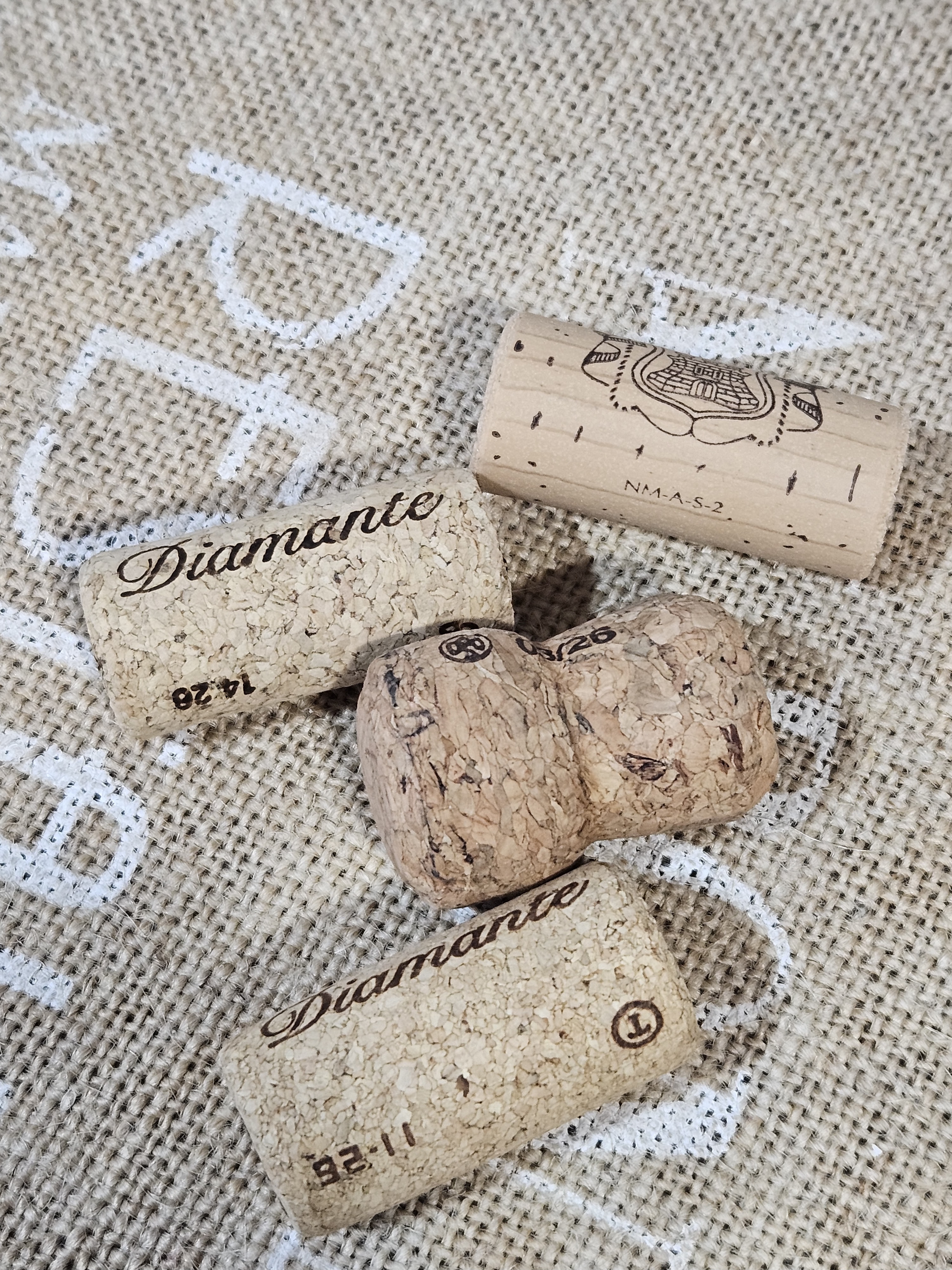
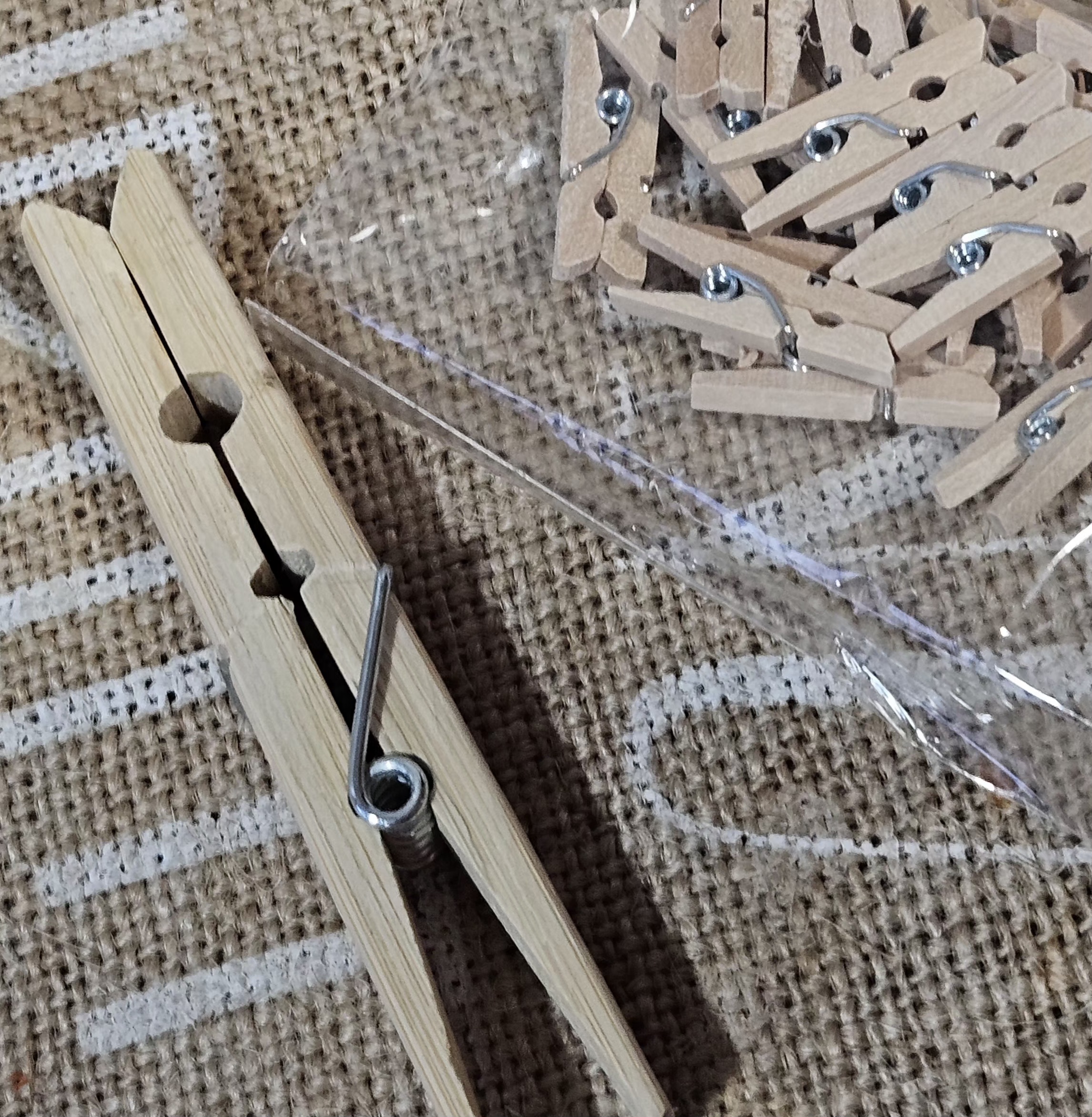
Wooden pegs: My tiny wooden assistants doing the heavy lifting of holding the story together.
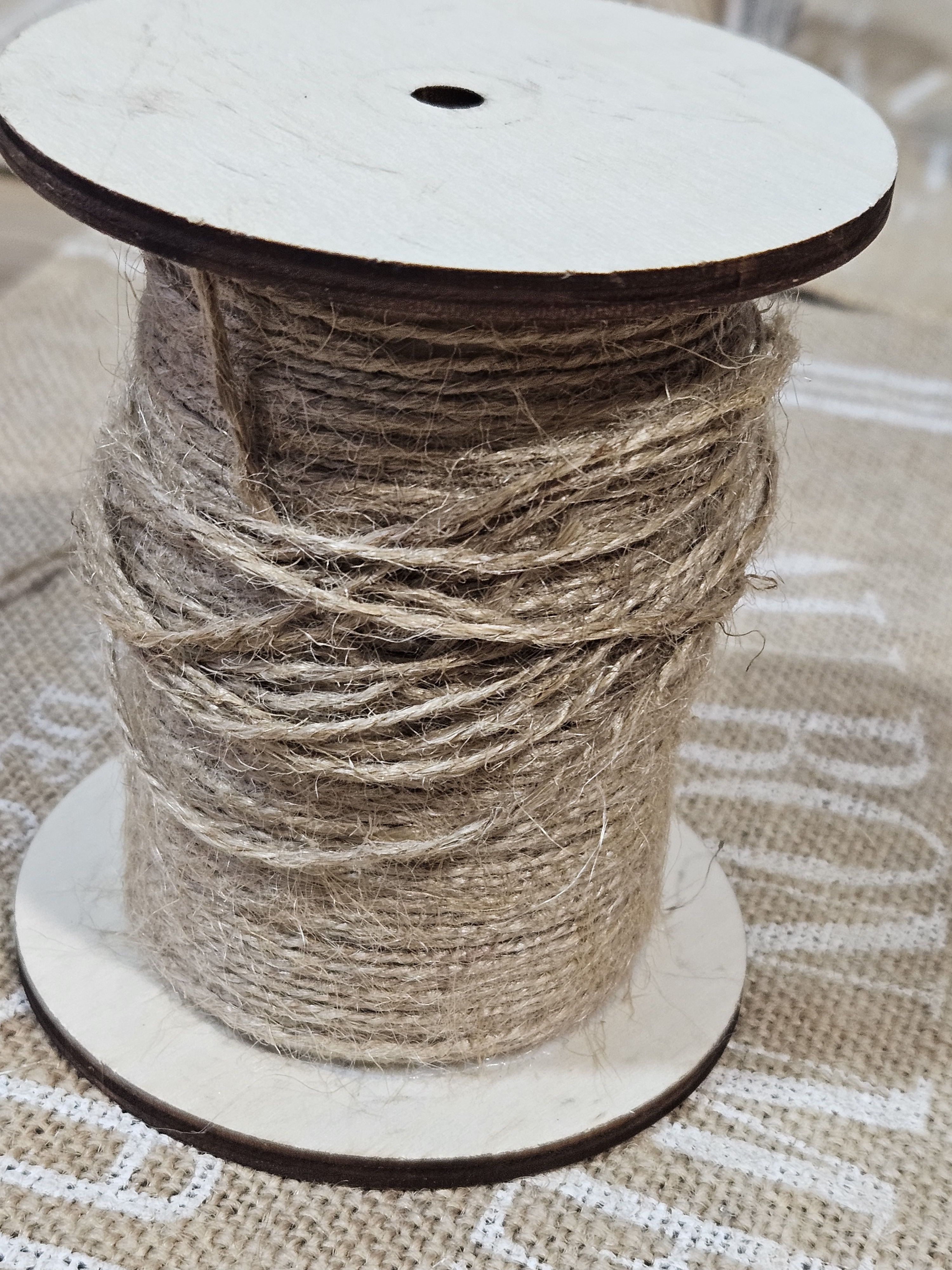
Linen strings: The tightropes my characters walk on while I figure out the plot twist.
Super magnets: For snaps, rapid changes, and maximum satisfying clicks.
Transparent elements:** Now you see it, now you don’t—pure layout wizardry.
The real joke: Designer storyboard
Picture a professional designer with fancy degrees hanging out in a store, aggressively clicking tiny magnets together to test their power. Right after that, I was stress-testing a roll of linen string to see if it would survive being wrapped around an old coat rack, while the staff slowly backed away.
What about you, fellow artists and illustrators? What do you use to keep your storyboards and ideas organized? Share your favorite studio hacks below!
Still life and urban sketching (with extra thorns)
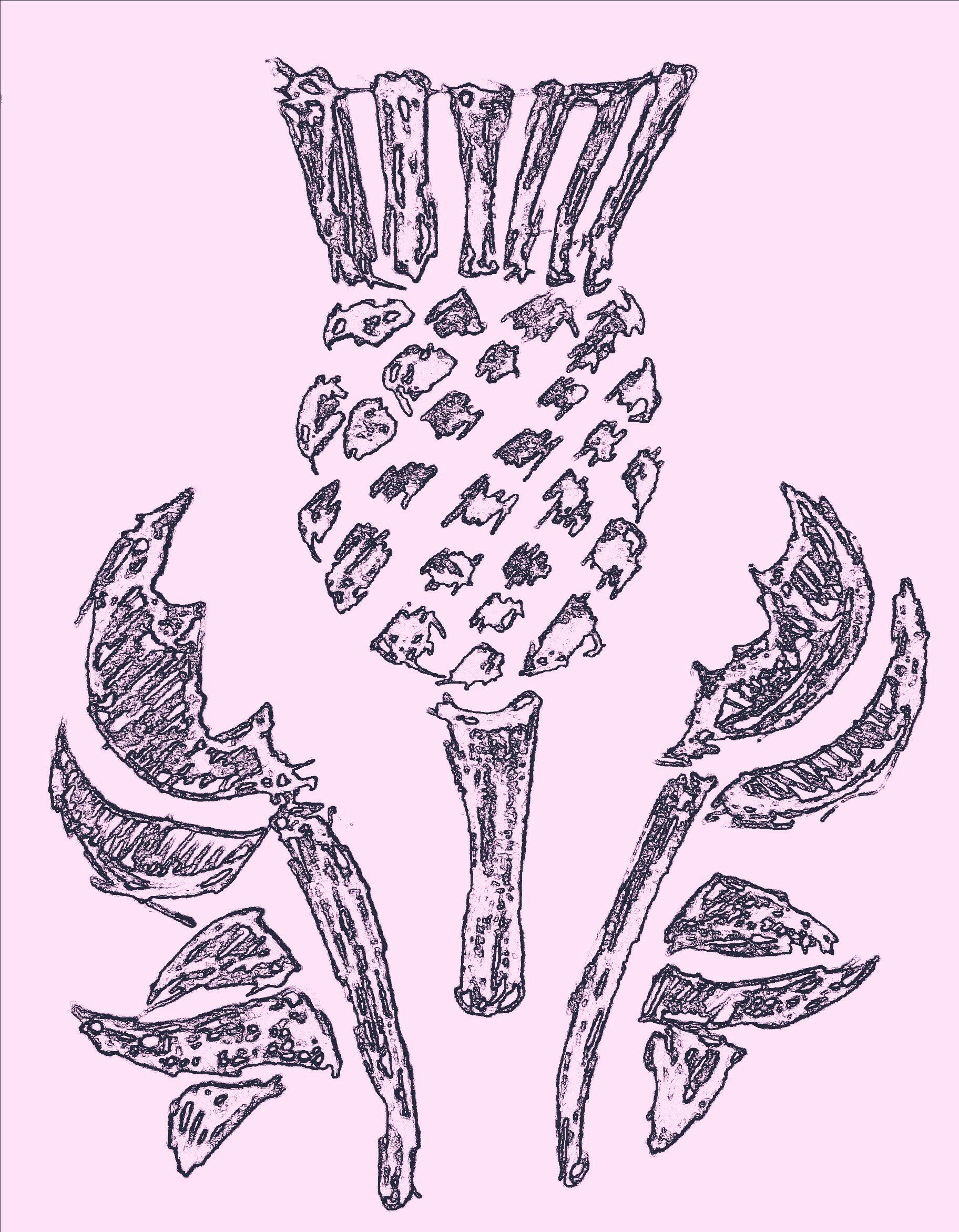
The spiky diva herself. Don’t touch.
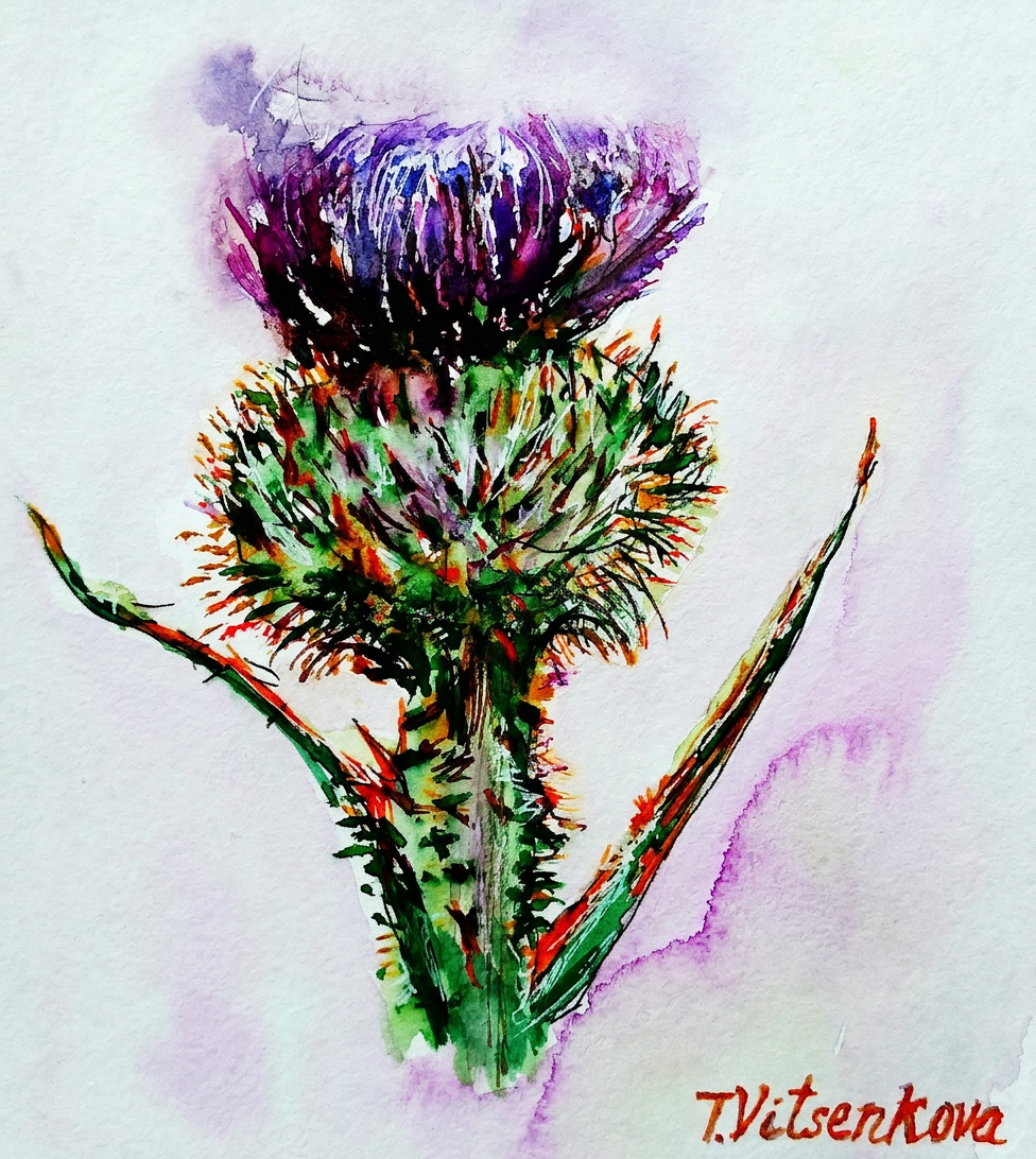
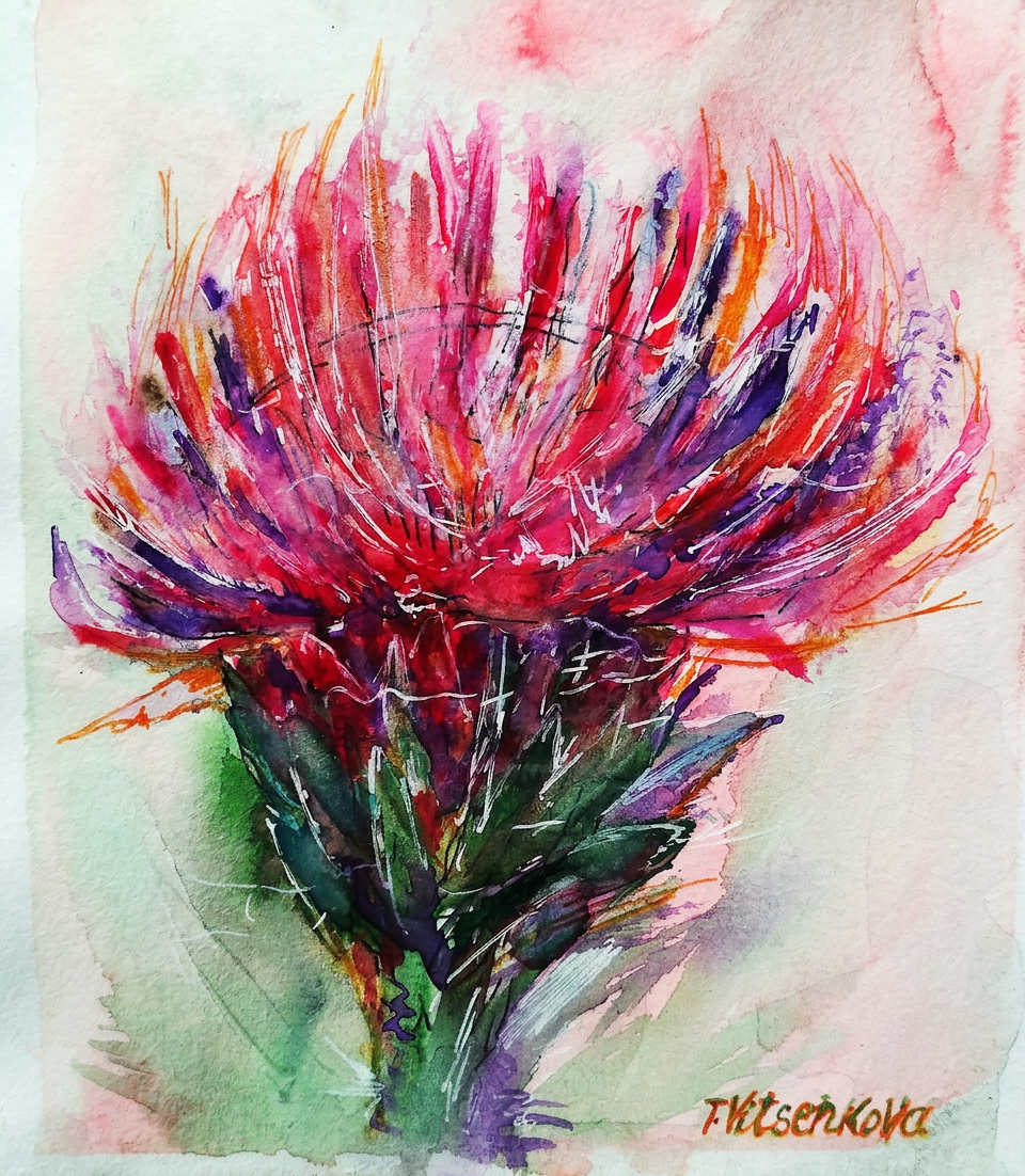
My sister asked me to paint a thistle flower that captures its personality: character, strength, inflexibility, firmness, and an almost aggressive refusal to die under any circumstances. Basically, the Rambo of the flower kingdom. Challenge accepted! I created an entire series of these botanical warriors that thrive everywhere and survive conditions that would make other flowers quit their jobs and move to Arizona.
Behold: one of my first watercolor flower graphics with ink—a masterpiece created when I was still discovering my artistic voice. I wielded cooler purple and dark violet like a tiny ninja, with strategic additions of carrot orange and silver gray. (Translation: I threw colors at paper and it worked.)
Purple and orange? She woke up and chose violence.
The thistle is credited with possessing the magical ability to ward off evil spirits. So basically, it’s the flower equivalent of garlic and a cross combined. Vampires and demons should be very, very worried.
Now here’s where it gets spicy: The thistle has been Scotland’s symbol since the 13th century. Legend has it that some ambitious army decided to invade Scotland by launching a surprise night raid. Tactical genius, right? Wrong. In their infinite wisdom, the invaders removed their shoes to move stealthily through the darkness. Spoiler alert: their stealth plan came to an abrupt end when one unfortunate soldier stepped barefoot on a thistle. The resulting shriek? Loud enough to wake the sleeping Scottish soldiers, who then proceeded to win the day. And THAT, my friends, is how a tiny spiky flower saved an entire nation. You’re welcome, Scotland!
Scotland’s unsung hero. Barefoot invaders not included.
The thistle is the official emblem of the Knights of the Order of the Thistle—a group of people who basically said, “You know what this order needs? A flower that actively hurts people.” Their motto? The Latin phrase Nemo me impune lacessit, which means “No one will touch me with impunity.” (Translation: This flower has zero chill.)
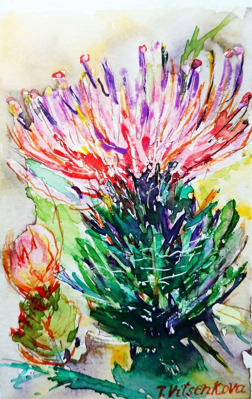
Thistle wildflower watercolor graphic alert! With ink, because subtlety is overrated. I mixed colors like I was a culinary artist: pink, milky blue opal, saffron latte, and neon colors for extra pizzazz. If your thistle painting doesn’t make people’s eyeballs tingle, are you even trying?
Pink, neon, and zero regrets.
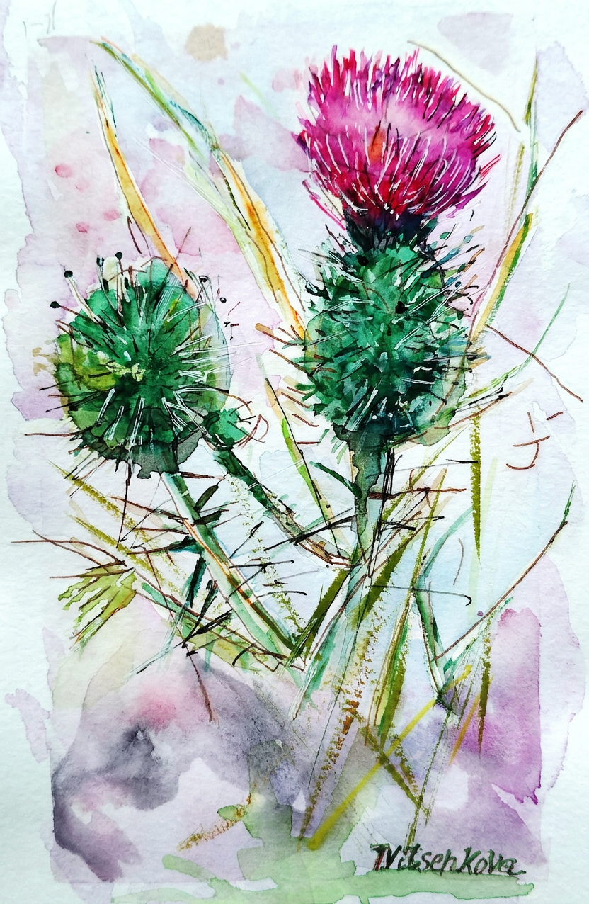
I’m absolutely obsessed with pink thistles and their refreshingly simple color palette. A splash of plum color, some pistachio background, and boom—you’ve got botanical happiness on paper. It’s like painting flower versions of minimalist interior design.
Minimalist thistle. Maximum attitude.
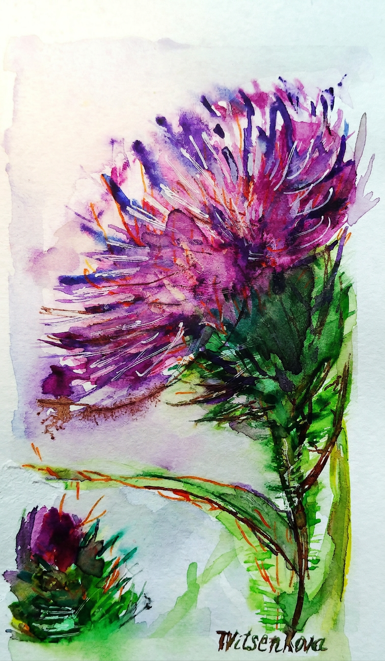
Thistle watercolor wildflower painting featuring petals the color of blueberries and purple grapes. Translation: I made fruit jealous by using their colors on a flower. The audacity!
Blueberry vibes. Not edible. Learned that the hard way.
Watercolor flowers graphic extravaganza! With ink, because apparently I can’t help myself. Colors used: strawberry petals (obviously), light khaki, and a shade of flax background that somehow made the whole thing work. Art is chaos. Beautiful, intentional chaos.
Strawberry fields forever — but make it thorny.
Plot twist: Some thistles come in caramel and turmeric colors. Because apparently thistle diversity includes the entire spice rack.
Caramel and turmeric. The spice rack called, it wants its colors back.
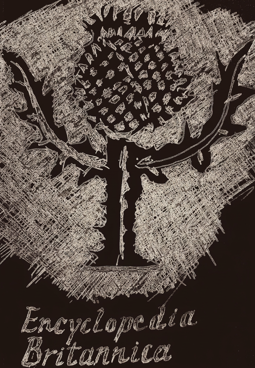
Here’s the thing about pink thistles: they’re the most popular thistle color, which is why I gathered all my pink watercolor paintings in my first post about this fabulous flower (complete with Scotland’s legendary defense narrative). And now, hold onto your berets: a thistle is not just the floral emblem of Scotland AND Lorraine—it’s ALSO the emblem of the Encyclopedia Britannica. That’s right, thistles are basically the overachievers of the plant world. They didn’t just stop at one honor. They went for three.
✦ This is Part 2 of the Vibrant Sea Landscapes series. In Part 1 I shared the story behind this painting — the inspiration, the color palette, and the Charleston connection. Here you’ll find the full step-by-step workshop. Grab your paints!
For my artist colleagues. Workshops. Holidays spirit for creative community. Paint your world.
I documented the main stages of the painting—from sketching to layering colors. Hope you appreciate seeing the evolution of a piece. I have a simple algorithm of 10 steps. Let’s warm up first:) I feel like a child, surrounded by bright colors in my studio and at the beach:)
Step 1. Color palette
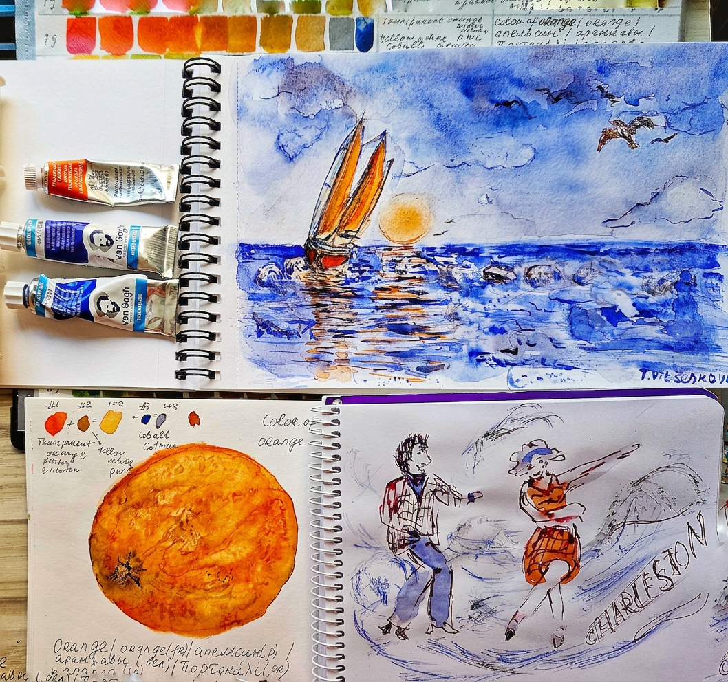
I am using a limited palette, a mixture of cobalt, ultramarine, and orange.
I’m drawing inspiration from the colors of berries and fruits. Expect vibrant hues that bring these sea landscapes to life. Let’s mix it up! Would love to hear your thoughts:)
Interestingly, in English, “orange” refers to both a fruit and a color, while other languages have separate words for each. I refer to this color as the fruit orange. “Orange sunset” sounds tasty, doesn’t it? :)
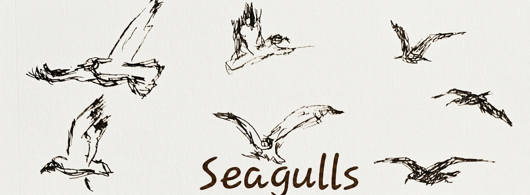
Step 2. Draftof birds
Primarily I was drawing seagulls in motion, soaring through the sky to convey a sense of freedom and movement. And occasionally I featured a hawk known as the Osprey, orsea hawk, which is known for catching fish. Never heard about this bird before… Painting is relaxing fun, always something new to learn:) Love to hear your funny stories during the painting process!
Step 3. Draft of boats
So on my photo reference the yacht is tranquil and a little bit boring. Not a problem, I added wind to my painting and voila— the yacht is moving towards distant shores.
Where is my yacht headed, and who is aboard?
Step 4. Soundtrack Inspiration
How about playing music while painting? Do you like it? I love it.
It captures the essence of sea and any imaginary story’s sounds, for this art is Charleston music! :) This rhythm can influence your brushwork and composition.
Similarly, there are some emotions linked with both the sea and the dance. How does the sight of the waves in motion resonate with you? Does it evoke joy or a sense of freedom? Maybe nostalgia?
Likewise, both are forms of expression that echo life’s rhythms. This serves as a metaphor. It merges the fluidity of sea waves with the rhythm of dance in the jazz age. Paint it like a lively Charleston—dynamic, energetic, and full of life!:)
Just listen to any Charleston music and your brush will do various brush techniques—including swirling, dabbing, and stippling—enhanced the illusion of movement in the wave paintings :)
At the end of the post, I will share my favorite list of Charleston compositions that you can find on YouTube.
Step 5. Color of yacht
Then adding color to the yacht. I chose vibrant bright orange, making it stand out against the sunset backdrop. The shadows of the yacht were painted in a mixture of ultramarine and orange.
Step 6. The 1st layer of sea, foam and waves
The foam shadow was painted with hints of a mixture of all three colors—cobalt, ultramarine, and orange—to capture the sunlight. I also left some white paper on top of the foam for contrast. Love catching the essence of the sea through art.
Step 7. The 1st layer of sky and clouds
Similarly, adding color to the sky. I was using a wet technique and adding a horizontal line. I left white spots on paper to give the clouds volume.
Step 8. The 2nd layer for sky, sea, foams and reflections
I used a gradient of warm hues for the sunset. The gradient starts with orange and lighter tones. I added blues as I moved upwards toward the sky.
For the sea, I incorporated a rich palette of blues, mixing ultramarine and cobalt to show the sea colors.
Step 9. Details for sea, yacht and birds
The main idea was to show the movement of the water. I employed swirling brush strokes to capture the water’s restless energy. The reflections in the water depict how the colors of the sunset and the yacht are mirrored beneath the waves.
Waves roll and splash joyfully. To add a bright spot, I painted an orange yacht sailing away in the strong wind.
I also added some color for seagulls circling above, their bodies glowing orange against the cloudy sky.
Step 10. Cool down
Adding some details for birds, decide what the name will be for the artwork and put the signature. Voila:)
I am capturing the essence of the sea upon my watercolor paper. Its waves are crashing gracefully. Meanwhile, an orange yacht sails onward toward the horizon of distant lands. What tale does this scene whisper?
It depicts an enchanting couple aboard the yacht. They are lost in a lively dance of the Charleston. Their laughter mingles with the sound of the waves. Who can truly say?This is my story. Can you tell me your story?:)
Every wave tells a story. Catch yours on paper! Keep an eye out for updates, sneak peeks, and finished pieces as we celebrate summer through sea landscapes.
I invite you to join me on this creative adventure. Together, let us create a series that celebrates the beauty of the sea. Let’s foster connection. We can inspire others to cherish the natural world around us. We’ll blend art and relaxation. Grab your paints; we’re about to make waves!
Thank you for reading the post. Don’t forget to like, share, and subscribe. These actions will bring you more captivating content about the history of art, nature and architecture.
Below is Soundtrack Inspiration. The list of compositions shows how the rhythm of the waves mimics the upbeat tempo of the Charleston music. Both evoke a sense of joy and liberation.
1. “Let’s twist again”-Chubby Checker California Jubilee
2. “Sway Dancing”-Rita Hayworth
3. “Hit the Road Jack”- Ray Charles
4. “It Don’t Mean a Thing (If It Ain’t Got That Swing)” – Duke Ellington
5. “Take the ‘A’ Train” – Duke Ellington
6. “Cheek to Cheek” – Ella Fitzgerald & Louis Armstrong
For my artist colleagues. Workshops. Holidays spirit for creative community.
Feeling stuck? Try a 2-brush, 2-paint challenge! You might surprise yourself with the beauty you uncover. and please share your creations!
Let’s continue to learn about clausura: where creativity meets tradition
Clausura: A History of Creativity. In the 16th century, the first academies of architecture and art in Europe set the groundwork for student evaluations. They assessed true knowledge and skills in a rather unusual way.
At the end of the semester, students entered separate rooms where they were locked up. This process, known as clausura, tested their creativity and abilities in drawing, painting, and sculpture. This system led to the creation of graphic images and layouts known as clauses. These clauses became the visual representation of a student’s creativity and talents. Today, clausura legacy continues through practical assessments. It also persists in creative evaluations in art and architecture schools globally.
Before and After. Wildlife, sunset and palms. Transformation of a watercolor painting, showcasing the evolution from ‘Before’ to ‘After’ with vibrant colors and artistic techniques.
Let your imagination run wild! What creatures do you see in this piece? Tell me in the comments:)
This is what I see: Golden hour magic. Two cheeky monkeys are totally captivated by the evening twilight! Painted with watercolor and the *clausura* technique, this piece captures the serenity and vibrancy of the sunset. What’s your favorite part of the day? What’s your favorite thing about sunsets? Mine is definitely the way they paint the sky! This palm tree art perfectly captures that feeling.
This painting just *happened*. It is a spontaneous explosion of color and emotion. The artwork captures more than just a scene. It conveys the pure, awe-inspiring feeling of being there.
Bringing the wild to life, one brushstroke at a time. The process of creating this piece is truly inspiring me.
The clausura history highlights how important practical assessments are. Hands-on evaluations are crucial to accurately gauge a student’s skills and abilities.
The next time you see a stunning painting, remember that it might be the result of a tradition. A breathtaking sculpture or an awe-inspiring building might also have origins in tradition. This tradition dates back to the 16th century.
Relaxing place in a home with sunset and wildlife painting
Thank you for reading the post. Don’t forget to like, share, and subscribe. These actions will bring you more captivating content about the history of art and architecture.
The magic of the holidays is in the making! Join me on this artistic adventure as I explore the captivating world of #TravelVibes #ArtAdventure
All paintings belong to the author. No image is to be copied without permission.
You are welcome to visit my personal website pages. There, you can find out more about the artwork I am offering in oil and watercolor paintings. You can buy canvas prints, framed prints, and more artwork.
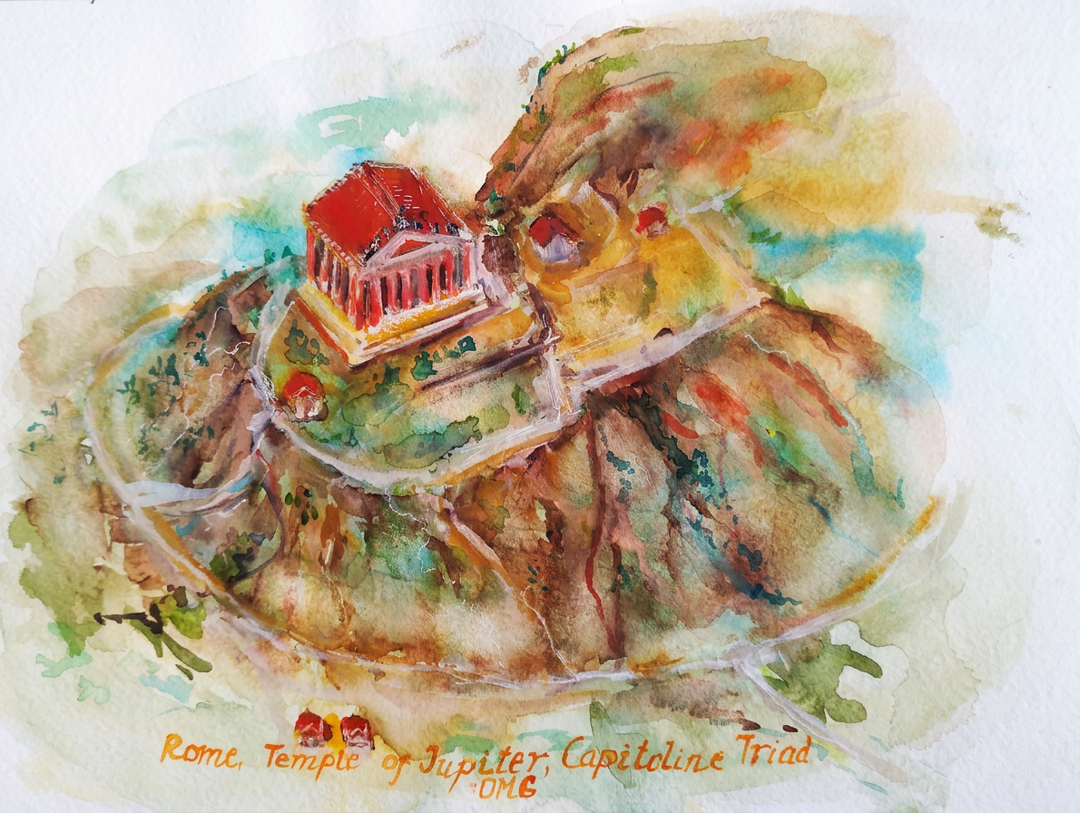
I continue the painting for my course Yale’s course Roman Architecture https://www.coursera.org/learn/roman-architecture. Rome, the Temple of Jupiter Optimus Maximus Capitolinus, Roman Architecture. 2-2.
I should admit that the information from this lecture is my favourite one so far from the course. The temple of Jupiter, Juno and Minerva, was built under the rule of the Etruscan King Tarquinius Priscus and completed by his grandson king Tarquinius Superbus on the Capitoline Hill in the sixth century BC. Design of the building had a huge impact for Roman and world architecture. There was a vast and beautiful Temple dedicated to three gods- Jupiter and his two female goddess companions, Minerva, the goddess of art, wisdom, medicine, commerce, handicrafts, poetry and Juno, the goddess who protected the nation as a whole and also kept special watch over all aspects of women’s lives.
I understand why it was such a beautiful Temple… because two out of three parts were dedicated to the female goddesses, and each god had a single cella. The Temple had the triple entrance way into three cellas of the structure. Democracy and equality for the 6th century BC, do you agree? The main temple was rebuilt several times, and all the time a colossal structure towered over the city with importance as a cultural, religious and civic center of Rome. The Temple was as beautiful as a miracle. I will add two quotes about the building from the Yale Roman Architecture course to this post:
Roman emperor Constantia’s II in the 4 century AD articulates its grandeur well: “beside the Temple of Jupiter everything else is like earth compared to heaven”.
Cicero, after the great fire of 83 B.C. and the rebuilding of the Temple of Jupiter OMG in marble: “Let us feel that conflagration to have been the will of heaven, and its purpose not to destroy the temple of Almighty Jupiter, but to demand of us one more splendid and magnificent!”
My painting is about the Chief temple of ancient Rome, the most important temple completed with mud brick for the podium and for the walls, wood and a red terracotta roof.
Painting- Rome, Temple of Jupiter OMG, Capitolini Triad, Roman Architecture. Year of construction- Precisely in 509. Address Via del Tempio di Giove, 18, 00186 Roma RM, Italy
Rome, Temple of Jupiter OMG, Capitolini Triad
An absolute discovery for me was that the Temple was built prior to the construction of the Parthenon in Athens (447 B.C.). Romans looked back to other nations’ architecture, what had been done by the Greeks and what had been done by the Etruscans. Romans picked and chose what they liked in each and they brought that together in an entirely new creation, with their own culture and religion. Roman architects mixed it up and created a distinctive style, that we know now as the Roman temple. Another interesting fact is that the religious service took place outside, the priest would officiate outside the temple, and very few were allowed to go inside to see sacred cult statues.
The temple was the only building that survived after the raiding of the barbarians in the 3rd century AD. The temple stood for about 1000 years. The remains can still be seen in the Piazzale Caffarelli, now part of the Capitoline Museums, and of its garden in Rome. Our family was several times in the museum, walked along this part of the museum and did not even suspect what miracle of architecture we were passing by, we hope to return back soon and enjoy the remains of the greatest architectural project in the 6th century BC.
All roads lead to Rome – Alain de Lille
Bon voyage! Until the next travel:)
The magic of the holidays is in the making! Join me on this artistic adventure as I explore the captivating world of #TravelVibes #ArtAdventure
All paintings belong to the author. No image is to be copied without permission.
Tools used for my painting Watercolour Charvin Savannah + Van Gogh ultramarine, Derwent, Albert Durer and Faber Castell watercolour pencils. Paper Acquarello Fabriano, grana grossa rough watercolour album, 22×30 cm (9 ×12 in.)
The Hellenization of late Republican temple, Roman Architecture. 2-4.
The Temple of Portunus is located in the former of the Forum Boarium, nowadays it is on the Piazza della Bocca della Verità, very popular place of the Mouth of Truth from the movie Roman Holiday with stars Audrey Hepburn and Gregory Peck.
It used to be a major commercial area along the banks of the Tiber in antiquity. In the Republican times here was a small port nearby from the side of the Tiber and market, where a lively livestock trade was carried on.
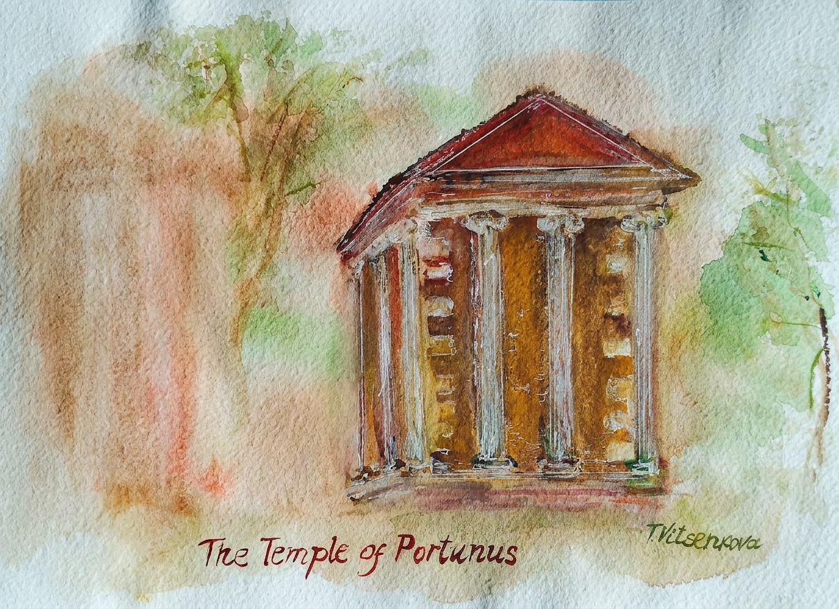
My painting is about the Temple of Portunus; the reference was my husband’s photo from our trip to Rome several years ago. From a distance the impression is that the whole building was made out of stone. The temple of Portunus by Tiber with their columns encircle the structure but is engaging into the wall. It characterizes the Ionic order, called spiral volutes. Greeks’ ionic capitals created for this type of column decoration like a hairstyle, the front parts of them with curls (ionic cymatium) and fruit garlands, and flutes were drawn along the entire trunk, descending like folds on the dress of bride ;) This is another example that Roman architects looked at Etruscan and Greek precedents, decided what they liked and mixed it up the way it best represented their own culture and religion. Another revolutionary step of Roman Architecture for this Temple was using roman concrete construction inside of the podium. This is the reason why Temple of Portunus is one of the few ancient buildings that have managed to stay intact until today.
In the middle ages the temple of Portunus was recreated to a Christian church, and this is another reason why it has been perfectly preserved. In this course the Professor showed the 19th century painting of the temple of Portunus with some architectural changes by this time. Nowadays we can see that the Temple was renovated closer to the original design of the structure, very important for the future preservation of Roman architecture.
In the ancient Roman mythology Portunus was considered the god of doors, keys and honeycomb, the guard of entrances and exits. I would like to go back and visit not just the outside and inside and I see everything with my own eyes. And I hope that the ancient god Portunus will open the door of its Temple for us.
All roads lead to Rome- Alain de Lille
Bon voyage! Until the next travel:)
Painting – Temple of Portunus, Rome, Roman Architecture
Year of construction – between 120 and 80 BC
Address – Piazza della Bocca della Verità, 00186 Roma RM, Italy
Tools used for my painting Watercolour siena, burnt siena Van Gogh, perm red light, lemon yellow, viridian Cotman Charvin ochre rouge + violet-Cotman dioxazine purple, Derwent, Albert Durer and Faber Castell watercolour pencils. Paper Acquarello watercolour album. Fabriano, grana grossa rough watercolour album, 22×30 cm (9 ×12 in.)
Δ
document.getElementById( "ak_js_7" ).setAttribute( "value", ( new Date() ).getTime() );
The magic of the holidays is in the making! Join me on this artistic adventure as I explore the captivating world of #TravelVibes #ArtAdventure
You are welcome to visit my personal website pages. There, you can find out more about the artwork I am offering in oil and watercolor paintings. You can buy canvas prints, framed prints, and more artwork.
All paintings belong to the author. No image is to be copied without permission.
My daily sketches’ journey in October 2020 is very close to the end. The next chapter is Old #Toronto.
Gooderham and Worts Distillery National Historic Site of Canada with industrial skyline of pitched roofs, turrets, chimney stacks and parapet.
When every chimney has retired but still dresses for the occasion.
Brick by brick, century by century — still standing, still judging your latte choices.
Old buildings staring down the new ones like: ‘We were here first.’
There are abandoned buildings with modern city’s buildings as background. Paintings were done as mixed of watercolour pencils, watercolour paints and acrylic, above added oil to add some texture for bricks.
I added cum clouds for peaceful sky and keep the interest in the scene to substitute buildings’ pipes that do not smoke anymore.
Abandoned? Prefer ‘vintage and unbothered.’
Cobblestones: lovingly restored. Tourist elbows: free of charge.
A lovingly rebuilt historic district that’s now so touristy, even the cobblestones are posing for selfies—yet somehow the old spirit still refuses to check out.
Canada Malting Site .It is one of two remaining silos in Toronto’s Harbourfront in Ontario, Canada. It is almost 100 years.
The museum and house Sir William Campbell is a vibrant public space where members of Toronto’ communities giving life to the words “freedom of expression.” Painting was done as combination of fountain pen with watercolour paints.
Almost 100 years old and still not on TikTok. Respect.
Toronto’s CN Tower, casually photobombing downtown with its reflection on the surrounding buildings, has been the city’s superstar landmark for the last 45 years. That basically makes it ancient history by our young country and city standards. CN originally stood for Canadian National, the railway company that decided, “You know what would be fun? A *massive* tower.” At over half a kilometer tall (555 m), the CN Tower spent more than three decades as the reigning champ of tallest building, tower, and freestanding structure—because apparently “really, really tall thing” needed multiple categories.
The CN Tower refused to be painted directly. A diva to the last pixel.
I decided to be “original” and painted this famous building, the CN Tower, not directly, but as a reflection in the fancy high-rises that try very hard to look taller than Canada’s tallest landmark:) I splashed in deep blue and juicy raspberry colours for a slightly over-the-top romantic vibe. This early-dawn scene was painted in the morning before work hours—because coffee and sunrise apparently make me think I’m a landscape poet with a paintbrush.
Bon voyage! Until the next travel:) All paintings belong to the author. No image is to be copied without permission.
Tools used for my painting Watercolour used Charvin and Van Gogh brands, Derwent watercolour pencils and Faber Castell artist pens. Paper Strathmore Watercolour and Mixed Media albums, 15×20 cm (6×8 in.)
I am starting a new journey. This time it will be “travelling” in my own city. I am planning to do daily sketches of city of Toronto, showing my preferred places, sometimes bright spots on its streets, sometimes… weird sculptures:)))) , the multicultural megapolis that is in harmony with its people.
Woodpecker Column – Toronto, Ontario at the Metro Toronto Convention Centre.
Metro Convention Centre’s woodpecker. This bird symbolizes construction, hardworking people of Ontario. It is prophetic bird, symbol of magical power, guardian of kings and trees. Even in mythology, the woodpecker is dedicated to Zeus (Jupiter), Ares (Mars), Sylvanu. In the eternal city of Rome, the woodpecker is said to have guarded Romulus and Remus, according legends.
Monument of culturalism. The statue of a man who uses all his strength to tighten the meridians of globe in this multinational city. On the “meridians” one can notice some birds perched up.
This is a place where residents or visitors of Toronto arrive or leave by subway, tram, bus, train, or airport. It is the heart of Toronto with its historical Union station. The statistics say that it has an average of 200,000 passengers passing through it each day. However, during the lockdown, that number was only 10% of its usual stat. In my hope for the best (and healthy) future, I captured the moment when the sky har the mixture of chocolate and rose hues. To complement it, I added some shades of coffee and vanilla to the sculpture.
Bike share Toronto. Who doesn’t know these famous bicycles in the streets of Toronto the colour of green apple? There are stations all over the city, including near the Harbour Centre, CN Tower and Rogers centre. You can rent a bicycle and spend a great time cycling for example near Ontario lake.
Bon voyage! Until the next travel:) Stay healthy.
All paintings belong to the author. No image is to be copied without permission.
You can visit my personal website pages here and find out more about the artwork I am offering in oil and watercolor paintings; purchase canvas prints, framed prints, and more artwork.
My favourite art store in Toronto is Deserres @Spadina avenue.
Tools used for my painting Watercolour used Charvin and Van Gogh brands, Derwent watercolour pencils and Faber Castell artist pens. Paper Strathmore Watercolour and Mixed Media albums, 15×20 cm (6×8 in.)






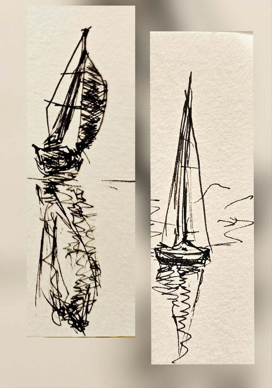


 Join me on this artistic adventure as I explore the captivating world of #TravelVibes #ArtAdventure